10 Best SaaS Homepage Examples

Great SaaS homepages don’t try to do too much, but they get the important stuff right. Within seconds, you should know what the product does, who it’s for, and why it’s worth your time. No guesswork, no digging around.
The best ones are simple on the surface but deeply strategic. Clean design, clear copy, and smart structure make it easy for visitors to understand the value and take the next step. Whether that’s signing up, booking a demo, or just scrolling to learn more, the path is obvious.
In this article, we’re sharing 10 SaaS homepages that stand out for clarity and conversion. We evaluated each one based on three key factors:
- Messaging clarity: how well the page explains what the product does and who it’s for
- Visual hierarchy: how easily visitors can scan and find what matters
- Conversion design: how well the page guides visitors toward action
Let’s take a look at what they’re doing right, and what you can learn from them.
10 Best SaaS Homepages
Here are our top picks of SaaS companies that got their homepage design right:
1. Notion

Notion’s homepage is designed to feel effortless.
Right from the top, it tells you what the product is and how it helps. The headline reads, “The AI workspace that works for you,” and everything below it supports that message.
The layout is clean, with plenty of breathing room. It’s not trying to impress with flashy visuals, but instead invites you in with quiet confidence.
As you scroll, you’re guided through key features, real use cases, and simple calls to action.
The product UI is embedded throughout the page, so by the time you finish scrolling, you already understand how it works.
Standout elements:
- Clear positioning up top — one line to explain what it is, one line to explain what it helps with
- Real product UI shown throughout the page, not just in mockups
- Logos from trusted names like OpenAI and Figma build immediate credibility
- Sharp CTA hierarchy — “Get Notion free” and “Request a demo” are easy to find and consistent
- Modular layout makes scanning easy: each section is focused and scrolls smoothly into the next
2. Slack
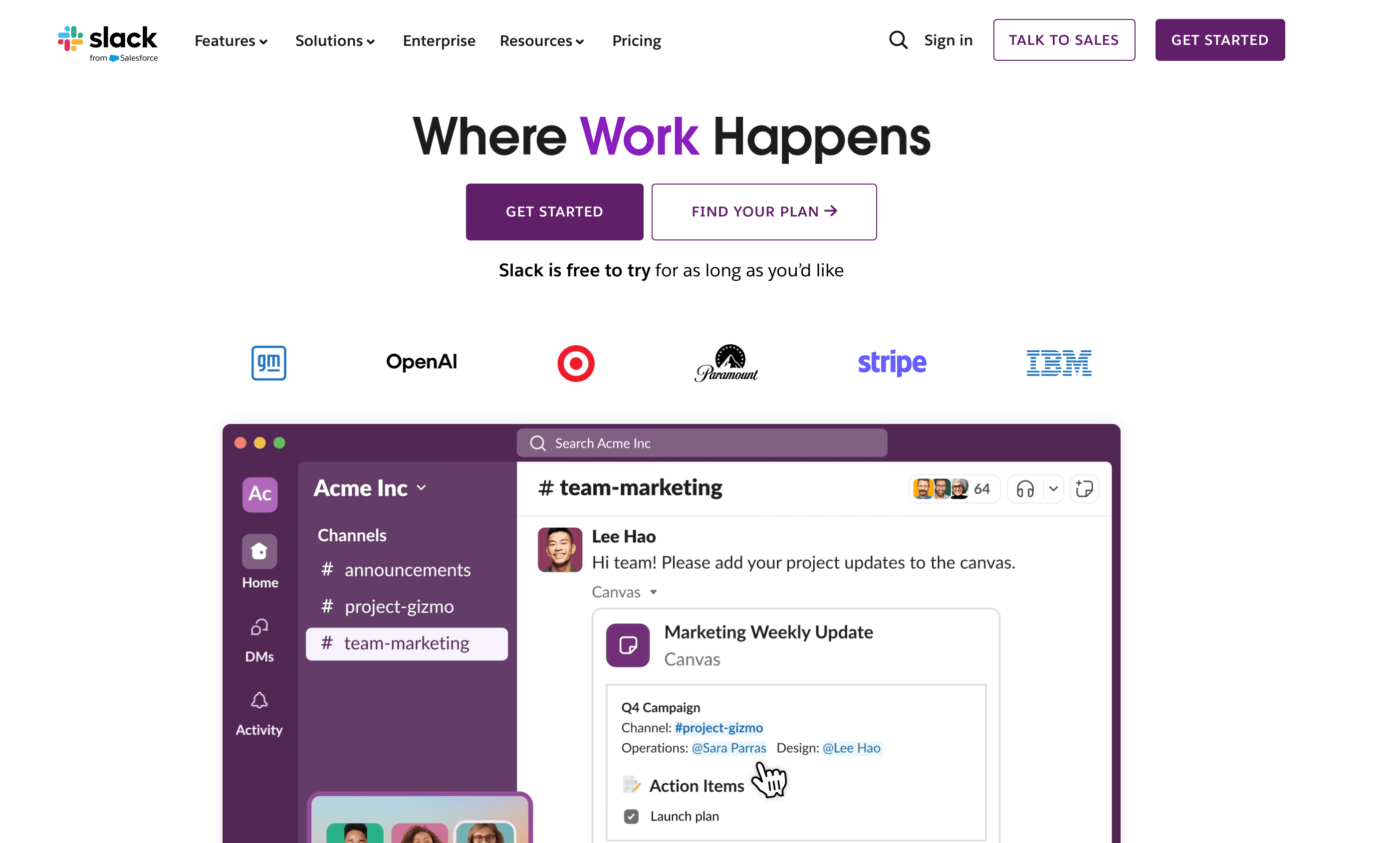
Slack’s homepage feels welcoming right away.
It uses a vibrant purple palette, crisp copy, and real product visuals to show how teams use Slack to communicate and get work done.
The design is clean but energetic. The page shows actual use cases, from chatting with teammates to using AI-powered tools.
The copy is direct and helpful, guiding visitors toward the right plan or action. The overall experience is polished but friendly, making Slack feel approachable for individuals and powerful enough for large teams.
Standout elements:
- Vibrant brand color runs consistently through the design, anchoring headlines and CTAs
- Live-looking UI snippets demonstrate team collaboration and AI features in context
- Benefit-first headlines lead each section, clearly tied to product visuals
- Stats and customer logos help build trust without slowing down the page
- Plan comparison grid is simple, scannable, and makes choosing a tier feel easy
3. Webflow

Webflow’s homepage looks like it was made by the kind of people who use the product.
Its sleek, dark background makes every headline and call to action stand out. The layout feels dynamic but never overwhelming.
Each scroll introduces a new feature or benefit, paired with clear visuals that show the product in action.
The site does a great job of balancing creativity with structure. It walks visitors through what’s possible without making them work to understand it. Everything feels deliberate, from the typography to the pacing.
Standout elements:
- Dark background with white and blue accents makes every CTA and headline pop
- Cinematic product previews embedded directly in-page, not hidden behind click-throughs
- Linear flow — each scroll introduces one benefit or use case, guiding you toward action
- Enterprise trust signals like success stats and recognizable brands placed strategically
- Modular structure lets users digest content in chunks — no long-winded sections
4. Stripe
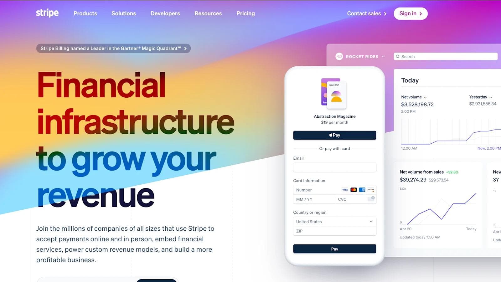
Stripe’s homepage is clean and direct. It opens with a subtle gradient and a clear message, setting the tone for a site that feels organized and trustworthy.
The layout is structured into well-defined sections that explain what Stripe does and who it’s for. There’s no clutter, just helpful content that guides users through the platform’s capabilities.
The visuals highlight product features without getting too technical, while the copy speaks to both developers and business leaders.
It’s the kind of homepage that feels calm, even when the product itself is powerful and complex.
Standout elements:
- Gradient hero background adds energy without overwhelming the clean layout
- Chunked feature blocks break up product offerings into scannable summaries
- Developer and enterprise use cases are shown side-by-side to cover both audiences
- Visuals focus on capability — UI cards, API docs, and dashboard snippets hint at power under the hood
- Global scale references appear subtly — through partner logos, regions served, and case study blurbs
5. Linear
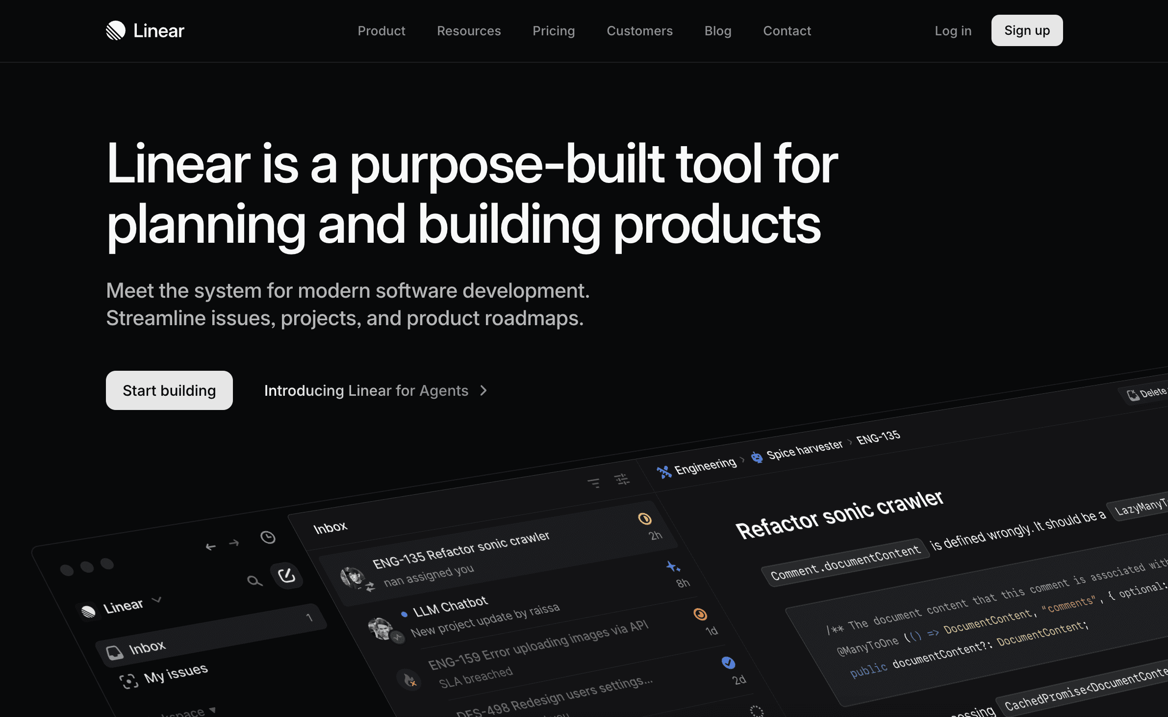
Linear’s homepage is quiet, sharp, and extremely intentional. It opens with a dark interface and precise typography that reflect the product’s focus on speed and clarity.
There’s no filler, just direct messaging and crisp visuals that show the product in use.
Each section introduces one clear idea and moves on. The tone speaks directly to product teams and engineers who know what they’re looking for.
The entire site feels fast and frictionless, much like the tool itself. Everything is built to reflect how high-performing teams think and work.
Standout elements:
- Fully dark UI reinforces a sense of control and focus — no distractions, no frills
- Dense grid system creates structure and rhythm without ever feeling rigid
- Navigation and sections are frictionless, letting users move smoothly from overview to detail
- Real interface previews don’t oversell — they show exactly what you’ll get
- Purpose-built messaging speaks directly to PMs, engineers, and tech leads without watering things down
See what’s working for industry-leading websites and find inspiration to improve yours.

6. Pitch
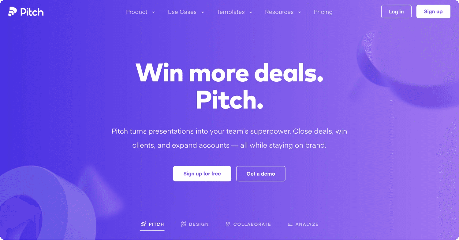
Pitch's homepage uses color, layout, and real examples to feel like an extension of the product itself.
The page opens with bold gradients and a short message that tells you what the platform is for. As you scroll, you’re shown how teams build, share, and collaborate on presentations.
The visuals are layered and engaging, but never feel heavy. Each section is short and purposeful, giving just enough detail to spark interest.
The tone is confident and modern, and the design reinforces the idea that great work happens when teams work together.
Standout elements:
- Vibrant purple gradient gives the hero section instant personality and brand recognition
- Slide-like content blocks mirror the product’s design DNA and help guide the scroll
- Template-first positioning makes it easy for users to jump right into creating
- Subtle storytelling runs throughout — showing how users start, collaborate, and measure results
- Trusted-by bar and testimonials land in the right places to reinforce credibility without slowing things down
7. Airtable
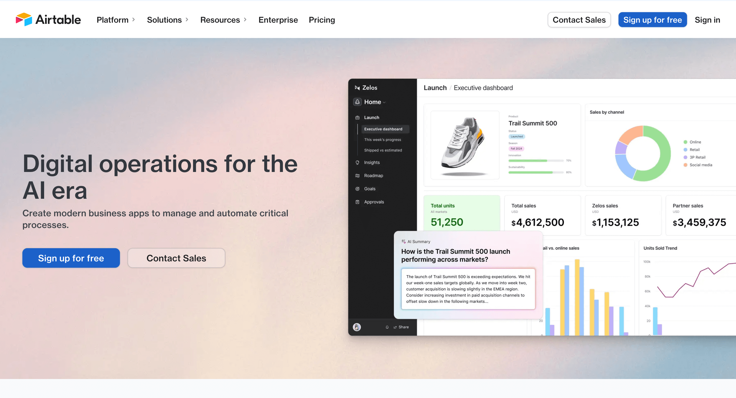
Airtable’s homepage feels flexible but grounded. It opens with soft gradients and familiar visuals that make the platform feel approachable.
As you scroll, the content shifts toward advanced use cases and business solutions. The layout is tidy and modular, guiding you through features without too much explanation.
Each section focuses on a specific benefit, paired with visuals that feel real and usable.
It’s clear that Airtable is positioning itself as both simple to start with and powerful enough to grow with you.
Standout elements:
- Soft color gradients in the hero create warmth and contrast with the UI overlays
- Use-case selector module lets visitors explore solutions by department instantly
- AI value props appear early but stay grounded in business outcomes, not buzzwords
- Side-by-side visual cards show real workflows without needing animation or interactivity
- Customer spotlight carousel adds credibility and motion near the bottom without cluttering the top
8. monday.com
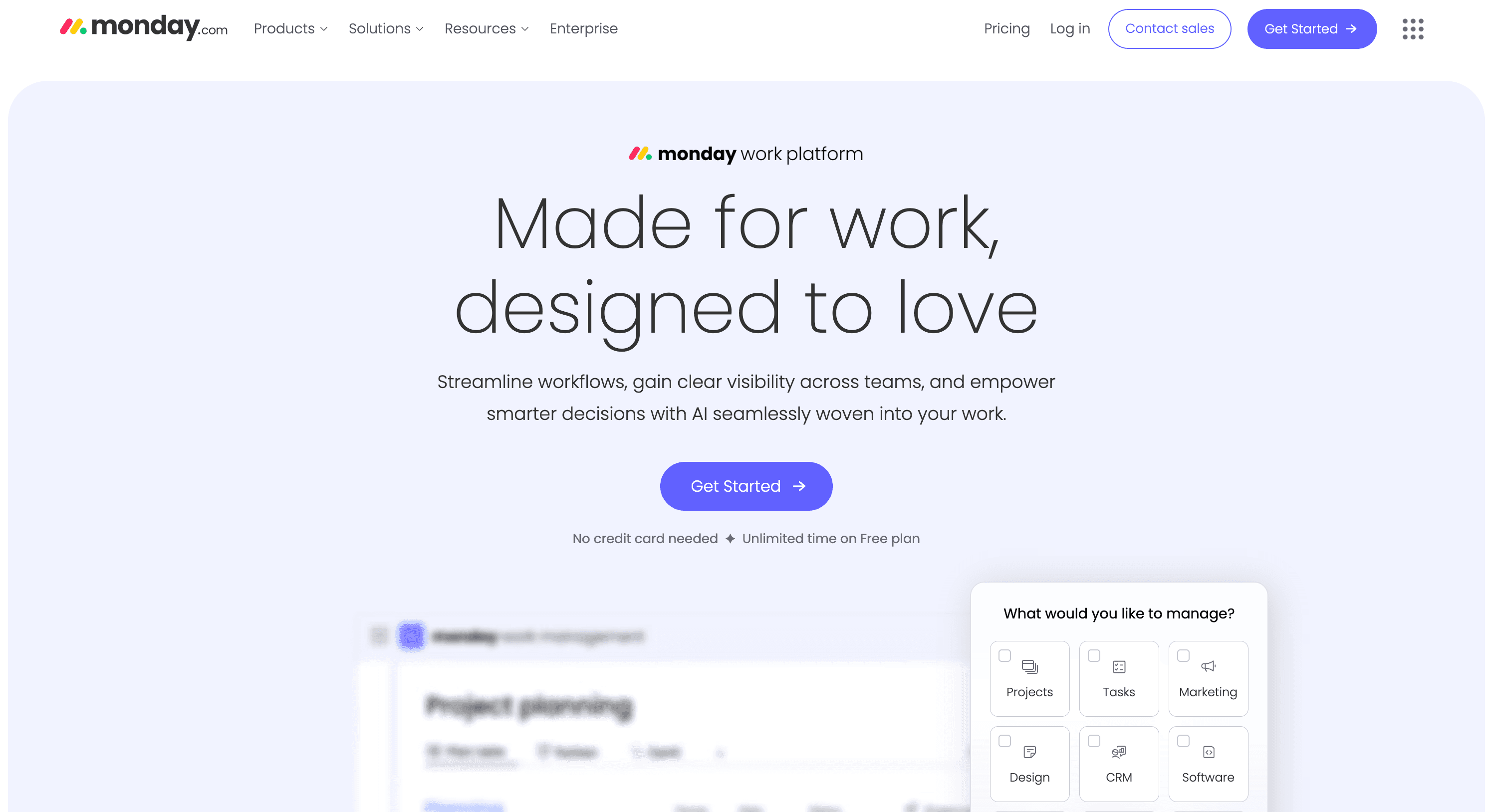
monday.com’s homepage is full of energy. From the first screen, it’s clear the site is designed to move visitors toward action.
Bright gradients, bold headlines, and clean product visuals make it easy to understand what the platform offers. The layout uses blocks of content that highlight features, use cases, and trust signals without slowing you down.
Every section feels purposeful, and the design keeps momentum high from top to bottom.
It’s built for speed, not just in how it loads, but in how fast it helps users find what they need.
Standout elements:
- Gradient-filled cards and CTAs reinforce brand identity and give visual energy to each section
- Above-the-fold action paths like “Start free trial” and feature categories minimize friction
- Dedicated AI section that’s visual, benefit-driven, and right where decision-makers expect it
- Trust badges and review logos spaced throughout the scroll to reinforce confidence
- Grid-based layout makes a high-volume homepage easy to scan, even on repeat visits
9. Scale AI

Scale AI’s homepage makes a strong first impression.
It opens with a deep black background, bright highlights, and bold typography that immediately communicates sophistication and technical depth.
The design is serious and precise, built to speak directly to data teams and enterprise buyers. The visuals focus on workflows, infrastructure, and advanced capabilities, rather than surface-level features.
Every section feels like it's made for people who understand the space and need a solution that can handle real scale. It’s not here to entertain, but to earn trust.
Standout elements:
- Dark palette with glowing accents gives the site a high-tech, research-grade feel
- Heavy focus on architecture and data workflows, with content structured like documentation
- Product visuals mimic real tooling — command lines, dashboards, and workflow diagrams
- Logo wall and case studies highlight credibility from players like Meta, OpenAI, and the U.S. government
- Minimalist CTAs keep the tone serious and intentional — you’re not here to browse, you’re here to build
10. Dropbox
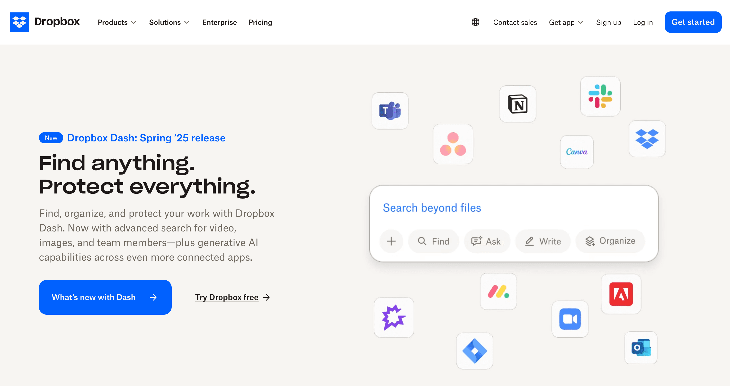
Dropbox's homepage keeps things straightforward and opens with a clean layout, a clear headline, and a single call to action.
It focuses on what users care about most — storing, sharing, and organizing files.
The design avoids clutter, using visual hierarchy and spacing to guide the eye. As you scroll, the page introduces different use cases and pricing plans without trying to oversell.
It’s quiet, confident, and easy to navigate. The overall experience reinforces Dropbox’s reputation as a dependable tool that just works.
Standout elements:
- Side-by-side pricing grid above the fold makes plan differences clear without extra clicks
- Value props broken into icons for fast scanning (store, share, collaborate, manage)
- Customer case study section adds personality without dominating the page
- Split CTA panels for personal vs. business use help visitors self-select instantly
- Straightforward footer and nav echo the brand’s no-nonsense, organized identity
Design With Purpose and Build for Growth
A great SaaS homepage doesn’t have to be flashy, but it does have to work. The best ones get to the point, guide the user to take action, and reflect the product's purpose.
Use these examples as a starting point. Look at what makes them clear, useful, and easy to trust, then build something that fits your brand and your users.
We partner with high-growth tech brands to design, build, and scale websites that marketers and end-users love.


I lead growth at Webstacks, connecting strategy, design, and engineering to build websites that drive results. I specialize in website strategy, CMS implementation, and helping B2B teams scale their web presence.