Firstup helps enterprise organizations communicate with millions of employees across moments that matter—from onboarding and change management to critical, real-time updates. As the platform evolved into a more intelligent, personalized system, the website needed to better reflect the sophistication behind it. The challenge wasn’t just explaining features, but clearly communicating impact, trust, and long-term partnership at first glance.
To support that shift, Firstup partnered with Webstacks to reimagine its web presence. Together, the teams focused on creating a design system and page experience that could express marketing-grade intelligence while maintaining the warmth and humanity essential to employee communication.
A Need for A Design Direction Rooted in Intelligence and Warmth
Firstup’s senior marketing leadership described a consistent friction they were seeing across the site. From their perspective, the experience required too much effort from visitors to piece together how the platform actually worked.
Buyers moved back and forth between pages, trying to connect orchestration, personalization, and employee journeys into a single story. While customer proof and credibility were present, they lived in isolation rather than reinforcing the narrative as users moved through the experience, making it harder for the site to guide visitors toward a clear understanding of Firstup’s value.
That friction showed up just as clearly in the visual system. From a marketing leadership perspective, the existing palette and rigid layout patterns limited how stories could be told across the site. Flat imagery and constrained modules made it harder to guide attention, emphasize proof, or create a clear sense of progression. The team needed a design foundation that could reduce cognitive load, support internal selling conversations, and communicate enterprise credibility immediately—without sacrificing approachability.
Key Firstup Pages That Carry the Story
The new visual system was guided by a clear tension discussed throughout the workshop: Firstup needed to project intelligence and sophistication without feeling cold or overly technical. Employee communications are inherently human, and the design needed to reflect that reality.
Webstacks approached the redesign with a focus on narrative hierarchy and flexibility. Visual decisions like expanded color usage, refined spacing, and subtle motion were used to guide attention and reduce cognitive load, allowing each page to communicate its core message quickly. Instead of presenting everything at once, the experience now leads with impact and supports it with detail.
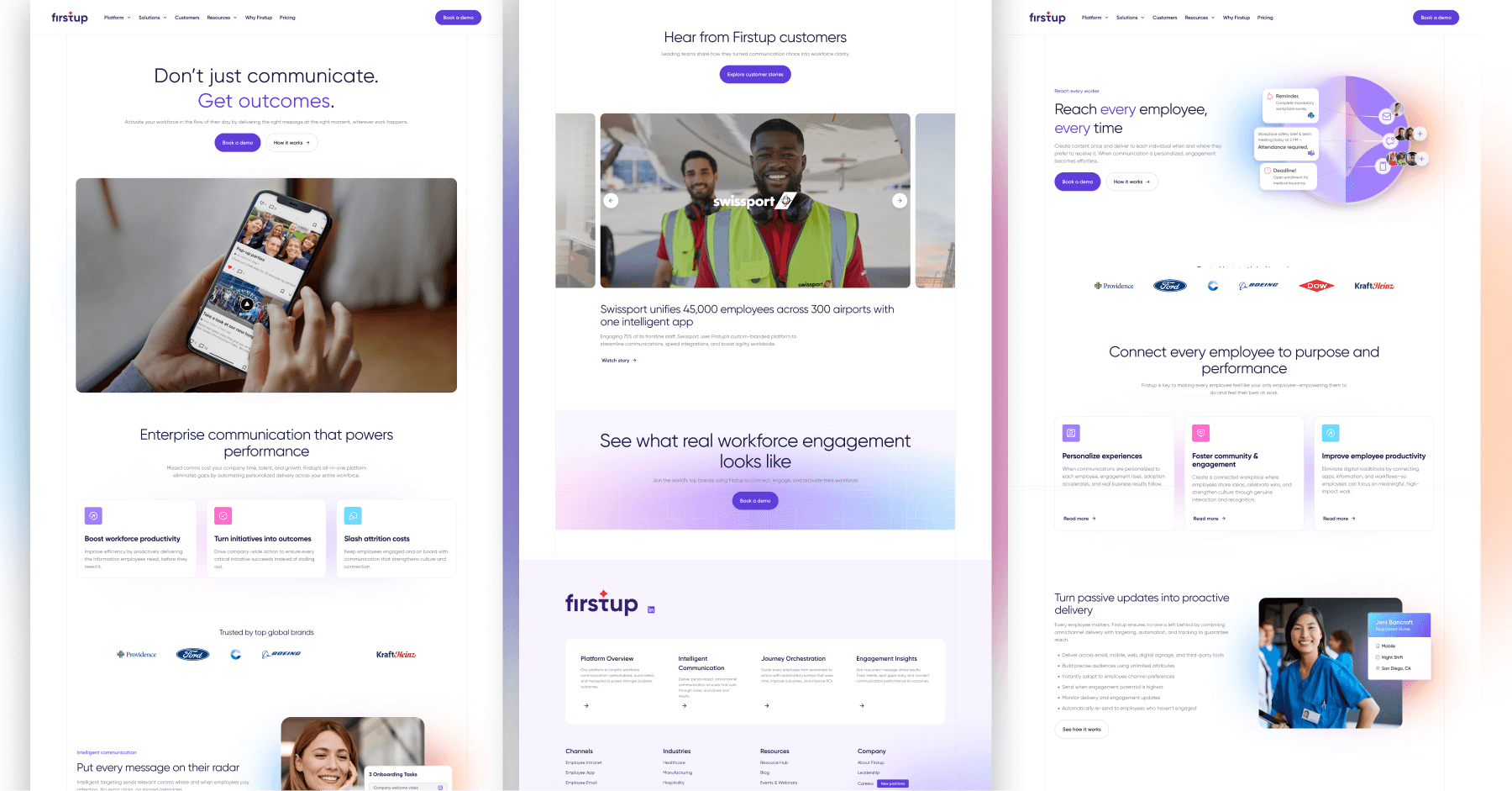
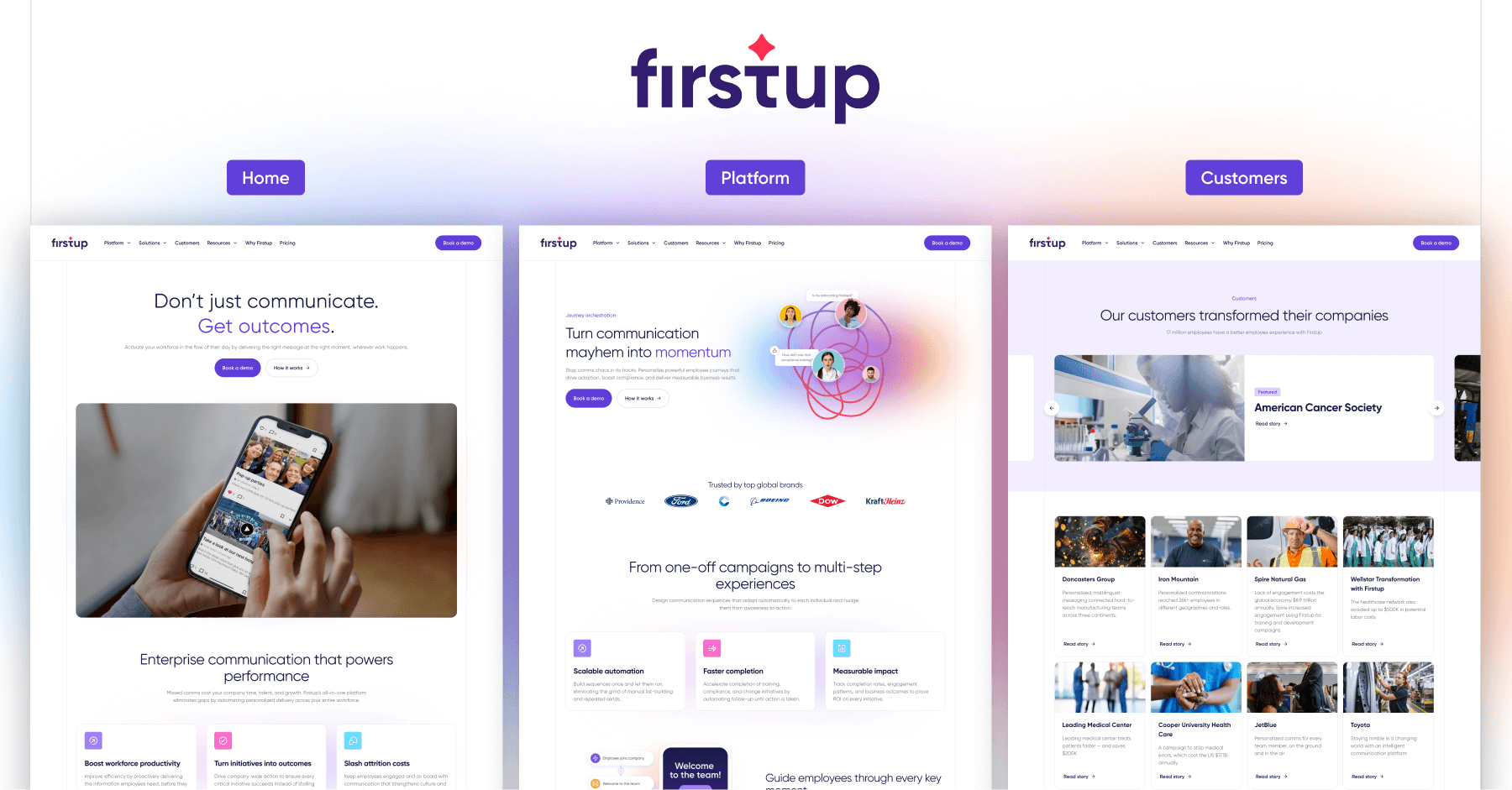
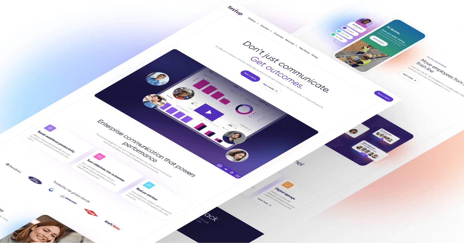
Homepage
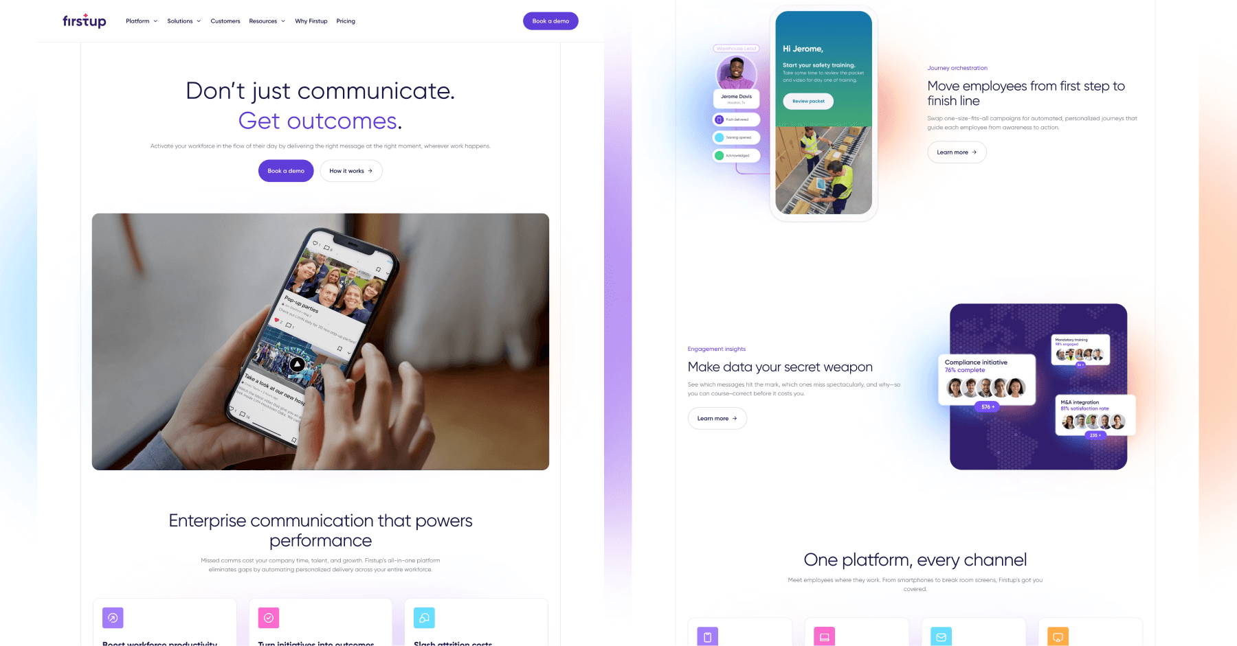
The homepage was designed to answer two questions immediately: What is Firstup? and Why does it matter? Clear hierarchy and confident messaging establish Firstup as an intelligent, enterprise-ready platform, while product visuals and human imagery reinforce approachability. The page sets the tone for everything that follows—strategic, modern, and grounded in real outcomes.
Customers Page
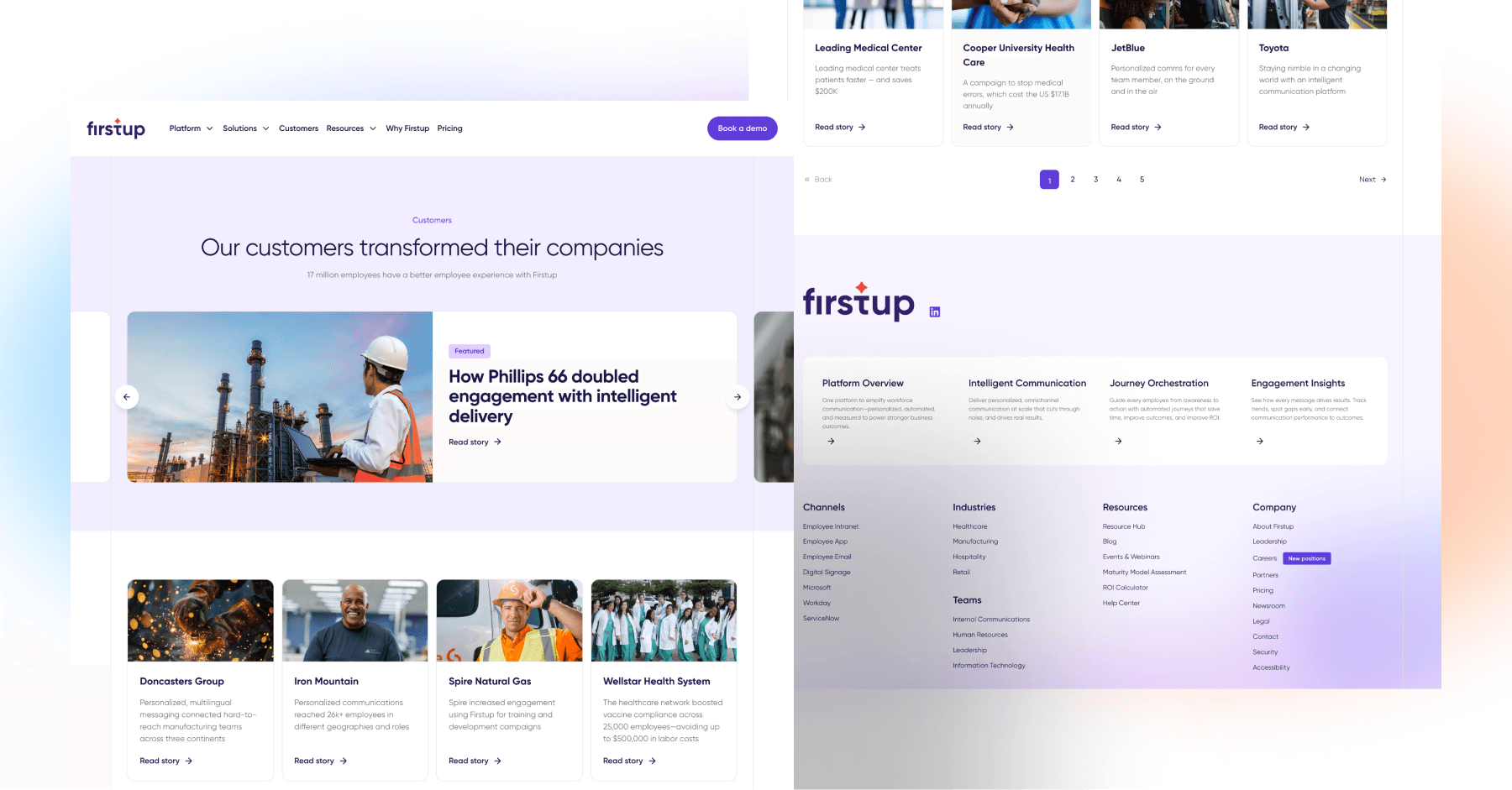
Customer validation emerged as one of the strongest conversion signals during discovery, and the redesigned Customers page treats it as such. Large-scale logos, featured stories, and industry diversity are surfaced prominently, reinforcing trust and credibility. The design makes it easy for high-intent buyers to see themselves in Firstup’s customer base without digging.
Platform: Journey Orchestration
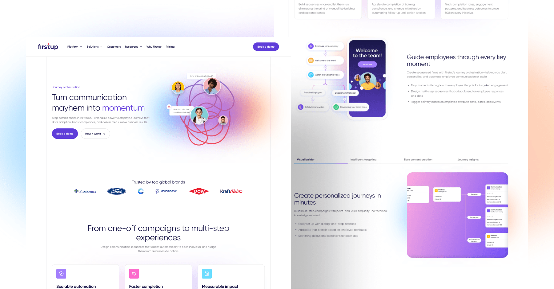
Journey Orchestration plays a central role in Firstup’s differentiation, and this page brings that complexity into focus. Modular layouts, visual builders, and progressive storytelling explain how multi-step employee journeys are created and automated—without overwhelming the reader. The design emphasizes flow and momentum, mirroring the product’s purpose.
Why Firstup
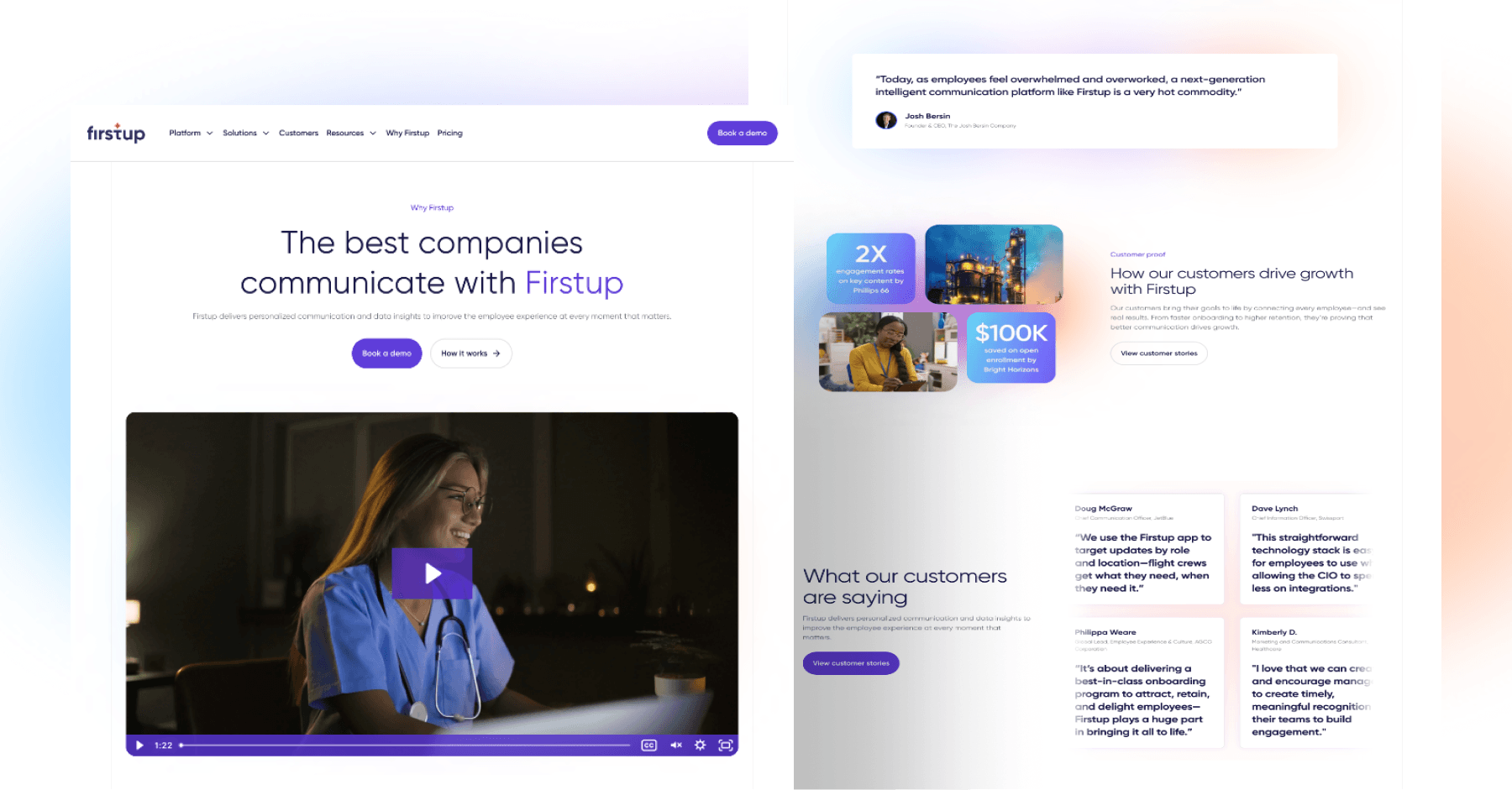
For buyers comparing platforms, the Why Firstup page distills differentiation into a clear, structured narrative. Rather than leaning on generic claims, the page highlights intelligence, personalization, and leadership through concise content blocks supported by visual cues. It’s designed to support both self-serve evaluation and sales-led conversations.
A Foundation Built for What’s Next
Moving forward, Firstup’s new website is a stronger foundation for brand consistency as the company continues to grow. Marketing leadership can now depend on visual language, messaging, and page structure to work together to reflect how Firstup wants to be perceived in the market—intelligent, human, and enterprise-ready. The site aligns the brand with the platform’s maturity, creating a clearer, more confident expression of who Firstup is today and where it’s headed.
Your website is your biggest growth lever—are you getting the most out of it? Schedule a strategy call with Webstacks to uncover conversion roadblocks, explore high-impact improvements, and see how our team can help you accelerate growth.