Web Design Agency
ComposableComposable websites for companies growinggrowing
We design scalable websites that evolve as your business grows.
Great web design isn’t a single deliverable; it’s the result of a clear, repeatable process that connects strategy, structure, and visual expression. We focus on how users move through your site, how information is organized, and how the design system supports long-term growth.

User Journeys
Define how users move through your site
We design the structure and flow of your website before individual pages, mapping different user intents to clear paths so content, layout, and calls to action are designed in context, not in isolation.
Clear page goals
Each page is designed with a specific goal based on where it sits in the overall flow.
Intent-driven hierarchy
Content is ordered and emphasized based on what users need at that point in their journey.
Purposeful layouts
Layouts are designed to guide progression and decision-making, not just visual balance.
Contextual calls to action
Calls to action are placed and prioritized based on user intent, not uniformly across pages.
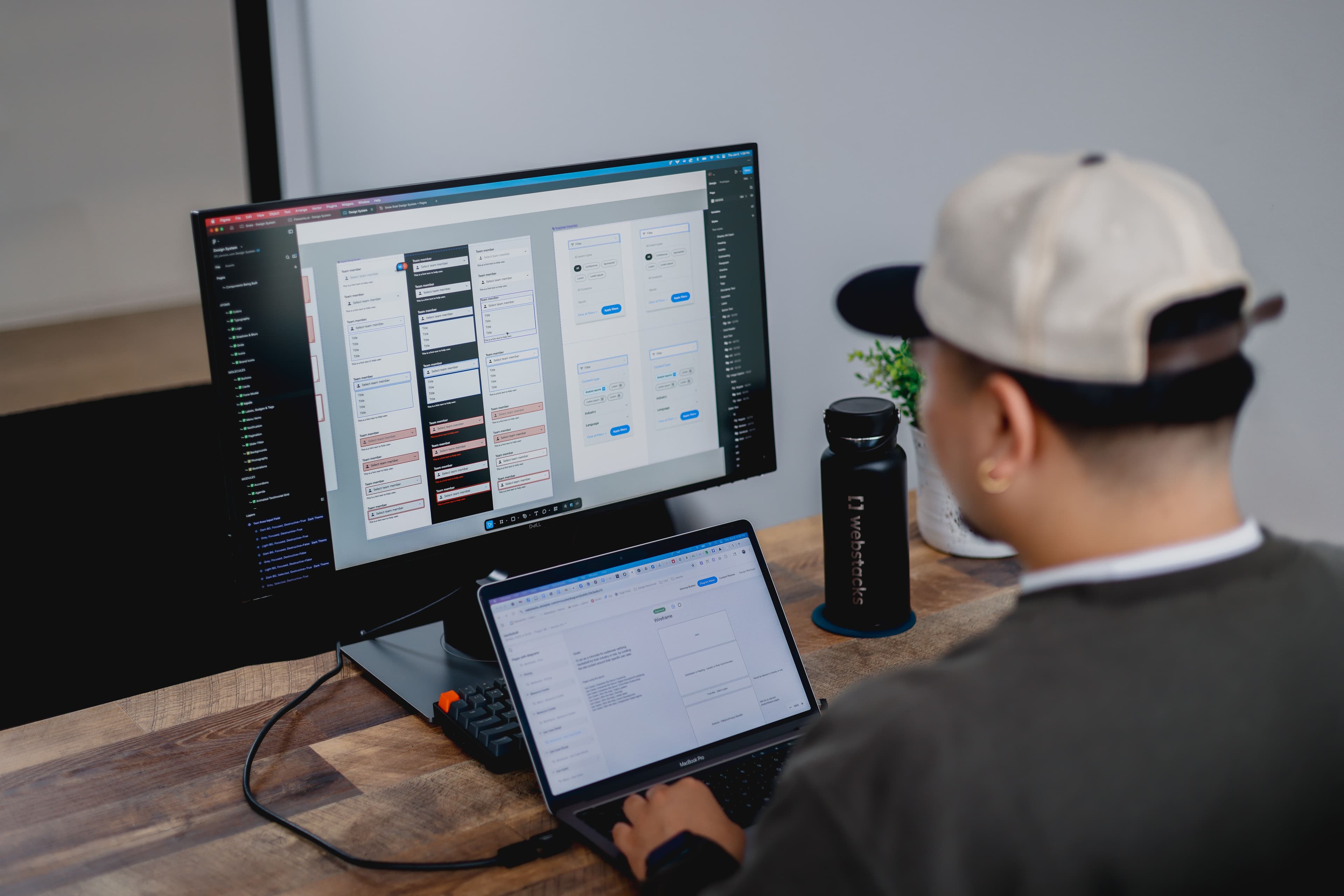
Wireframes
Establish structure before visual design
We use wireframes to establish layout, hierarchy, and content structure before visual styling. This allows page goals, user flow, and content priority to be validated early, so visual design is applied to a clear and intentional foundation.
Clear layout structure
Each page layout is built around its primary goal, content order, and required components.
Validated hierarchy
Content priority and emphasis are resolved early, reducing rework during visual design.
Aligned decision-making
Wireframes create shared understanding across teams before visual polish begins.
Design-ready foundation
Approved wireframes serve as a blueprint for visual language and component design.

Visual Language
Shape how the site communicates visually
We develop a visual language that brings clarity, hierarchy, and tone to the structure through typography, color, imagery, and motion.
Clear visual tone
Typography, color, and imagery establish a consistent tone that reflects the brand.
Reinforced hierarchy
Visual emphasis supports content priority and helps users scan and understand pages quickly.
Intentional use of imagery
Illustration, photography, and motion are used purposefully to explain, guide, or emphasize.
Expressive consistency
Pages feel related and cohesive without relying on rigid repetition.

Interaction and Motion
Use interaction and motion to support the message
We design interactive components where interaction and motion work together to clarify relationships, provide feedback, and reinforce key messages.
Message-driven components
Bespoke interactive elements use motion to reveal, compare, or emphasize information.
Clear cause and effect
Interaction and motion work together to show what changed and why.
Guided understanding
Movement and state changes help users follow sequences and relationships.
Intentional restraint
Interaction and motion are used only where they add clarity or meaning.
Design system
The foundation behind the site
We design with , , and , so visual updates, layout changes, and content variation don’t require redesign.
Reusable components
Components are designed for flexibility and reuse across pages and templates.
Shared design tokens
Typography, color, spacing, and motion are encoded into tokens for consistency.
Faster iteration
A shared system reduces rework and speeds up new page creation.
Long-term maintainability
The site can grow and evolve without fragmenting the design.
“When we started working with Webstacks, our website was effectively unusable for our marketing team. They worked closely with us to redesign our website, creating a design system that allowed our marketing team to build pages without tapping our engineering team.
”

test
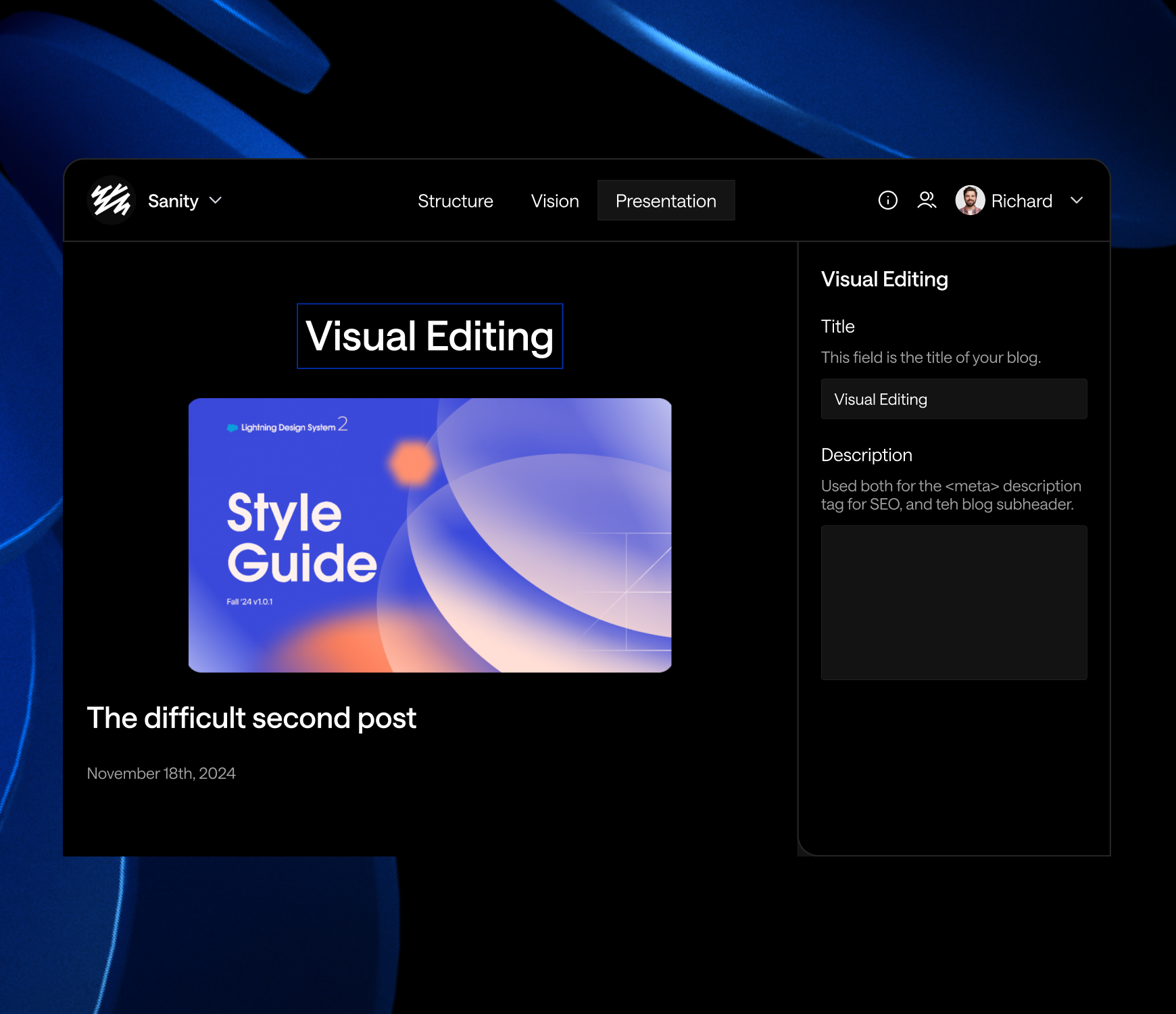
Gong
ServiceTitan
Calendly
Justworks
Braze
Thinking about your next website move?
We’ll help you think through conversion paths, evaluation flows, and long-term scale.
Built for scale
Systems that support evaluation, iteration, and growth
Live walkthrough
How we design and build systems for growing product teams
Trusted by industry leading SaaS teams