What's the Meaning of Atomic Design? Common Misconceptions

You might have noticed by now that we're huge advocates of the atomic design methodology. We post about it at least once a week!
As a reminder, Atomic Design is an approach to building web pages from the simplest building blocks, also known as atoms. The challenge designers face is evolving these building blocks into larger beings, or pages, so that developers can make them functional.
In this article, we'll list the four most common misconceptions about the atomic approach and why they're not true.
1. Molecules and Organisms are the Same
If you're familiar with atomic design, you know that atoms are the simplest building blocks of a user interface. Molecules and organisms are the next phases in the process where teams find it hard to distinguish the two.
Yes—molecules are atoms bonded together to form a larger aspect of a design component and organisms are groups of molecules joined together to form a relatively complex, distinct section of a user interface. We understand how it can get muddy.
Is it a molecule? Is it based on size? Can't molecules be standalone organisms if we want them to be? Luckily, there is a fine line between what is a molecule and what is an organism.
How to get around it:
In this case, we'll refer to organisms as components—molecules combined to form larger aspects of an interface.
Organisms aren't the same as components because you need them to build larger beings that become reusable when teams wish to build page templates or pages.
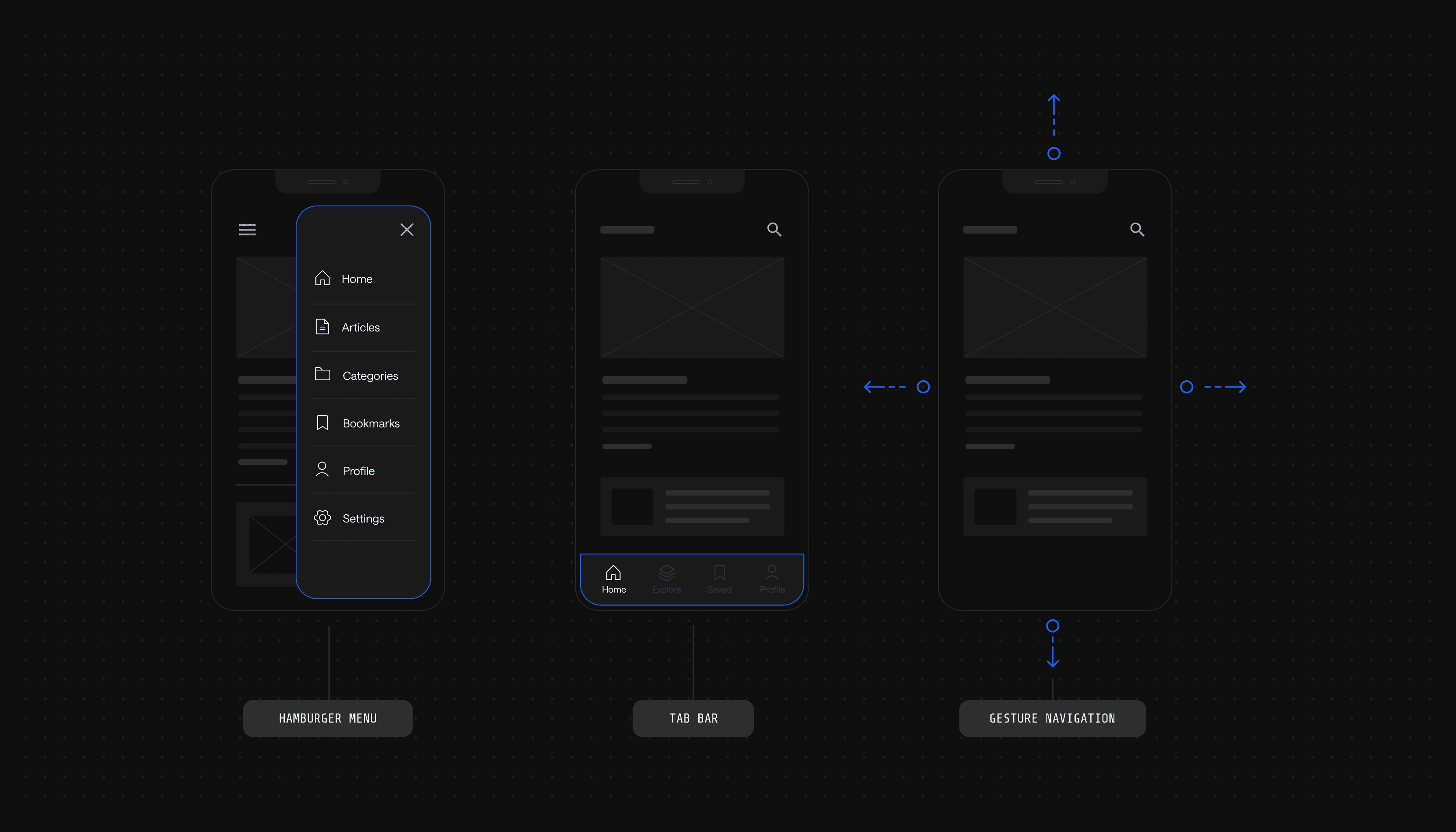
For example, the navigation bar of a website appears on every core page. Typically, the navigation bar will have a company logo (atom), menu items (atom), buttons (molecules), and a search bar (molecule).
These are molecules that combine to form an organism—an element that can be reused and modified on any page as needed. The core difference between the two is not bound by categorization or size. Without the smaller elements, teams cannot build the necessary structure and components required for a design system.
2. Atomic Design is Strict Categorization
When it comes to atomic design, there is a categorization element that does box your website elements into a box. By building from the ground up, teams label which elements are considered atoms and which elements are required to build molecules, organisms, and so forth.
When it comes to atoms, elements such as typography, colors, and icons are the smallest elements of any design system. When teams begin building buttons, inputs, or other larger design elements, it will begin to feel like the labels are permanent.
In a sense, the atomic design does feel like strict categorization that teams have to abide by. However, it's not as bad as anti-atomic users make it seem.
How to get around it:
Categorizing design elements by atoms, molecules, and organisms (components) provides teams with correct answers and naming conventions. The issue with categorizing design elements is that it becomes debatable when designers, marketers, and even developers step into the picture to identify what everything is.
In retrospect, it sounds like a great problem to have.
By involving everyone on the website team responsible for maintaining the look and feel of the site, teams will understand how each design element should be used.
The atomic design system eliminates any point of confusion and resolves inconsistencies from the start. Categorization is all about ensuring that internal website teams are using the same visual language across the internet.
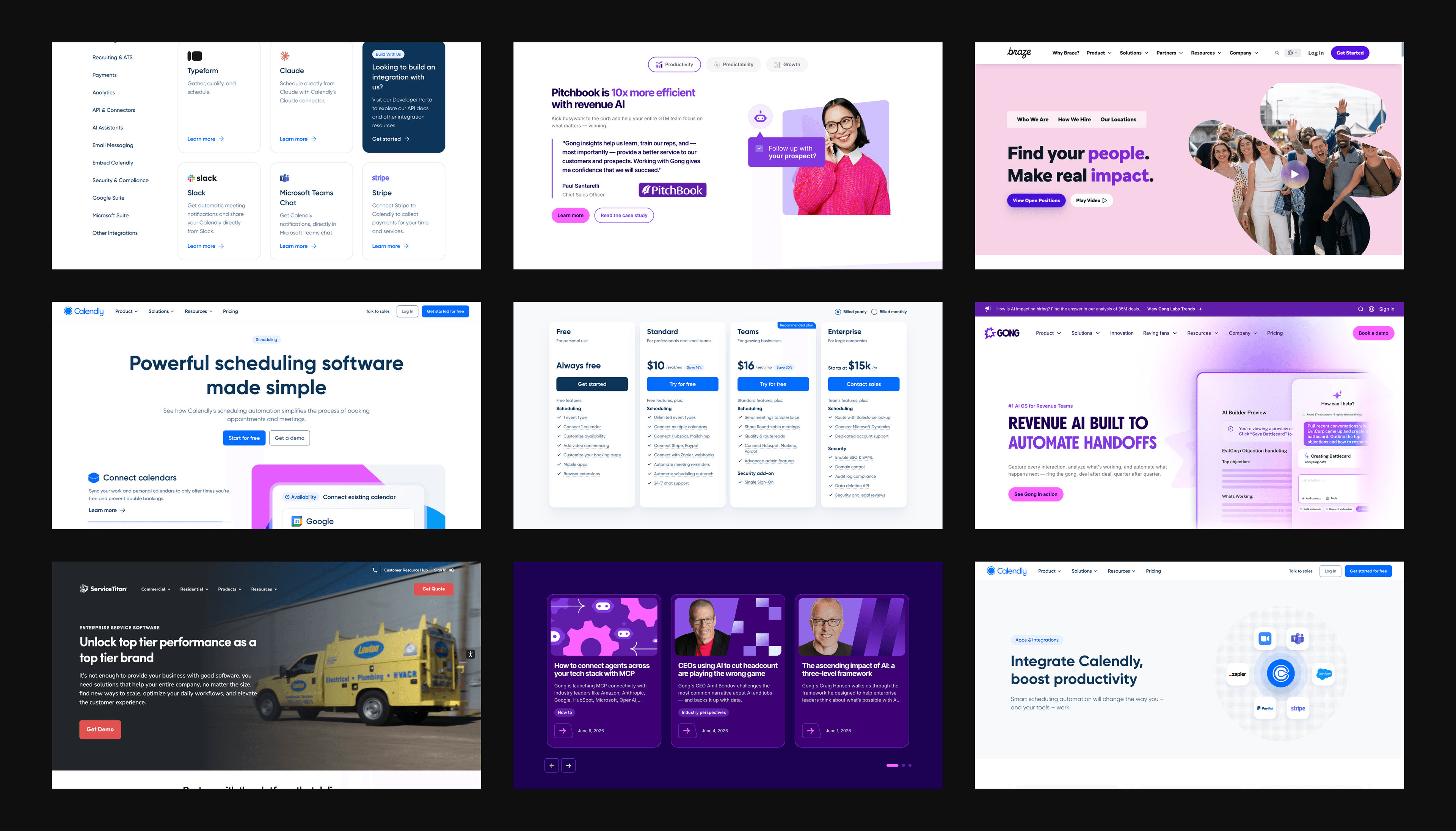
Without a visual identity system, teams like Calendly run into the issue of using improper button styles on a landing page or the wrong hero components on their pricing page.
Call it what you want, but design systems that use categorization set proper guardrails to ensure teams aren't implementing design components incorrectly.
3. A Leaky Abstraction Between Templates and Pages
The distinction between a template and a page is frequently misunderstood. Why not call templates pages and call it a day?
From a non-designer's perspective, it might not make sense to label them differently to avoid confusion. It's typical for non-designers and non-technical people to not know why templates are the abstract form and pages are the visible implementation of the template.
People new to the atomic design concept struggle with understanding how templates are utilized, why they form part of the language and categorization, and what they're supposed to look like.
How to get around it:
Brad Frost describes templates as the skeleton of a page that represents the underlying content structure of the user interface without the final content. As we mentioned, templates are hard to visualize and even troubling for most developers to implement.
Luckily, there is a way to get around the leaky abstraction between templates and pages to make it easier for website teams to work cohesively from the same visual identity system without confusion.
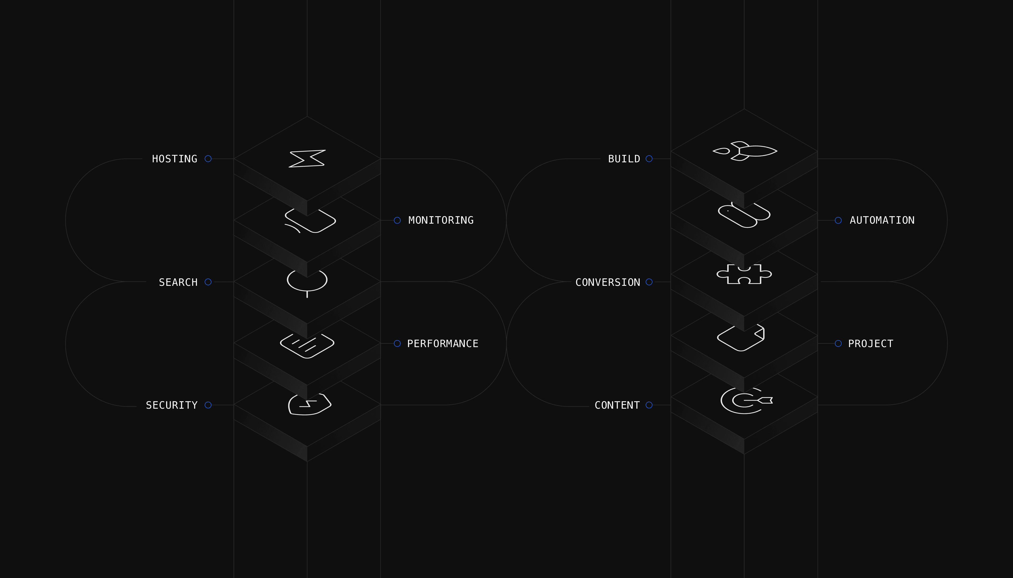
Instead of including templates in the atomic process, teams should build a design system containing a library of reusable components. These components are the organisms.
What this means is that come time to build a page, teams aren't building confusing templates. Instead, they are pulling from the visual identity system to create pages. That way implementation is more straightforward and no longer a guessing game of "how are these templates supposed to look and work?"
4. Colors and Typography Aren't Atoms
If you're familiar with brand style guides, then you'll know that colors and typography are at the heart of it. For that reason, it makes sense for teams to now consider these elements as part of a visual identity system.
Better yet, teams are unsure how colors and typography would fit in the atomic design process. At the end of the day, both elements only exist to serve a neat aesthetic, right?
We respectfully disagree—both elements matter because they affect the user experience and overall brand identity. Therefore, they should be taken into account when teams are beginning the atomic design process.
How to get around it:
Because colors and typography are basic elements in design, they are considered atoms in the atomic approach.

It's standard for teams to have a primary and secondary palette, and different sets of typography (fonts, sizes, etc.).
Including all different sets of each element allows teams to create different variations of a molecule using different colors and fonts.
This solves the problem of having to go back to each page and have development teams make simple updates. Following this method not only adds more variation to the inventory of components but also teams don't rely on development resources time and time again.
The Methodology in Practice
Atomic design is not a new practice. Teams have been building user interfaces with the approach for years now. Because of that, we've had the opportunity to build atomic design systems for clients and partners in SaaS, Blockchain, and FinTech industries.

Most recently, we helped the SaaS scheduling platform Calendly build an accessible atomic design system that empowers their marketing team to evolve their marketing website.
Seeing world-class organizations take a chance on atomic design shows that it's quickly becoming the industry standard. Hopefully, you'll feel inspired to give it a try or at least learn more about how the methodology can help your website scale and your team to work smarter.
Your website is your biggest growth lever—are you getting the most out of it? Schedule a strategy call with Webstacks to uncover conversion roadblocks, explore high-impact improvements, and see how our team can help you accelerate growth.