Best Partners Page Design Examples
Your partners page directly affects whether qualified prospects join your ecosystem or go to a competitor. The gap between pages that generate passive interest and those that drive real partnership growth comes down to deliberate design choices: directory structure, benefit clarity, and conversion paths that serve both partners and customers.
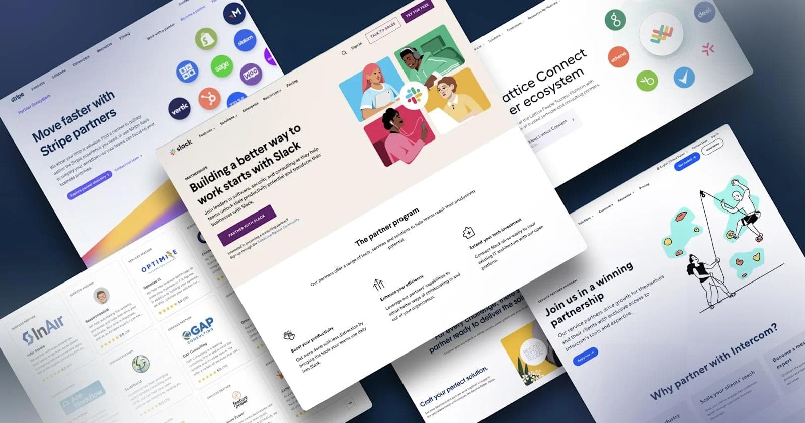
Most B2B SaaS companies build partners pages that function as simple lists: partner logos, vague benefit descriptions, and a contact form. Companies like Stripe, Salesforce and Airtable treat their partners pages as recruitment infrastructure that simultaneously attracts partnership prospects and helps customers discover implementation support. These pages balance two distinct audiences with different needs while maintaining clear conversion paths for both.
This guide examines 15 partners pages that successfully execute this balance. You'll see how leading B2B SaaS companies structure directories for different ecosystem types, communicate program benefits without generic claims, and convert prospects through deliberate form design and CTA placement. Each example includes specific analysis of design decisions and strategic choices that make these pages effective.
What Is a Partners Page?
A partners page provides information about a company's partnerships, alliances and integrations within their ecosystem. For B2B SaaS companies, these pages serve two distinct audiences with different needs and expectations.
For prospective partners, partners pages detail available partnership programs and the specific benefits of joining your network. Strong partners pages answer the fundamental question every prospect asks: why should we invest time and resources into this relationship? The page must demonstrate clear value, provide program details, and build confidence through proof points.
For existing customers, partners pages showcase additional resources that extend product value. This typically includes marketplaces or directories where users browse partnerships to find implementation support, complementary tools, or specialized expertise. When customers can easily discover and connect with partners, they extract more value from your platform and stay longer as users.
Why Partners Pages Matter for B2B SaaS Growth
Partners pages drive measurable business outcomes when designed strategically. The most effective pages accomplish four key objectives that directly impact revenue and market position.
Attract Partnership Opportunities
Partner programs that scale require clear digital visibility. Before joining a partnership program, prospects evaluate three factors: program structure, partnership benefits, and organizational credibility. Your partners page must address all three factors effectively.
High-quality content, interactive elements, and clear program details encourage prospects to inquire and ultimately join your ecosystem. When partners can self-educate through your website, you accelerate the qualification process and attract more serious prospects.
Establish Credibility Through Ecosystem Strength
Trust determines whether prospects become partners and whether customers adopt partner solutions. Partners pages build credibility by displaying success stories, testimonials, partner logos, and relevant certifications. Draw attention to measurable outcomes from partner collaboration rather than generic claims about partnership value.
Your partners ecosystem directly impacts brand equity and product utility. Just as integration marketplaces drive product adoption, strategic partnerships signal market position and help attract prospective buyers who evaluate ecosystem strength during purchase decisions.
Help Customers Find Product Experts
Showcase organizations in your ecosystem that help users maximize product value. Whether partners offer implementation, guidance, strategic support, or technical assistance, directories with robust search make it simple for customers to find and evaluate resources. When customers succeed with your product through partner assistance, retention improves, and expansion revenue grows.
Differentiate Through Network Effects
An impressive partners page sets your brand apart by demonstrating ecosystem strength and diversity. The most effective approach creates a searchable directory that showcases partnership breadth across categories, industries, and geographies. This conveys credibility and distinguishes your company in competitive markets where partner network effects create defensible advantages.
These four objectives work together to transform partners pages from static information repositories into active growth drivers that expand your ecosystem while helping customers succeed.
Essential Components of Effective Partners Pages
Building a partners page that converts requires strategic content architecture. Your site should address both partner recruitment and customer discovery needs through distinct sections that serve each audience effectively.
Partner Programs
Detail each partnership type so prospects can evaluate fit without scheduling a call. Common B2B SaaS partnership models include technology partners (integration and API partnerships that extend platform capabilities), reseller partners (sales partnerships that expand market reach), referral partners (commission-based partnerships that drive qualified leads), agency partners (service partnerships that deliver implementation work), system integrators (technical partnerships that build custom solutions) and strategic alliances (joint go-to-market partnerships with complementary vendors).
Each program type requires different resources, commitment levels and expertise. Clear program descriptions help prospects self-qualify and choose the right partnership path.
Partner Benefits

Clearly communicate partnership benefits to sell your program effectively. Successful partners pages use design to present benefit information intuitively through visual hierarchy, iconography, and scannable formatting.
Benefits must be specific and measurable. Replace generic claims like "grow your business" with concrete value: "partners average 30% year-over-year revenue growth" or "access dedicated partner success manager and co-marketing budget." When benefits connect directly to partner goals, conversion rates improve dramatically.
Partners Marketplace (Directory)

A well-organized partner marketplace makes it simple to explore partnerships and find solutions that complement your products. Robust directories engage prospective customers by showcasing added support and benefits your network provides.
Implement search functionality and filtering by partner type, industry, geography, and capability. Include partner logos, company descriptions, capability summaries, and links to dedicated partners pages. These elements help users quickly evaluate which partners can address their specific needs. Making partner discovery straightforward increases the value customers extract from your ecosystem.
Partner Application

A straightforward application form converts interested prospects into active partners. When prospects begin an application, the process should follow conversion best practices through clear field labels, logical information flow, and visual cues that indicate required information.
Use dropdown menus for categorical information, provide field-level help tex,t and explain what happens after submission. Reduce friction by requesting only essential information upfront. Save detailed qualification questions for follow-up conversations. Each additional field creates another opportunity for prospects to abandon the application.
Design Principles for Partners Pages That Convert
Creating partners pages that drive results requires deliberate design choices grounded in conversion principles and user experience fundamentals. These six principles form the foundation of effective partners page design.
Clean Layout and Information Hierarchy
Effective B2B SaaS design prioritizes clarity over complexity. Your partners page layout should guide visitors to information based on their goals. Prospective partners need program details and benefits. Customers need directory access and search functionality. Use visual hierarchy, whitespace, and section breaks to create distinct pathways for each audience.
Clean layouts reduce cognitive load and help visitors find relevant information quickly. When layout supports user intent, time on page increases and conversion rates improve. This principle applies whether you're building a simple single-page program or a complex multi-tier ecosystem hub.
Compelling Copywriting That Addresses Partner Motivations
Every word must advance the relationship. Sell your partnership program through benefit-focused copy that addresses prospect motivations: revenue opportunity, market access, technical capability development, or customer success improvement.
Write clear headlines that communicate value immediately. Avoid generic statements about "partnership opportunities" in favor of specific outcomes like "Join 500+ agencies driving $10M+ in annual partner-sourced revenue." This level of specificity helps prospects visualize success and makes the decision to apply more concrete.
Strategic Use of Visual Content
Images and videos help prospects envision the partnership experience and understand program structure. Use visuals purposefully to illustrate partner benefits, showcase success stories, and demonstrate program tiers or partner journeys. High-quality visual content boosts engagement and helps visitors retain information.
Avoid stock photography that doesn't represent actual partners or partnership activities. Authentic visuals build trust while generic imagery undermines credibility. When budget allows, invest in custom photography or illustrations that reflect your actual partnership experience.
Consistent Branding and Design Systems
Prospective partners frequently evaluate multiple programs. Strong branding differentiates your program and reinforces unique value. Visual elements, typography, and color palette should align with overall brand identity while creating a distinct partnership brand within your broader system.
Design system consistency across partners pages, application forms, and partner portals signals operational maturity and reduces friction as prospects move through evaluation and onboarding. Inconsistent design raises questions about program stability and support quality.
Trust Signals Throughout the Experience
Social proof establishes credibility and reduces partnership risk. Effective trust signals include trust bars showing logos of recognizable partners across different categories, testimonials with specific quotes from partners about program benefits and support, product reviews offering third-party validation of partner experience, and case studies with detailed stories showing partner success and revenue impact.
Place trust signals strategically throughout the page rather than in a single section. When prospects see consistent validation as they scroll, confidence builds progressively. The most effective partners pages integrate trust elements into every major section.
Prominent Calls-to-Action
Clear CTAs influence prospect decisions at critical moments. Design CTAs that stand out through contrasting colors, strategic placement, and action-oriented copy. "Become a Partner" or "Apply Now" work better than generic "Learn More" buttons.
Place primary CTAs in the hero section and repeat them strategically as visitors scroll through benefits and program details. Each major section should include a logical next step that moves prospects toward application or inquiry. This redundancy acknowledges that prospects reach decision points at different stages of their evaluation.
See what’s working for industry-leading websites and find inspiration to improve yours.

15 Exceptional Partners Page Examples
These examples demonstrate different approaches to partners page design based on program complexity, audience needs, and business model. Each example highlights specific design choices, strategic decisions, and conversion principles that make these partners pages effective.
1. Airtable

Airtable's Services Partner Program demonstrates how to structure complex partner ecosystems for easy navigation. Their hub separates service partners from integration partners through distinct directories, each with robust filtering and search functionality. This separation acknowledges that customers searching for implementation help have fundamentally different needs than those looking for technical integrations, a distinction many companies miss by lumping all partners into a single directory.
The page excels at communicating partner value through customer outcomes rather than partner credentials. Instead of listing what partners do, Airtable explains what customers achieve by working with certified partners. This subtle shift in framing makes the directory more useful for customers making selection decisions. The visual hierarchy guides users naturally from understanding the program structure to exploring specific partners to taking action, with clear CTAs appearing exactly when decision momentum builds.
What makes it effective:
- Dynamic trust bars showcase partner breadth across categories
- Separate directories for services and integration partners reduce confusion
- Solution-oriented copy focuses on customer outcomes rather than partner features
- Application form incorporates visual elements from the Airtable platform itself, reinforcing brand consistency
The form integration demonstrates how thoughtful design choices strengthen brand recognition while reducing friction in the application process.
2. Stripe

Stripe's partner ecosystem reflects how critical partnerships are to their core business. Their directory allows filtering by product, location, industry, and partner type. Each partner receives a dedicated landing page with the company description and relevant information. The depth of their directory functionality demonstrates the operational investment required to maintain partner data accuracy at scale. Stripe clearly treats partner content management as ongoing operations rather than a one-time website project.
What distinguishes Stripe's approach is how they've built their partnership ecosystem to serve multiple use cases without creating confusion. Technology integrations live in a separate App Marketplace, while consulting and implementation partners occupy the main directory. This architectural decision acknowledges that developers evaluating API integrations follow completely different research patterns than executives hiring implementation partners. The dedicated partner pages include detailed capability descriptions and customer success stories, giving prospects confidence to reach out directly rather than routing all inquiries through Stripe's partnership team.
3. Curative

As part of Curative's website redesign, we created partner pages targeting four distinct relationship types: employers, brokers, providers, and employees. The design helps Curative position themselves as a trustworthy healthcare services partner. The healthcare industry demands higher levels of credibility and reassurance than typical B2B SaaS. Curative's partnership pages address this through custom illustrations that humanize medical services while maintaining professional authority. The component variety prevents the common healthcare website problem of dense, intimidating text blocks that overwhelm visitors.
Each audience segment receives tailored messaging that addresses their specific concerns and decision criteria. Employers care about cost management and employee satisfaction, while brokers focus on commission structures and onboarding efficiency. Rather than forcing all audiences through generic content, Curative's architecture allows each group to self-select into relevant pathways immediately. The FAQs and press releases provide additional credibility layer,s particularly important in regulated industries where prospects need multiple confirmation points before committing to partnerships. The bold headlines cut through healthcare industry jargon to communicate value in plain language that decision-makers can immediately understand.
What makes it effective:
- Custom illustrations humanize healthcare services
- Component variety prevents dense text blocks
- Bold headlines communicate value in plain language
- FAQs and press releases provide additional credibility layers
The tailored messaging for each audience segment allows self-selection into relevant pathways immediately upon arrival.
4. Hotjar

Hotjar's partner program focuses on agencies and freelancers through a relatively simple structure: one landing page and an application hosted by PartnerStack. Despite simplicity, design cues make this highly effective. The page demonstrates that conversion success doesn't require complexity. Hotjar achieves high engagement through clear value articulation and strategic trust building rather than elaborate functionality. For companies with straightforward partnership models, this focused approach often outperforms feature-rich pages that dilute key messages.
The transparency in Hotjar's benefits communication stands out. They explicitly state revenue share percentages and training commitments rather than using vague language about "competitive commissions" or "comprehensive support." This candor builds trust immediately and qualifies prospects effectively. Partners know exactly what they're signing up for before applying. The FAQ placement demonstrates a sophisticated understanding of the prospect journey by addressing common objections and questions at the moment when commitment builds. This prevents drop-off from uncertainty and reduces back-and-forth during the evaluation process.
What makes it effective:
- Candid explanation of revenue share and training benefits
- Success stories with specific testimonials from current partners
- Prominent FAQ section addresses common objections
- Subtle animations create an engaging experience without distraction
The transparency in benefit communication builds trust immediately and qualifies prospects effectively before they apply.
5. Slack

Slack's partnerships page organizes hundreds of partners across software, consulting, security, and compliance categories. The page links to the Slack Marketplace and includes a "Load More" button that expands content without forcing visitors to navigate away. This progressive disclosure approach keeps initial page load fast while giving users access to comprehensive partner information without pagination friction. The performance consideration matters significantly when directories contain hundreds of partners, as load speed can determine whether users engage or abandon.
Slack's content strategy extends beyond the directory itself by linking to relevant blog posts, customer stories, and implementation guides directly from the partners page. This creates natural pathways for different research behaviors. Technical evaluators can jump to integration documentation while business stakeholders can read success stories from similar companies. The interconnected content approach transforms the partners page from a standalone resource into an entry point for ecosystem exploration, increasing overall engagement and time spent understanding partnership value.
What makes it effective:
- Links to relevant blog posts and customer stories provide additional context
- Intuitive directory organization by partner category
- Bold hero CTA immediately directs qualified prospects to application
- Progressive disclosure through "Load More" functionality maintains page performance
The interconnected content strategy turns a simple directory into a comprehensive ecosystem education tool.
6. Salesforce

Salesforce's partner landing page exemplifies how playful illustrations can work alongside professional copywriting. The cohesive layout flows naturally while incorporating all essential elements. Salesforce demonstrates that enterprise software companies don't need to sacrifice personality for professionalism. The custom illustrations create memorable brand moments while maintaining the gravitas expected from a market leader. This balance becomes increasingly important as partnership programs mature and need to differentiate from competitors offering similar technical capabilities and commission structures.
The AppExchange integration provides customers with direct access to thousands of partner solutions without leaving the Salesforce ecosystem. This connection between partner recruitment and customer discovery creates a virtuous cycle. Prospective partners see evidence of ecosystem vibrancy while customers encountering the rich marketplace understand why partnering with Salesforce provides market access. The variety of social proof formats (testimonials, customer stories, partner success metrics) addresses different prospect concerns and learning preferences. Some prospects respond to peer testimonials while others need concrete revenue data. Salesforce provides both rather than assuming one approach works universally.
What makes it effective:
- Captivating custom imagery reinforces brand personality
- Salesforce AppExchange provides clean, functional directory
- Multiple forms of social proof address different prospect concerns
- Additional resources support partner education beyond initial application
The variety of trust signals acknowledges that different prospects need different types of validation to commit.
7. Workgrid

Workgrid's partners page highlights differences between referral and reseller partnerships while showcasing top alliances. The workplace platform needed clear differentiation between partnership models. The comparison table addresses a common prospect question directly: what's the actual difference between these partnership types, and which should I pursue? By making this comparison transparent and prominent, Workgrid reduces qualification friction and helps prospects self-select into appropriate tracks without requiring sales conversations.
The strategic display of alliance partner logos serves dual purposes: it demonstrates ecosystem credibility to prospective partners while signaling to potential customers that Workgrid integrates with the enterprise tools they already use. The icon usage throughout provides visual anchors that improve information retention. Prospects remember "referral partners get commission" more easily when paired with a distinctive icon. The clean layout demonstrates that even complex partnership structures remain comprehensible when information architecture receives appropriate attention. Workgrid proves that B2B workplace platforms can maintain enterprise credibility while creating accessible, user-friendly partnership experiences.
What makes it effective:
- Comparison table clarifies distinctions between partnership types
- Partner and alliance logos establish ecosystem credibility
- Icons improve information retention
- Clean layout makes complex information digestible
The strategic display of alliance logos serves dual purposes: ecosystem credibility for prospects and integration confidence for customers.
See what’s working for industry-leading websites and find inspiration to improve yours.
8. Monday.com

Monday.com's partnership page demonstrates how to present multiple partnership types without creating confusion. They list four partnership categories (channel, referral, marketplace and strategic alliances), then use switchback components for each type with dedicated CTAs for application or additional information. The switchback pattern creates visual rhythm while giving each partnership type equal weight and attention. Prospects can quickly scan the page to understand all options before diving deep into their area of interest.
The page's information architecture reflects sophisticated thinking about partnership marketing. Rather than forcing prospects to choose a partnership type before seeing details, Monday.com presents all options upfront, recognizing that many potential partners might qualify for multiple programs or remain uncertain about the best fit. The video content adds credibility and helps prospects envision successful partnerships through storytelling rather than feature lists. This multi-modal approach (text, visuals, video) accommodates different learning styles and increases the likelihood that prospects find the information format that resonates with them.
What makes it effective:
- Switchback component design clearly differentiates partnership types
- High-quality video introduces the program and builds credibility
- Trust signals through partner logos and testimonials appear throughout
- Strategic CTA placement at logical decision points
The information architecture reflects sophisticated thinking about how to present multiple options without forcing premature decisions.
9. Lattice

Lattice's partners page demonstrates how to present comprehensive partner information on a single page without creating clutter. The tabbing system displays both technology and consultant directories while individual partner detail pages remain easy to navigate. This single-page approach with progressive disclosure works particularly well for companies where prospects want to understand the full partnership options before committing to detailed exploration. Lattice's architecture acknowledges that partner evaluation often involves comparing multiple partner types simultaneously rather than following linear navigation paths.
The video introduction to Lattice Connect provides immediate context about integration philosophy and technical approach, critical information for partners evaluating the development effort required. The embedded form represents sophisticated conversion thinking by reducing friction at the moment prospects decide to engage. Rather than sending interested visitors to a separate application page where they might reconsider, Lattice captures information immediately while intent remains high. The partner cards strike an effective balance between providing enough information for initial evaluation (logos, descriptions, capability summaries) while encouraging click-through to detail pages for serious prospects. This tiered information approach respects both casual browsers and committed evaluators.
What makes it effective:
- Video introduction provides immediate context about the integration philosophy
- Tabbing and filtering accommodate simultaneous comparison
- Partner cards balance initial evaluation with detailed exploration
- Embedded form captures information at peak interest
The single-page approach with progressive disclosure works particularly well when prospects want to understand the full partnership options before committing to detailed exploration.
10. Mutiny

Mutiny's Agencies landing page attracts B2B marketing partners through design that embraces the brand's color palette, personality, and voice. The page demonstrates how partnership marketing can reinforce overall brand identity rather than existing as a disconnected afterthought. Mutiny's bold use of their signature purple and consistent illustration style creates immediate brand recognition while signaling to prospects that partners receive access to distinctive, memorable brand assets they can use in their own marketing.
The animations and microinteractions throughout serve strategic purposes beyond aesthetics: they guide attention, provide feedback on interaction, and create moments of delight that increase time on page. The multiple use cases and client stories help agencies envision specific ways they could integrate Mutiny into their service offerings. Rather than generic partner benefits, Mutiny shows concrete scenarios where agencies have built practices around personalization. The frequent CTAs reflect an understanding that conversion often happens impulsively when momentum builds. By providing multiple opportunities to apply, Mutiny captures interest at various stages of the evaluation journey.
What makes it effective:
- Consistent brand color usage creates a cohesive experience
- Animations and microinteractions enliven without overwhelming
- Use cases help agencies envision specific integration opportunities
- Multiple CTAs capture interest at various evaluation stages
The bold brand expression demonstrates that partnership marketing can reinforce overall brand identity rather than existing as disconnected collateral.
11. Okta

Okta's Elevate program includes multiple partnership categories, each with subsequent landing pages that differentiate unique benefits. Their directory can be sorted by partner type, specialization, and geographic region. The hub-and-spoke content architecture allows Okta to maintain a clean main page while providing depth for prospects who need detailed information about specific partnership tracks. This structure scales effectively as partnership programs add complexity. New partner types simply receive their own dedicated pages rather than cluttering the main landing page.
Okta's approach to partner discovery prioritizes customer needs over internal partner classifications. The geographic and specialization filters acknowledge that customers often care more about local expertise and industry knowledge than whether Okta classifies a partner as a reseller versus a system integrator. The custom illustration work adds personality while serving a functional purpose. Visual metaphors help prospects grasp abstract concepts like "partner tiers" and "certification paths" more quickly than text explanations alone. This combination of utility and design sophistication signals program maturity and organizational investment in partnership success.
What makes it effective:
- Clear copywriting explains program structure and benefits
- Custom illustration communicates program concept visually
- Card deck with iconography makes partner types immediately scannable
- Directory filtering helps customers find relevant partners quickly
The combination of visual and textual elements accommodates different learning styles while maintaining clarity.
12. Intercom

Intercom's App Partner Program uses fun, creative design while maintaining professionalism. The page balances education with engagement through concise yet compelling copy and ample social proof. The colorful illustrations create visual interest without undermining credibility, a difficult balance that many companies struggle to achieve. Intercom's design confidence stems from their strong brand position, allowing them to take creative risks that less established companies might avoid.
The developer hub integration demonstrates sophisticated thinking about partner enablement. Rather than treating the application as the end goal, Intercom provides clear next steps for approved partners through a four-step development process. This transparency reduces uncertainty and helps prospects evaluate whether they have the technical resources to succeed before applying. The microinteractions throughout the page (button hover states, expanding cards, animated dropdown elements) create an engaging experience that reflects the product's own attention to user experience detail. This consistency between marketing and product experience reinforces brand trust and suggests partners will receive the same level of polish in program resources and support.
What makes it effective:
- Colorful illustrations create a memorable visual identity
- Trust bar and testimonials with headshots establish credibility
- Microinteractions enhance engagement without overwhelming
- Clear instructions reduce uncertainty about next steps
The consistency between marketing experience and product polish reinforces brand trust and suggests partners will receive similar quality in program resources.
13. Wrike

Wrike's partners page features three partnership types (sellers and distributors, referrals and independent vendors) through a minimalist design that emphasizes clarity. The restrained visual approach reflects confidence. Wrike doesn't need elaborate graphics or heavy animation to communicate partnership value. This minimalism serves a strategic purpose by reducing cognitive load and allowing prospects to focus entirely on program details and benefits rather than navigating visual complexity. For partnership programs with clear, differentiated value propositions, less often creates more conversion impact.
The benefit presentation demonstrates careful attention to information hierarchy. Each partnership type receives equal visual weight with icon-supported headlines and concise supporting copy that explains rather than sells. The simple illustrations serve functional purposes: filling whitespace, creating visual rhythm and providing mental anchors that help prospects remember key differentiators between partnership types. The strong contrast between text and background improves readability across devices and accessibility standards, while the generous whitespace makes the page feel premium rather than sparse.
What makes it effective:
- Minimalist design eliminates distraction while maintaining engagement
- Benefits presented with icons, clear headings, and supporting copy
- Simple illustrations fill whitespace purposefully
- Strong contrast between text and background improves readability
The restrained visual approach demonstrates that clear value propositions require less design embellishment to convert effectively.
14. Wix

Wix's Partner Program targets freelancers, designers and web agencies through design that showcases their platform capabilities while explaining partnership benefits. The page demonstrates how product-focused companies can use partnership marketing to simultaneously recruit partners and demonstrate product value to end customers. Wix's approach makes sense given their business model: showing what partners can build attracts both partners and potential customers who might hire those partners.
The prominent CTAs throughout reflect aggressive conversion work. Wix recognizes that freelancers and small agencies often make quick partnership decisions based on immediate revenue opportunities rather than lengthy evaluation processes. The high-quality testimonials from successful partners provide social proof specifically relevant to the target audience (other freelancers and agencies) rather than generic corporate endorsements. The compelling copywriting emphasizes revenue potential and business growth rather than abstract partnership benefits. This direct, benefit-focused approach resonates with pragmatic freelancers evaluating partnerships primarily through return on investment considerations. Wix understands their audience makes partnership decisions based on clear economic value rather than brand affinity or strategic alignment.
What makes it effective:
- Prominent CTAs drive consistent conversion opportunities
- Product showcase attracts both partners and potential customers
- High-quality testimonials provide relevant social proof
- Compelling copywriting emphasizes revenue potential
The direct, benefit-focused approach resonates with pragmatic freelancers evaluating partnerships primarily through return on investment considerations.
15. Deel

Deel's partner program takes a unique approach by using pop-up forms when visitors click "Become a partner" CTAs rather than sending them to separate landing pages. This reduces clicks required to begin the application. The modal approach represents an interesting conversion hypothesis: by keeping users on the same page context while collecting initial information, Deel minimizes the psychological commitment required to start an application. This pattern works particularly well for mobile users who experience higher friction from page transitions.
The trust bar featuring prominent company logos provides immediate credibility, while the substantial explanatory content makes sure prospects understand partnership value before committing. Deel balances breadth and depth effectively with enough information to educate serious prospects without overwhelming casual browsers. The abundant visual elements (custom illustrations, icons, and partner logos) create an engaging scroll experience that maintains interest through lengthy content. This visual density works because each element serves a specific purpose rather than functioning as decoration, guiding attention to key decision points throughout the page.
What makes it effective:
- Trust bar features an impressive logo collection
- Pop-up form tests alternative conversion path
- Abundant visual elements maintain engagement through lengthy content
- Substantial explanatory content balances breadth with depth
The modal approach reduces the psychological commitment required to start an application while keeping users in their original context.
These 15 examples demonstrate that successful partners pages share fundamental principles (clear value communication, strategic trust building and conversion focus) while expressing those principles through distinct design approaches suited to different business models and partnership structures.
See what’s working for industry-leading websites and find inspiration to improve yours.
Build Partners Pages That Drive Measurable Growth
Most companies treat partner pages as reference material. The highest-performing B2B SaaS companies recognize them as a conversion infrastructure that actively shapes ecosystem economics. The critical distinction lies in viewing every page element as part of a system that either accelerates or inhibits partnership velocity.
The most sophisticated partner programs we've built share three non-obvious characteristics. First, they implement progressive disclosure that matches information depth to visitor intent signals. Prospects who scroll past benefits into technical integration details receive different CTAs than those who immediately navigate to application forms. Second, they architect a directory taxonomy around customer jobs-to-be-done rather than internal partner categories, recognizing that a customer searching for "implementation support" doesn't care whether you classify that partner as an agency, system integrator, or reseller. Third, they instrument behavioral data at the component level to understand exactly where qualification happens and where friction accumulates, then refine those specific moments rather than redesigning entire pages.
The partnership field has shifted dramatically. As product-led growth matures and sales cycles become longer, partner ecosystems increasingly determine a company's competitive position. Your partners page competes against direct sales conversations, analyst recommendations, and peer networks for mindshare in partnership decisions.
When prospects can self-educate thoroughly through your website, your partnership team spends less time on unqualified conversations and more time on strategic relationships that drive meaningful revenue. When customers can discover relevant partners without contacting support, activation rates improve and expansion opportunities surface earlier.
For other B2B page types that build credibility, see our guides to press page design and corporate website design.
Ready to build partners pages tuned for ecosystem velocity? Webstacks designs composable partnership infrastructure where content architecture, conversion paths, and performance instrumentation work together to accelerate program growth.
We've helped B2B SaaS companies scale from small partner programs to ecosystems that drive substantial pipeline through strategic partners page design. Schedule a strategy call to discuss how we transform partner pages from static directories into active growth systems.

I research and write about B2B web design trends, content strategy, and UX best practices. I focus on helping teams understand how great website design drives business growth.