Are your partner pages successfully attracting and building new partnerships? Do they effectively highlight the strategic alliances and collaborations that add value to your products and services? Learn how to impressively showcase partnerships on your website with these tips and best partner page examples.
What Is a Partners Page?
A partners page offers information about a company’s reputable partnerships, alliances, and integrations within their ecosystem.
In most cases, SaaS companies will want to use partners pages to address two audiences; prospects and customers.
For prospective partners, these pages give details about the kinds of partner programs you have, and the benefits of being a partner. Here, you will want to pitch why someone should join your network and become an evangelist for your products or services.
For customers, partners pages exist to exhibit additional resources in your ecosystem that increase the utility of your products. This often includes a marketplace or directory, where users can browse your organization’s partnerships and find the ones that will help them get the most out of your products.
Why Have a Partners Page?
There are a number of reasons to invest in partner content on your website.
1. Increase partnership opportunities
A well-designed partners page can play a crucial role in attracting and building successful partnerships. Before joining a partner program, prospects often ask the following:
- What types of partnerships does this organization have?
- What are the benefits to partnering with this organization?
- Can we have trust in partnering with this organization?
“Our Partners” pages address these questions by featuring elements like program details, perks, and social proof. High-quality, interactive content will entice prospects to inquire, and ultimately join work with you.
2. Establish credibility and trust
Trust is a must – especially when it comes to building SaaS partnerships.
Partners pages are an opportunity to establish credibility with both partners and customers by displaying success stories, testimonials, partner logos, and accreditations. Draw attention to the meaningful and measurable outcomes you’ve achieved by collaborating with partners.
Moreover, these partners can be extremely valuable to your overall brand equity or the utility of your products. Just like integrations, partnerships and strategic alliances are critical for onboarding and attracting interest from prospective buyers.
3. Help customers find product experts
Showcase the people and organizations in your ecosystem that can assist users in maximizing the value of your offerings. Whether your partners offer implementation, optimization, strategic guidance, or any other type of assistance, marketplaces make it easy for customers to find and evaluate these additional resources.
4. Differentiate from competitors
What better way to stand out from the competition than to flex your unique network?
An impressive partnership page sets a brand apart from competitors by demonstrating the strength and diversity of its ecosystem. The best way to do this is by creating a directory, which encompasses the wide range of partnerships your organization has. This further conveys your brand’s credibility and distinguishes your company in the market.
What Should Be Included in Partner Pages?
When it comes to designing a partner landing page content, you will want to include a few different sections on your website to properly showcase active partners and entice prospects to apply.
Partner Programs
There are various types of partner programs, and it’s important to provide details of your programs to empower potential partners in selecting the one that best suits their business needs. Some common types of partner programs in SaaS include:
- Technology partners
- Reseller partners
- Referral partners
- Agency partners
- System integrators
- Strategic alliances
- Application integrations
Partner Benefits
airtable-partners-benefits
You must be able to explain your partnership benefits both clearly and concisely in order to effectively sell your program. Here, you will have to rely on design to come up with creative, intuitive ways to present this information. Check out our examples later on to get inspiration for how to present your partnership benefits.
Partners Marketplace (Directory)
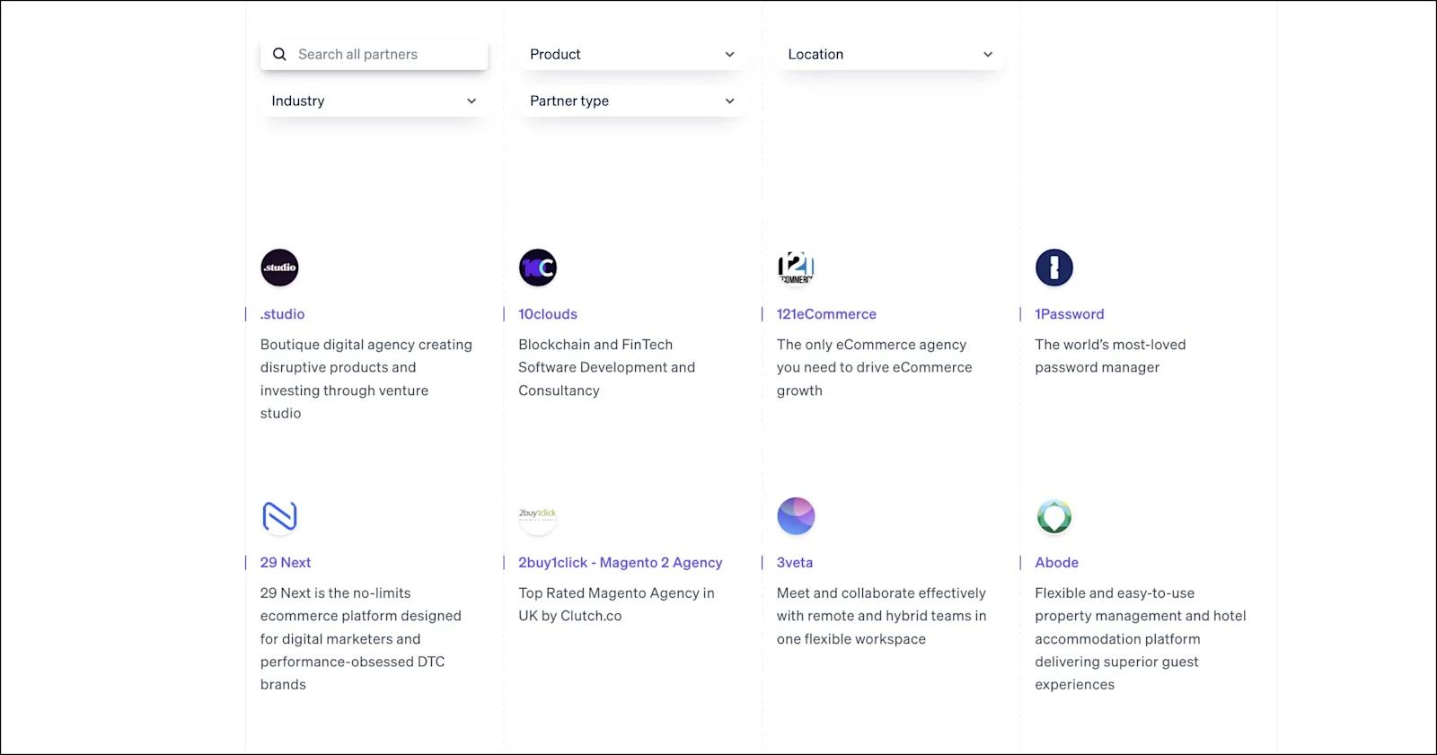
stripe-partners-directory
A well-organized marketplace makes it simple to explore your various partnerships and find solutions that complement or add to your products. It can also engage prospective customers by showcasing the added support and benefits provided by your network. We recommend implementing a search bar and other filtering functionality that allows users to easily refine their search. Other elements that can elevate a partners directory include partner logos, links, and company bios.
Partner Application
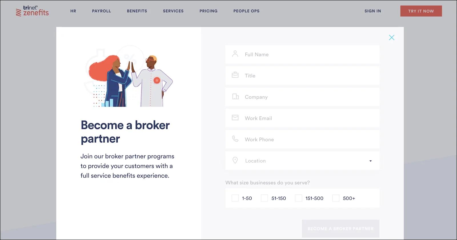
zenefits-partners-form
A simple and painless application form is a crucial part of any successful partner landing page. When a prospect begins an application, it should be a straightforward process that is optimized for conversions. Each field should feature icons or other visual cues that indicate the information being requested. In some cases, dropdown menus may be the most effective way of gathering prospect information.
Partners Page Website Design
Interested in crafting an impressive partners page but don’t know where to start? We got you covered. Here are essential design elements to include in your next partners page UI design.
Clean layout - Sleek and simple web design is essential in SaaS. With a clean layout, you’re ensuring that anyone who visits the partners page finds the information they are looking for.
Compelling copywriting - You must sell your brand, products, and partner program for prospects to take action. Make every word count, especially in headings.
Images and videos - Incorporating visuals and media into your partners page can further entice site visitors to learn about the advantages of your partnership program. Compelling images and videos on your partners page not only boost user engagement, but they help users envision the partnership experience.
Branding - Prospective partners are frequently invited to join SaaS partner programs. That’s why branding is crucial to perfect on your partners page in order to highlight your unique program offerings and differentiate your brand from competitors. Make sure to utilize visual elements, fonts, and colors that are consistent with your overall branding.
Trust signals - As we discussed earlier, social proof is imperative to include on your partners page to establish credibility and trust in potential partners and customers. A few trust signals we love to see on partners pages include trust bars, testimonials, product reviews, and client stories.
CTAs - An enticing Call-to-Action (CTA) can play a crucial role in influencing a potential partner's decision to join your partnership program. To ensure your CTAs are clickworthy, make sure they are bold, visible, and feature actionable copy.
Partner Landing Page Examples
Now, let’s get into our best partner page design examples so you can get some inspiration for how to display partners on a website.
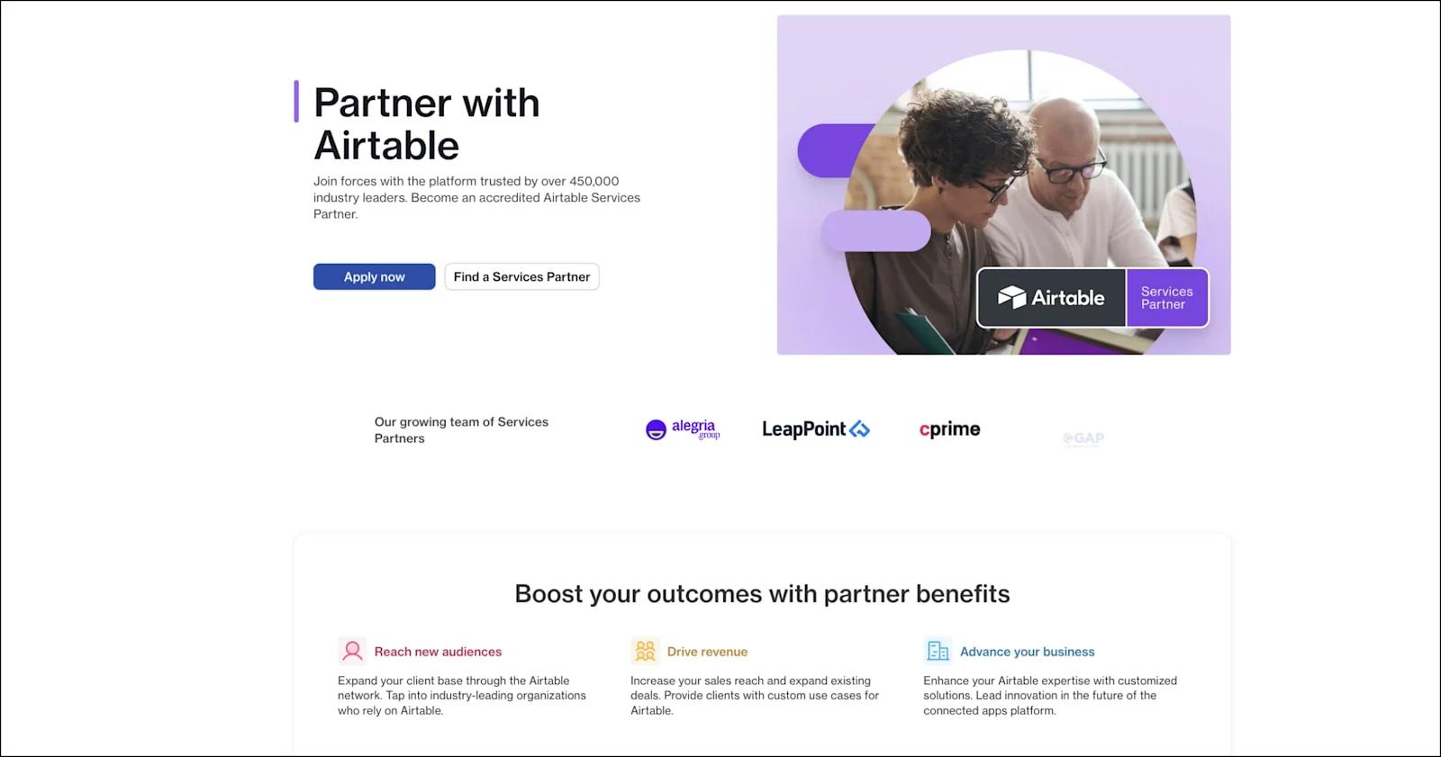
Airtable
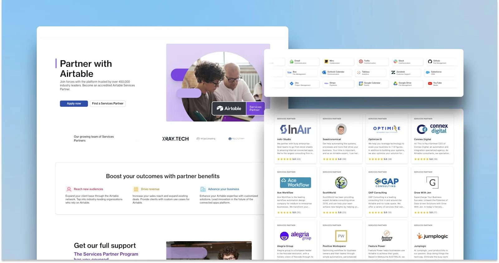
airtable-partners-page
To kick off our partners page UI design examples, we have Airtable - a spreadsheet-database hybrid solution.
The Airtable Services Partner Program allows customers to get a more personalized and integrated platform experience. Their entire partner’s hub is extremely organized and intuitive. Moreover, the partner directories have tons of filtering options, as well as search functionality. Airtable has a vast amount of impressive partnerships, and they do an excellent job at marketing these valuable relationships.
Features to acknowledge from Airtable:
- Dynamic Services and Integrations Partner trust bars
- Services and Integrations partner directories
- Powerful, solution-oriented copywriting
- Partner application form (with clever use of designs from the Airtable platform!)
Stripe
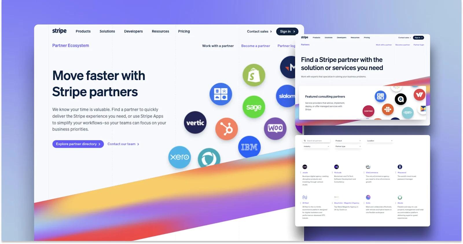
stripe-partners-page
A leader in payment processing services, Stripe boasts a strong alliance of technology and consulting partners.
Users can seamlessly browse the Stripe partnership directory by searching or filtering by product, location, industry, and partner type. Each partner has their own simple landing page with a company description and other relevant information.
Stripe also has an App Marketplace, featuring even more tools that help to get the most out of its products.
Partnerships are remarkably important to Stripe’s core business offerings - and they are successfully leveraging their website to promote and expand these connections.
Highlights from Stripe:
- Vibrant design elements with strategic use of partner logos
- Embedded case studies
- Compelling list of partner benefits
- Straightforward and painless partner form
Curative
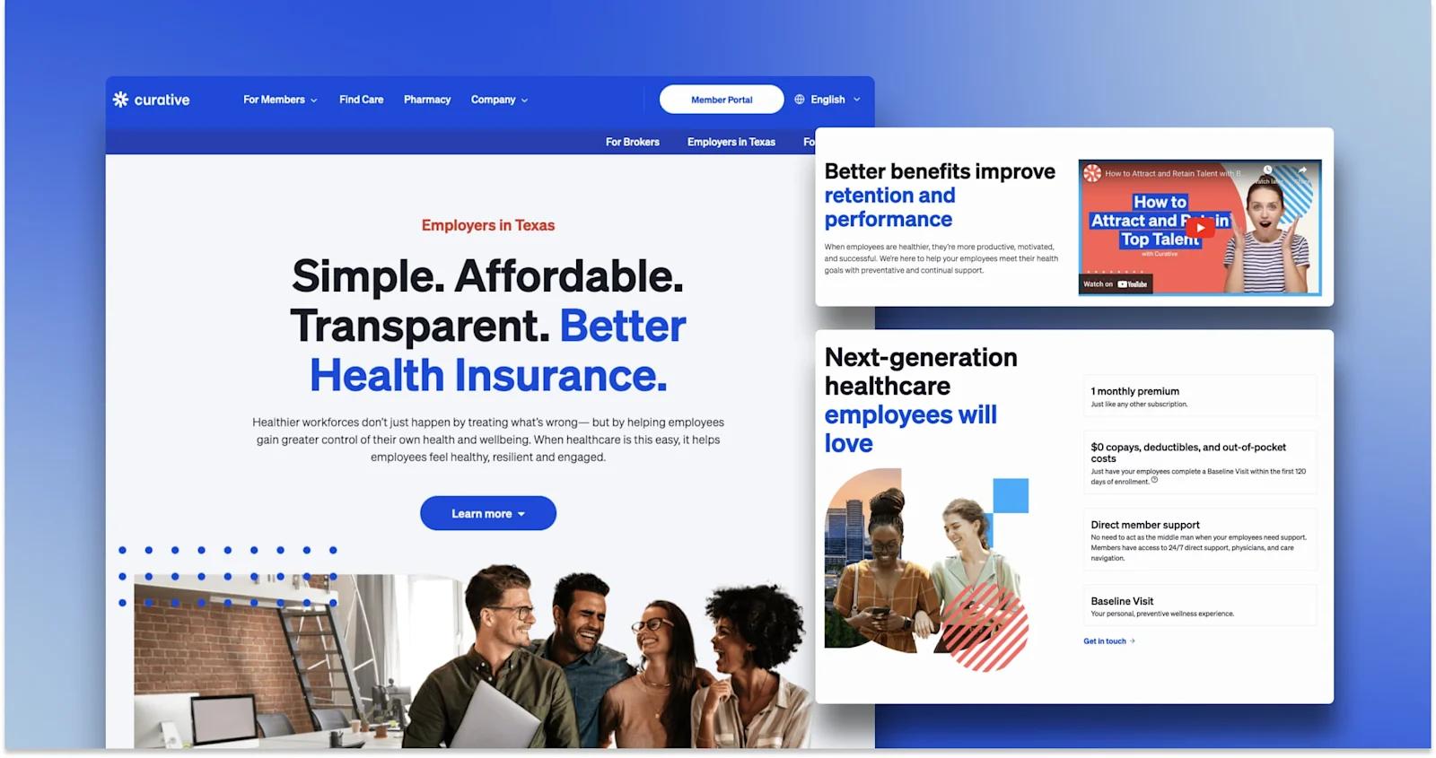
curative-partners-page
Next we have Curative - a client of ours here at Webstacks!
As part of a website redesign project, Curative needed a collection of partner pages to target 4 types of relationships: employers, brokers, providers, and employees. What we created helps Curative professionally market themselves as a trustworthy partner in the health care services industry.
We love how the illustrations turned out, bringing an important human touch to the design. Also, the various components do a lot to break up the page, and avoid having walls of text.
More things to like from Curative:
- Bold, eye-catching headings
- FAQs and press releases
- Images and videos
- Microinteractions and animations
Hotjar
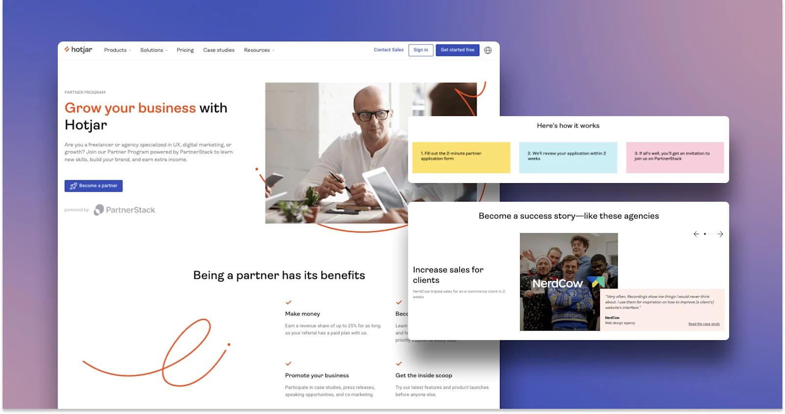
hotjar-partners-page
For a partner program in insights and analytics, we turn to Hotjar. With revenue share and hands-on training, Hotjar has plenty to offer agencies and freelancers.
Their partner pages are relatively simple - with just a landing page and an application form hosted by PartnerStack. Nonetheless, the design cues make this an effective SaaS partner page. It’s clear what the program is, how it works, and why users should consider joining.
Takeaways from Hotjar:
- Remarkably candid explanation of benefits
- Success stories with testimonials
- Prominent FAQs
- Subtle animations that liven the page
Slack
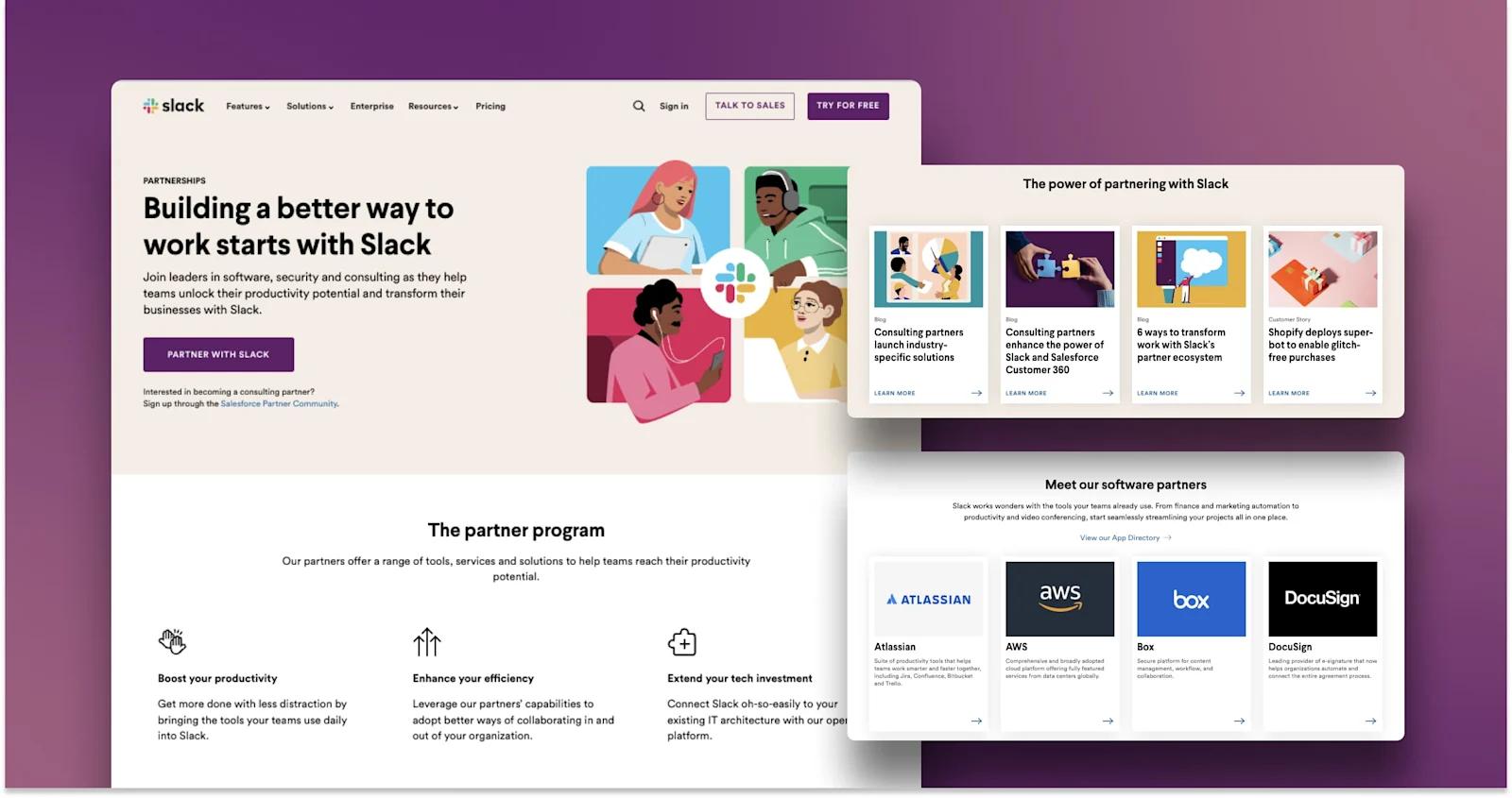
slack-partners-page
Let’s take a look at Slack’s partnerships web design. Off the bat, Slack has hundreds of partners, spanning from software, consulting, security and compliance. Each category is featured within the partners page, along with links to the Slack App Directory
A little design callout- the “Load More” button is a neat way to expand the page without making the user exit to another page.
More reasons to appreciate Slack:
- Links to blog and customer story content
- Intuitive and organized app directories
- Bold CTA in the hero
Salesforce
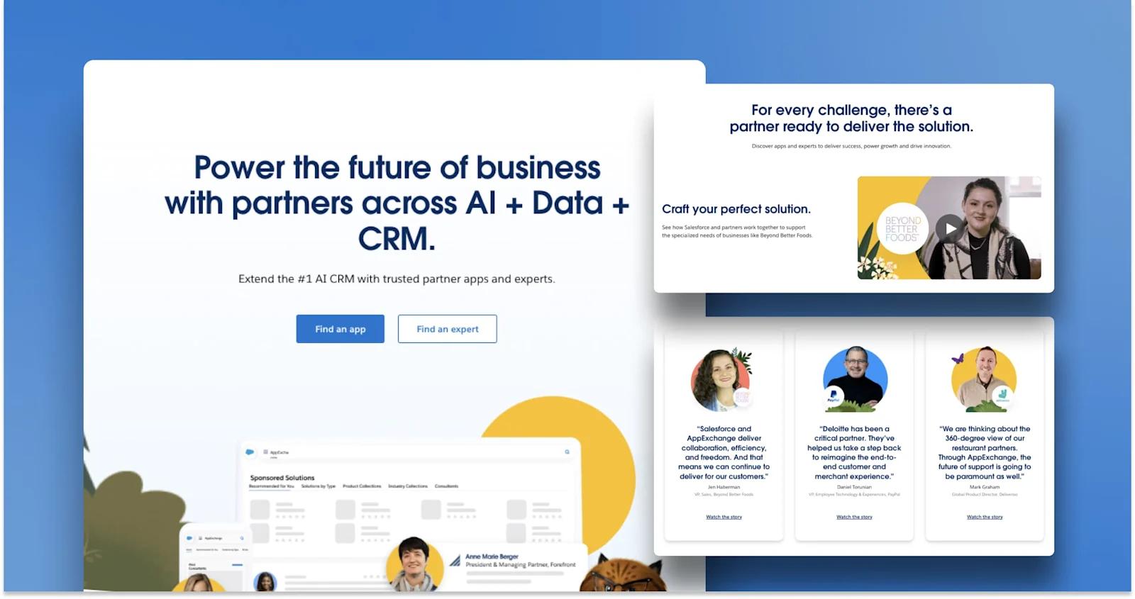
salesforce-partners-page
Salesforce is a prime example of effective SaaS partner landing page design. Their playful illustrations are accompanied by motivating copywriting. It is then all tied together in a cohesive layout that flows very naturally. All the elements you want for a partners page come together here for Salesforce.
Notable design elements from Salesforce:
- Captivating imagery
- Clean directory with the Salesforce AppExchange
- Social proof with testimonials and customer stories
- More relevant resources such as guides and videos
Workgrid
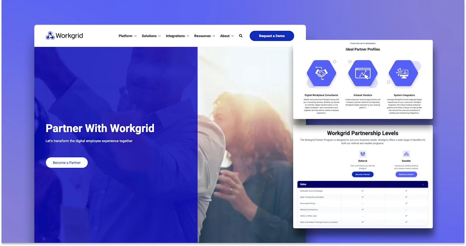
workgrid-partners-page
Next, let’s examine the partners page from Workgrid.
Another client of Webstacks, Workgrid is a workplace platform that improves the digital employee experience. We designed this page to highlight the differences between their two partnerships (referral and reseller), and showcase some of their top alliances.
What to love from Workgrid:
- Partnership comparison table
- Partner and alliance logos
- Icons for visual cues
Monday.com
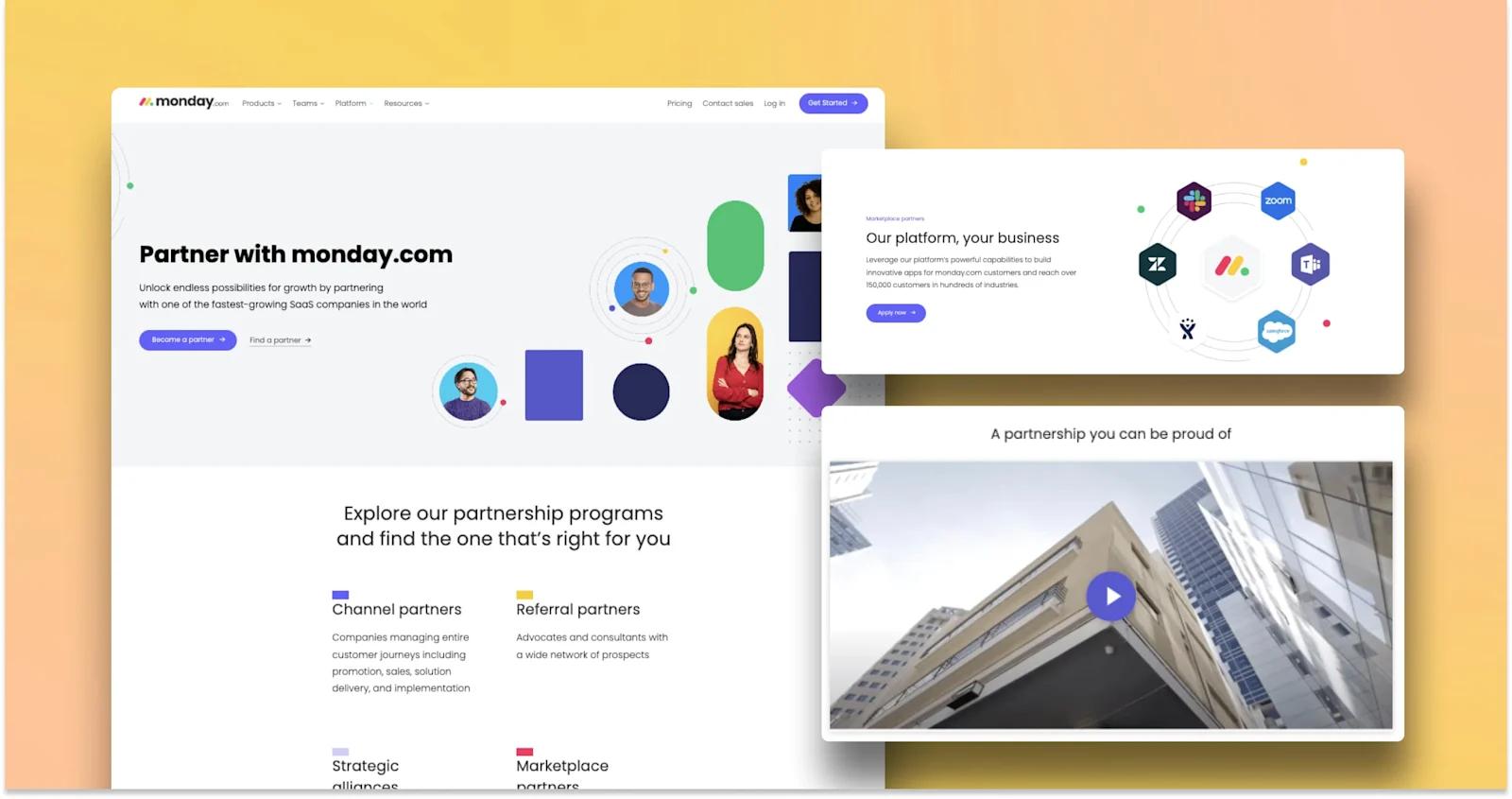
monday-partners-page
Monday.com’s partnership page is one you do not want to miss!
If your SaaS company has a dynamic partner program like Monday.com, take note of their layout and site architecture. First, they list every type of partnership they have (channel, referral, marketplace, and strategic alliances). Then, they feature a switchback component for each type of partner, which goes more in-depth and includes CTAs for applying or learning more about that specific program.
Monday.com is a top-notch example for crafting a professional and impressive partner page.
Underscores from Monday.com:
- Intuitive layout (with excellent use of switchback components!)
- Professionally produced video
- Trust signals through partner logos and testimonials
- CTA placement
Lattice
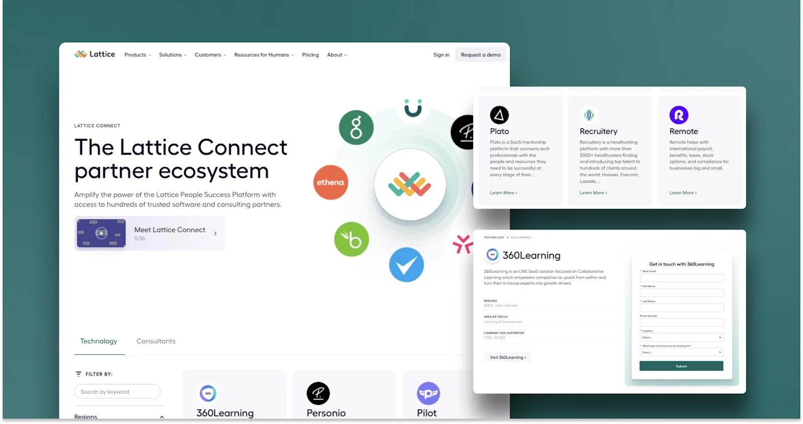
lattice-partners-page
When discussing beautiful partner landing pages, we had to make sure Lattice was included. Lattice relies on working with software and consulting companies to bring their People Success Platform to the masses - and this is evident through their website.
Lattice manages to fit all their partner information on one page without making it seem clustered. This is in part thanks to the tabbing system, which seamlessly displays both technology and consultant directories. The details pages for individual partners are also easy to navigate. Also, the embedded form is a great idea for partners pages!
What Lattice does extremely well:
- Video introduction to Lattice Connect
- Tabbing, filtering, and search UI design for directories
- Partner cards with logo, company descriptions, and “Learn More” CTAs
Mutiny
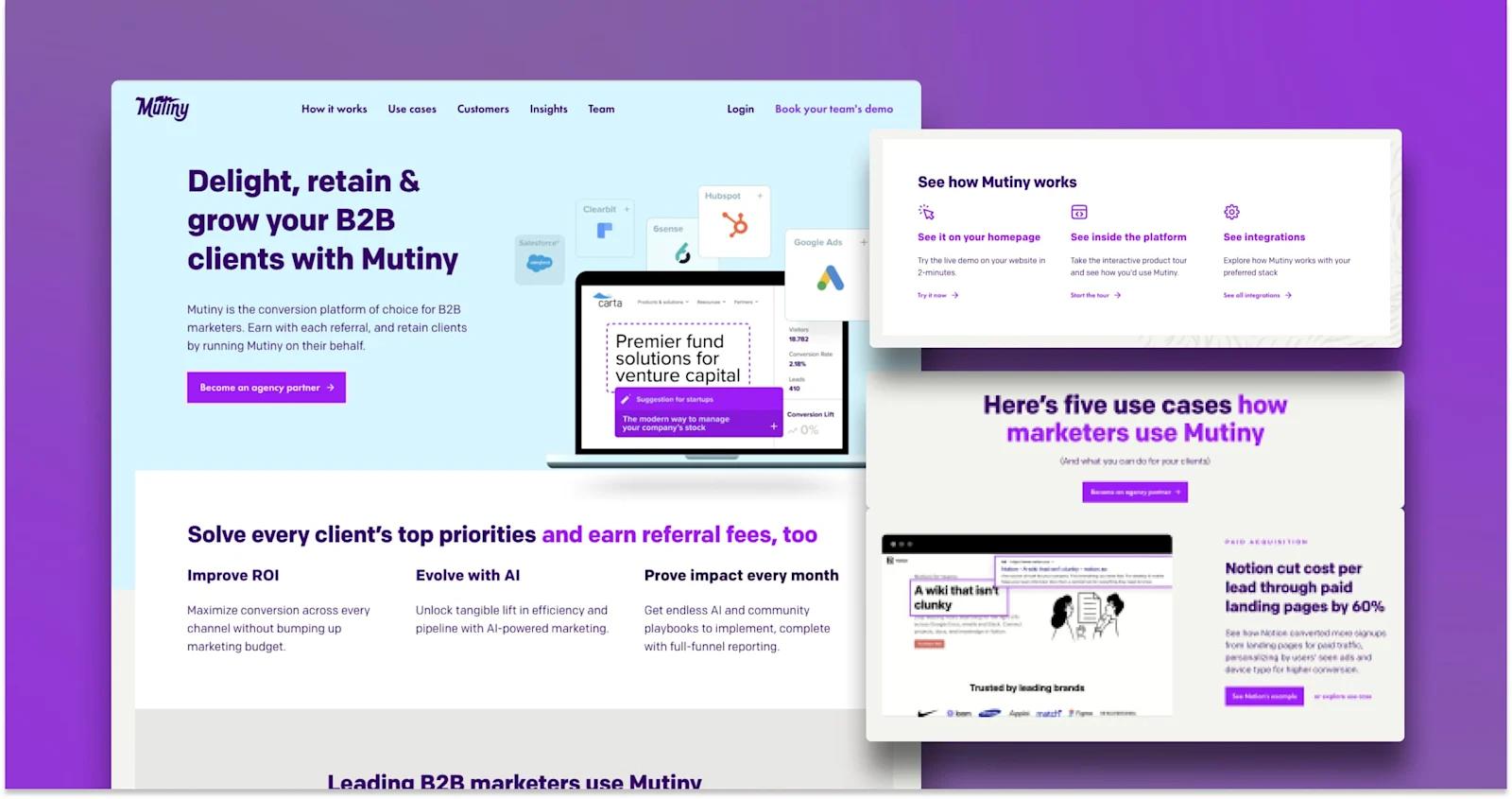
mutiny-partners-page
Mutiny, a website personalization tool, utilizes its Agencies landing page to attract B2B marketing partners.
Firstly, we love the use of subtle animations which really enhance this web page’s presentation. Similarly, the design embrace’s Mutiny’s color, branding, and tone of voice.
Top-notch design elements from Mutiny:
- Use of branding and colors throughout the page
- Lively animations and microinteractions
- Use cases and client stories
- CTA Placement (lots of points for users to convert!)
Okta
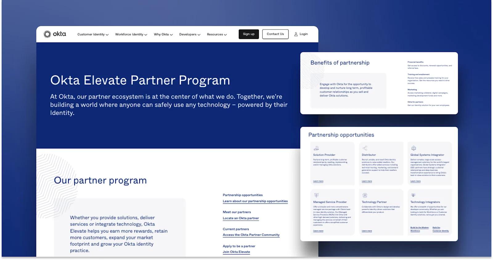
okta-partners-page
Next up we have the access management company, Okta.
Okta collaborates with a variety of organizations to better verify and authenticate identities, making partnerships an integral part of their business. Their partner program, Elevate Okta, includes several types of partnerships:
Every category has its own subsequent landing page, which does a great job of differentiating and showcasing the unique benefits of each partnership. There is also a directory which can be sorted by partner type, specialization, or geographic region.
Things to admire from Okta:
- Persuasive copywriting
- Partner program illustration
- Card deck for partnerships (with cool iconography!)
Intercom
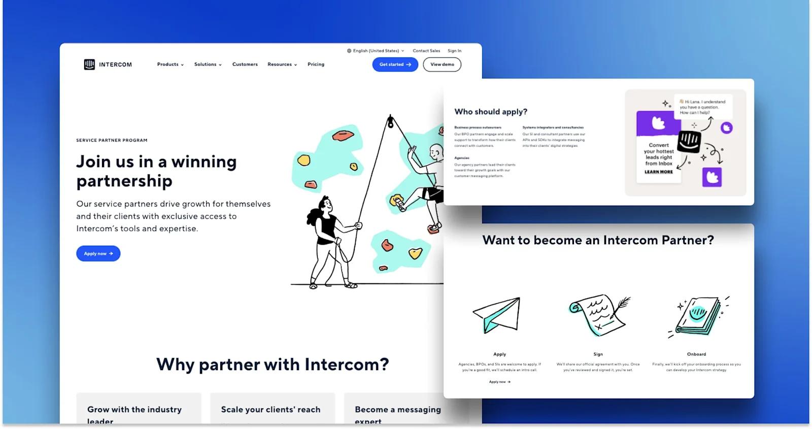
intercom-partners-page
For more stunning partner landing page design, we turn to Intercom. The customer service platform’s App Partner Program is full of fun and creative design quirks we really appreciate.
Beyond that, the page has tons of content that educates and intrigues. The copy is concise yet compelling, and there is an ample amount of social proof that reaffirms what you read from Intercom.
If someone wants to start creating an app with Intercom, they can click through to a simple 4-step process outlined in their developer hub. Overall, this our partners page design is a win in our books.
What Intercom does well:
- Fun colorful illustrations
- Establishing social proof with a trust bar and testimonials with headshots
- Microinteractions with buttons, cards, and drop-downs arrows
- Clear and straightforward instructions for partners
Wrike
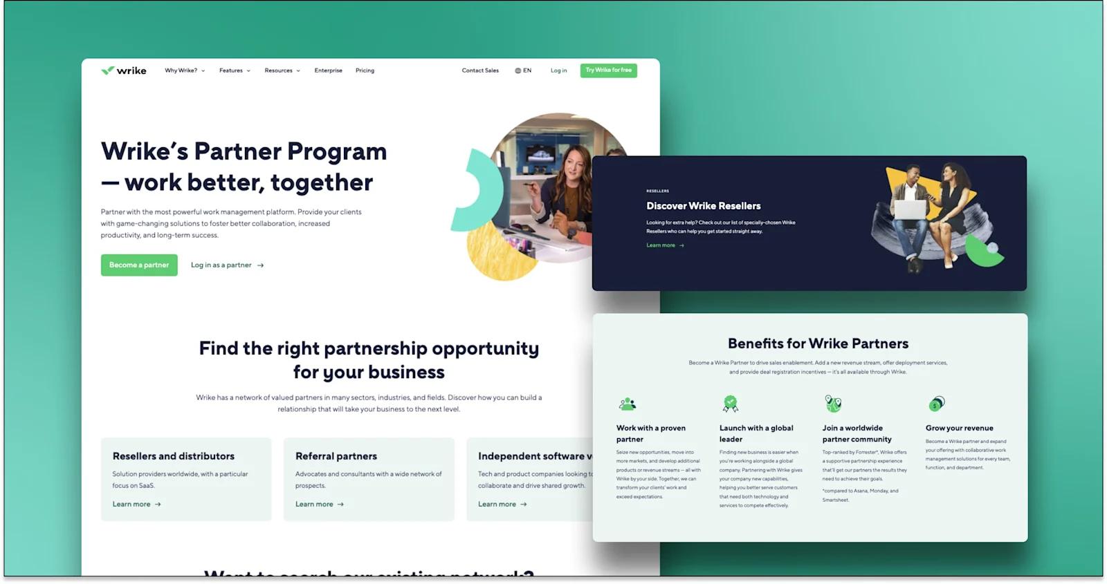
wrike-partners-page
If you’re interested in working with a project management platform, make sure to take a look at Wrike’s partners page.
Wrike features three types of partnerships; sellers and distributors, referrals, and independent vendors. The design yields an intuitive experience for prospective users wondering who Wrike partners with, and how it can benefit them. Paired with vivid contrasts and subtle drawings, the design gives Wrike’s brand a memorable personality.
Best design elements from Wrike:
- Minimalist yet effective design
- Benefits with icons, headings, and supporting copy
- Simple drawings that fill whitespace
- Contrast between text and background
Wix
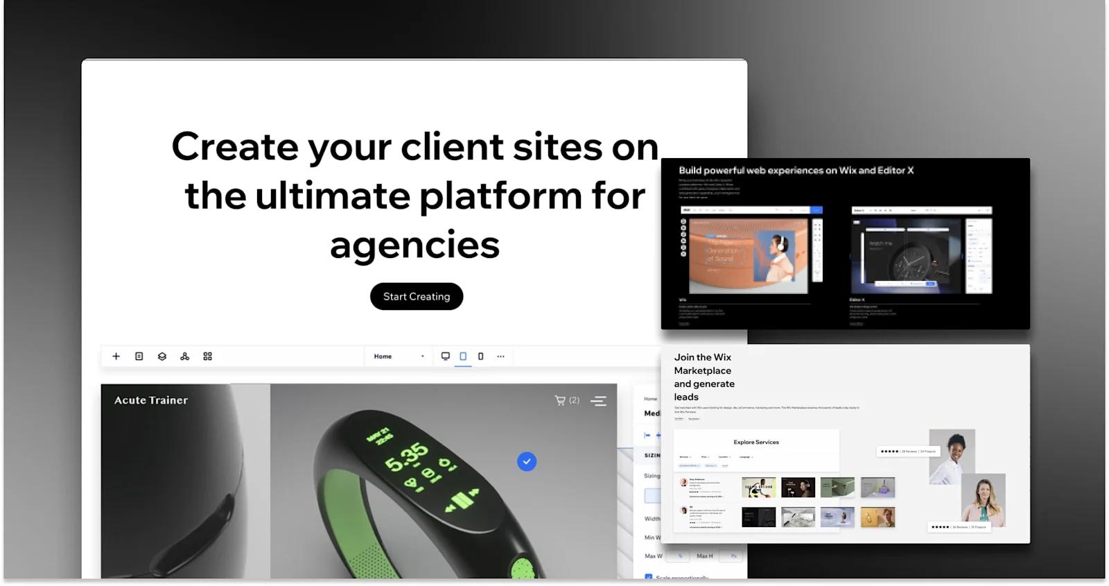
wix-partners-page
Freelancers, designers, and web agencies are all key partners for Wix’s Partner Program. With building websites at the core of their business, Wix made sure to put forward something that is bound to impress potential clients. Overall, they do a great job showcasing their work and the reasons to join the Wix community.
Things Wix does well:
- Plenty of prominent CTAs
- Showcasing of the product
- High quality testimonials
- Compelling copywriting
Deel
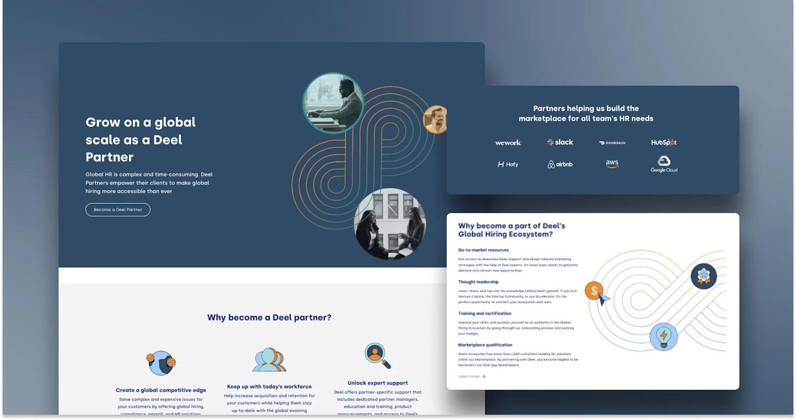
deel-partners-page
Rounding out our best partner page examples, we have Deel!
The global HR solution is a valuable tool for breaking down barriers to worldwide hiring. Whether you are fit for a solution or product partnership, Deel offers a plethora of reasons to join their expansive network.
In terms of design, there is one thing that Deel does that is different from most other partner pages. When a user clicks on a “Become a partner” CTA, they are instantly presented with a pop-up form, rather than being sent to a separate landing page to apply. This is an interesting design, and we’re dying to know what the conversion rates are like 🤔.
- Trust bar with impressive logos
- Pop-up partner form
- Images, Icons, symbols, and other visuals
- Substantial content to explain partner benefits
Boost Partnerships, Alliances and Integrations with Web Design
A partners page is the digital storefront to your partner program. By following the best SaaS website design practices, you can properly exhibit the value that your partnerships and alliances bring. This is invaluable in nurturing new relationships, and ensuring your existing customers have visibility into your ecosystem.
To recap this entire article, here are some key takeaways for partners page website design:
- Your organization should have a partners landing page/partners hub to market your partnership opportunities. We already know how important strategic partners, alliances, and integrations are to your brand and products. Give your partnership program a voice with the proper real estate on your marketing website.
- Your partners content should be structured to match the scale of your partnership program. If you have a robust and complex partner network full of different partner types, alliances, and integrations, you need to put more thought into the site architecture.
- Include a directory with sufficient functionality such as filters and search bars so users can easily browse through organizations in your ecosystem. Additionally, make your partner application simple enough that it does not deter submissions.
- Employ user-friendly design, accompanied by engaging content. Ensure your partner's page aligns with your brand personality, including colors, styling, and tone of voice. Provide content to feed users’ curiosity - whether that is case studies, testimonial videos, blogs, guides, etc.