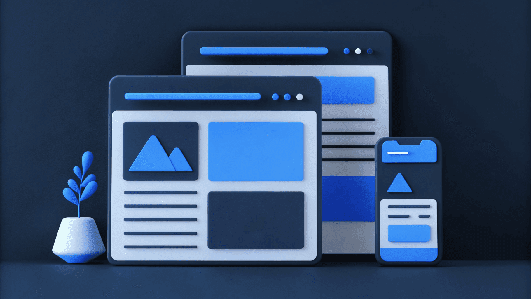
5 Critical Service Page Design Mistakes That Cost You Leads (And How to Fix Them)

For B2B technology companies and digital agencies striving to optimize their service pages, avoiding common design pitfalls is quite important. This guide delves into the critical errors that could be costing you valuable leads and offers actionable solutions to refine your service page design for maximum impact. You'll discover how to communicate complex B2B services effectively and maintain professional credibility while boosting conversions.
In brief:
- Undefined value propositions and messaging can result in lost leads on B2B tech service pages.
- Disorganized content and poor information hierarchy make it hard for prospects to understand your services.
- Ineffective Calls-to-Action and lack of social proof can lower conversion rates and trust.
- Optimizing service pages for mobile devices is necessary since many decision-makers browse on their phones.
The Critical Role of Service Page Design in B2B Tech
Service pages are the digital storefront where complex B2B tech offerings meet potential clients.
Service pages aren't just another element of your website—they're the critical junction where technical capabilities must align with business value, where expertise needs to be demonstrated, and where potential clients make decisions that impact both their business and yours.
The stakes are particularly high in the B2B tech space, where services are often sophisticated and buying cycles are complex. Your service pages need to effectively communicate with multiple stakeholders while maintaining technical accuracy and professional credibility. For inspiration, examining successful SaaS website examples can help you achieve this balance. With decision-makers increasingly relying on digital channels to evaluate potential partners, even small design missteps can significantly impact your ability to convert high-value prospects into qualified leads.
1. Unclear Value Proposition and Messaging
Many B2B tech companies struggle to communicate their offerings effectively on their service pages.
Craft a Compelling Value Proposition
Instead of clearly stating how they solve specific business problems, they hide behind technical jargon or vague marketing speak.
Consider these contrasting examples:
- Weak: "We use cutting-edge technology solutions to maximize operational efficiency"
- Strong: "We help enterprise IT teams reduce deployment time by 40% through automated infrastructure management"
To craft a compelling value proposition:
- Lead with the specific business problem you solve
- Quantify the benefit when possible
- Differentiate your approach from competitors
Remember that about 99% of your visitors aren't ready to contact sales immediately. Structure your messaging in a pyramid approach: start with a concise value statement, then expand on how you solve the problem, and finally detail the specific features and benefits that support your claims.
Your messaging should clearly answer:
- Who is your target customer?
- What specific problem do you solve for them?
- How do you solve it differently than others?
- What concrete results can they expect?
Consider a cybersecurity company that shifted their messaging from "We provide advanced cybersecurity solutions" to "We protect your business from cyber threats, reducing security incidents by 50%." This change led to a significant increase in lead generation as the value proposition directly addressed client concerns and offered a quantifiable benefit.
Keep your language simple and direct, focusing on outcomes rather than technical specifications. When describing complex services, always tie technical features back to business benefits your clients care about, which can help improve conversion funnel effectiveness.
2. Poor Information Architecture and Content Organization
Poor information architecture can overwhelm potential clients and drive them away.
Structure Your Content Effectively
Start by establishing a clear content hierarchy. Your primary service offering should be immediately visible above the fold, followed by supporting details in order of importance to your target audience. Use descriptive H2 and H3 headings to create logical sections that break down complex services into digestible components. Employing the Atomic Design methodology can further enhance your information architecture.
To improve scanability, limit paragraphs to 2-3 lines and use bullet points for key features or benefits. Consider implementing progressive disclosure techniques, showing basic information first while allowing users to expand sections for more detailed specifications or technical requirements. Staying aware of SaaS website design trends can help you make informed decisions about your content organization.
White space significantly enhances readability in B2B tech content. Don't try to cram everything into one dense block of text. Instead, create breathing room between sections and use visual cues like icons or dividers to separate distinct service components.
One SaaS provider reorganized their service pages by grouping features into clear categories and using bullet points for benefits. As a result, they noticed a reduction in bounce rates and longer time spent on their pages, indicating improved user engagement. Exploring inspire better service pages can provide practical insights into effective content structuring.
For technical audiences, prioritize specifications and implementation details but make them accessible through clear navigation. Place strategic CTAs after key decision-making points, where prospects are most likely to have their technical requirements satisfied.
Remember to maintain consistency in your information structure across all service pages. This helps B2B buyers quickly navigate between different offerings and find comparable information, making their evaluation process more efficient.
3. Ineffective Calls-to-Action (CTAs)
Your service page's CTA can make or break your conversion rates.
Optimize Your Calls-to-Action
Place your primary CTA prominently above the fold, while including secondary CTAs throughout the page for visitors at different stages of their decision journey.
Use action-oriented language that speaks directly to your B2B audience's goals. Applying principles on how to design effective landing pages can improve your CTAs' effectiveness. Instead of generic phrases like "Learn More" or "Submit," opt for specific, value-driven copy such as "Start Your Free Security Assessment" or "Book Your Strategy Session." Include supporting text (click triggers) near your CTAs to address potential hesitations—for example, "No credit card required" or "15-minute consultation."
Design your CTAs to stand out visually while maintaining professional appeal, drawing inspiration from high-converting landing page elements. Use contrasting colors that complement your brand palette. For instance, a software company saw a 20% increase in click-through rates after redesigning their CTAs with brighter colors and clearer text. Ensure adequate white space around your CTAs and maintain consistent button styling throughout your page.
For complex B2B services, consider creating multiple conversion paths. Offer both high-commitment options like "Request Custom Pricing" and lower-commitment alternatives such as "Download Service Overview." This approach accommodates various levels of buyer readiness while maintaining a clear path to conversion.
4. Lack of Social Proof and Credibility Indicators
Building trust through credibility indicators is key in B2B services.
Incorporate Strong Social Proof
The most effective trust signals for B2B service pages include:
- Client logos from recognized companies in your industry
- Detailed case studies showing measurable results
- Industry certifications and awards
- Security badges and compliance certifications
- Technical documentation access
- In-depth testimonials from decision-makers
Simply listing these elements isn't enough—they need to be strategically placed where they support your service claims. For example, position relevant case studies near service descriptions to validate your expertise in that specific area. Display security certificates prominently when describing services that handle sensitive data.
Remember that B2B buyers are typically more sophisticated and scrutinizing than B2C customers. They're looking for concrete evidence of your capabilities, not just social proof. Make sure your credibility indicators are specific to your service offerings and include quantifiable results whenever possible to enhance customer engagement.
5. Poor Mobile Optimization
Poor mobile optimization can instantly diminish your credibility and cost you valuable leads.
Optimize Your Service Pages for Mobile
You might be surprised to learn how many B2B decision-makers browse service pages on their phones between meetings or while traveling. When your service page isn't properly optimized for mobile devices, potential clients face frustrating experiences like difficult-to-click buttons, unreadable text, or broken layouts.
To fix this, start by implementing a mobile-first design approach. This is essential to optimize for mobile users. Make sure all critical elements—especially call-to-action buttons and contact forms—are easily accessible with a thumb tap. Pay special attention to your page load times on mobile networks by optimizing images and implementing lazy loading for off-screen content. Implementing principles of meaningful user experiences can significantly enhance user satisfaction on mobile devices. Adhering to proven mobile UX design practices ensures your mobile site meets user expectations.
Following responsive design checklist, here are key mobile optimization elements to address:
- Test your service pages across various devices and screen sizes
- Make buttons and interactive elements at least 44x44 pixels for easy tapping
- Make sure text is readable without zooming (16px minimum font size)
- Maintain adequate spacing between clickable elements to prevent accidental taps
- Optimize forms for mobile completion with appropriate input types and autofill support
After optimizing their service pages for mobile devices, a B2B tech firm experienced a 30% increase in mobile inquiries. Providing a smooth mobile experience is not just a technical requirement but a strategic advantage.
Remember, a poor mobile experience isn't just inconvenient—it signals to potential clients that your company might not be as technologically capable as they need. In the B2B space, where technical expertise is often a key differentiator, this can be particularly damaging to your conversion rates.
Our Take on Top Service Page Design Mistakes and How to Avoid Them
At Webstacks, we recognize that a well-designed service page is more than just a digital brochure—it's a strategic tool that can significantly impact lead generation and conversion rates. We've helped numerous B2B tech companies transform their service pages by focusing on clear value propositions, effective content organization, compelling CTAs, and mobile optimization. In our experience, understanding the difference between user interface vs user experience can lead to substantial improvements in user engagement and conversion metrics. By applying data-driven strategies and continuously refining page elements, businesses can effectively communicate their offerings and stand out in a competitive market.
Take Action to Improve Your Service Pages
Start by ensuring your pages clearly communicate your unique value proposition and back it up with specific details about your services. With over 50% of web traffic coming from mobile devices, prioritize responsive design and accessibility across all devices.
Focus on data-driven improvements by implementing proper analytics tracking and regularly testing different page elements. Small changes can lead to significant results; for instance, a simple CTA optimization can significantly increase click-through rates. Remember to regularly gather user feedback, analyze your metrics, and make incremental improvements to keep your service pages performing at their best. Taking steps to future-proof your website can and will provide long-term success.
Take the first step today by auditing your current service pages against these common mistakes, then create a testing roadmap to systematically enhance your pages' effectiveness. Implementing proven website redesign practices can also contribute to improved performance.
Ready to optimize your SaaS website structure for growth? See the Webstacks difference: Schedule a brief discovery call today. Let us help you create a website that drives results

I drive our marketing initiatives and help maintain the company website. I work closely with our design teams to keep branding consistent across every channel.