WorkBright’s platform makes one promise: get employees to work faster. Their digital-first onboarding solution simplifies I-9 verification, streamlines paperwork, and gives HR leaders confidence in compliance without slowing down the process.
But the website told a different story. Instead of projecting momentum and clarity, it felt cluttered, clunky, and disconnected from the bold new identity WorkBright had just rolled out. Where the brand aimed for polish and confidence, visitors found friction and noise.
As the Head of Brand at WorkBright admitted, “Our brand feels fun and energetic everywhere but on the website—it just feels clunky.” That disconnect wasn’t cosmetic. It was costing WorkBright credibility, conversions, and growth—and it exposed deeper gaps in how the story was being told online.
The Gaps That Cost WorkBright Website Growth
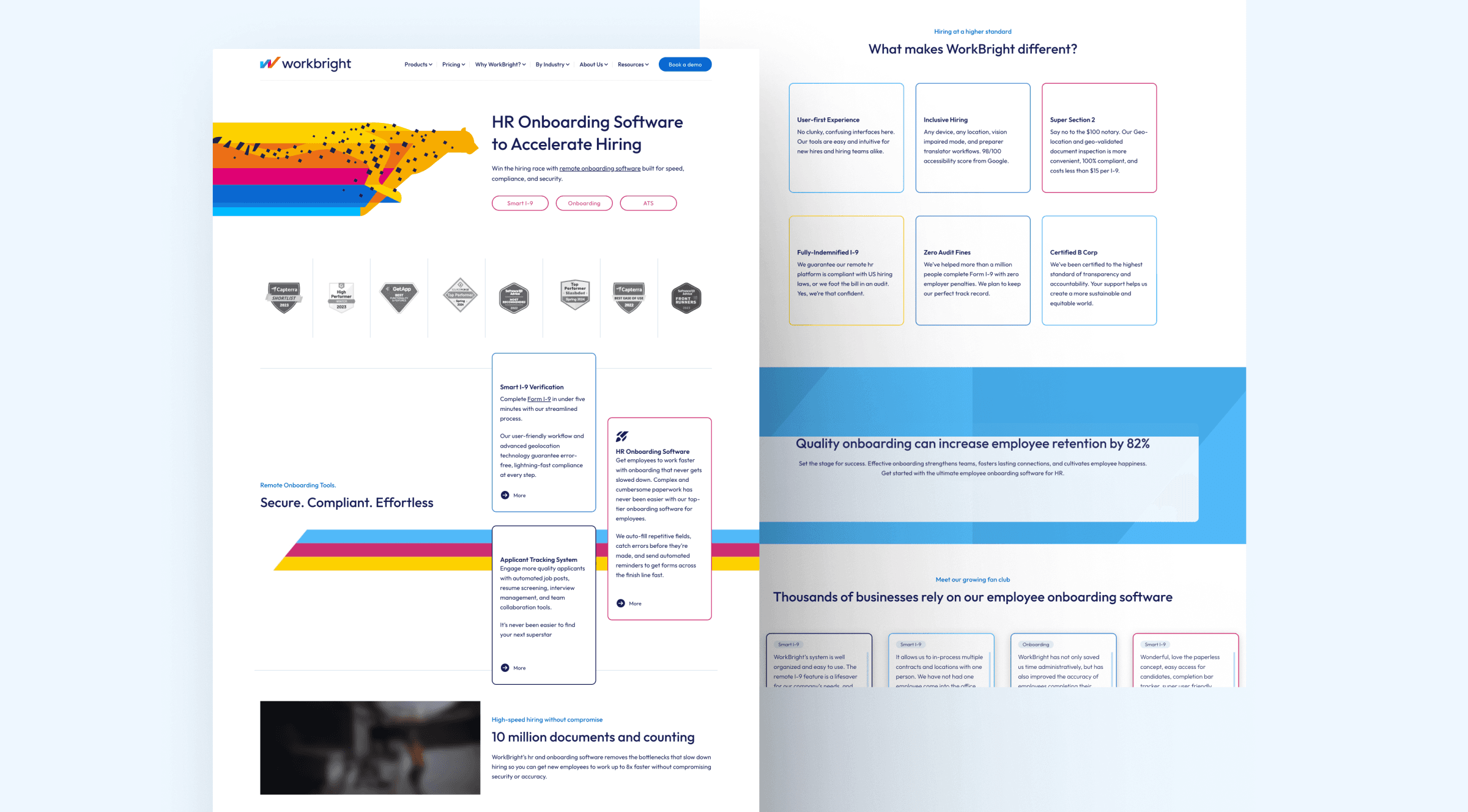
WorkBright’s brand identity was bold and distinctive, but online, none of that came through. With bold colors, playful illustrations, and an approachable voice, the brand stood out in an industry crowded with dreary compliance tools. However, none of that was reflected on the website. Instead of feeling polished and momentum-driven, the site diluted the very personality WorkBright wanted to project.
Three gaps in particular made the problem impossible to ignore.
Brand Dilution
The vibrant palette and illustrations that defined WorkBright’s refreshed identity weren’t integrated into the site. Online, they looked bolted on rather than intentional—making the experience feel generic instead of distinctive.
User Friction
Website visitors struggled to find their way. The blog and resources lacked structure, leaving prospects without clear routes to demos, case studies, or compliance content. Even simple actions—like subscribing or exploring careers—were buried. Instead of building confidence, the site created friction that cut engagement short.
A Lost Product Story
Screenshots and static mockups failed to capture what made WorkBright unique: a platform built for speed, compliance, and simplicity. Instead of showcasing ease of use, the site buried the product’s biggest strengths—momentum and clarity—behind visuals that felt dated and uninspired.
Together, these gaps created a web experience that weakened WorkBright’s brand and limited its ability to convert. Addressing them wasn’t about polishing visuals or rearranging content—it meant rethinking the entire design system and product storytelling to better reflect the speed and clarity of the platform.
Redesigning for Brand Momentum
For WorkBright, the website redesign wasn’t about adding a fresh coat of paint. It was about closing the gap between a bold, energetic brand and a digital presence that felt dated and clunky. A transformation was needed to capture the momentum, clarity, and approachability that had been missing online.
The redesign began with a refined design system that strikes a balance between vibrancy and professionalism. Navy provided a foundation of trust and security, while bright accents introduced energy and approachability. Cleaner layouts, more white space, and sharper visual hierarchy gave the brand the polish it was missing.
WorkBright’s product story was reimagined, too. Instead of static screenshots that undersold the experience, the new site showcased simplified product visuals and motion-enhanced elements that conveyed speed and ease of use at a glance. Subtle animations and stripe-based motifs reinforced momentum, while a refreshed iconography system added consistency and clarity.
The content experience was also rebuilt for readability and conversion. Blog and resource templates were streamlined, with CTAs designed to feel like natural extensions of the user journey. Visitors now move fluidly from discovery to deeper engagement, without the friction that once hindered their progress.
Together, these design decisions turned WorkBright’s website into a true extension of its brand identity—bold, clear, and momentum-driven. What once felt clunky and inconsistent now projects confidence, clarity, and trust.
Pages That Brought the Brand to Life
Before & After
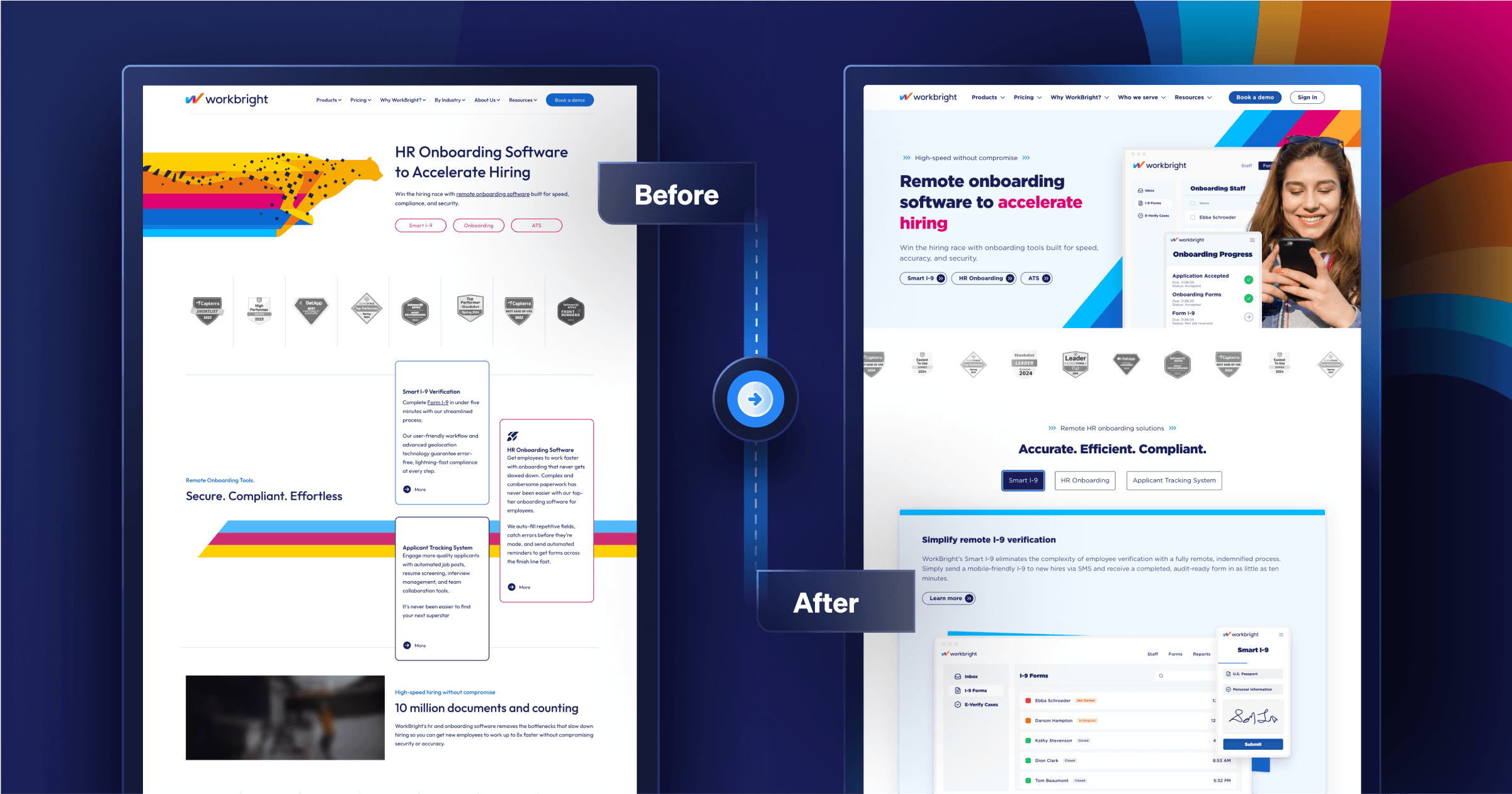
The transformation is striking. The old site felt dated and cluttered, with brand elements layered on rather than integrated. The redesigned experience brings polish and consistency, showcasing WorkBright’s approachable identity in a modern, trustworthy way.
Pricing Page
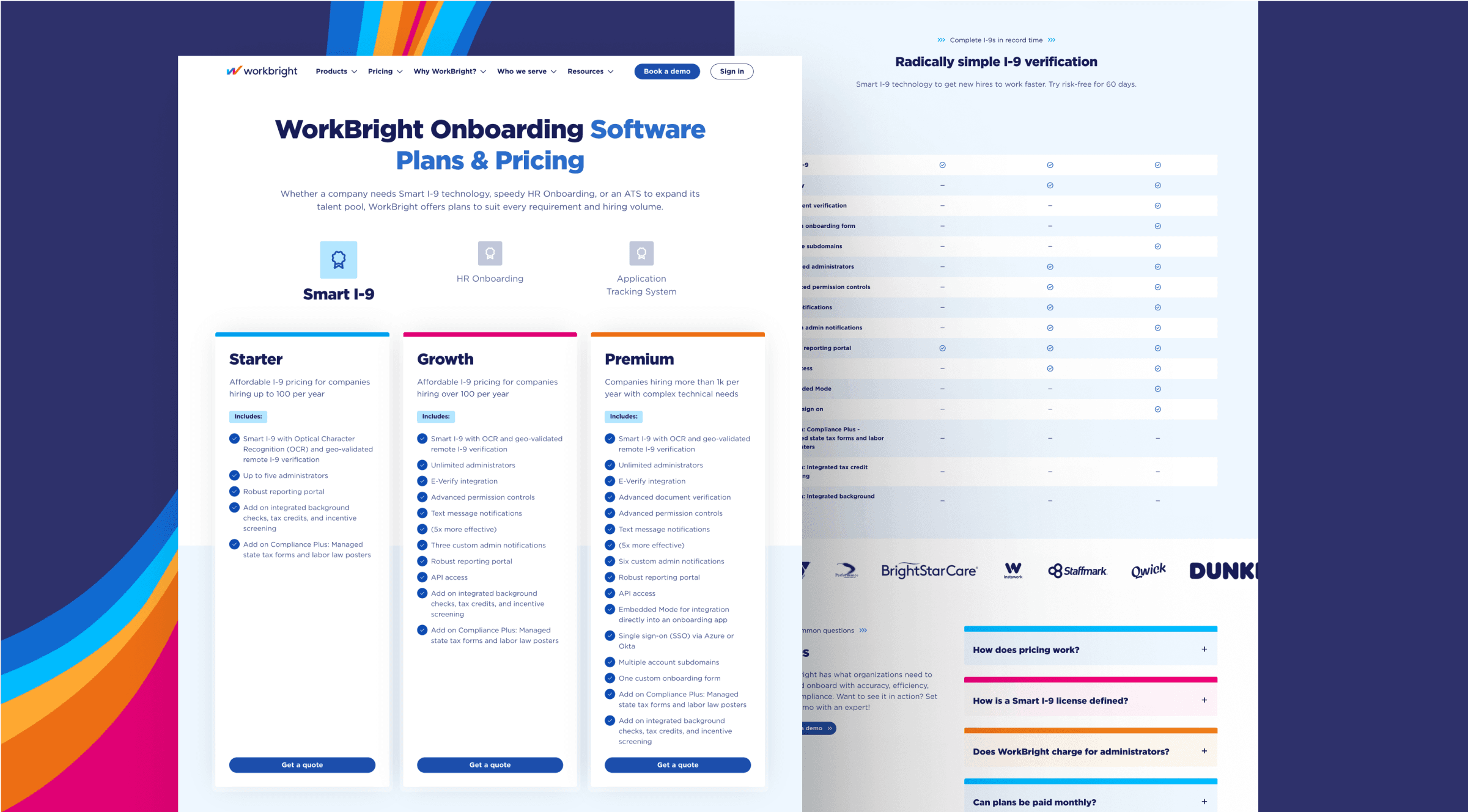
The original pricing page required visitors to decipher the tiers on their own. The redesigned version introduces a clear, structured layout that maps plans directly to hiring needs—helping HR leaders evaluate faster and move toward conversion with confidence.
Partner Program
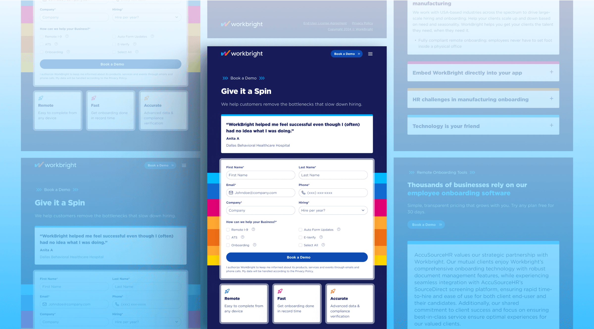
The partner program page was rebuilt with simplicity and clarity at the forefront. With intuitive form design and concise messaging, it’s now easy for prospective partners to understand the benefits of working with WorkBright and apply without friction.
Career Page
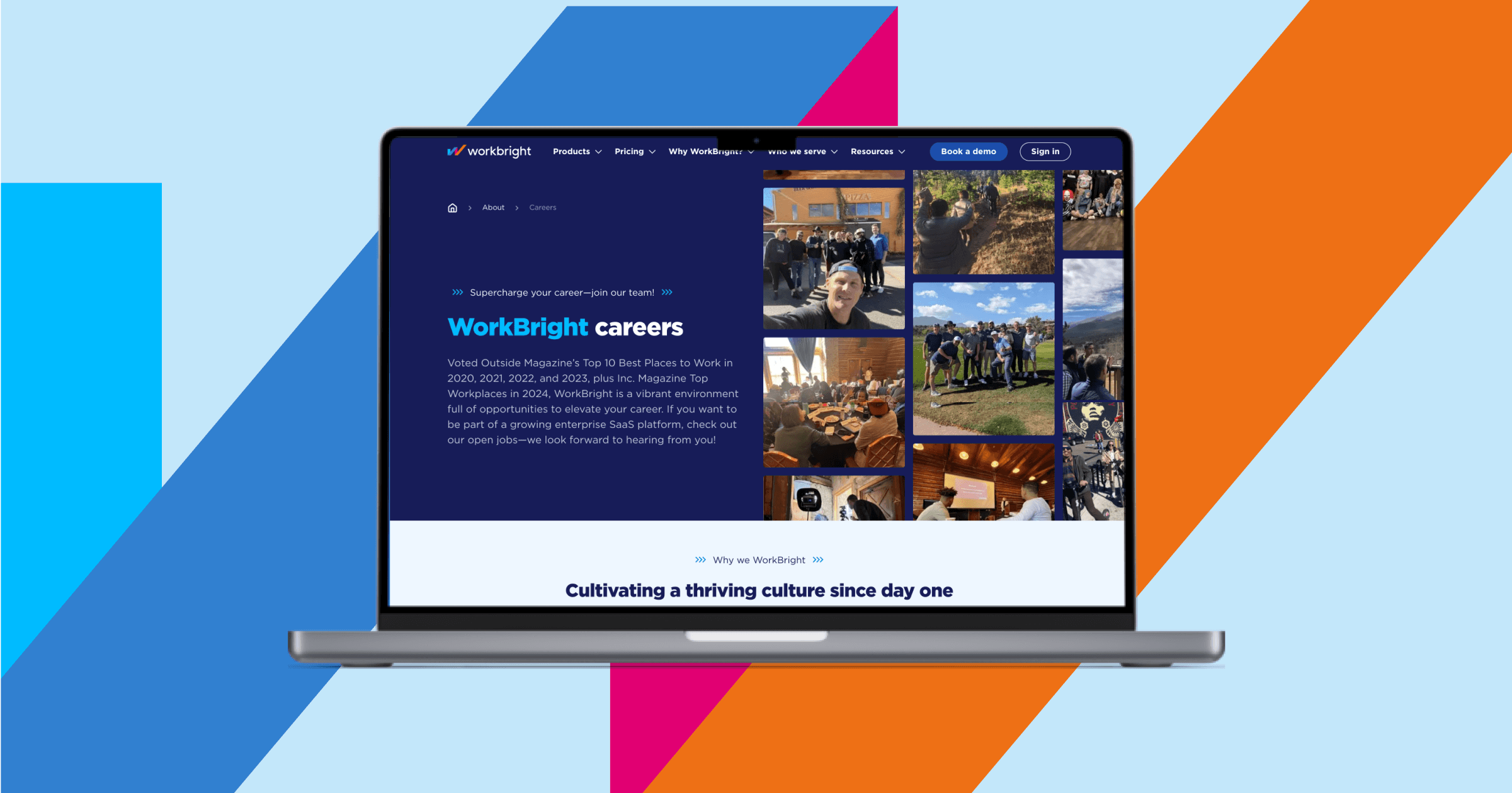
The careers page puts WorkBright’s culture front and center. Through modular layouts, vibrant photography, and team highlights, it presents the company as not just a software provider, but a workplace that values its people—helping attract top talent for future growth.
About Us
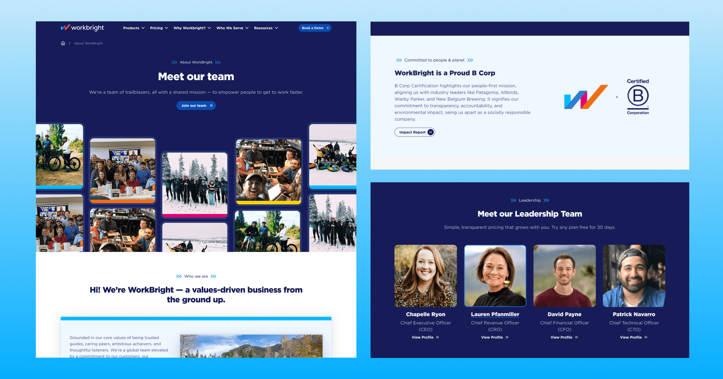
The About Us page was redesigned to reflect the people and purpose behind the product. Dedicated sections for leadership, team highlights, and mission bring authenticity and credibility, turning what was once a static company description into a dynamic story of who WorkBright is.
A Website That Finally Fits the Brand
The transformation was immediate. The new site visually reinforces WorkBright’s mission to “get people to work faster,” with momentum and clarity expressed in every page. Marketing now has the autonomy to publish at will, free from technical bottlenecks. Visitors experience a guided, modern journey that reflects the product’s strengths, from compliance rigor to ease of onboarding.
Most importantly, the redesign closed the credibility gap. WorkBright now appears online as the approachable, innovative compliance leader it always was—only now, the site tells the same story as the brand.
WorkBright Positioned to Scale to the Next Growth Stage
With a brand-forward website and flexible design system in place, WorkBright is equipped to scale. Their marketing team can move at the pace of their growth goals, launching campaigns and testing ideas without being hindered by infrastructure limitations. Prospects encounter a polished, differentiated experience that reflects the speed, clarity, and compliance WorkBright is known for.
The site no longer lags behind the brand. It moves with it—fast, clear, and built for momentum.
Talk with the experts in composable web design, development, and strategy.