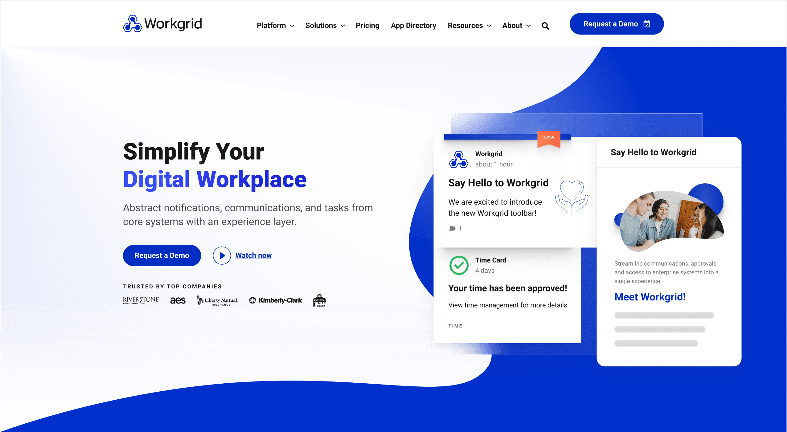
Who is Workgrid?
Workgrid focuses on creating solutions that solve the most common and inefficient workplace technology challenges faced by mid-large global businesses. They create intuitive experiences that enable human potential by building software that people love.
Problem: A Directionless Style Guide
One of the biggest problems we see with high-growth SaaS companies is a lack of a robust design system created specifically for their marketing websites. Often, marketing departments will piggyback off their software products’ style guides because it feels efficient at the moment.
Although these guides provide some degree of direction, the fact remains that user experiences and journeys inside a software product are completely different than those on the products’ marketing website.
Hence, for marketing websites to grow and evolve quickly and efficiently, designers need access to a design system that’s made specifically for marketing website experiences.
Inefficient Component Updates
Workgrid suffered from this very problem. With their marketing department relying heavily on their product’s style guide, entire marketing website user experiences—and their necessary brand elements like buttons, forms, and imagery—were completely unaccounted for, stoking inefficient brand governance and unaligned user experiences.
And even if elements were accounted for, there was no direction on how they should be used.
This lack of direction forced designers to reinvent the wheel on most net-new design projects, sacrificing scalability and slowing the marketing department’s speed-to-market on important website launches.
Workgrid’s goal was clear: Develop a robust and cohesive design system, made specifically for the marketing website, that was more usable, flexible, and scalable.
Solution: Design & Implement an Atomic Design System
The first step was to evolve Workgrid’s style guide into a formal atomic design system.
Taking cues from the style guide, other brand elements, and external inspiration, we closely collaborated with Workgrid to establish an “MVP” version of the design system so they had something to work with immediately. From there, we quickly evolved it into a finalized version that all stakeholders were aligned on.
Once complete, the atomic design system immediately began flexing its muscles.
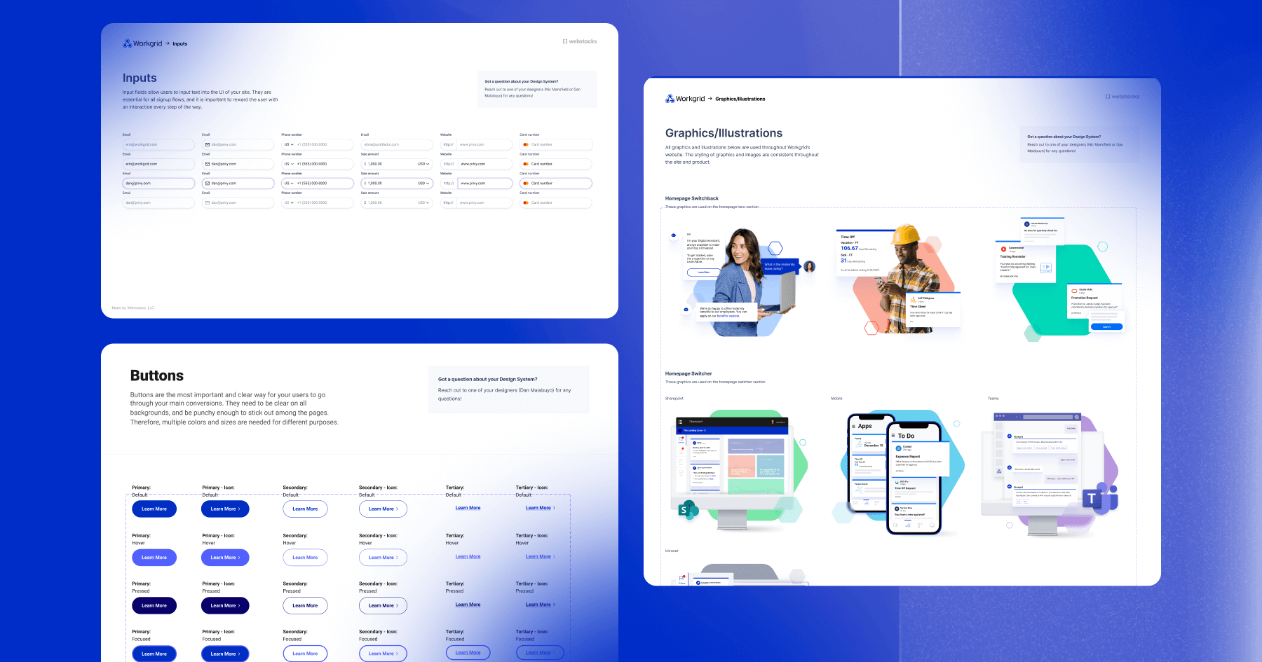
How it Works
With standardized “atomic” assets functioning as building blocks, designers can quickly:
- Find and fuze these “atoms” (logos, colors/gradients, typography, spacing) to make…
- “Molecules” (buttons, input fields, copy blocks, etc.), that when combined make…
- “Organisms” (forms, hero templates, etc.) to ultimately piece together…
- Page templates in a fraction of the time it used to take Workgrid.
Here’s a look into two of Workgrid’s design system atoms: colors and gradients.
The Benefits
Cross-Channel Consistency

With a unified design system in place, Workgrid’s brand elements—like colors, typography, buttons, and visual patterns—can now be reused across a variety of channels. Whether it’s a gated report, a paid ad campaign, or a social media graphic, every asset stems from the same foundational design language. This not only improves brand recognition but also speeds up asset creation, enabling the marketing team to scale campaigns faster while maintaining uniformity at every touchpoint.
Easy handoff systems
With the new system, Workgrid doesn’t have to reinvent the wheel with each new design project—a common bottleneck at many traditional marketing agencies.
Instead, the design system’s atoms, molecules, organisms, and components can be easily recycled whenever necessary, decreasing the time it takes to design and hand off mockups to the development team.
Empowered Designers
Another benefit of Workgrid’s aligned atomic design system is that it decentralizes decision-making and empowers informed designers to make quick decisions. This speeds up the process even more while simultaneously making brand governance a breeze for management.
Using Figma to Streamline Alignment & Collaboration
To further speed up project deployment, we use the highly-collaborative design tool Figma, which excels at:
- Keeping design and development teams in constant alignment, and therefore…
- Streamlining the creative-to-development handoff.
Developers are set up for success
Just like with the design team, the development team doesn’t reinvent the wheel with each design deployment and is empowered to make informed decisions. Since the design system has been baked into Figma, developers simply pull the necessary code directly from the atomically designed mockup.
More efficiency
And because both design and development teams simultaneously work inside Figma, developers can advise designers on system capacities for net-new asset mockups, completely removing unwanted deployment surprises down the road.
Outcome: A Fast, Flexible & Aligned Design System
All of this adds up to a design system that provides a shared design language for empowered designers, developers, and marketers, evolving and scaling the website they oversee.
Since starting the atomic design approach, we’ve developed roughly 14 design components and 11 design templates ready for deployment.
Increased Speed to Market
With the existing design components and templates, Workgrid can optimize and solidify the key components of their website which results in easier content updates for their marketing team on the CMS side and faster page implementations for development teams.
Ultimately, the design system we implemented achieved what Workgrid needed: a more refined and cohesive design system that was easy to use, fast, flexible, and scalable. Projects that used to take weeks now take a couple of hours.
Talk with the experts in composable web design, development, and strategy.