Atomic Design Methodology for Web Design Systems

Designing for the web is no longer about shipping a single page. Interfaces now stretch across screen sizes, devices and contexts, and that shift has changed how teams approach their work.
Atomic design offers a way to handle that complexity. It is a methodology for building user interfaces from the ground up, treating every screen as the product of smaller, reusable parts that fit together by design rather than by accident. For B2B teams, the payoff is a design system that holds up as the product grows: shipping velocity and brand consistency in the same workflow, instead of the redesign treadmill every 18 months.
The idea comes from natural science. Atoms are the smallest building blocks of matter; combine them into molecules, and those molecules form organisms and complex structures. Atomic design applies that same logic to interfaces, starting with the smallest user interface (UI) elements (buttons, input fields, labels) and combining them into components, templates and full pages.
What is Atomic Design?
Atomic design is a methodology that structures the development of visual systems in an organized way using atoms, molecules, organisms, templates and pages. It gives design and engineering teams a shared model for building cohesive, scalable interfaces.
The methodology was introduced by designer Brad Frost to help teams craft reusable UI systems. His book, Atomic Design, lays out the framework for creating and maintaining visual identity systems at scale.
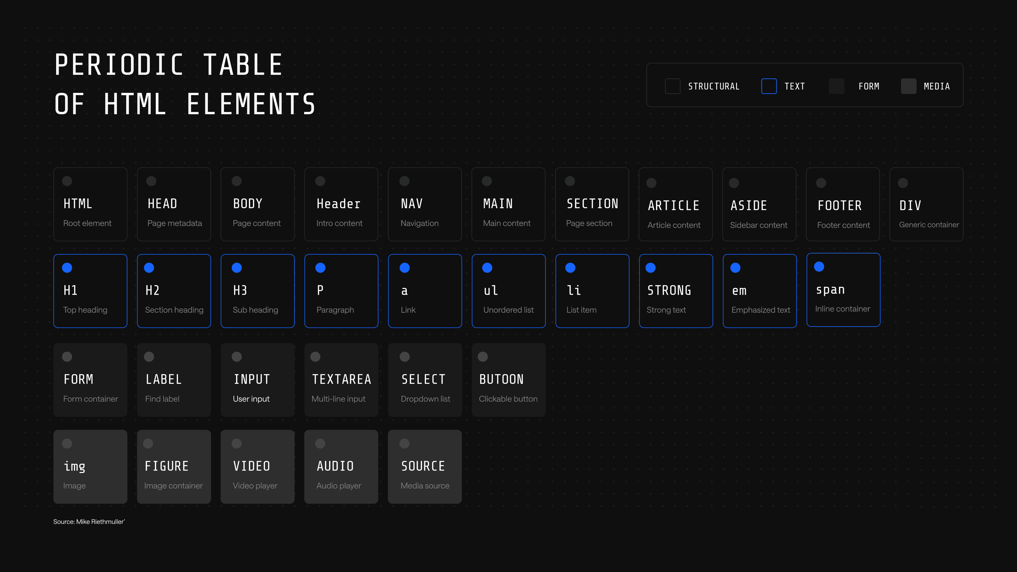
The chemistry analogy maps directly onto how interfaces are built. Just as the periodic table catalogs the finite set of elements that combine to form every substance in the physical world, the periodic table of HTML elements shows how every website is built from the same finite set of tags. Atomic design treats those HTML elements as the literal atoms of any interface, then builds upward.
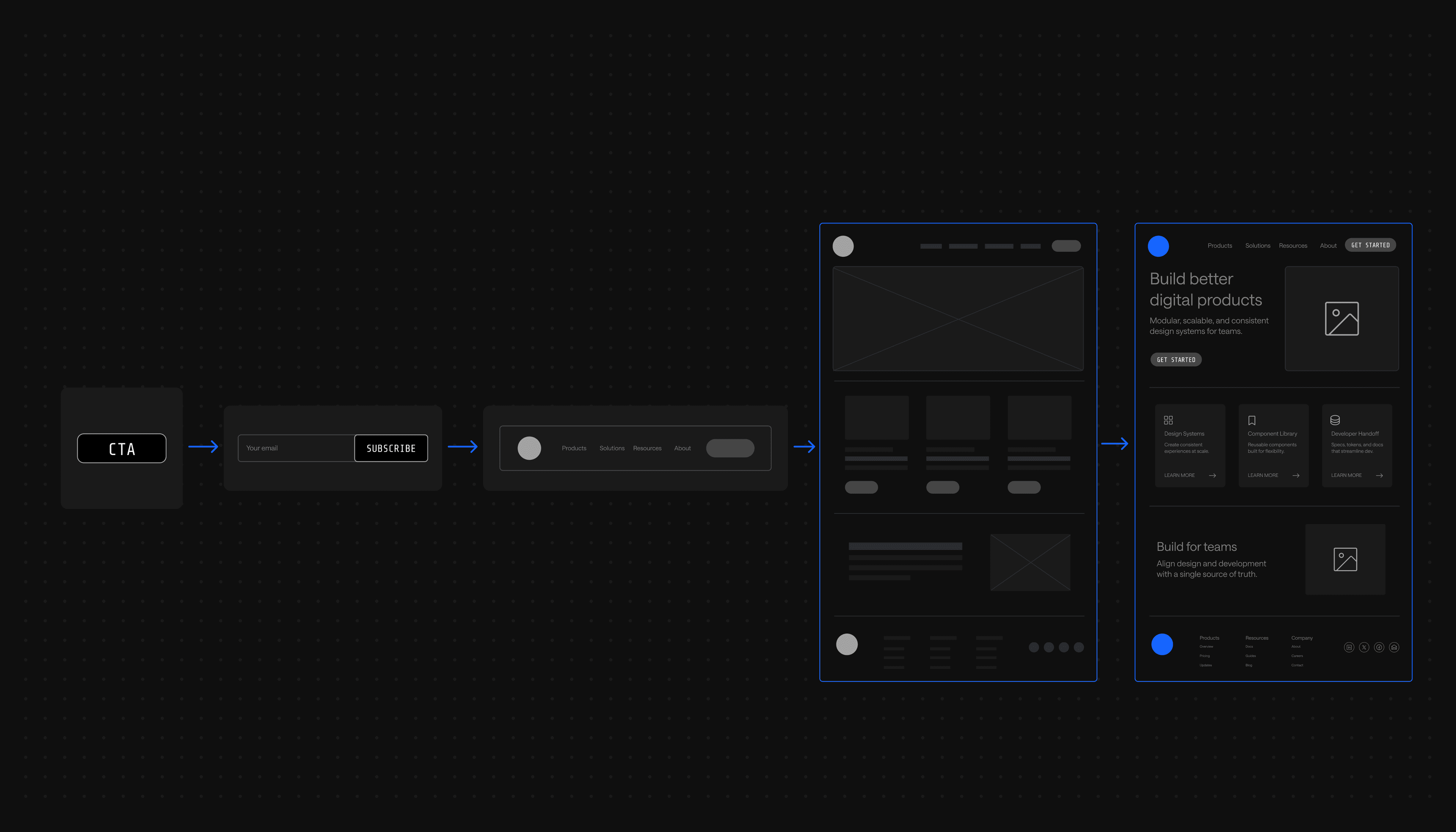
A simple example: a search icon and an input box are two separate atoms. Combine them into a search box, and that is a molecule. Drop the search box into a header with a logo and navigation, and the result is an organism. Slot the organism into a layout, and that is a template. Fill the template with real content, and a page emerges.
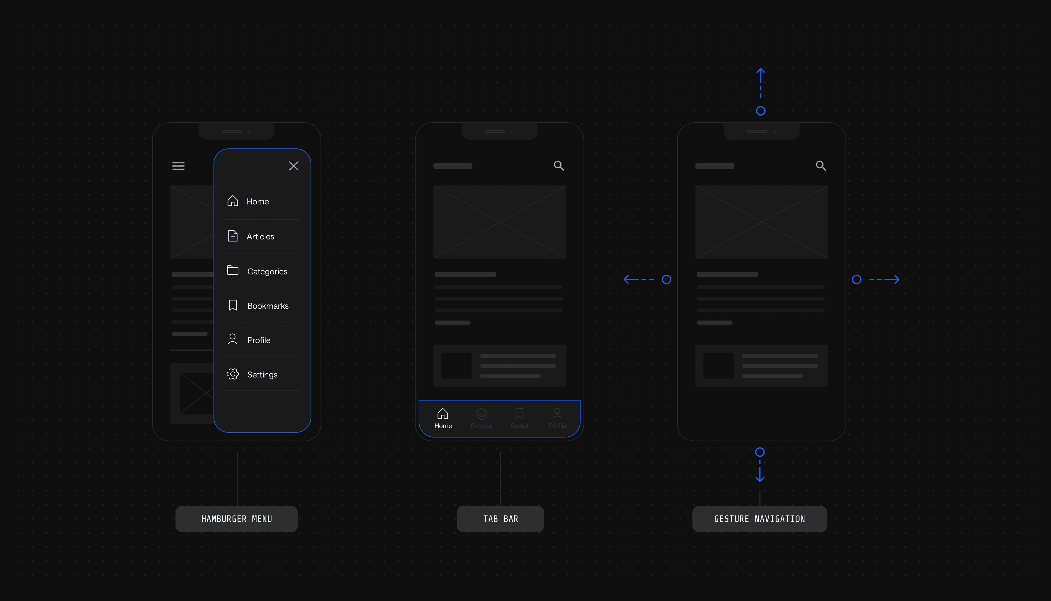
The Five Phases of Atomic Design
An atomic design system improves the efficiency of web development projects by giving every team the same building blocks to work from. Like in science, atomic design starts from the smallest unit of any page and works outward through five phases.
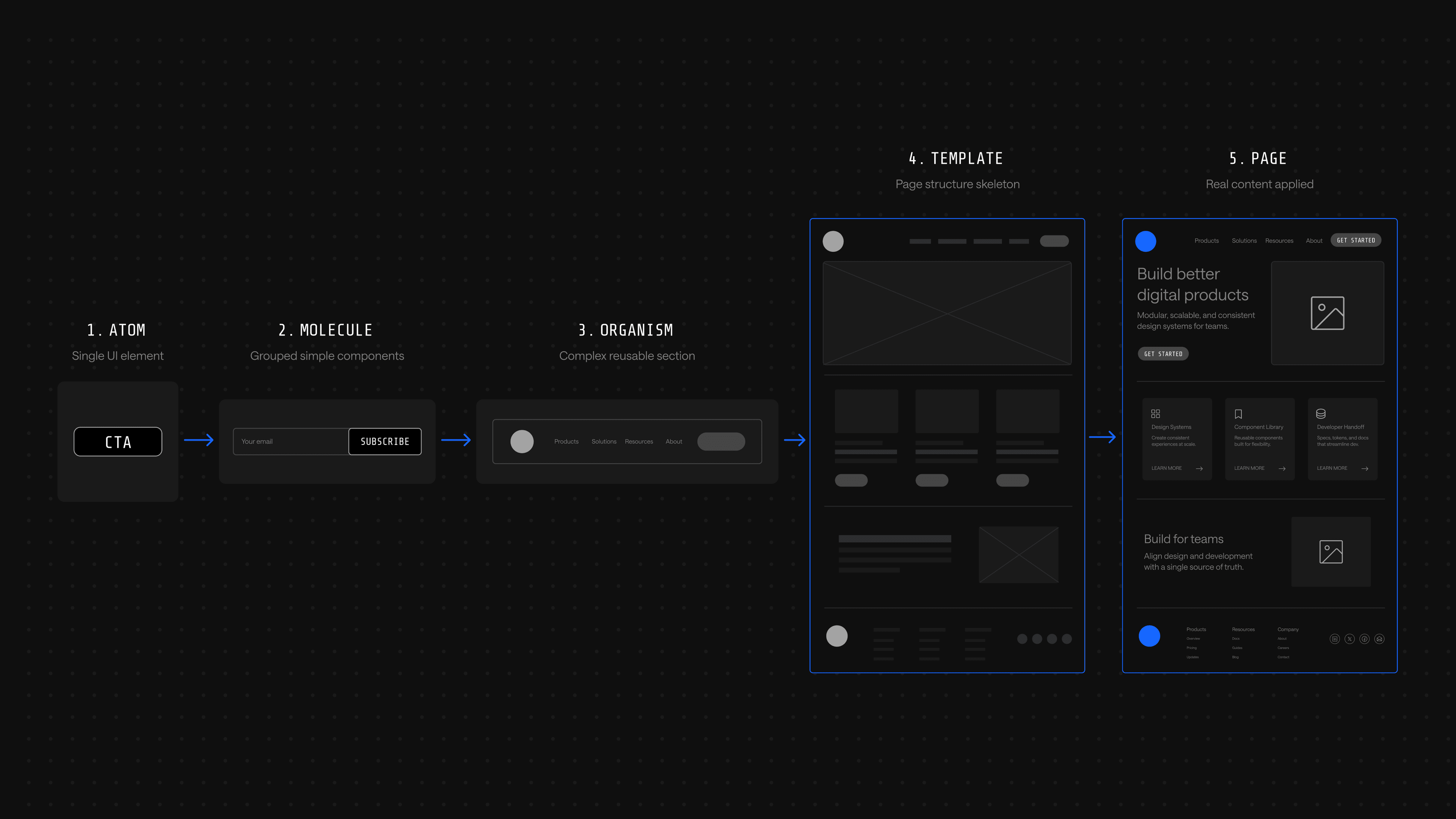
1. Atoms
Atoms are the smallest building blocks of a website page. In atomic design, atoms refer to basic HTML elements that provide the smallest units of a web page: buttons, labels, input fields, fonts, color tokens and animations.
Anything that cannot be broken down further within the user interface is labeled as an atom. An atom that can combine with others to create a more complex component is still an atom; the classification is about indivisibility, not isolation.
2. Molecules
Atoms bond together to create molecules, the second smallest groups on a page. A molecule combines two or more atoms into a small, functional unit with a single job.
A blog subscription box is a classic example: it joins a field label atom, an input field atom and a button atom into one functional component. The molecule is more useful than any atom on its own because it solves a discrete user need.
3. Organisms
Organisms are groups of molecules joined together to form more complex components. In interface terms, an organism is any design sequence that appears on a website page as a distinct, recognizable unit.
The header and footer of a website page each consist of two or more molecules, making them both organisms. A search bar molecule sits inside a header organism alongside a logo, navigation menu and call-to-action button.
4. Templates
Pages start to take shape in the fourth phase. Templates are groups of organisms combined to form the structure of a page, defining where each component lives without yet specifying the content inside it.
On a homepage template, the header and footer organisms anchor the top and bottom, with hero, feature and proof organisms slotted in between. Templates ensure that components of a visual identity system look and function together; think of them as the skeleton of a page.
5. Pages
After the first four phases, designers have everything they need to build out the final UI. Pages are templates filled with real content: actual headlines, images, copy and product details that show what the live experience will feel like.
If the previous four steps were done well, the final step gives designers freedom to drop in content and validate the system. The final appearance of pages dictates whether the site is ready to launch or whether the team needs to loop back and adjust earlier components.
Why Atomic Design?
Breaking big projects down into templates, organisms and molecules is efficient on its own. The deeper value is that atomic design lets teams focus on small details without losing sight of the bigger picture, the application's full user interface. That dual focus saves time and builds a culture of reuse instead of constant reinvention.
Mix and Match Design Components
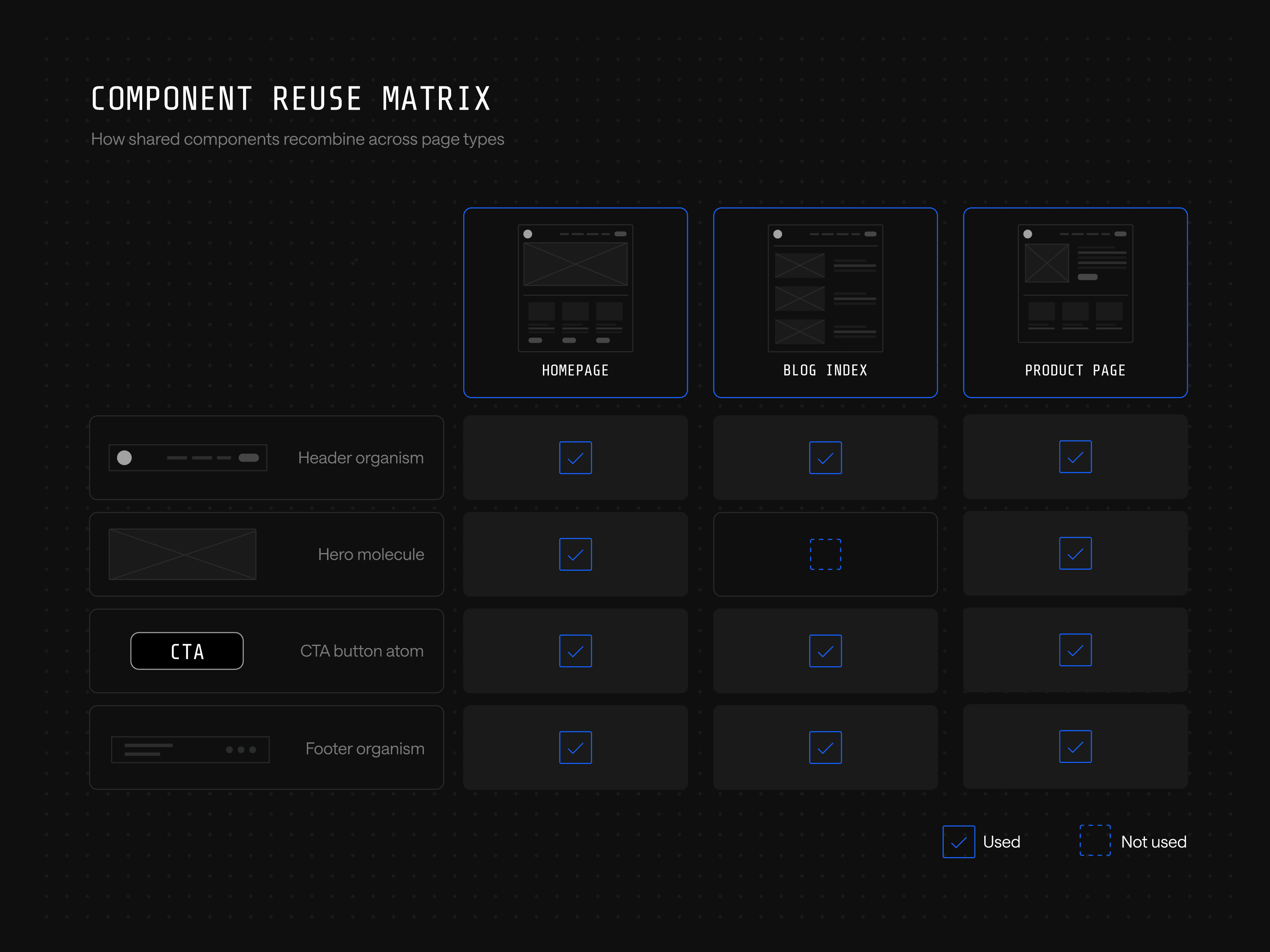
Once a component library exists, building new pages becomes recombination rather than design from scratch. A homepage, a blog index and an article page can all be assembled from the same pool of atoms and molecules, and new campaigns or landing pages ship faster because the parts are already designed, coded and approved. Teams snap components together for the use case rather than starting at zero.
Website Code is More Consistent
For developers, the atomic approach provides the guardrails they need to take existing components and implement them properly. When design components follow an atomic structure, developers work from an established language and structure that is universal across the project.
Atomic design is also a strong onboarding tool for any developer joining a new project. Because every component is organized and mapped to its mockup, development teams can move quickly from component to component without relearning the codebase each time.
Fewer Design Components to Manage and Organize
Without an atomic system, teams accumulate duplicates. Designers create new versions of components that already exist, usually because they forgot or because no documentation tracks what is already in the library. The library grows in size without growing in usefulness, and maintenance gets harder over time.
The atomic approach prevents that drift. Teams document each atom from the start, then track every instance where it is used to build a larger molecule or organism. The result is a smaller, cleaner component library the team can actually use.
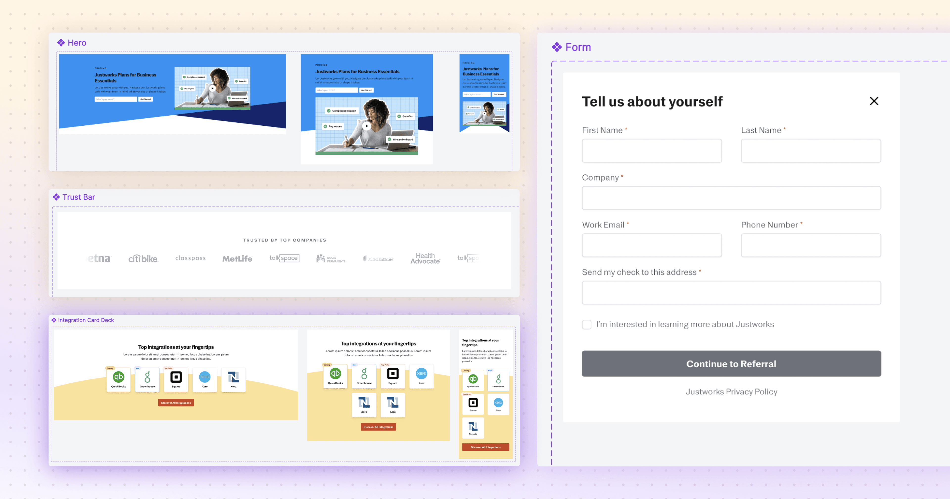
Justworks is a clear example. Before partnering with Webstacks, the company had no design system in place, and UI inconsistencies were unavoidable; creating new pages meant reinventing the wheel instead of pulling from a shared library.
Webstacks built a scalable design system with standardized typography, spacing and color usage, then replaced the freeform page builder in their content management system with structured, reusable components. Storybook was introduced as a single source of truth, so every team member could see exactly how each element was supposed to look and function.
Faster Speed-to-Market
Visual identity systems make cross-browser, cross-device, performance and accessibility testing easier, which speeds up production and lets teams launch higher-quality work faster. All teams speak the same visual language, so the workflow for shipping new pages compresses to three steps:
- Marketing teams request a new page using components from the atomic design system
- Designers build the mockup using those same components
- Developers ship the page without rebuilding what already exists
Accessibility and brand consistency get baked into the system itself, so improvements compound. Every new page benefits from work that was already done, and interfaces reach more users without extra effort from any individual team.
Solana saw this firsthand. Webstacks built Solana's design system as a component-based architecture organized along atomic principles, with standardized typography, color schemes and reusable UI components mapped to consistent page structures. After the redesign, content teams could publish and update pages without developer support, removing a major bottleneck that had slowed previous content cycles.
How to Apply Atomic Design to Build Visual Identity Systems
With the case for atomic design established, the next question is what it actually produces. The output of the methodology is a visual identity system: the documented, governed set of components and rules that designers and developers work from every day. This section covers what that system contains and how the components inside it get built.
What Is a Visual Identity System?
A visual identity system, also called a design system, is a comprehensive framework of visual elements (logos, color schemes, typography, imagery) that represent an organization's brand consistently across every medium. It exists to create a recognizable brand image and to make sure every visual communication carries the same message to its audience.
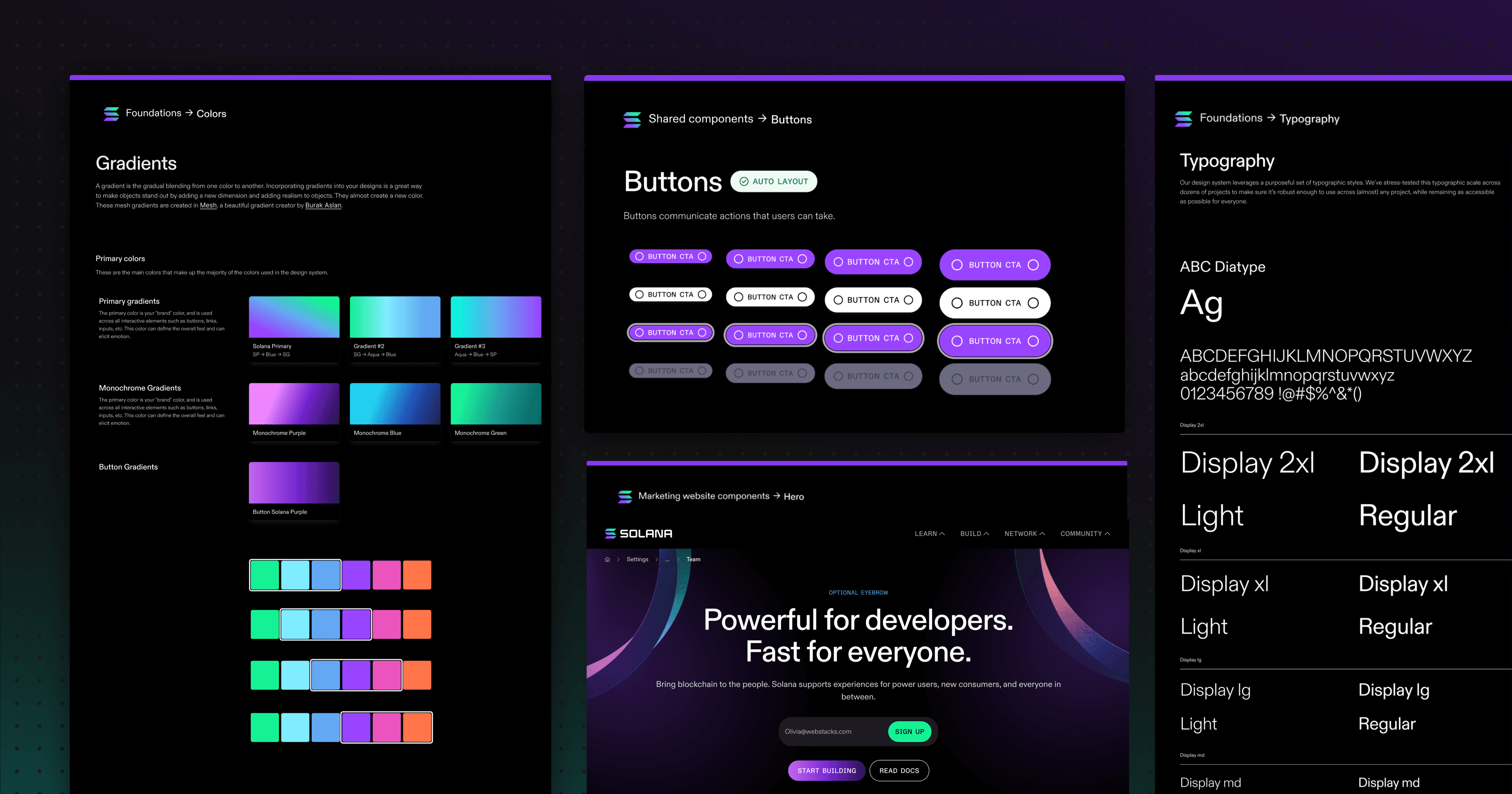
A design system gives designers and engineers a single point of access to visual style guides, typography systems, color tokens, component libraries, design patterns and voice and tone guidance. The system that emerges from the atomic methodology contains every component in use along with the code that powers it, making it a working reference for both disciplines.
Documentation is what makes a design system useful in practice. It spells out how each component should be used, and well-documented systems strengthen the relationship between the user and the brand while keeping the experience consistent across every digital product.
How to Build Design Components for Your Visual Identity System
Components are the functional elements of a design system. They are the building blocks teams reach for when creating new products, and combined, they form the libraries that give designers a reusable toolkit.
A component can be anything from a dropdown menu to an icon to a full call-to-action block. What matters is that it combines elements to solve a specific problem in the digital experience.
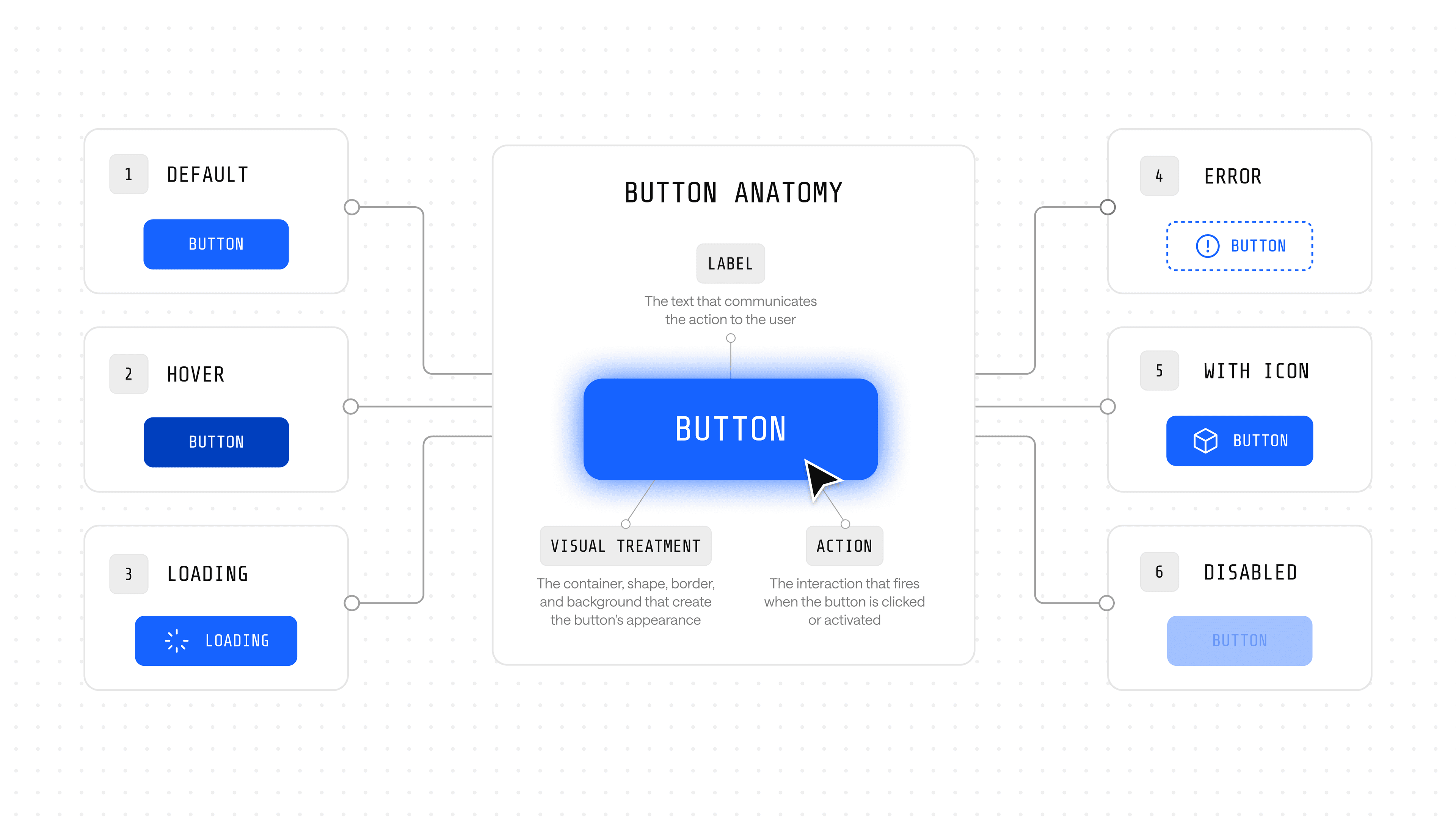
When building a new component, start with its default state. Identify the most necessary aspects of the component and write a generalized, default version of it. A Button component, for example, requires at minimum:
- A label, whether text or icon
- A visual treatment, including color, size and styling
- An action, the behavior triggered when a user interacts with it
The default configuration of these characteristics informs the base usage. Next, expand the component to handle other states: error handling, loading states, icon-and-text variants. In most cases, states should work independently of one another so the component stays predictable as it scales.
How to Implement Atomic Design in Your Workflow
For B2B startups and enterprise teams, atomic design is a practical way to keep consistency and speed intact as a product grows. The methodology earns its place when it is operationalized into how teams audit, communicate, build, tool and govern their interfaces.
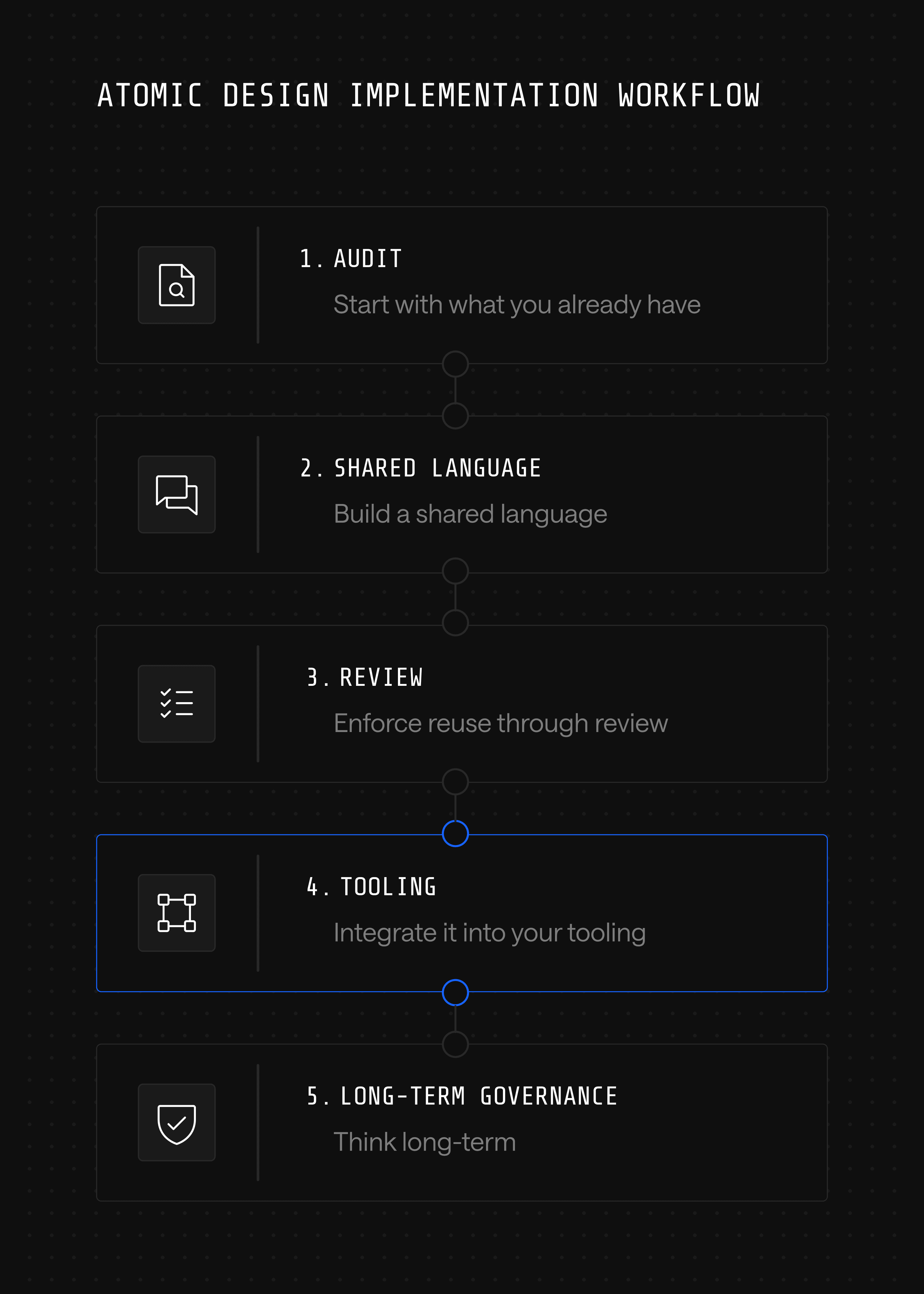
Start with what you already have
Audit the existing UI. Most teams find overlapping components: five slightly different buttons, inconsistent form styles, mismatched spacing. This kind of UI debt slows everything down and creates confusion across handoffs. Atomic design gives a framework to clean it up systematically rather than redesign from scratch.
Build a shared language
In fast-moving teams, designers, developers and product managers often talk past each other. Atomic design provides a common vocabulary: atoms, molecules, organisms, templates, pages. Handoffs go smoother, and the back-and-forth over "which version of the dropdown is current?" goes away.
Enforce reuse through review
Reuse does not happen automatically; it requires gatekeeping. Build a review step into the design and engineering workflow where any new component proposal is checked against the existing library first. Set contribution rules for when a variant earns a new component versus when it should reuse or extend an existing one. Assign clear ownership for the library so the rules get applied consistently rather than drifting team by team.
Integrate it into your tooling
Atomic design works best when it is not siloed. Use Storybook or Figma libraries to reflect the atomic system directly in workflows, and connect it to the codebase so developers can actually use what designers build. This is also where atomic thinking becomes the foundation for composable architecture: when components are versioned, governed and reusable across pages, the website itself becomes a modular product that can be reshaped without a full rebuild. That is the principle behind treating the site as growth infrastructure rather than a static asset.
Think long-term
For enterprise environments with complex approval processes and multiple stakeholders, atomic design reduces risk. A change to a core atom, like a button style, cascades predictably through the entire product, which makes governance and quality assurance far easier over time.
These five practices work together rather than in isolation. Each step gets stronger when the others are in place, and skipping any one weakens what the rest can do. Together they turn atomic design from a methodology into a working system.
Atomic Thinking is the Foundation of Scalable Design
Treating a website like a one-off project is what forces teams into the redesign treadmill every 18 months. Atomic design breaks that pattern by turning the website into a system: every component has a clear job, every page is built from parts that already exist and every change improves the whole rather than fragmenting it.
That is what makes atomic thinking the foundation of scalable design: an operating model for teams that want their websites to evolve continuously rather than be rebuilt periodically. Components become the unit of governance, the unit of iteration and the unit of growth, which is exactly what a site needs to function as a growth product.
For B2B teams under pressure to ship faster without sacrificing brand consistency, that shift is the difference between a website that drags behind the business and one that drives it forward.
Ready to treat your website like a growth product? Talk to Webstacks.
Your website is your biggest growth lever—are you getting the most out of it? Schedule a strategy call with Webstacks to uncover conversion roadblocks, explore high-impact improvements, and see how our team can help you accelerate growth.