B2B Website Design Trends & Best Practices 2025
Most B2B websites still act like digital brochures. They look fine, but under the hood, they're rigid, slow to update, and disconnected from how your team goes to market. That doesn't work in 2025.
Modern B2B teams need websites that scale fast. If you're launching new products, personalizing by segment, and running campaigns across channels, and your site can't keep up, you have a system issue.
Webstacks helps B2B organizations treat their websites like products, not projects. B2B website design trends mentioned in this article are what we implement to help high-performing teams move faster, convert better, and build a real pipeline.
Find out what the industry's best websites are doing to stay relevant and effective. If you need web strategy inspiration, this is the resource for you.

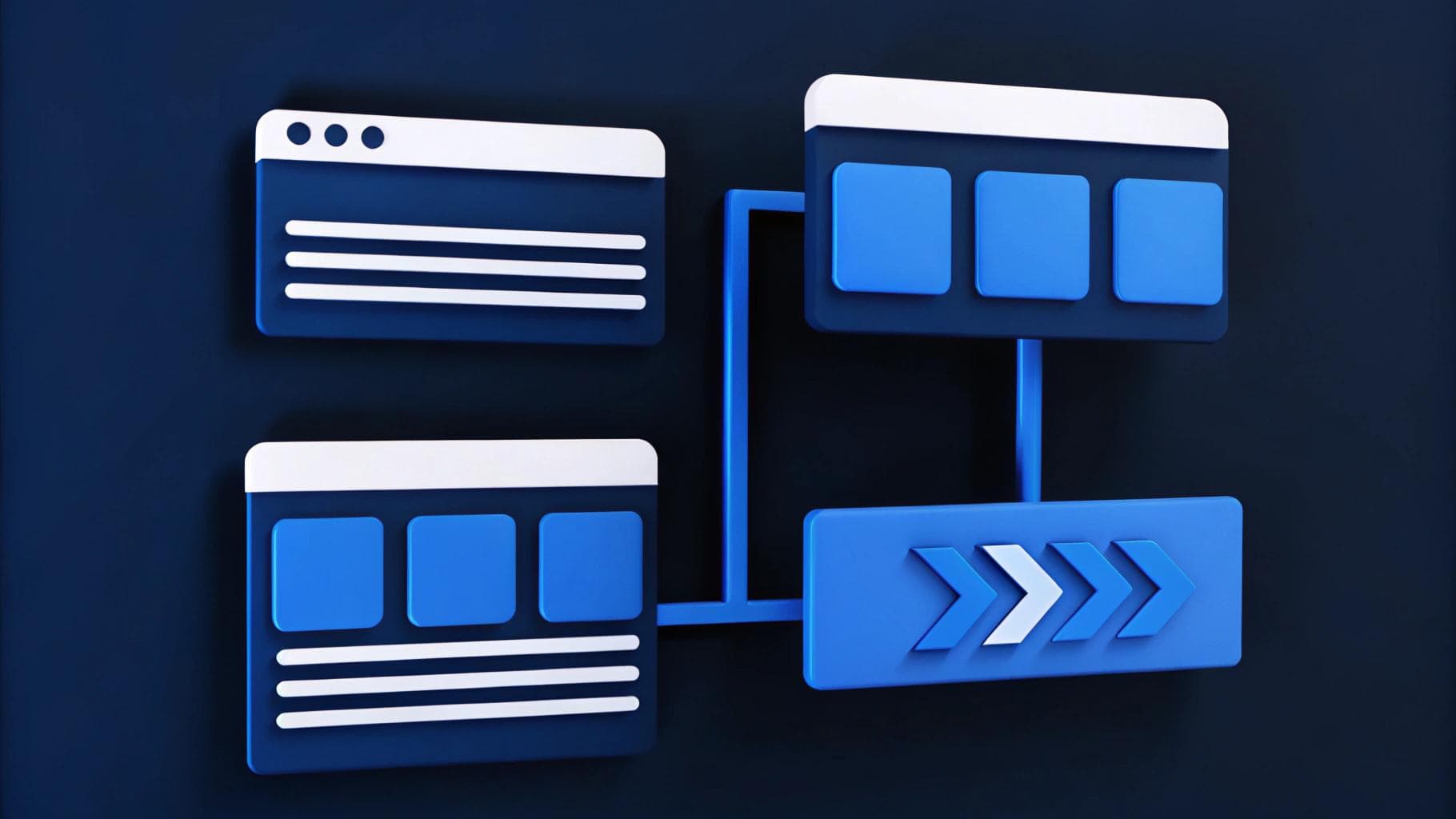
1. Modular Design Systems That Scale
If every new landing page feels like starting from scratch, your design system isn't working for you. Modular design changes that by giving your team a flexible, reusable set of building blocks — components that can be assembled in different ways without sacrificing consistency. Think of it like a content LEGO set: same core pieces, endless variations.
This structure addresses the biggest challenge B2B marketers face with traditional web design: speed. With a modular system, you're equipped to build fast, stay on brand, and adapt in real time.
Here's what that looks like in practice:
- Launch velocity: Need a new campaign landing page for a product launch or event? Pull from pre-approved sections, such as hero banners, feature lists, and partner callouts, without involving design or dev.
- Cross-team scale: Product marketing, demand gen, and regional teams can all ship pages using the same library, reducing rework and review cycles.
- Brand governance: You don't sacrifice design quality. Modular systems are built to enforce brand consistency across touchpoints, even when multiple teams contribute.
This approach isn't just for startups either. Enterprise B2B teams use modular design to manage hundreds of pages across multiple product lines or regions. When combined with a headless CMS or component-based platform, it becomes the foundation for long-term scalability.
2. Personalization at the Component Level
B2B buyers expect relevance. They're coming to your site with specific goals, roles, and levels of urgency. A generic homepage or catch-all product page doesn't reflect that. Personalization at the component level helps your site respond to what different visitors actually need.
This doesn't mean creating dozens of standalone pages. It means using your CMS to dynamically update sections of a page, such as headlines, CTAs, social proof, or product highlights, based on who is visiting.
Here's how it works in practice:
- Segment-based messaging: Show different value props or features depending on the visitor's industry, role, or account segment.
- Funnel stage targeting: First-time visitor? Highlight educational content. Returning visitor who downloaded a demo guide? Show a comparison table or "Get a Quote" CTA.
- Account-level customization: If your ABM platform or enrichment tools identify a key target account, your homepage or solution page can reflect that, without requiring a dedicated URL.
Personalization doesn't have to be complex. Start with high-impact sections like hero modules, testimonials, or resource cards that can adapt based on simple logic. Over time, your team can layer in more data sources or behavioral signals to refine the experience.
3. UX That Prioritizes Pipeline, Not Just Looks
In B2B, strong UX helps your website inform, guide, and convert. It's not just about aesthetics, it's about making it easy for buyers to move forward without second-guessing where to go next.
Start with structure. Group your navigation around how buyers evaluate solutions:
- By role
- By use case
- By industry
In that way, visitors can quickly find what matters to them. Pages should highlight different decision points without overwhelming first-time users or underserving returning ones.
Then, focus on action. Not every visitor is ready for a sales conversation, so give them useful next steps:
- Product tours
- Integration overviews
- Customer stories
On the performance side, fast load times and mobile optimization aren't optional. When your site slows someone down, it's often the end of the journey.
Calendly rebuilt its UX around these principles — cleaner navigation, clearer page flows, and better alignment between user intent and page content. That shift made it easier for buyers to evaluate, and more simple for marketing to support growth.
4. Interactive Content That Educates and Converts
B2B buyers tend to convert once they feel informed and confident. That's why interactive content has become one of the most effective tools on a modern B2B website. It shifts the experience from passive reading to active exploration.
Most buyers aren't looking for a pitch. They're trying to figure out:
- Does this solve my specific problem?
- How does it work in real scenarios?
- Is it worth the investment?
- How does it compare to other options?
Static content makes them work harder to answer those questions. Interactive content does the heavy lifting for them. Here are a few high-impact formats worth building into your site:
- Product tours: Instead of explaining how your platform works, let visitors walk through it. Interactive walkthroughs or click-through demos help them connect features to their actual workflows, which is especially helpful for technical or multi-feature tools.
- ROI calculators: Buyers want to justify the cost. Giving them a calculator that outputs potential time savings, revenue impact, or cost reductions based on their own inputs helps turn curiosity into intent.
- Feature selectors or comparison tools: These help buyers narrow in on the functionality that matters most to them, especially when you offer multiple products, plans, or configurations.
- Interactive case studies: Instead of a wall of text, show success stories filtered by industry, use case, or company size. The more relatable the example, the more credible the outcome feels.
- Expandable resource sections: Visitors shouldn't have to dig through multiple pages. Collapsible FAQs, downloadable resources, and in-line tooltips make it easier to consume depth without cluttering the page.
Interactive content doesn't just look modern, but it also reflects how B2B buyers prefer to learn. It keeps them engaged longer, increases time on page, and gives your team better behavioral signals. It also helps de-risk the buying decision by making information easier to absorb and personalize.
If your site feels like a static catalog, you're forcing buyers to do too much on their own. The more you can turn your content into tools, the more useful and persuasive your website becomes. A strategic website redesign will support better buyer experiences.
Find out what the industry's best websites are doing to stay relevant and effective. If you need web strategy inspiration, this is the resource for you.
5. Headless Architecture for Marketing Speed
Most traditional CMS platforms slow teams down. When every change depends on a developer, launching a new page or updating messaging becomes a bottleneck.
Headless architecture solves that by separating the frontend from the backend. Developers focus on building flexible systems. Marketing teams get a structured environment where they can manage content directly, without waiting for sprint cycles.
This setup is especially effective for B2B organizations with multiple products, regions, or go-to-market motions. Instead of building one-off pages or relying on custom templates, teams work from a shared set of components that stay consistent across the site.
It also makes testing easier. Messaging updates, layout changes, or campaign variants can be handled in the CMS and pushed live in hours, not weeks. And because the architecture supports clean APIs, it's easier to connect analytics tools, personalization engines, or product data without compromising site performance.
6. Accessibility and Dark Mode as Standard
Accessibility and dark mode are foundational to how people use and evaluate your site. If key visitors can't comfortably read, navigate, or interact with your content, you're creating friction at the critical moment.
Accessible design improves usability for everyone, not just those with specific needs. And in B2B, where buyers spend time reviewing documentation, comparing solutions, or gathering input from teammates, clarity and consistency go a long way.
That includes:
- Strong contrast and readable typography
- Semantic HTML for screen readers and better SEO
- Logical tab order and keyboard-friendly layouts
- Clearly labeled form fields and buttons
Dark mode adds another layer of comfort, especially for users exploring your site at night or switching between tools during the workday. It reduces visual strain and shows that you've considered how and when your audience engages, not just what they see.
These design choices also reflect how your brand operates. A site that's flexible, inclusive, and easy to use communicates professionalism before a single conversation happens. And because these systems are structured and reusable, they're easier to scale and maintain across teams and markets.
7. Continuous Design Optimization Based on Data
Strong B2B websites aren't one-time builds. They improve over time, based on how real users interact with them. Buyer behavior shifts, messaging evolves, and new content gets added. If your site doesn't adapt, it falls behind.
Optimization doesn't mean starting over. It's about small, targeted adjustments that respond to performance data. That might mean:
- Testing headline variations on key conversion pages
- Adjusting CTA placement based on scroll depth or click patterns
- Refreshing layouts when bounce rates signal confusion or fatigue
- Reworking the copy when heatmaps show users skipping over important sections
Behind the scenes, reviewing page speed, accessibility scores, and engagement metrics helps you catch friction points early. These small insights compound, especially as your team scales campaigns or supports more complex buyer journeys.
Turn Your Website Into a Growth System
A modern B2B site needs to do more than look good. It should support how your team operates, helping you launch faster, update pages without delays, and guide buyers through complex decisions with clarity. The trends in this article are based on how successful teams work.
Your website isn't a static asset. It's a tool your team relies on every day. When it's built for flexibility and scale, it supports everything from product launches to content programs. Webstacks builds websites around that reality. We help B2B teams create systems that move as fast as they do — measurable, adaptable, and ready to support growth. If your current site is slowing you down, let's talk.
Your website is your biggest growth lever—are you getting the most out of it? Schedule a strategy call with Webstacks to uncover conversion roadblocks, explore high-impact improvements, and see how our team can help you accelerate growth.

I lead growth at Webstacks, connecting strategy, design, and engineering to build websites that drive results. I specialize in website strategy, CMS implementation, and helping B2B teams scale their web presence.