B2B Website Information Architecture Guide
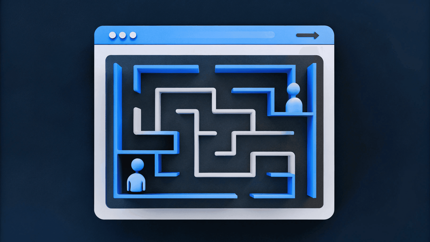
Most B2B companies focus on visual design while ignoring the structural decisions that determine whether their website serves business goals or creates friction for users. A beautiful homepage means nothing if prospects can't find your pricing page, sales teams avoid sharing case studies because they're impossible to locate, or your product catalog overwhelms rather than guides buyers toward solutions.
Information architecture (IA), the practice of organizing, structuring, and labeling content so users can find what they need, is the foundation that makes websites functional. Get IA right and your site becomes a scalable growth engine. Get it wrong and you've built an expensive obstacle between your company and revenue.
This guide covers IA fundamentals specifically for B2B contexts: complex product catalogs, multiple user types navigating different buying journeys, long sales cycles requiring different content at each stage, and internal teams who need the site to serve both external prospects and internal enablement.
What Is Information Architecture for B2B Websites?
Information architecture is the structural design of how content is organized, labeled, and accessed across your website. It determines whether a technical evaluator can quickly compare your product to competitors, whether a CFO can find ROI evidence to justify purchase, and whether your sales team can confidently send prospects to your site knowing they'll find what they need.
IA consists of four interconnected systems.
- Organization systems determine how content is grouped: by product line, by industry, by use case, or by user role.
- Labeling systems establish the terminology users see in navigation menus and page titles.
- Navigation systems create pathways users follow to move through content.
- Search systems help users find specific information when browsing fails them.
B2B IA differs fundamentally from consumer sites because buyers rarely purchase impulsively. They research extensively, involve multiple stakeholders, and require different information at different decision stages. A junior analyst researching solutions needs different content than the VP approving budget. Your IA must accommodate this complexity without overwhelming any single user.
Poor IA manifests in recognizable patterns:
- Sales teams resort to emailing PDFs to prospects and other workarounds because marketing-created content is scattered. Sellers simply can't find what they need when they need it.
- Marketing teams duplicate content because taxonomy doesn't support reuse
- Product launches stall because there's no clear place in site structure for new offerings
Understanding what IA is and why it matters for B2B contexts is the first step toward building websites that work.
Understanding Your Users and Their Content Needs
Before organizing content, understand who uses your website and what they're trying to accomplish. B2B websites serve multiple distinct audiences:
- Early-stage researchers exploring solutions
- Technical evaluators assessing integration requirements
- **Business decision-makers **evaluating ROI
- Procurement teams needing compliance documentation
- Existing customers seeking support resources
- Internal users like sales teams needing competitive comparisons, marketing teams publishing content, customer success teams directing customers to resources
Conducting Stakeholder Research
Stakeholder interviews reveal how internal teams experience the website as a business tool—not just a marketing asset. These conversations expose misalignments between site structure and real buyer behavior, uncover friction in sales workflows, and surface the competitive context that should shape navigation and content prioritization.
Different stakeholders provide distinct strategic inputs:
- CEO and leadership: Competitive positioning priorities, deal-breaking objections that surface late in the sales cycle, and strategic messaging that isn't landing with target accounts.
- Product leaders: Feature comprehension gaps, capabilities prospects consistently undervalue or misunderstand, and technical differentiation that's buried or poorly explained.
- Sales teams: Content gaps forcing reps to build one-off decks, navigation paths that don't match buyer questions, and whether the site actually supports deal velocity or slows it down.
When your sales team avoids using the website to close deals, that's an IA failure—the structure doesn't align with how buyers evaluate solutions.
Content Inventory and Audit
Effective IA starts with understanding what content exists, how it performs, and where structural or quality gaps prevent users from finding what they need. A content inventory catalogs every page with metadata like URL, content type, owner, last updated date, traffic, and engagement metrics. The audit layer evaluates whether that content is discoverable, usable, and aligned with user goals.
What a Content Audit Actually Reveals
A content audit isn't just a spreadsheet—it's a diagnostic tool that exposes structural breakdowns and quality issues. When executed properly, it reveals patterns that explain why prospects struggle to evaluate your product, why sales teams avoid linking to your site, and why high-value content generates no business impact. The audit surfaces four critical failure modes:
- Valuable content buried by poor IA: High-performing case studies scattered across blog categories instead of consolidated in a dedicated customer stories section. Product documentation split across disparate pages with no clear hierarchy or entry point.
- Content gaps that block deals: Sales teams report prospects repeatedly ask questions the site doesn't answer—pricing transparency, integration details, compliance certifications. These aren't content problems; they're strategic IA failures.
- Organizational dysfunction: Product specs trapped in downloadable PDFs that aren't searchable or indexable. Sales enablement materials living as internal Google Docs instead of being structured as gated website content. Compliance documentation buried three levels deep under marketing fluff.
- Duplication and decay: The same feature explanation written five different ways across product pages, blog posts, and help docs—confusing users and diluting SEO authority. Outdated content is still ranking in search, sending traffic to pages with deprecated information.
Actionable Audit Framework
The audit output needs to drive decisions, not just document problems. Categorize findings into three action-oriented buckets that guide prioritization and resourcing. Each category requires different treatment—amplification, remediation, or net-new creation—and helps teams move from analysis to execution:
- Keep and amplify: Content performing well in traffic, engagement, or conversion. Use it as the model for new content structure and messaging.
- Fix or consolidate: Valuable information trapped in poor structure, outdated material worth refreshing, or duplicated content that needs unification under a single authoritative page.
- Create: Missing content identified through sales interviews, search console queries with no matching pages, or competitive gaps where rivals provide resources you don't.
Organizing Your B2B Content
Content organization determines how pages group together into navigable structures. Three primary schemes serve different scenarios.
- Hierarchical organization structures content in parent-child relationships for product catalogs, where offerings naturally nest
- Sequential organization arranges content in a specific order for onboarding flows or implementation guides
- Matrix organization provides multiple pathways to the same content, letting users access information by industry, role, or product
Developing Taxonomy and Classification
In B2B contexts, taxonomy isn't just organizational housekeeping—it's the infrastructure that lets prospects self-qualify and find proof points relevant to their specific context. A well-designed taxonomy anticipates how different users slice information and ensures the system can support those paths without creating redundant content or forcing users into rigid navigation hierarchies.
- **Categories **represent primary groupings that appear in navigation.
- Tags provide secondary classification, cutting across category boundaries.
- Attributes add structured metadata powering advanced filtering: Industry, Company Size, Use Case, Products Used.
Faceted classification becomes essential when users need to slice content across multiple dimensions. A prospect wanting case studies from manufacturing companies in Europe that implemented specific products requires filtering by industry AND geography AND product simultaneously.
Modeling Content for Scale
Content modeling defines the structure, relationships, and attributes of different content types across your website. In a headless CMS, it translates your IA decisions into reusable data structures that determine whether your site scales efficiently or requires constant rework.
A well-designed model specifies what fields each content type contains and how those types relate to each other. Product pages need fields for name, category, SKU, specifications, compatible products, and pricing tier. Case studies need company name, industry, size, challenge, solution, and results. Blog posts need title, author, date, topic tags, and related products.
The business value is operational efficiency. Structured fields enable automated filtering, so prospects can narrow 200 case studies to three relevant ones by industry and company size. Defined relationships power dynamic recommendations without manual linking. Reusable components let marketing teams assemble landing pages from existing blocks rather than recreating content.
Poor structure creates technical debt. Without structured industry fields, you can't filter case studies by industry without manually tagging hundreds of stories. Without product relationship fields, you can't recommend compatible products or enable cross-selling.
This discipline works hand-in-hand with your taxonomy. Your taxonomy defines categories and tags. Your model determines where those taxonomies apply and how they function. If your taxonomy includes Healthcare, Financial Services, and Manufacturing, your model specifies which content types get industry fields and whether they allow single or multiple selections.
The goal: enable your website to work like a database, not a document repository. Structured content lets you query, filter, sort, and personalize at scale. Marketing teams can launch landing pages that automatically pull relevant content by industry or use case. Sales teams can send prospects to pages showing only relevant materials.
Start this work during your content audit when you're identifying existing content types and patterns. Document which types you need, what fields each requires, what relationships exist between types, and what logic governs display and filtering.
Designing Navigation Systems
Navigation translates content organization into pathways users follow to find information and accomplish tasks. Primary navigation provides the main wayfinding system that appears consistently across your site, typically in the header. Secondary navigation supports deeper exploration within sections or provides contextual pathways based on where users are and what they're doing. The distinction matters because primary navigation must balance comprehensive access with cognitive simplicity, while secondary navigation can be more specific and contextual.
Primary Navigation Systems
Primary navigation anchors users regardless of where they land on your site. It represents your site's highest-level organizational structure and must be immediately understandable to first-time visitors while remaining useful for returning users. The challenge lies in showing enough options that users understand their choices without overwhelming them.
Global (Main) Navigation
The persistent top menu appears across your site header and guides high-level movement across main content areas. Standard B2B patterns include Products, Solutions, Resources, Customers, Pricing, and Company. Each label should clearly signal what users will find underneath without requiring them to guess or explore.
Hierarchical (Sectional) Navigation
This pattern organizes content by category or topic under parent items. Under "Products," users might see subcategories like "By Industry," "By Use Case," or specific product lines. This works when your content naturally groups into clear parent-child relationships that match how users think about your offerings.
Mega Menus
Large, multi-column dropdowns expose multiple hierarchy levels simultaneously, displaying categories, subcategories, featured items, and promotional content in a visual grid. Mega menus work well for complex B2B catalogs where users need to see the full scope of options before committing to a path. However, not every page earns a spot in primary navigation. Reserve mega menus for when breadth genuinely serves users rather than defaulting to them because you have many pages.
Audience-Based Navigation
This approach serves sites where different user types need fundamentally different content paths. A B2B infrastructure company might provide separate navigation tracks: "For Developers" (API documentation, SDKs, integration guides) and "For Business Leaders" (ROI calculators, case studies, procurement resources). This pattern works when audience needs diverge significantly enough to justify separate information structures.
Utility Navigation
These elements support global tasks that aren't part of the main content hierarchy. Login, Search, Support, Contact Sales, and Documentation typically appear in a smaller top bar above or beside the main navigation. Utility navigation provides access to functional tools without cluttering primary content navigation.
Footer Navigation
The footer serves as a safety net and secondary access point. Users who scroll to the bottom without finding what they need can scan footer links organized by category. Footers also house required links like Privacy Policy, Terms of Service, and Sitemap that don't belong in primary navigation but must remain accessible.
Secondary Navigation Systems
Secondary navigation supports deeper exploration within specific sections or provides contextual pathways based on user location and task. Unlike primary navigation, which must serve all users equally, secondary navigation can adapt to context and provide more granular wayfinding within focused areas.
Breadcrumbs
Breadcrumbs become essential for deep hierarchies. When users navigate Homepage → Products → Analytics → Features → Data Visualization, breadcrumbs show that path and let them jump back to any level without using the browser back button repeatedly. They also help users understand where they are within your site's structure.
Contextual (Related) Navigation
These links help users discover related content without forcing them back to top-level navigation. Product pages should link to relevant case studies, implementation guides, and compatible products. Blog posts should suggest related articles. Documentation pages should surface related topics and next steps. The goal is keeping users engaged and moving forward in their journey.
In-Page (Anchor) Navigation
For long-form content like comprehensive guides or product pages with multiple sections, anchor navigation lets users jump to specific sections. This is particularly valuable for technical documentation, feature comparison pages, or resource centers where users need specific information within larger content pieces.
Sidebar Navigation
Section-specific menus appear in the sidebar for content areas with their own hierarchy, such as documentation, resource centers, or learning hubs. Sidebar navigation shows the structure of the current section and highlights the user's current location within it.
Pagination and Sequential Navigation
For content that follows a logical sequence (multi-step guides, training modules, product tours), sequential navigation provides "Previous" and "Next" controls. This reduces cognitive load by making the path forward obvious.
Mobile Navigation
Mobile navigation requires adapting desktop patterns for small screens. Complex mega menus don't translate to mobile, so mobile navigation typically uses progressive disclosure. A hamburger menu expands to show primary categories, each expanding further to show secondary options. Priority navigation elements like "Contact Sales" or "Get Demo" often remain visible outside the collapsed menu.
The most common navigation mistake is organizing menus around internal company structure rather than user mental models. Navigation reflecting your org chart doesn't serve how customers think about their needs. Test your navigation with actual users to validate that your structure matches their expectations and helps them accomplish their goals.
Labeling and Nomenclature
The words you choose for navigation menus, page titles, and category names directly impact whether users understand their options and feel confident clicking. For example, "Resources" tells users little about content, but "Customer Stories," "Technical Documentation," and "Analyst Reports" set clear expectations.
Balancing Standard and Proprietary Terms
Labeling decisions determine whether users can navigate confidently or struggle to decode your vocabulary. B2B websites must balance two competing pressures: using familiar industry-standard terms that provide immediate clarity, and preserving proprietary terminology that differentiates your brand and resonates with your existing customers. Getting this balance wrong creates friction that drives users away before they engage with your content.
Industry-Standard Terminology
Standard labels provide immediate familiarity and reduce cognitive load. B2B buyers expect certain terms across websites: Pricing, Documentation, Resources, Blog, Case Studies, Support. These labels work because users don't need to interpret them. They know exactly what content to expect when they click.
Use standard terminology for navigational elements and structural content types. This helps users navigate confidently without decoding unique vocabulary. Even if your internal teams use different terms, your navigation should reflect what users expect to see. Standard labels are particularly important in primary navigation, utility navigation, and footer links where clarity matters more than brand differentiation.
Proprietary Terminology
Proprietary labels can strengthen brand identity when your audience already recognizes and values specific branded terms. If your customers actively use your proprietary language when describing solutions or referring to your offerings, preserve it in appropriate contexts.
However, test whether new visitors understand proprietary labels before committing to them in primary navigation. The wrong place for unique terminology is navigation labels that users encounter before understanding your product. The right place is within content where you can provide context and explanation.
The rule: standard labels in navigation, brand voice in content. "Products" in the menu works even if you call them "Solutions" or "Modules" in marketing copy. "Resources" in navigation works even if individual resources use proprietary naming. This approach lets you maintain brand identity without sacrificing usability.
Testing and Maintaining Consistency
Technical specifications versus business benefits create a labeling challenge. Technical evaluators need technical labels to assess capabilities. Business decision-makers respond to outcome-focused labels. The solution is parallel taxonomy: tag each feature with both technical attributes (API integrations, SOC 2 compliance) and business outcomes (reduce manual work, improve security). Users can then filter by "SOC 2 Type II" or "Enterprise Security" depending on their lens.
This requires governance discipline. Assign taxonomy ownership and require both tag types before publishing new products. Without clear ownership, technical teams skip business tags and marketing teams skip technical tags. Document definitions so everyone applies "scalability" or "integration" consistently. Review tags quarterly.
Validate labels through testing. Card sorting reveals how users naturally group content. Tree testing shows whether users can find content through your proposed labels. A/B test navigation terminology to see what drives engagement.
Consistency means placing the same elements in predictable locations across similar pages. If case studies include industry tags on some pages but not others, users can't rely on filtering. If some product pages include ROI calculators while others don't, users won't know what to expect.
Search and Filtering Systems
Navigation works well for exploratory browsing, but search becomes essential when users know specifically what they need or when content volume exceeds what navigation can surface. Site search needs to understand your content taxonomy and respect it in results. Someone searching "automation" should see relevant product pages, case studies where automation was the primary use case, blog posts discussing automation strategies, and documentation for automation features.
Implementing Faceted Search
Faceted search allows users to refine results by applying multiple filters simultaneously—critical when your site contains hundreds or thousands of resources spanning different content types, industries, and buyer personas. Without it, prospects are forced to wade through irrelevant content or rely on site search that may not surface the specific proof points they need. Proper implementation requires both technical infrastructure and thoughtful UX design to balance power with simplicity.
Core Functionality
After running a broad search like "case studies," users should be able to narrow results by industry, company size, product used, and outcomes achieved. This prevents prospects from abandoning the search when early results don't match their context. A manufacturing company evaluating your platform needs to see case studies from other manufacturers—not SaaS companies or retailers—without having to manually scan dozens of irrelevant pages.
Filter Design Principles
Balancing comprehensiveness with usability is the core challenge of filter design. Showing every possible filter upfront overwhelms users and clutters the interface. Progressive disclosure works better: display the most commonly used filters by default (industry, content type, topic), then provide a "Show More Filters" option for advanced refinement like geography, company size, or integration requirements. This approach keeps the interface clean while still supporting power users who need granular control.
Enhancing Search Usability
Search functionality becomes critical when navigation alone can't serve every user need or content discovery path. B2B websites with extensive product catalogs, large resource libraries, or deep technical documentation require search systems that go beyond basic keyword matching. Effective search reduces friction, surfaces relevant content quickly, and provides helpful guidance when exact matches don't exist.
Autocomplete and Query Suggestions
Autocomplete guides users toward content as they type, reducing errors and accelerating discovery. As someone types "int," suggestions might include "integrations," "integration documentation," and "integration case studies." Effective autocomplete shows both matched terms and actual content destinations, letting users jump directly to specific pages rather than reviewing full search results.
No-Results Pages
No-results pages represent failure points where users might abandon your site. Instead of just "No results found," provide helpful next steps: suggest similar terms ("Did you mean [similar term]?"), offer related topics to browse, or provide direct contact options ("Contact sales for help finding what you need"). These recovery paths keep users engaged rather than frustrated.
Scoped Search
Search within specific sections helps users who know what content type they need. Documentation search shouldn't return blog posts. Product search shouldn't return customer stories. Let users scope their search to Resources, Products, Documentation, or Support to filter out irrelevant results and find the right content faster.
B2B-Specific IA Challenges
B2B websites face IA challenges that consumer sites never encounter. Account hierarchy with multiple users complicates content presentation. An enterprise organization might have dozens of team members accessing your site, each with different needs. Your IA must support role-based content display: administrators see account management interfaces, developers see API documentation, and business users see analytics dashboards.
Supporting role-based display requires structured content models that separate content from presentation. In a composable architecture using headless CMS platforms like Sanity or Contentful, your IA defines content relationships and permissions at the data layer while your frontend determines what appears based on user attributes. Content models specify which roles access which content types. Developers get API references, IT administrators get installation guides, and business stakeholders get case templates.
This decoupled approach means the same underlying content can power different experiences without duplication: a technical portal for developers, a resource center for business users, and a simplified view for trial users. Your IA remains consistent while presentation adapts to context. This is how composable web architecture enables the scalability and flexibility B2B marketing teams need to serve multiple audiences without managing multiple content sets.
Pricing and Account Management
Contract-specific pricing requires careful IA because pricing varies by customer, usage volume, and negotiated terms. The pattern typically separates three experiences:
- **Public pricing overview **that explains your model and shows starting prices
- **Pricing calculator that **helps prospects estimate costs
- Authenticated pricing dashboard that shows actual contracted rates for logged-in customers
Documentation and Resource Architecture
Documentation and resource centers span wide-ranging content types with different audiences. Getting started guides serve new customers. Feature documentation provides detailed how-to content. API reference materials serve developers. Video tutorials demonstrate complex workflows. Effective documentation IA provides multiple pathways for browsing by:
- Topic
- Role
- Product
Search functionality should support these structures.
Partner Portals
Partner and distributor portals require a separate IA from your main site. Partners need deal registration, co-marketing materials, and training resources that shouldn't be publicly accessible. Commonly, this results in a gated partner portal with its own navigation structure, linked from your main site but maintained as a distinct experience.
Multi-Region Sites
Multi-region and multi-language IA introduces challenges beyond translation. Different regions might offer different products or have different legal requirements. Language switchers should be prominent and persistent. Regional content variations (pricing pages showing regional currency, case studies featuring customers from that geography) require content modeling supporting regional attributes without duplicating entire page structures.
Creating and Validating Your IA
Documenting IA decisions transforms abstract planning into concrete guidance that design, development, and content teams can execute. Site maps show the complete IA and how pages relate to each other. Comprehensive site maps display primary navigation categories with all secondary and tertiary pages nested beneath, show cross-relationships between sections, identify page templates for different content types, and mark pages that require user authentication.
Mapping User Flows and Wireframe Structure
Before building pages, map how users will move through your IA to accomplish specific goals. User flows and wireframes validate that your organizational structure actually supports the journeys users need to take. This step catches structural problems before design and development begin, when fixes are cheap rather than expensive.
User Flows
User flows trace specific pathways through your IA for common tasks. A flow for "First-time visitor researching solutions" might map: Homepage → Solutions Overview → Industry-Specific Solution → Related Case Study → Contact Sales. Documenting these flows validates that clear pathways exist for priority use cases and identifies content gaps where necessary pages or connections are missing.
Wireframes
Wireframes communicate content structure and hierarchy without dictating visual design. Low-fidelity wireframes keep focus on structure rather than aesthetics. Gray boxes representing content blocks, simple labels, and clear hierarchy indicators help stakeholders understand page organization without getting distracted by design preferences like color or typography.
First-Click Testing
First-click testing measures whether users know where to click to start accomplishing a task. Show users a page mockup and ask them to indicate where they'd click to find specific content or complete a goal. If users can't identify the correct starting point, your navigation or content hierarchy needs adjustment before moving forward.
Measuring Post-Launch Effectiveness
Your IA isn't finished when the site launches. Real user behavior reveals whether your organizational structure actually serves user needs or creates friction you didn't anticipate during planning. Post-launch measurement identifies specific navigation problems, validates whether users follow intended pathways, and provides data to prioritize improvements.
Tools like Google Analytics, Hotjar, FullStory, and Posthog track user behavior patterns at scale. Analytics platforms show navigation paths and drop-off points. Session replay tools let you watch individual users struggle with or succeed at finding content. Heatmaps reveal which navigation elements users click and which they ignore. Combined, these tools provide quantitative data on IA performance and qualitative context on why users behave the way they do.
- Task completion rates show whether users can successfully find content. If only 40% of users who visit your Solutions page make it to a specific industry solution, your navigation or content hierarchy may be unclear.
- Time to completion measures efficiency. Users who take five minutes and eight page visits to reach your pricing page face more friction than necessary, even if they eventually succeed.
- Navigation path analysis reveals whether users follow intended pathways or consistently take unexpected routes. If most users access case studies through search rather than navigation, your case study organization may not match user mental models.
IA Governance and Scalability
Creating excellent IA means nothing if it degrades within months as teams add content without structure. IA governance establishes rules, processes, and accountability, keeping your structure intact over time.
Planning for Growth
Building IA that scales requires anticipating future growth during initial planning. Your taxonomy must include room for new topic categories, navigation must accommodate additional content types without cluttering menus, and content models must support attributes needed for filtering larger volumes.
Establishing Governance Rules
When multiple teams create and manage content independently, taxonomies fragment and content models degrade. Governance prevents this chaos by establishing clear boundaries and decision-making authority before problems emerge.
The foundation of governance is control. Restrict taxonomy fields—industry, company size, region—to predefined options instead of allowing free-form text entry. This prevents the slow drift toward inconsistency that comes when every contributor interprets categories differently. Assign specific individuals as taxonomy owners with the authority to approve changes, ensuring that evolution happens deliberately rather than accidentally.
Your CMS should enforce these rules automatically. Required fields, character limits, and relationship requirements aren't suggestions—they're structural guardrails that make compliance the default path. When you need multiple approval layers or tiered permissions, build them into workflows so governance happens invisibly during the normal publishing process.
The cultural component matters as much as the technical one. Train content contributors not just on how to follow the rules, but on why governance exists. When teams understand that constraints enable speed and prevent future cleanup work, adoption becomes easier. Governance isn't about restricting creativity—it's about creating the conditions where teams can move fast without breaking the system they depend on.
Maintaining IA Over Time
Information architecture degrades without active maintenance. As content volumes grow, teams change, and business priorities shift, your carefully designed structure can fragment into an inconsistent mess that undermines the user experience you worked to create.
Sustainable governance starts with documentation that makes your IA decisions transferable. New team members joining your marketing or content teams need context beyond rule lists. When documentation explains that industry tags enable filtering that converts 30% better than unfiltered content, contributors understand why consistent tagging matters. This connection between governance rules and business outcomes builds buy-in rather than compliance fatigue.
Structural decay happens gradually, which makes regular audits essential for catching problems early. Analytics provide early warning signals well before users complain. High exit rates from specific sections suggest navigation dead ends. Failed searches clustering around particular terms indicate missing content or misaligned terminology. Unexpected navigation paths reveal that users can't find what they need through your intended routes.
Quarterly reviews should surface orphaned content no longer linked from anywhere, redundant categories that confuse rather than clarify, and broken relationships between content types. These findings become prioritized improvement opportunities rather than comprehensive cleanup projects. High-traffic areas where structural problems affect the most users deserve attention first. Lower-priority sections can wait until resources allow. This incremental approach keeps IA maintenance manageable rather than overwhelming.
Building IA That Drives Business Outcomes
Information architecture isn't something you fix once and forget. It's the difference between a website that scales with your business and one that requires constant rebuilding. The principles in this guide work, but implementing them while managing stakeholder priorities, existing technical constraints, and aggressive growth timelines requires experience most internal teams don't have.
Webstacks specializes in building IA for B2B companies facing exactly these challenges. We've helped companies like Prismatic translate competitive insights into navigable structures, guided enterprises through complex content migrations without losing SEO equity, and built taxonomy systems that support both 50 pieces of content today and 500 next year. Our approach starts with the stakeholder research and user validation covered in this guide, then translates those insights into IA that actually ships.
If your current website structure is slowing down campaigns, frustrating sales teams, or requiring developer intervention for basic content updates, the problem is architectural. Talk to Webstacks to build an IA that turns your website into the growth engine your business needs.
Your website is your biggest growth lever—are you getting the most out of it? Schedule a strategy call with Webstacks to uncover conversion roadblocks, explore high-impact improvements, and see how our team can help you accelerate growth.

I lead growth at Webstacks, connecting strategy, design, and engineering to build websites that drive results. I specialize in website strategy, CMS implementation, and helping B2B teams scale their web presence.