How to Build a Brand Style Guide the Webstacks Way

We’re excited to share our brand style guide with you (reading this grants you access to our release party), and we’re looking forward to releasing more design content.
But, before we jump into things: If you’re unfamiliar with style guides and what their purpose is—We’ve got you.
Why are Style Guides Important?
Remember being in school and you’d go around the room doing introductions? How awkward would it be if it got to you and you had nothing? Like, blank stare. No identity. Nothing.
Except replace yourself with a company’s design style.
A more practical example: What if you joined a design agency as a designer and you didn’t have one central source of truth for the brand identity? You wouldn’t know how to design for them with lacking knowledge of their voice and style, right?
")
Right. Enter style guides.
With a style guide in place, the team now has a single source of truth for design and other helpful information. Style guides are the cornerstone for the rest of your design content.
If you’re just interested in a brand style guide example, check out ours here. Otherwise, stick around for the breakdown.
Let’s Break It Down
A brand style guide has a mix of the following:
- Mission Statement
- Brand story
- Target audience
- Values
- Voice
- Colors
- Logo Usage
- Iconography
- Illustration style
- Typography
- Motion guidelines
The list isn’t definitive, though, and you may not have all of these when you begin designing your guide. It's completely okay!
Each company is slightly different in what they choose to document; but as a good rule of thumb, it’s best to at least include: voice, colors, logo usage, and typography to start.
At Webstacks we’ve documented what we have for certain and will continue to add to our living document. No need to rush what you’re not sure of yet.
Plus, documents like this are never meant to be considered “completed”—They’re ever-growing just as your company is.
Speaking of that living document, let’s jump into it.
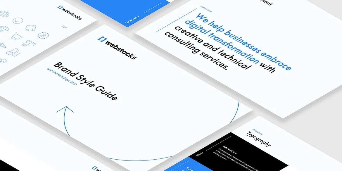
Mission Statement

This one is pretty straightforward—What is your company trying to accomplish and how? This is the sole reason for your company’s existence.
Think elevator pitch…but shorter.
For example, Webstacks strives to bring brands into the 21st century. But how do we do that? By helping businesses embrace digital transformation with creative and technical consulting services. Boom! Now we're in business.
Voice

Authentic. Passionate. Bold.
Copy is the shining star of your brand identity. Seriously. You could have the most visually appealing brand identity of all time, but if your copy sucks… nice knowing you. The truth hurts, so it's wise to take some time and decide on a few words that represent your brand voice.
At the end of the day, this is YOUR brand.
Colors
You have to have Primary colors. There's no other way around it. Secondary colors? Yep. They're the support your primary colors need. What's more fun than getting to choose your colors? Naming them
Primary Colors
")
These colors are front and center throughout your brand identity. Be sure to include the hex code (as well as its CSS variable if there is one) to ensure that designers and developers have what they need when referencing the guide.
Secondary Colors

Secondary colors aren’t in the spotlight as much as primary colors are, but they make perfect accent colors. For example, you’ll often see secondary colors used in illustrations, on secondary (or tertiary) buttons, and more.
Color Naming

Now for the fun we've all been waiting for.
For Webstacks’ color names, we knew that we wanted them to be unique and unlike other standard color names. We contemplated going a theme route—ie: space—but it didn’t feel right.
Then it hit me. We emphasize the importance of modern design through storytelling and individuality; our brand colors should be unique to our story. So I called in the team.
Did we end up with names like “bleu” and “swaggy” this way? 100% yes. But it reflects the silly, fun-loving culture we have. And I can say with confidence that they’re unique.
(My personal favorite shade name is Snorlax.)
Logo Usage
")
If you’ve ever been on a design or marketing team, there’s nothing that’ll make your blood boil faster than the logo being used incorrectly.
Here, you can outline the different logos you have, as well as define where and how they’re supposed to be used.
Typography

Hot take: Typography is nearly as important as the content itself.
Look. You could write the most fascinating copy to ever exist, but if it’s written in papyrus with poor kerning, or users struggle to differentiate letters, then it was nice knowing you.
Think of typography as the accent your copy is read in.
At Webstacks, we chose Supreme LL to represent our bold, yet classic, style.
Iconography

Good iconography can really elevate a brand identity. Iconography is like an accent of its own, too.
We went with a hybrid style (meaning both stroked and filled) for our icons. This stays true to our simplicity reimagined ideology.
Bonus Step: Mockups
This step is completely optional. But we're now looking forward to sharing designs with the community, so this is the final touch to make them presentable. I mean, aren’t you more excited to open a present when it’s packaged nicely?

And finally, the last step. Share those beautiful design mockups! Don't even think twice. Do it. The style sheet should get your UX strategy going and heading in the right direction.
Looking for More?
Webstacks is finally on Dribbble! Follow our journey for more design content as we continue to bring brands into the 21st century—One website at a time.