Monday, July 13, 2020
5 Easy Tips to Build a UX Strategy that Drives Conversions

Avoid lousy UX! Website visitors nowadays have high expectations so it is important that you don't let them down. They're counting on you. Luckily, we have 5 tips that will keep your website visitor's from throwing up the peace sign and bouncing.
How Important is UX on a Website?
The usability, design, and function of a website make for an appealing experience that brings visitors back time and time again. This is what is known as user experience, or UX. How important is the UX of your website?
Great content is what website visitors will always have on their radar. You will rarely hear the words ‘wow, this website has great usability’ come out of a typical user's mouth. But when a website visitor begins to experience friction, whether it is challenging navigation, unorganized content modeling, or pushy marketing tactics, quite frankly you start hearing things like ‘this website sucks’.
Keeping UX frictionless will keep website visitors invested. When visitors are invested, lead conversion becomes more probable to achieve.
How UX Affects Lead Conversion
A lead is said to convert when they fill out a contact form, subscribe to a blog, download a resource from a website, or make a purchase. Conversions will set apart a successful website with a working UX strategy from a website whose UX is lacking.
Think about it this way: A good UX will give users the freedom to do what they want on a website—but I’d argue that a powerful UX gives this freedom while simultaneously increasing the number of conversions.
This is why it is crucial that visitors encounter the least amount of friction or none at all. For example, countless links on landing pages, overwhelming color schemes, content that is misleading, and elementary use of graphics can ruin UX.
These factors prove to be detrimental because they impact a site’s conversion rate. When visitors begin to frequently notice these kinks they give up and go elsewhere. In fact, 88% of online shoppers never return after having a bad user experience because visitors find it difficult to find the value they are looking for, even though they landed in the right place. Luckily, this can be prevented by following a few easy practices.
5 ways to Increase Lead Conversion with UX
Let's dive into five ways to help jumpstart a solid working UX strategy for your website.
1. Call-to-Action Button Placement
CTAs are a crucial component for a website’s UX strategy. However, adding too many CTAs will make it apparent that you’re trying to shove a resource down a visitor’s throat. Having too little CTAs can leave a visitor with no guidance and ultimately showing them the exit door.
First, it is important to determine the purpose of each CTA that will be used and the value a visitor will find after they click on the button. HubSpot suggests that a great UX has two CTAs on the main page of your website, followed by a CTA on each of your website’s most visited pages.
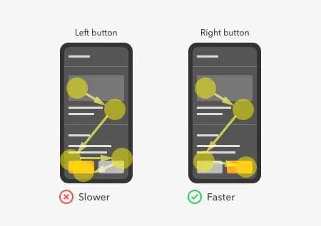
Once the CTAs are sorted out and value lays beneath each button, placing them is the next task. It is not easy. DON’T scatter the CTAs with no intention and make sure the CTAs are visible. If your team uses a heat map tool like FullStory, then figure out where visitors navigate the most and where they don’t bother hovering over.
If a heatmap tool is not at your disposal, then follow the rule of thumb tested by Unbounce: Always place the CTA buttons above your website’s copy, product, or idea you are attempting to sell.
2. High Website Readability
81% of online users skim the content they read online. I’m sure you form part of this group. This is why readability is a major component of a prominent UX strategy, although it may not seem like it matters. The font, font size, and consistency of the typography constitute a good website readability experience that will gauge readers to go from skim mode to all-out dissection of your content.
Choosing a font like Georgia, Arial, or Sans Serif will make your website pages simple and easy to read. While these are arguably the most common, you might dare to be different—using intricate cursive fonts is not the right way to be different.

Remember, website visitors love to skim. The trick here is to not make your content hard to read and making it consistent throughout. According to W3 Lab, creating a hierarchy will lead to high readability. For example, WordPress has an H2 headline size of 38px, H3 at 25px, and the body text at 18px.
This is an established hierarchy that promotes an obvious difference between each section. This hierarchy must use the same font and font sizes. The harder it is to comprehend, the easier it is to place your website into the UX pile of disasters.
3. Simple Web Forms
Nothing is more annoying than clicking on a subscribe button or a contact form and being asked 21 questions. This will kill your conversions.
People love simplicity and there is no way around it. But when you are offering a free resource like an ebook on lead conversion or a handbook for the best UX strategy practices, then asking for a little more information from the person doesn’t hurt.
Still, it is important to keep the form simple. Asking for a name, email, phone number, and company size is a fair trade for a free resource. For subscriptions, only an email should be required. It is important to note that the ask should always match the value you're providing to make both parties happy.
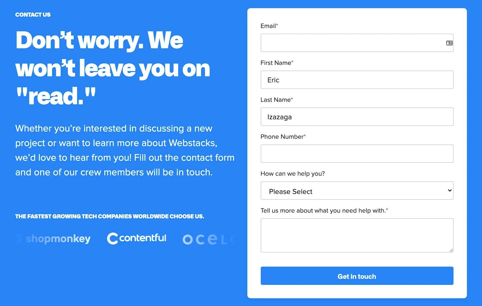
Contact forms should follow the same format as the first one we mentioned so that your Marketing and Sales teams have something to build off to achieve a point of contact.
Finally, great UX extends beyond the website itself. Send a ‘thank you’ note for every form that is submitted—this is the icing on the cake for this part of the UX strategy. Giving the user a holistic experience with your brand is the key to them coming back to your website over time.
4. Fast Website Speed
Nothing frustrates users more than having to wait for a page to load. Kissmetrics found that 40% of users bounce after waiting more than 3 seconds for a page to load. 47% of users expect a website to load in 2 seconds.
Users expect each page to load fast and for the browser to be very responsive, which is why website speed can prove to be a lead conversion killer.
Every human has accepted the fact that technology continues to make long strides to innovate what people decades ago would call only a figment of our imagination.
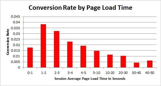
A slow website just doesn't cut it. Now imagine if your website was loading in the 1-2 second range. Cloudfare notes pages that load within that time frame experience a conversion rate greater than or equal to 1.9%.
There is a higher chance that leads will stay, possibly convert, and if they don’t, they’ll remember your website as responsive, maybe returning at a later date.
5. Engaging, Aesthetic Design
A website that is pleasing to the eye can be the determining factor for UX. This is because people form an impression in a mere 50 milliseconds and 75% of people form their judgment purely on aesthetics. While this tells you that visitors can be more attracted to the design of a website than the content displayed, both components must work in tandem.
There are two approaches that a website can take. The first approach is setting the copy of the website to be the most important component. The second approach is setting the design instead. Remember, first impressions are key.

The design will keep visitors from bouncing and instead keep them engaged. Yes, the design may not necessarily be the main source for conversion, but it is the component that makes everything look aesthetically pleasing.
The copy of a website is what will speak to your visitors. Let the content be the guide that shows visitors around your website by leading them to learn more about the value you're providing or fill out a form that leads them further down the funnel.
As we mentioned, they must work in tandem. An engaging, aesthetic design must be inviting and memorable, setting up your content to truly grip your visitors and never let them go.
Excellent User Experience is Sticky
These are 5 proven ways to help your website’s UX improve lead conversion. UX will always act as the first impression like when you first meet your partner's parents.
Like in real life, it's important not to leave a bad taste or else you will dig your website into a hole.

