10 Best Hospital Website Designs
Hospital website design isn't just a branding exercise — it's how patients decide where to get care.
Kyruus Health research backs this up: 71% of healthcare consumers research care options online, and over 80% visit two or more online resources before choosing a provider. What they find — or don't — shapes their next step. 61% say the availability of online scheduling is extremely or very important when selecting a new provider. And 48% of those who skipped or delayed care would switch to a provider that lets them book online.
In other words, your website is now part of the care experience. If it's slow, confusing, or outdated, patients move on.
At Webstacks, we work with healthcare orgs to design websites that are fast, accessible, and built to scale — so we know what separates a high-performing hospital site from one that's costing you patients.
Here are 10 hospital websites that get design right, and what you can learn from each.
Webstacks is the design and development agency partner for modern teams ready to scale.

10 Best Hospital Website Designs
If you're building a new site or fixing an old one, these examples can help you see what's possible.
1. Presbyterian Healthcare Services
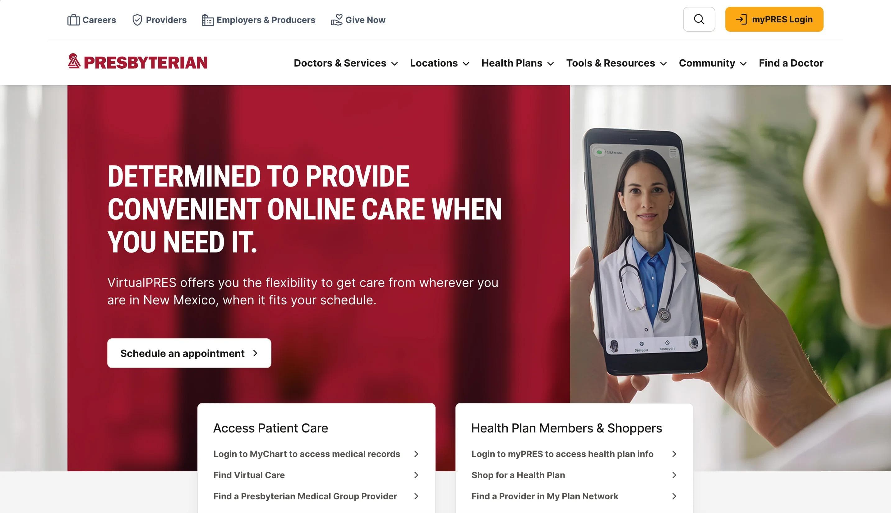
Presbyterian Healthcare Services (PHS) serves as a digital hub for one of New Mexico's largest healthcare systems. The homepage greets visitors with clear messaging, inclusive imagery, and a modern layout that speaks to the organization's mission of providing accessible, community-driven care. Strong typography, structured navigation, and audience-specific pathways make it easy for users to take action—whether that's finding care, managing their health plan, or locating nearby services.
Standout Elements:
- 🔧 Component-based UI built with Storybook – Every page element is documented, reusable, and editable in isolation, helping PHS manage content at scale and onboard new team members quickly.
- 📍 Audience-specific navigation – Clear pathways for patients, providers, employers, and community members streamline discovery and reduce friction.
- ⚡ High-performance frontend – With static site generation via Next.js and hosting on Vercel, PHS benefits from faster load times, better SEO, and improved reliability across devices.
2. Mayo Clinic
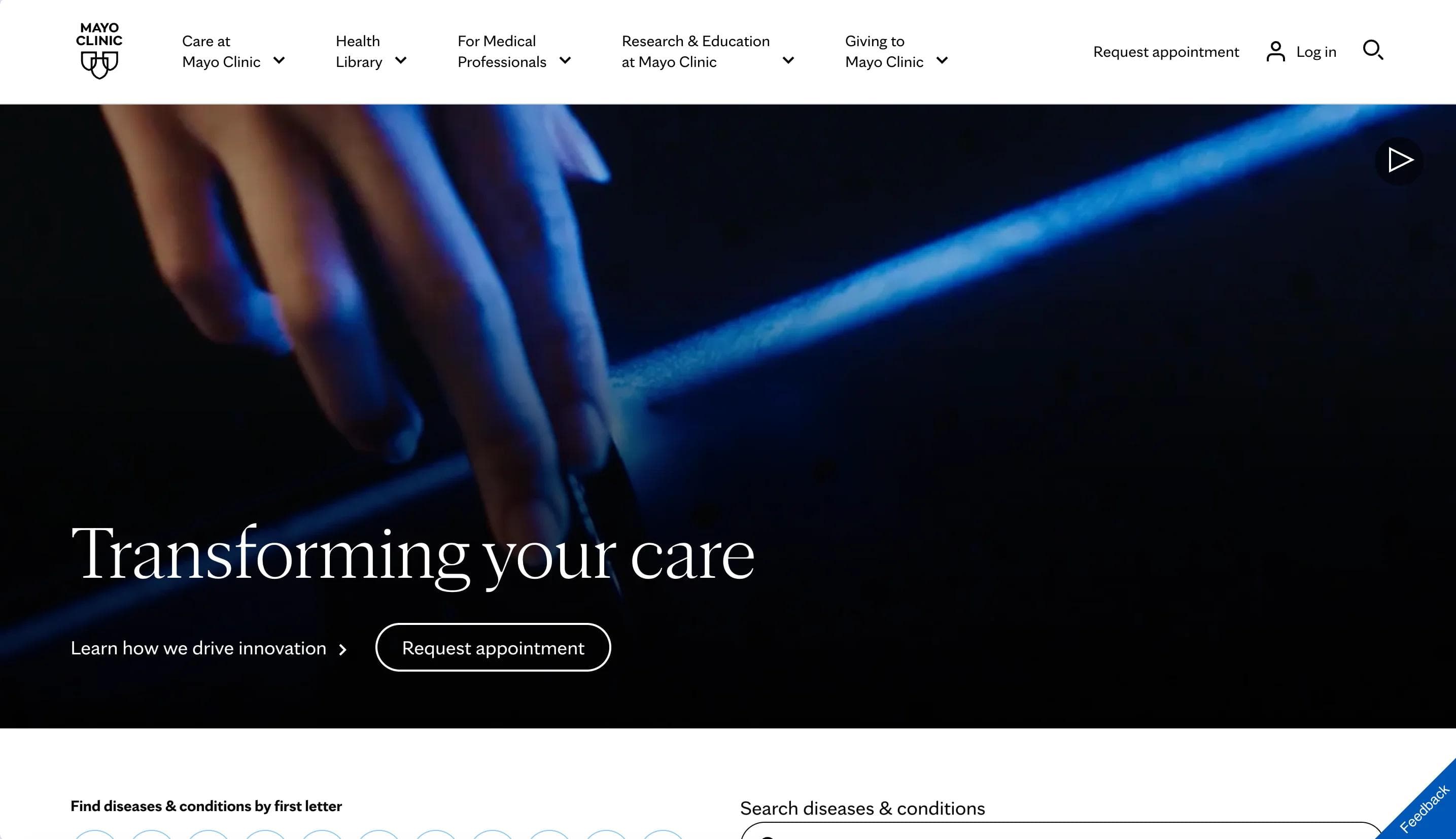
Mayo Clinic's homepage is clean, focused, and easy to navigate. The design uses a simple white background, subtle typography, and plenty of spacing to create a calm, professional feel. The hero section prominently features the headlines "Transforming your care" and "The world's best hospital," reinforcing the brand's clinical authority, global reputation, and focus on innovation.
Content is broken into scrollable sections for conditions, patient stories, and services. Each section is easy to scan and works well on mobile. Photos of real patients and providers support the human side of the brand without overdoing it.
Navigation is clear and designed for multiple audiences, including patients, providers, and researchers. Despite the site's size, it feels organized and approachable from the start.
Standout Elements:
- 🌐 Location previews with thumbnails – Clickable images and city labels highlight Mayo Clinic's locations across the U.S. and internationally, spanning Arizona, Florida, Minnesota, and the broader Health System network.
- 🧭 Expandable mega footer – The footer is organized and easy to scan, with collapsible sections for business partners, students, and international visitors. It's built to support a wide range of user needs.
- 🎯 CTA pairing in the hero: Two clear, accessible CTAs ("Learn how we drive innovation" and "Request Appointment") give users immediate options based on their intent.
3. Cleveland Clinic
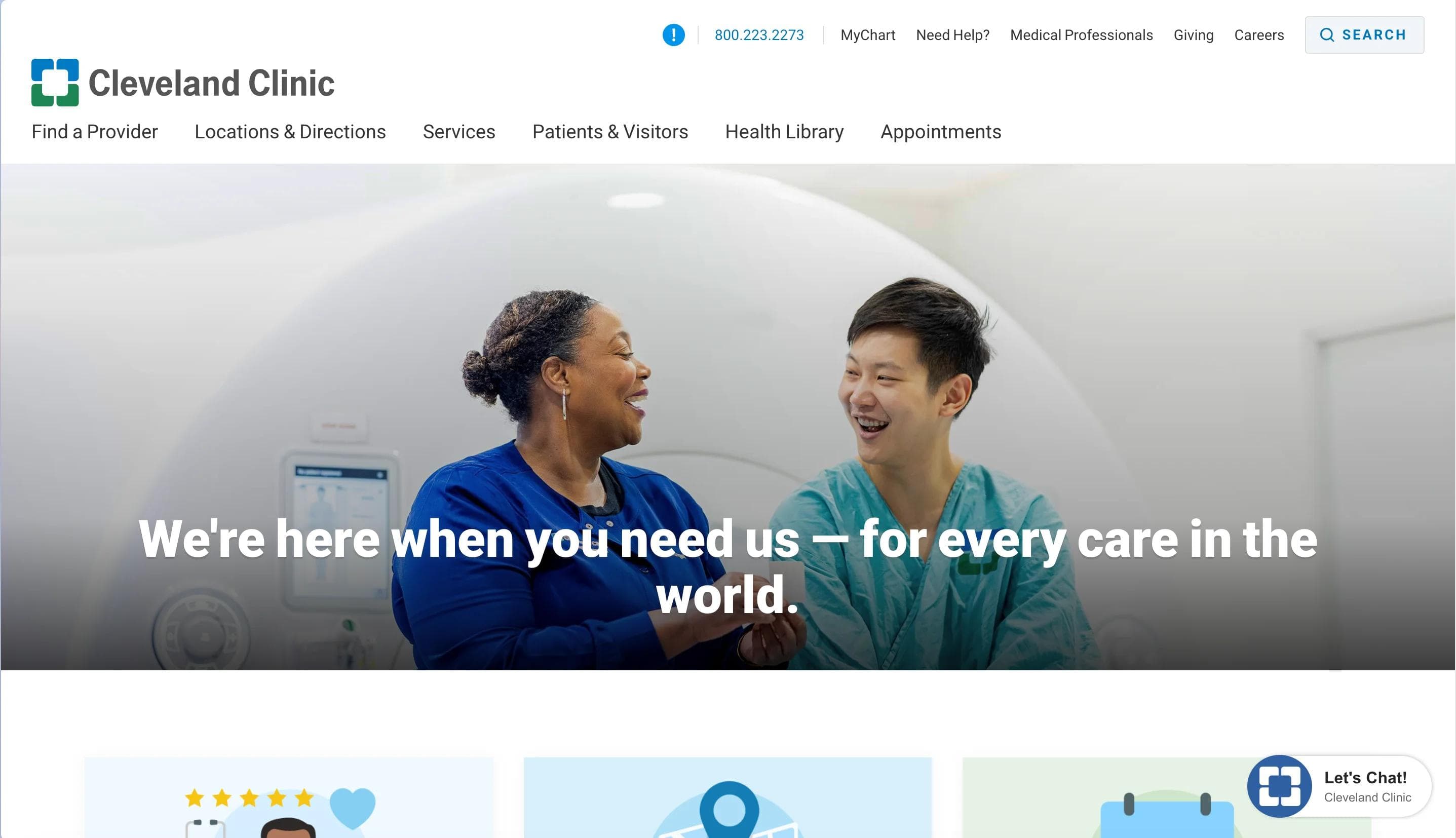
Cleveland Clinic's homepage layout is clean and easy to follow, with high-contrast design, plenty of white space, and calm blue tones that reinforce the brand's clinical identity.
A full-width hero image shows a patient and caregiver, paired with the headline "We're here when you need us — for every care in the world," which speaks to their mission of accessible, inclusive care.
Key actions like finding a doctor, scheduling an appointment, and accessing the health library are placed at the top of the page with clear icons and labels. Below, content blocks guide users to services, wellness resources, and FAQs without overwhelming the experience.
The design uses bold headers, consistent icons, and a simple grid to keep navigation intuitive. Patients can quickly scan and act, which is especially helpful in urgent situations. Space for providers and professionals appears lower on the page, keeping the focus on patients while still serving broader audiences.
Standout Elements:
- 🧑⚕️ Doctor and location discovery cards – Three large tiles at the top of the homepage help users quickly find a doctor, get directions, or schedule an appointment. These shortcuts remove friction and get people to what they need faster.
- 📖 Modular health library hub – The health library is broken into clear sections—conditions, treatments, testing—making complex topics easier to browse and understand.
- 🌐 Geographic coverage carousel – A scrollable module highlights Cleveland Clinic's 300+ locations across the U.S. and internationally. It visually reinforces the scale of their network and makes it easy to explore care options by region.
- 📞 Persistent dual contact anchors – Contact numbers for appointments and general support stay fixed in the footer, giving users quick access to help no matter where they are on the site.
4. Mount Sinai
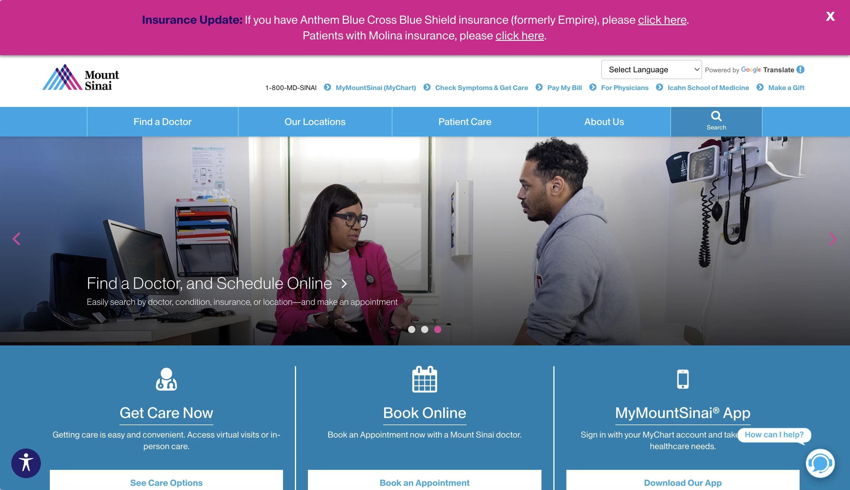
Mount Sinai's homepage is bold and focused, with strong colors, clear messaging, and real photos of staff and physicians that build credibility from the start.
A rotating hero banner features seasonal initiatives like Nurses Month, keeping the content current and tied to the organization's voice.
Core actions—like scheduling an appointment, downloading the mobile app, or calling for help—are available immediately in the top-level navigation. The design combines clean UI elements with people-focused photography to strike a balance between professional and approachable.
The page layout is varied but purposeful. Wide section breaks guide users down the page, while mid-page modules highlight services and surface helpful content like patient stories, news updates, and educational programs.
Standout Elements:
- 🔎 Streamlined doctor search – Right below the hero banner, users can search for doctors by specialty, insurance, and location.
- 🏙️ Urban identity through visuals – Photos of New York landmarks, like the Brooklyn Bridge, immediately connect the healthcare brand to its local roots.
- 📰 In-line research news slider – A mid-page carousel displays recent research updates and press coverage in a clean format. It keeps users informed about innovation without pulling them away from the core experience.
5. Ronald Reagan UCLA Medical Center
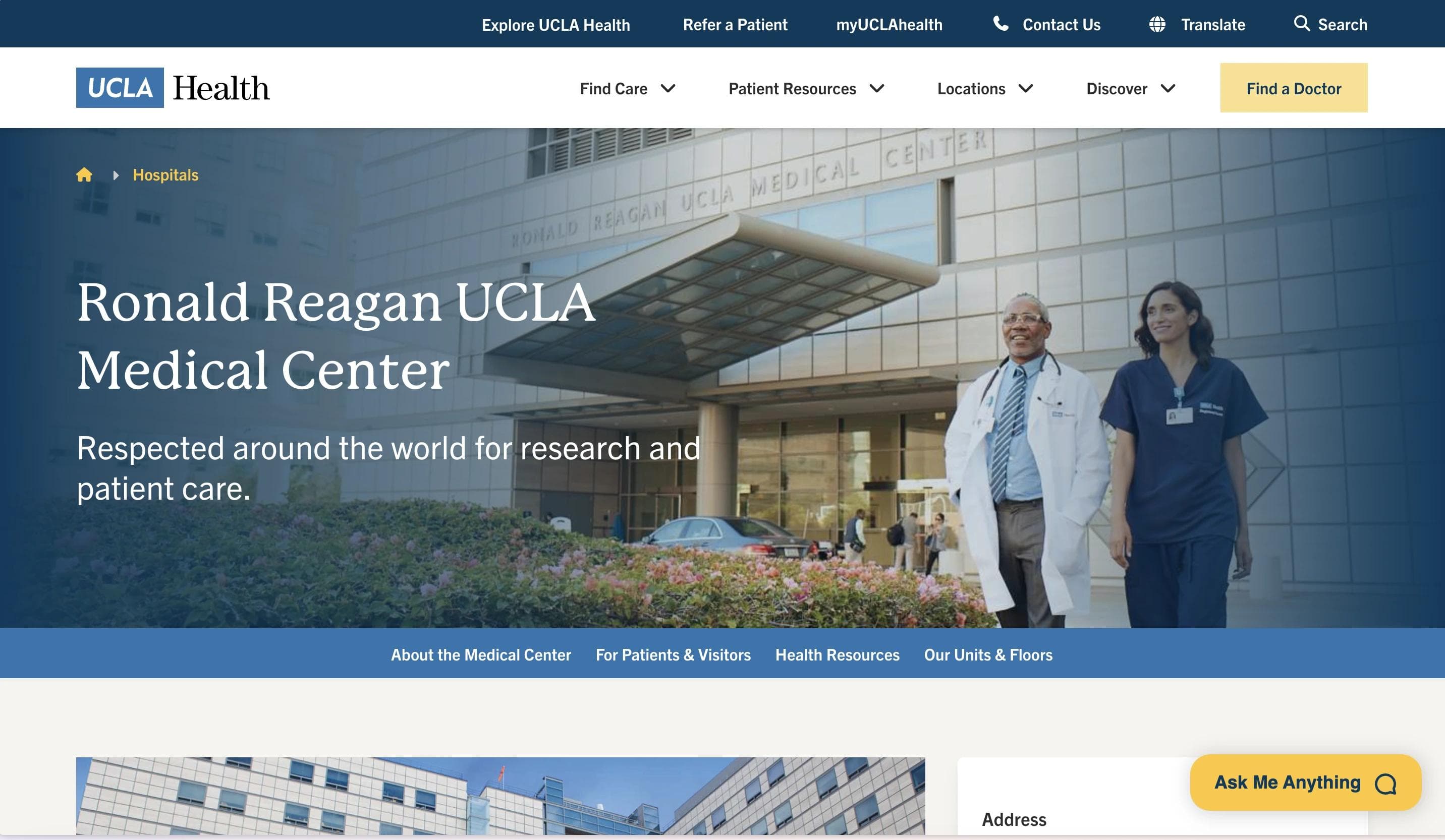
The Ronald Reagan UCLA Medical Center homepage reflects the precision and authority of a top academic hospital.
The design uses a neutral palette, simple layouts, and clear messaging to keep the focus on information.
Content is organized in clear vertical sections, starting with institutional messaging and moving into patient services, visitor information, and educational resources. Each block is well spaced, with clean visuals and minimal distraction, making it easy for users to scan and take action.
The site is designed to guide without overwhelming, helping both patients and visitors find what they need quickly.
Standout Elements:
- 🗺️ Map and parking directions tool – An interactive tool provides clear guidance on valet and self-parking options, along with a labeled campus map to help patients and visitors navigate with less stress.
- 🧭 Virtual tour access panel – A mid-page card links to a virtual tour of the medical center, giving users a chance to explore the space in advance and get familiar with the environment before arriving.
6. Houston Methodist Hospital Homepage
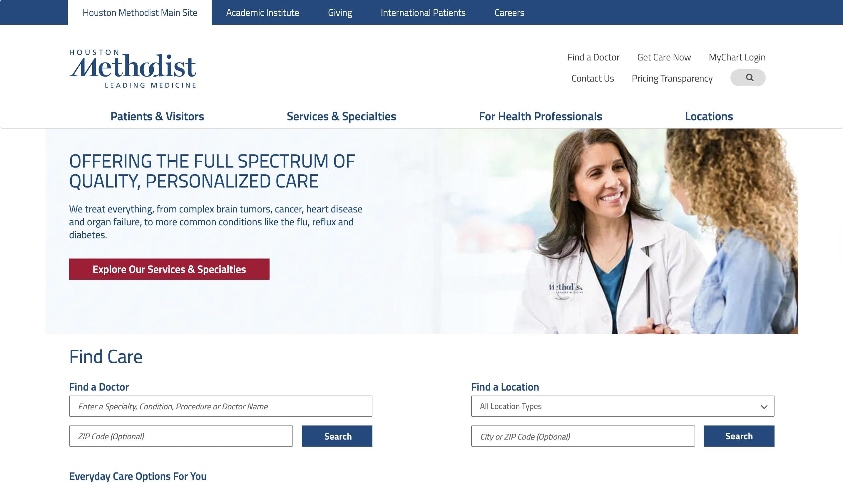
Houston Methodist's homepage is designed to feel both authoritative and approachable. It opens with a rotating banner featuring physicians and lab environments, clearly positioning the organization as a leader in both care and research.
The design is clean, with a white and navy color scheme that reflects clinical precision. A prominent search tool at the top makes it easy for users to find care or nearby locations.
Below, clear section breaks guide visitors through practical services, research updates, and community programs.
The layout uses horizontal content blocks to separate topics like service lines, clinical trials, news, and outreach efforts.
Standout Elements:
- 🧭 Interactive value tabs – A 4-tab framework presents key themes like "Leading Care Everywhere" and "Personalized Care" alongside "Full Spectrum of Services" and "Get Quality Care Now" in a simple, clickable format.
- 📌 Service icon grid – Just below the main search bar, a horizontal row of icons highlights key services.
- 📱 Mobile app integration – A dedicated homepage section promotes the MyMethodist App with App Store and Google Play CTAs, positioning the app as a central tool for managing healthcare needs.
We Build Websites for the Future of Healthcare
Webstacks is the design and development agency partner for modern teams ready to scale.
7. Johns Hopkins Hospital
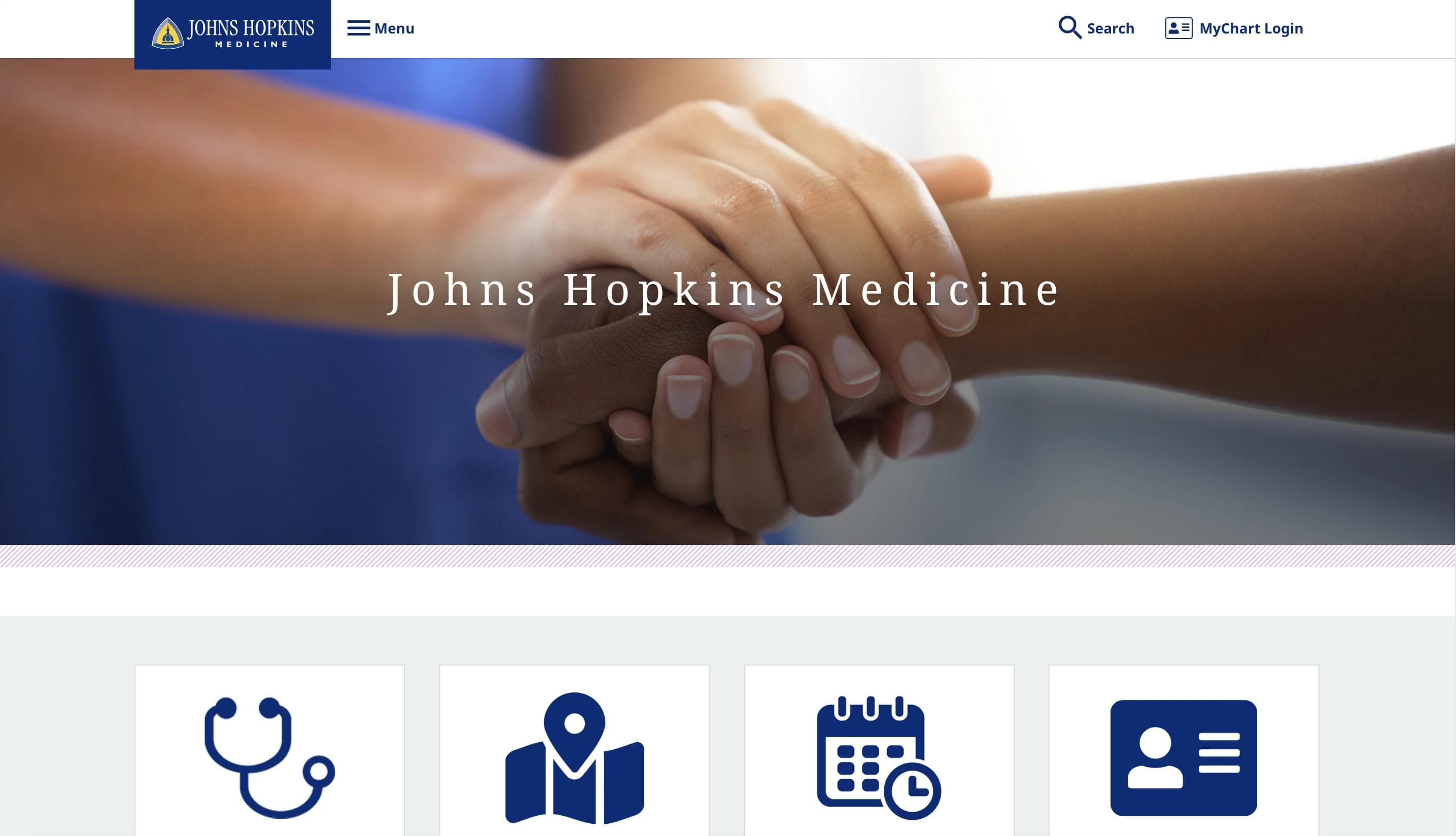
The Johns Hopkins Hospital homepage reflects its academic roots and global reputation. The design is clean and low-friction, using white space and a muted palette of blues and purples to create a calm, professional tone.
A static hero image of the hospital's main building anchors the page, paired with the tagline "World-Class Care. Close to Home," which reinforces its dual focus on international leadership and local access.
The layout is structured and easy to follow. Core services come first, followed by highlights on research, rankings, and medical education. Classic fonts and centered headlines add to the academic feel, aligning with Johns Hopkins' identity as a teaching hospital and research leader.
Content carousels surface updates on research and student initiatives without cluttering the experience.
Standout Elements:
- 🧭 Compact resource tile section – Just below the hero image, four tiles give users quick access to key areas. Each one is clearly labeled and designed to guide different types of visitors without confusion.
- 🧬 Rotating research impact carousel – The "Research Saves Lives" section highlights real research stories. Patient outcomes are paired with the investigators behind them, reinforcing the link between innovation and care.
- 🏅 Top rankings showcase strip – A horizontal strip near the bottom of the page features badge-style visuals that highlight Johns Hopkins' national rankings across specialties.
8. Massachusetts General Hospital
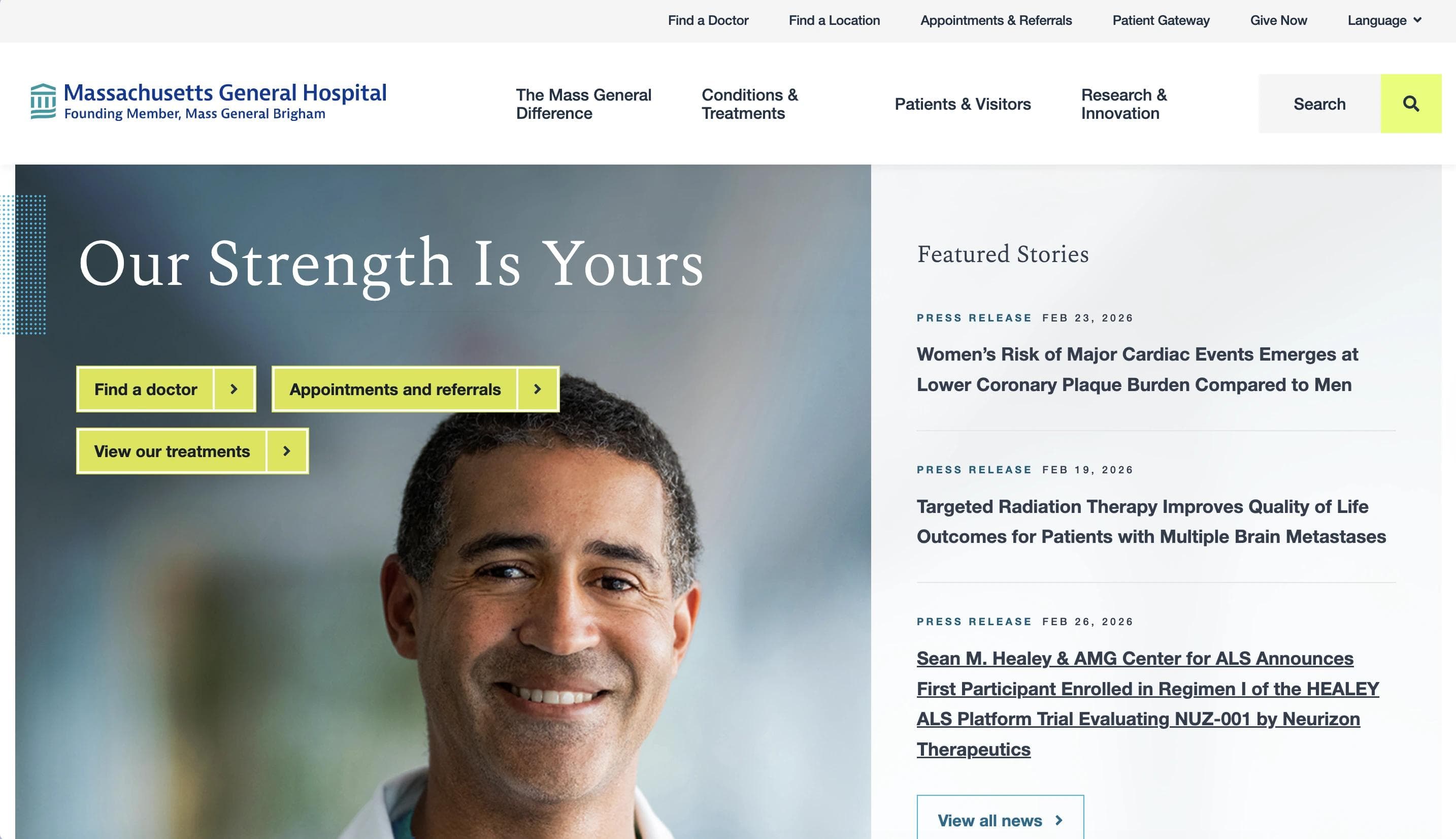
Massachusetts General Hospital's homepage focuses on trust, care, and credibility. The design is minimal, using soft gradients, clean lines, and generous spacing to create a calm and structured experience.
Key actions like "Find a Doctor" and "Make an Appointment" are placed at the top of the page, easy to find without scrolling.
From there, the layout flows into patient stories, research updates, and community programs, each section clearly defined and easy to navigate. Photography highlights real people paired with editorial content that reinforces the hospital's leadership in care and public health.
The overall structure reflects Mass General's dual identity as both a top-ranked hospital and a research institution affiliated with Harvard Medical School.
Standout Elements:
- 🟡 Bold CTAs – Bright yellow buttons next to the hero image guide users to critical actions like booking appointments or searching for a provider.
- 📰 Press highlights – A sidebar displays the latest news and achievements, keeping press content visible without distracting from patient-focused sections.
- 🧠 Dedicated health education modules – Educational content, such as how to recognize stroke symptoms, is featured in styled blocks with clear visuals and copy.
9. Boston Children's Hospital
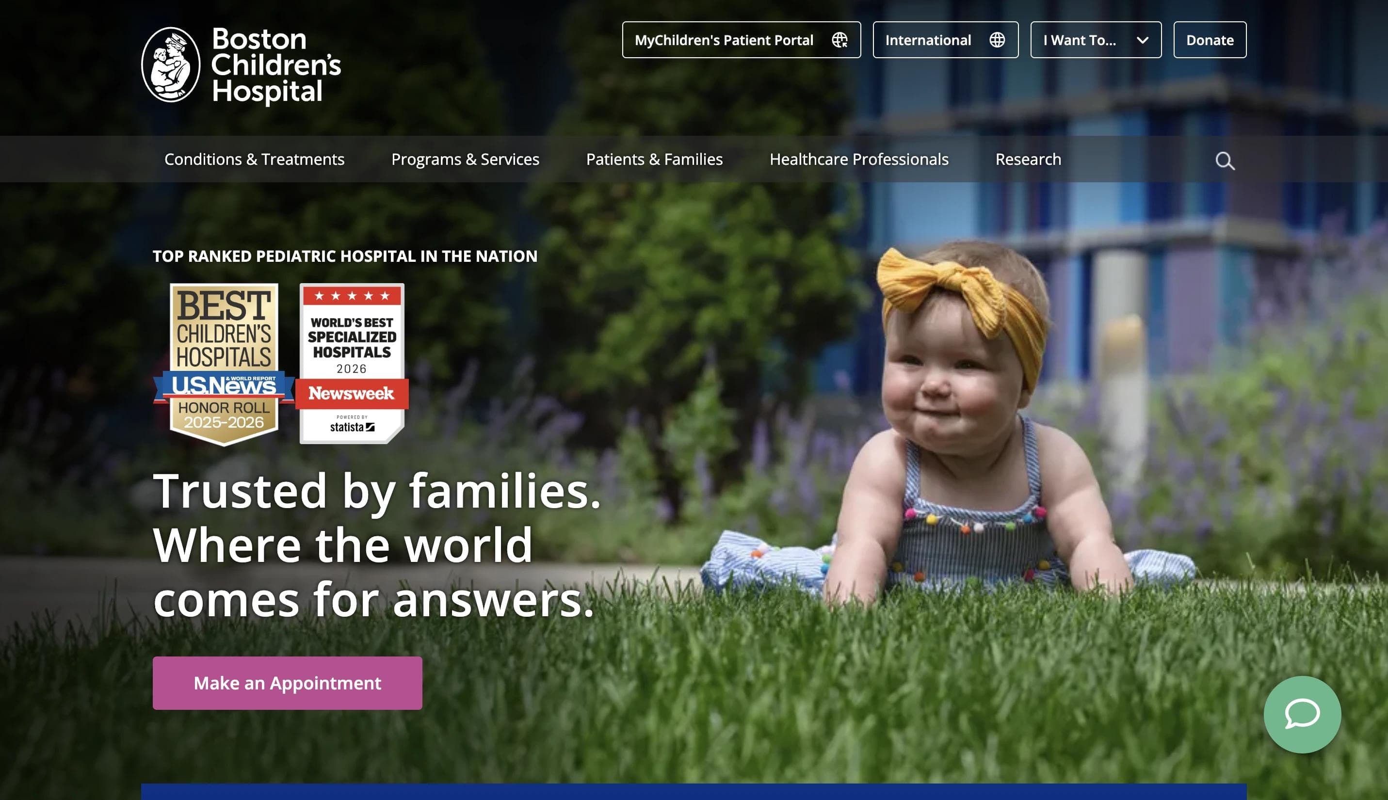
Boston Children's Hospital's homepage uses a friendly, patient-centered design to connect with families from the first click.
The homepage opens with a warm hero section featuring real staff and child patients to build trust and highlight care in action.
Navigation is straightforward. High-contrast buttons for booking appointments and finding a doctor are placed front and center. As users scroll, they find nurse profiles, a dedicated Spanish-language resource section, and a fundraising panel driven by real patient stories. Spanish-language content and donation prompts are also included without disrupting the flow.
The design relies on real images, clear headlines, and short content blocks—ideal for busy parents trying to find care quickly.
Standout Elements:
- 👩⚕️ Thematic nurse profiles section – A structured content block highlights nurse leaders and innovators, each paired with a call to action.
- 🌐 Dedicated Spanish-language resource module – A dedicated section for Spanish-speaking families includes translated content, a welcome video, and culturally relevant navigation tools to guide them through the site.
- 💖 Emotionally-driven giving panel – The fundraising section uses real patient stories and focused messaging to show how donations support areas like chronic care and family services.
10. Barlow Respiratory Hospital
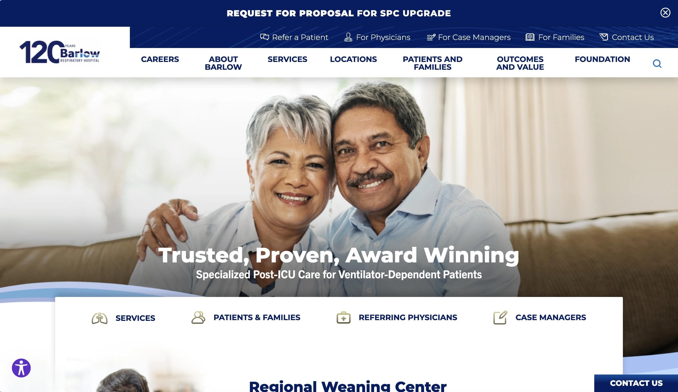
Barlow Respiratory Hospital's homepage highlights its focus on ventilator weaning and post-ICU care through a clean, no-frills design. A hero image of a smiling couple sets a tone of compassionate, outcome-driven care.
Navigation is straightforward, with high-contrast buttons for booking appointments and finding a doctor placed front and center.
The layout is linear and content-first. Section headings guide visitors through the hospital's specialty focus, including complex conditions like traumatic brain injuries and medically fragile patients. Messaging centers on results, recovery, and leadership in long-term acute care.
The design sticks to a consistent blue and white palette, with real patient stories and clear explanations of services.
Standout Elements:
- 🌬️ Post-ICU service strip with hover effects – A row of service tiles highlights Barlow's focus areas using smooth hover effects to reveal details and encourage deeper exploration.
- 📈 Ventilator weaning – A focused content block shares Barlow's nationally recognized weaning success rate, helping differentiate the hospital with real, measurable outcomes.
- 🏗️ "Rebuild Barlow" campaign section – This section outlines the hospital's capital improvement initiative, showing long-term investment in facilities and a commitment to future-ready respiratory care.
Rethink Your Hospital Website as a Strategic Growth Tool
A hospital website is where patients make decisions, providers connect, and your brand builds credibility. The hospitals in this article show what strong digital experiences look like: clear, fast, accessible, and built around real user needs.
The data reinforces this. According to ONC research, 65% of individuals accessed their online medical records or patient portal, and 77% of patients read reviews before choosing a provider. Patients are doing more research online, on more devices, with higher expectations than ever before.
If your site feels outdated or hard to manage, it's a barrier to growth. A modern hospital website should reflect how people actually seek care today. It should be mobile-ready, easy to navigate, and built to evolve as your organization grows. Accessibility matters too—the DOJ's 2024 ADA Title II final rule now specifies WCAG 2.1 Level AA as the binding standard for government entities, with compliance deadlines in 2026–2027. For private hospitals, WCAG 2.1 Level AA is widely adopted as the industry benchmark.
At Webstacks, we help hospitals and MedTechs build websites that support patients, simplify workflows, and give marketing teams the tools to move faster. Schedule a strategy call with Webstacks to uncover conversion roadblocks, explore high-impact improvements, and see how our team can help you accelerate growth.
Your website is your biggest growth lever—are you getting the most out of it? Schedule a strategy call with Webstacks to uncover conversion roadblocks, explore high-impact improvements, and see how our team can help you accelerate growth.

I lead growth at Webstacks, connecting strategy, design, and engineering to build websites that drive results. I specialize in website strategy, CMS implementation, and helping B2B teams scale their web presence.