18 Best Healthcare Website Design Examples (2026)
Today, a significant majority of healthcare interactions start online, whether it's patients researching conditions or evaluating providers before booking an appointment. Roughly 77% of patients search online before booking care, and the bar for what a healthcare website needs to do has risen sharply. According to Zocdoc's 2025 What Patients Want Report, 1 in 3 Americans now uses tools like ChatGPT for healthcare advice weekly, meaning your website is no longer competing only with other provider sites. It's competing with AI.
That makes strong healthcare website design more important than ever. Providers need to invest in a well-designed healthcare website to attract patients, build trust, and stay visible in an increasingly AI-mediated search environment.
Key Takeaways:
- The majority of patients rely on online search before making healthcare decisions.
- Well-crafted healthcare websites convey trust, credibility, and professionalism.
- Mobile-friendly design and user-focused features shape how patients view providers.
- Data security and HIPAA compliance are crucial for establishing patient confidence.
- AI-native features, telehealth integration, and hybrid care pathways are now standard expectations.
In this blog, we review healthcare website design inspiration from the best healthcare websites. We encourage you to learn from the best and take your findings back to your marketing and design teams.
Why Healthcare Needs Modern Web Design
As a healthcare provider or medtech company, your website could be the last of your priorities. But if it's outdated, it's actively hurting your business. Modern healthcare organizations can't afford a static digital presence. Here's what's driving the shift.
- Improving Patient Access to Services: Modern healthcare website design with intuitive navigation, mobile responsiveness, and easy appointment scheduling allows patients to find information and book appointments without friction.
- Meeting AI-Era Discovery Expectations: Healthcare reports indicate that AI‑enabled tools (from symptom checkers to intelligent search and virtual assistants) are becoming a routine part of how patients research conditions and compare providers, complementing traditional referrals rather than replacing them. Websites that aren’t structured for clear, machine‑readable summaries risk being de‑prioritized or omitted when these AI systems surface options for patients.
- Enhancing Communication and Support: UX features like secure messaging, telehealth platforms, and chatbots offer support and accessibility. Educational resources, FAQs, and interactive tools empower patients to make informed decisions.
- Increasing Patient Engagement and Loyalty: 65% of patients say they would switch providers to get better digital features, including online scheduling, digital records access, and streamlined communication. Features like patient portals and personalized health content drive the engagement that retains them.
Healthcare Web Design Best Practices
What should you pay attention to when designing your healthcare website? Here are the best practices to follow:
Mobile Optimization for On-the-Go Access
Over 50% of users access health information from smartphones. Implementing mobile optimization, including touch-friendly interfaces, concise content, and fast-loading pages, improves satisfaction. Easy access to schedules, contact details, and services on mobile is no longer optional.
Clear and Intuitive Navigation
Organize content into clear categories so users can find services easily and include a search function with breadcrumb navigation. The homepage should highlight critical features like appointment booking, provider directories, and patient portals. An intuitive navigation menu reduces bounce and encourages exploration.
Accessible Design for All Users
Healthcare websites must be usable by people of all abilities. Accessibility laws are tightening under WCAG 3.0. Include alt text for images, support keyboard navigation, and use high-contrast colors. Use legible fonts and clear headings that work with screen readers.
HIPAA-Compliant Security Features
Implementing strong encryption, secure authentication for portals, and conducting regular security audits are essential. Any third-party services integrated into your site, including web trackers, must also be HIPAA compliant.
AI-Optimized Content Structure
In 2026, your content needs to serve both human readers and AI systems. Structure pages with clear headings, factual answer-first paragraphs, and FAQ sections. The patient journey often begins on search engines or LLMs, so pages that aren't organized for retrieval and summarization are losing visibility before they're ever found.
Key Elements of Healthcare Website UX
Good healthcare web design UX makes it easy for patients to find information and book an appointment. Pay attention to these elements:
Seamless Appointment Scheduling
An intuitive booking system should display real-time availability, allow bookings by provider or service, and send confirmations and reminders. Add options for rescheduling and cancellations to reduce friction. Support for in-person and virtual visits caters to the hybrid care models patients now expect.
Comprehensive Patient Portals
A patient portal engages patients in managing their health. It should offer secure access to medical records, test results, prescription refills, and communication with healthcare teams. Features like online bill payment and health tracking tools make patients' lives easier and increase retention.
Interactive Tools and Feedback Mechanisms
Features like symptom checkers, appointment pre-registration, and insurance verification reduce administrative burden on staff while improving user experience. Chatbots can handle common queries. Include feedback forms and surveys to gather insights and identify areas to improve.
See what’s working for industry-leading websites and find inspiration to improve yours.

Healthcare Website Design Examples
These examples showcase excellence in healthcare website design, improving the patient experience and clearly communicating medical information.
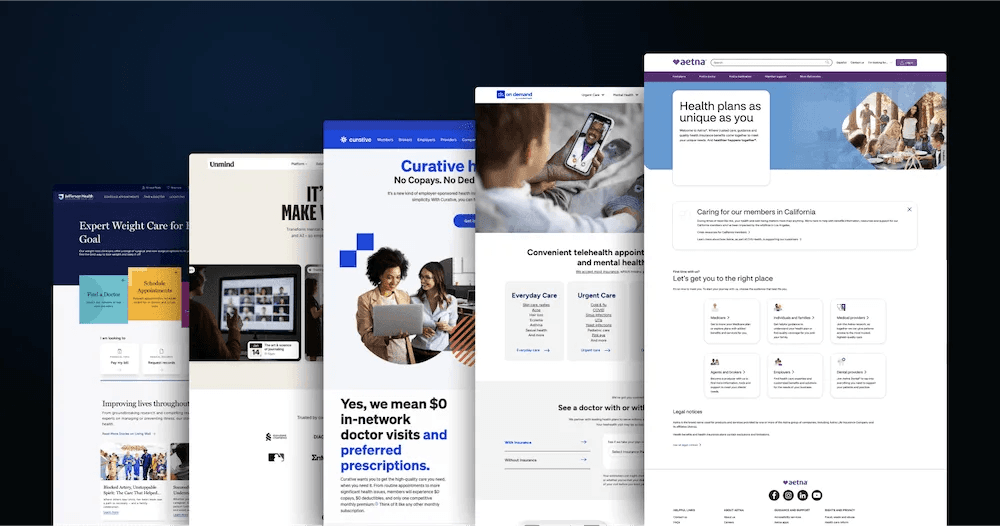
1. Aetna

Aetna's homepage reflects a professional, user-centric design with a white background accented by blue and purple elements that evoke trust and health. The layout features dynamic banners highlighting individual, family, and employer health plans. Prominent CTAs like "Find Plans" and "Find a Doctor" guide users toward their services, including dental, vision, and Medicare options. Structured sections and an intuitive menu ensure easy navigation across different plans and resources.
Why Aetna's healthcare website design stands out:
- Readable Typography: Bold headers and clean text make information accessible.
- Dynamic Banners: Clear section banners showcasing key offerings and services.
- Simplistic Design: White background with a minimal structure reduces cognitive load.
- Feedback Feature: An embedded feedback form invites user input at any point in the visit.
2. Maven Clinic

Maven Clinic is the largest virtual clinic for women's and family health, providing comprehensive care across fertility, pregnancy, postpartum, parenting, and menopause. Maven's all-in-one platform connects patients with over 1,400 specialists across 20+ areas of expertise. The website reflects this depth without overwhelming users. A calming green palette, original brand-aligned photography, and clean modular sections communicate both warmth and clinical credibility.
Why Maven Clinic's healthcare website design stands out:
- Strategic Color Psychology: The calming green palette is intentionally chosen to evoke trust, health, and well-being.
- Original Photography: Every image avoids generic stock photos, creating authentic visual storytelling.
- Clear Value Communication: The homepage immediately communicates Maven's virtual-first model and accessible pricing.
- Custom Onboarding: Interactive pathways guide employers and members to the right programs.
3. athenahealth

athenahealth sets expectations immediately with clinical imagery and a direct headline that positions AI-native tools as a way to reduce administrative burden and keep clinicians focused on patient care. The header makes intent unmistakable by placing a patient login and the athenaOne login front and center, reinforcing access to records and ongoing care. As visitors scroll, the page organizes EHR, billing, and patient engagement into clearly defined modules. Clean navigation with only a handful of primary links keeps the experience from overwhelming a busy clinical audience.
Why athenahealth's healthcare website design stands out:
- Minimal Navigation: A streamlined menu with primary links and separate login portals eliminates cognitive overload.
- AI-Forward Messaging: Product storytelling is grounded in concrete workflow efficiency gains.
- Module-Based Layout: EHR, revenue cycle, and patient engagement sections are clearly separated for fast scanning.
- Motion Design: Purposeful animation illustrates value proposition without distraction.
4. Zocdoc

Zocdoc features a clean, user-centric design with a white background and yellow highlights reflecting accessibility and healthcare innovation. The layout emphasizes finding doctors easily, with a prominent search bar and conversion-focused CTAs. Dynamic visuals and patient reviews foster trust, and a clear filtering system makes the booking process fast. Zocdoc's 2026 campaign "You've Got Options" reinforces insurance clarity and access as the brand's core promise.
Why Zocdoc's healthcare website stands out:
- Search-Centric Design: A bold search bar for providers simplifies access to care.
- Interactive Filters: Sorting options for specialties, availability, and insurance ensure efficiency.
- Mobile App Support: QR code makes it easy for visitors to download the mobile app.
- Insurance-First UX: In-network filtering is prominently surfaced as patient cost concerns have grown.
5. Curative

Curative utilizes a clean, engaging design with a white background and blue and red accents, emphasizing transparency and innovation. The site highlights its $0 copay, deductible-free health plans with prominent CTAs like "Get in Touch." The layout is modular, with clear sections explaining their Baseline Visit, pharmacy benefits, and provider network. High-quality visuals reinforce the company's commitment to affordability and care engagement.
Why Curative's web design stands out:
- Concise Content Blocks: Short, focused text explains services clearly.
- Dedicated Contact Form: Easy-to-find form for anyone wanting to engage.
- Transparent Design: Pricing information and FAQs are easy to locate, building user confidence.
6. Hims & Hers

Hims & Hers pioneered consumer-friendly healthcare design and continues to set a high bar. The brand blends clinical access with e-commerce UX, built around a core belief that health access should feel approachable, not clinical. Their motion system, built around the concept of "Access For All," uses expanding shapes, guided transitions, and diverse visual elements to reduce barriers and communicate trust. Bold CTAs, negative space, and a high-contrast monochromatic palette create a brand that feels modern, discreet, and direct.
Why Hims & Hers' healthcare website design stands out:
- Motion-Led Storytelling: A full motion system carries brand values through every scroll.
- Frictionless Checkout: Cart slides in without changing pages, maintaining UX continuity.
- Minimalist Palette: Deep charcoal and white create a clean, trustworthy aesthetic.
- Destigmatizing Tone: Copy and design work together to normalize health conversations.
7. Unmind

The Unmind homepage showcases a professional yet approachable design with a white background and subtle off-white and black sections, emphasizing mental health and innovation. Bold CTAs like "Request a Demo" guide users toward exploring their science-backed workplace mental health solutions. Dynamic sections outline services such as therapy, coaching, and wellbeing tools, with visual data points highlighting the business benefits of investing in employee mental health.
Why Unmind's web design stands out:
- Clear Data Visualizations: Stats on employee mental health and ROI add credibility.
- Modular Layout: Sections tailored for individuals, leaders, and organizations make navigation clear.
- Real-World Testimonials: Case studies, results, and VP quotes build trust in the platform.
8. Jefferson Health

Jefferson Health's homepage features an accessible design with an intriguing color palette conveying trust and professionalism. Key CTAs such as "Find a Doctor" and "Schedule Appointments" are displayed in captivating floating banners, making navigation straightforward for users seeking care. Organized sections provide resources for billing, medical records, and symptom checkers. The site also emphasizes community health initiatives through patient stories and articles.
Why Jefferson Health's web design stands out:
- Dynamic Storytelling: Patient stories and expert advice create an emotional connection.
- Professional Color Palette: Calming tones and white accents create a clean aesthetic.
- Comprehensive Resources: Integrated tools for symptom checkers, urgent care, and billing streamline the user journey.
9. Providence

Providence employs a professional, accessible design with a white background and blue accents reflecting trust and care. The layout is focused on usability, with key CTAs "Find a Doctor" and "Schedule a Screening" prominently displayed. Dynamic sections offer clear pathways to virtual care, clinic locations, and care navigation. The site emphasizes mission and values through content about community outreach and health equity initiatives.
Why Providence's web design stands out:
- Segmented Navigation: Organized categories for services and locations simplify the user journey.
- Color Consistency: Blue accents highlight features and enhance readability.
- Expert Content: An active blog keeps the homepage fresh with seasonal and relevant health topics.
See what’s working for industry-leading websites and find inspiration to improve yours.
10. Oscar Health

Oscar Health's homepage is sleek and user-focused, with a white background and bold blue and orange accents drawing attention to CTAs like "Explore our plans" and "Activate member account." The site features a simple layout with dynamic visuals highlighting benefits like $0 virtual care, low-cost prescriptions, and Care Teams. Interactive provider searches minimize friction. A 2026 update has placed even greater emphasis on insurance plan clarity and cost transparency as patient cost-sensitivity has grown.
Why Oscar's web design stands out:
- "Reasons to Love" Section: Clear benefit callouts like "Saving with $3 meds" encourage immediate interest.
- Explanation-First Design: A dedicated carousel section gives visitors context about the company and model before asking for conversion.
- Dynamic Visuals: Scrolling animations and service highlights maintain engagement without clutter.
11. American Diabetes Association

The American Diabetes Association homepage uses an informative and engaging design with a white background and bold red accents, emphasizing urgency and advocacy. The layout highlights donation options, educational resources, and community programs with CTAs like "Donate Now" and "Take the Risk Test." Dynamic banners showcase upcoming events, research highlights, and tools for diabetes management.
Why ADA's web design stands out:
- Structured Information Layout: Resources are segmented into manageable blocks for easy navigation.
- Dynamic Banners: Rotating visuals spotlight events and key programs.
- Red Accents: Vibrant red draws attention to CTAs and critical information.
- Community Integration: Stories, advocacy tools, and donation options foster engagement.
12. One Medical

One Medical combines a clean, modern design with a white background and subtle green accents emphasizing innovation in healthcare. Prominent CTAs like "Get Started" and "Join Now" guide users toward membership and primary care services. The layout highlights key benefits like same-day appointments, virtual care, and integrated labs. One Medical highlights its membership-based care model in a user-friendly way, supported by bold icons and short content blocks.
Why One Medical's web design stands out:
- Integrated Member Features: Tools to manage health records, book appointments, and chat with providers create a smooth experience.
- Simple Color Palette: Blue and green accents emphasize trust without overwhelming.
- Transparent Costs: Clear membership pricing communicates value and reduces pre-conversion hesitation.
13. Parsley Health

Parsley Health's homepage highlights a sophisticated wellness-oriented design with a pastel-colored background and green accents, emphasizing health and sustainability. Key CTAs like "Schedule a Call" and "Learn About Membership" guide users toward their functional medicine services. The modular layout highlights their root-cause healthcare approach, with sections on conditions treated, health plans, and testimonials. Dynamic features, such as customer stories and visual steps for personalized care, make the experience engaging and transparent.
Why Parsley Health's web design stands out:
- Step-by-Step Layout: Visualized processes for care planning add clarity.
- Prominent Testimonials: Patient quotes with specific health outcomes add authenticity.
- Dynamic Pricing Sections: Transparent pricing tables and plan comparisons build trust.
14. American Cancer Society
The American Cancer Society's homepage combines informative and community-focused design with a white background, bold blue and red highlights evoking urgency and compassion. Key CTAs "Donate" and "Get Screened" guide users to take actionable steps. The modular layout includes rotating banners for events, research, and health programs, with sections on cancer types, prevention tips, and support services for patients and caregivers.
Why the American Cancer Society's web design stands out:
- Content-Rich Navigation: A detailed menu provides access to resources on every aspect of cancer care.
- Rotating Banners: Visuals showcase key campaigns and initiatives.
- Community Integration: Tools for volunteering, donating, and advocacy enhance user involvement.
15. Teladoc Health

Teladoc Health's homepage features a clean, professional design with a white background and colorful accents emphasizing accessibility and innovation in telemedicine. Prominent CTAs "Get care now" and "About us" direct users to virtual care options. The layout organizes content into clear sections for individuals, employers, and healthcare providers. Dynamic elements highlight app-based solutions, mental health support, and chronic condition management programs, reflecting the maturing of telehealth as a standard care channel in 2026.
Why Teladoc Health's web design stands out:
- User-Centric Navigation: Streamlined menus cater to individuals, organizations, and clinicians.
- Dynamic Highlights: Rotating stats and reports maintain credibility.
- Patient Story Section: A dedicated "Stories We Love to Hear" section builds emotional connection with prospective patients.
16. CommonSpirit Health

CommonSpirit Health's homepage uses a clean, community-focused design with a white background and subtle red accents emphasizing care and compassion. The site highlights its mission to improve community health with a direct form offering "Request appointment," "Find a Doctor," and "Find a location" options. Sections are neatly categorized for primary care, urgent care, and specialized treatments, while dynamic visuals showcase patient stories and health equity initiatives.
Why CommonSpirit Health's web design stands out:
- Searchable Doctor Finder: An interactive tool allows users to locate nearby providers efficiently.
- Dynamic Storytelling: Patient testimonials and real-life health stories drive emotional engagement.
- Community Integration: Clear links to volunteer opportunities and health equity programs support user involvement.
17. Medtronic

Medtronic's homepage highlights a cutting-edge, innovative design with a clean white background and blue accents reinforcing its focus on advanced healthcare technology. The layout uses bold CTAs like "Learn More" and "Join Us" to guide users through medical devices, impact reports, and career opportunities. Modular sections emphasize key statistics, patient stories, and technology advancements, creating a balanced mix of technical detail and emotional engagement.
Why Medtronic's web design stands out:
- Impactful Typography: Bold headlines draw attention to healthcare innovations.
- Data-Driven Features: Key statistics are presented with visual clarity.
- Dynamic Banners: Rotating headers showcase product lines and innovations.
18. Moderna

Moderna's homepage highlights a cutting-edge design with a white background and vibrant blue and red accents reflecting its focus on mRNA innovation and global healthcare impact. The layout emphasizes transparency and accessibility, with CTAs like "Learn More About mRNA" and "Read our Blog." Homepage sections provide insights into their research pipeline, ESG initiatives, and career opportunities. Interactive features, including video spotlights and scrolling banners, create an engaging experience.
Why Moderna's web design stands out:
- Interactive Storytelling: Dynamic team member profiles, stats, and video spotlights bring the brand to life.
- Bright Accents: Red and blue highlights focus attention on CTAs and critical information.
- Research-Focused Design: Clear statistics and pipeline updates cater to professionals and stakeholders.
It's Time to Upgrade Your Healthcare Website
Modern websites aren't just reserved for B2B SaaS brands. In 2026, the best healthcare websites share a few simple things: they feel calm, they load fast, and they respect the person using them. As patient preferences shift and AI reshapes how people find care, a refined healthcare website is no longer optional.
When you elevate your online presence, you better serve existing patients, capture new ones, and stay competitive in a market where digital experience is increasingly the first impression. Evaluate your current healthcare web design against these best practices, and plan updates that align with your goals and patient expectations.
Ready to level up your healthcare website? Download our Best B2B SaaS Websites eBook to discover more inspiring examples and actionable insights that can transform your digital presence.
Webstacks is the design and development agency partner for modern teams ready to scale.


I lead growth at Webstacks, connecting strategy, design, and engineering to build websites that drive results. I specialize in website strategy, CMS implementation, and helping B2B teams scale their web presence.