14 Best Biotech Website Design Examples
A well-crafted biotech website acts as a strategic asset that amplifies reach beyond traditional marketing channels. It must balance technical depth with accessibility so that diverse stakeholders—from investors and researchers to potential partners and end-users—can easily engage with and understand the company's innovations.
In this article, we'll explore 14 examples of biotech website design that combine sophistication with effective communication. These carefully selected cases demonstrate how leading companies in the field are setting new standards for digital presence, offering valuable insights for others in the industry.
What Makes a Modern Biotech Website
Modern biotech and medtech websites must balance showcasing complex scientific innovations with user-friendly accessibility. Essential features include:
- Clear Scientific Messaging: Communicate complex concepts effectively without overwhelming visitors. Use concise, jargon-free language accessible to all stakeholders, structuring information hierarchically to allow deeper exploration as needed.
- Engaging Visuals: Use high-quality imagery and interactive elements to illustrate complex processes. Incorporating illustrations can make technical information digestible and memorable, enhancing user engagement.
- Responsive Design: Ensure the website performs seamlessly across all devices. Implement responsive design for intuitive navigation and proper functionality on desktops, tablets, and smartphones. Follow best practices in responsive design to ensure optimal user experience across various devices.
- Secure Data Integration: Implement strong security measures to protect sensitive information and comply with regulations like HIPAA and GDPR. Use SSL certificates, encrypted data transmission, and regular security updates to build user trust.
See what’s working for industry-leading websites and find inspiration to improve yours.

Biotech Website UX Best Practices
Whether you have a biotech or a B2B SaaS website, the principles of good UX are the same. Let’s break them down.
Intuitive Navigation
A well-structured navigation system helps biotech website users find complex information easily. To do that, you can:
- Implement a clear menu structure with logical categorization of content, limiting main menu items to 3-5 options to prevent overwhelming users.
- Include breadcrumb navigation to help users track their location within deep content hierarchies.
- Use descriptive labels for menu items and maintain consistency across all pages. For instance, separate sections for research, products, and resources help users quickly locate specific information without unnecessary clicks.
Accessibility Compliance
Biotech websites must prioritize website accessibility to ensure information is available to all users, including those with disabilities. Follow Web Content Accessibility Guidelines (WCAG) standards by implementing:
- Sufficient color contrast for improved readability
- Alt text for images and scientific diagrams
- Keyboard navigation support
- Screen reader compatibility
- Proper heading hierarchy for content structure
Optimized Performance
For biotech websites that often contain complex data and visual elements, having a high-performing website will increase the amount of time users spend browsing it. Implement:
- Image compression without sacrificing quality
- Efficient caching strategies
- Minimized HTTP requests
- Mobile responsiveness for all devices
- Optimized code structure
Interactive Features
Enhance user engagement through strategic implementation of interactive elements that help communicate complex biotech concepts:
- Interactive infographics for visualizing scientific data
- User-activated animations for demonstrating processes
- Real-time chat support for technical queries
- Dynamic data visualization tools
- Virtual tours of facilities or research labs
Developing interactive landing pages can also significantly boost user engagement. However, remember to maintain a balance between sophisticated functionality and simplicity, ensuring that interactive elements improve rather than complicate the user experience.
Best Biotech Website Examples
If you’re thinking about revamping your website, take inspiration from these great examples:
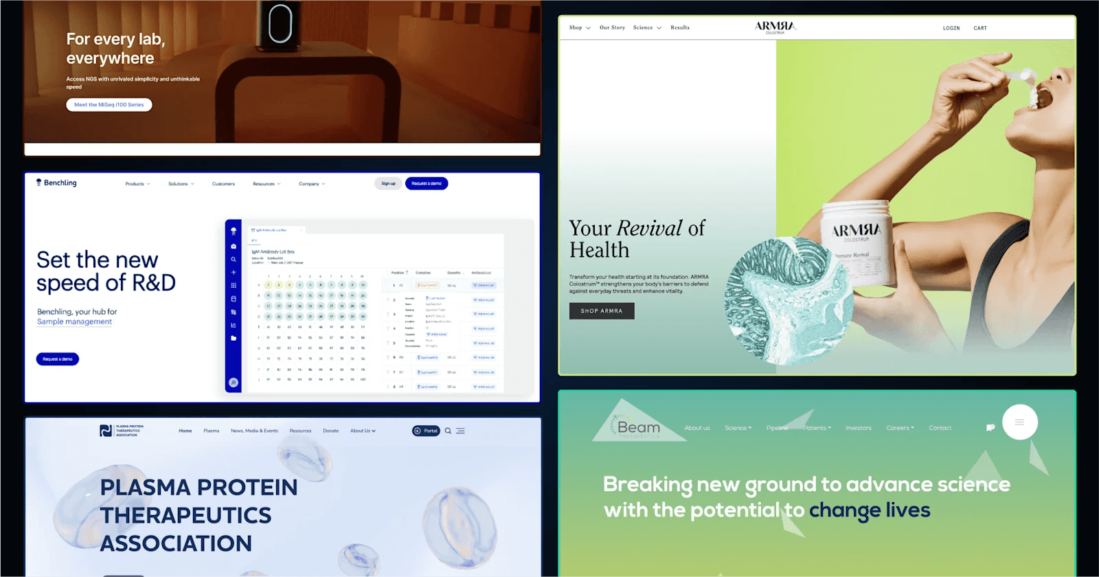
1. Plasma Protein Therapeutics Association (PPTA)

PPTA’s homepage features a simple design with a white and navy-blue color scheme that evokes professionalism. The layout uses clear typography and structured menus, making navigation intuitive.
Key CTAs like “Donate Now” and “About PPTA” stand out in contrasting colors. Rotating banners highlight recent updates, while neatly organized sections cater to donors, patients, and industry stakeholders to create a great website experience.
Why does PPTA’s design stand out?
- Clean Typography: Bold, legible fonts enhance readability and focus.
- Simple Navigation: Drop-down menus and quick links improve user experience.
- Rotating Banners: Visual sliders add movement without cluttering the page.
- Color Contrast: Strategic use of navy for buttons and highlights draws attention effectively.
2. Benchling

Benchling’s homepage has a polished and futuristic design with a clean white and blue color scheme, reflecting its focus on innovation and biotech. The layout features a balance of text and visuals, including icons and diagrams that simplify complex ideas.
Prominent CTAs like “Request a Demo” guide users through the site, while a sticky top menu ensures smooth navigation. Subtle animations and clean sections create an engaging browsing experience without overwhelming the visitor.
Why does Benching’s design stand out?
- Modern Typography: Clean, sans-serif fonts complement the professional look.
- Visual Hierarchy: Bold headers and clear subheadings create structure.
- Interactive Animations: Subtle effects draw attention to important features.
- Consistent Layout: Grid-based sections ensure an intuitive and organized flow.
3. Illumina

Illumina’s homepage showcases a cutting-edge design with a white, black, and blue color palette complemented by clean visuals and dynamic banners. The layout emphasizes innovation, featuring rotating headers that highlight sequencing platforms and tools like the MiSeq i100 Series.
The CTAs, such as “Explore focus areas” and “View kit,” are strategically placed to encourage user exploration. Content is neatly segmented, making it easy to access resources for research, applications, and customer support.
Why does Illumina’s design stand out?
- Dynamic Headers: Prominent headers draw attention to new products and advancements.
- Structured Navigation: A clear menu and segmented sections enhance usability.
- Visual Consistency: Blue and red accents guide the eye while maintaining brand identity.
- Resource Highlights: Prominent tools and webinars are easily accessible for researchers.
4. ARMRA

ARMRA’s homepage features a modern, clean design with a white background and subtle green and yellow accents that convey health and vitality. The site uses full-width imagery and bold typography to emphasize the transformative benefits of its colostrum-based products.
CTAs like “SHOP ARMRA” and “SHOP NOW” are well-placed to guide users. The scrolling format highlights product benefits, testimonials, and clinical results in a visually engaging way, creating an immersive and trustworthy experience.
Why does ARMRA’s design stand out?
- Bold Typography: Large, clear fonts make product benefits stand out.
- Engaging Visual Hierarchy: Full-width banners and clean product grids create a seamless flow.
- Dynamic Product Showcase: Scrolling animations draw attention to key products and features.
- Testimonial Integration: Real customer quotes enhance trust and engagement.
5. Beam Therapeutics

Beam Therapeutics’ homepage employs a sleek, modern design with a white and teal color scheme, emphasizing innovation and cutting-edge science. The site highlights its mission to revolutionize genetic medicine through base editing with bold headers and immersive imagery.
CTAs such as “Discover More” and “View openings” are strategically placed to drive engagement. Interactive elements, like hover-enabled team cards, add a dynamic and engaging experience for users.
Why does Beam Therapeutics’ design stand out?
- Interactive Team Cards: Hover effects add a playful yet professional touch.
- Purposeful Color Accents: Teal highlights draw attention to CTAs and key information.
- Human-Centric Design: Employee stories and photos personalize the brand.
6. Asimov

Asimov’s homepage features a futuristic and catchy design, utilizing a clean white background with subtle black and blue-purple accents. The design reflects its focus on synthetic biology and cutting-edge technology.
Prominent CTAs like “Learn more” guide users to learn about its tools and services. The layout is attractive and effective, with a focus on bold statements and full-width sections that showcase its advanced lab capabilities and computational models.
Why does Asimov’s design stand out?
- Minimalist Typography: Clean fonts align with the futuristic aesthetic.
- Wide Sections: Full-width layouts emphasize key messages and visuals.
- Animated Section: An animated section is incorporated making the website captivating
- Integration Focus: Visuals communicate a seamless blend of biology and technology.
See what’s working for industry-leading websites and find inspiration to improve yours.
7. Antiverse

Antiverse’s homepage features a sleek and futuristic design with a black-and-white base accented by green and blue highlights that emphasize innovation.
The layout integrates bold, modular sections with concise content and sharp typography, reflecting its focus on AI-driven antibody discovery. Dynamic visuals, like spinning team cards and animations, improve engagement.
Why does Antiverse’s design stand out?
- Modular Layout: Distinct sections with clear divisions improve readability.
- Hover Animations: Interactive effects on team and feature cards add depth.
- Accentuated Colors: Green highlights draw attention without overwhelming the minimalist design.
- Professional Imagery: High-quality visuals of lab work and diagrams support credibility.
8. Ginkgo Bioworks

Ginkgo Bioworks’ homepage showcases a vibrant design with a white background enhanced by black accents, reflecting its focus on biotechnology and innovation. The layout is modular, with clear sections for R&D tools, solutions, and industries served.
Animations and sleek transitions add a dynamic touch, while high-quality visuals reinforce the site’s professional appeal.
Why does Ginkgo’s design stand out?
- Modular Layout: Clearly segmented sections streamline navigation and readability.
- Dynamic Animations: Smooth transitions and hover effects create an interactive experience.
- Strategic Accent Colors: Moving visuals and black highlights emphasize innovation.
- Industry-Specific Pages: Dedicated sections cater to diverse audiences, enhancing user relevance.
9. Cytiva

Cytiva’s homepage is polished and professional, using a white and green color scheme to reflect health and sustainability. The modular design organizes content into intuitive sections, such as product categories, applications, and recent news.
Full-width banners with vibrant visuals highlight innovations like FlexFactory and sustainability initiatives, giving the site a dynamic and informative feel.
Why does Cytiva’s design stand out?
- Well-Defined Layout: Clear sectioning for applications, products, and resources enhances usability.
- Engaging Banners: Large visuals and headlines draw attention to key updates.
- Sustainability Integration: Subtle green accents emphasize environmental priorities.
- Global Personalization: Regional options and multilingual support cater to a global audience.
10. Wild Bio

Wild Bio’s homepage features a bold, nature-inspired design with a black-and-white color scheme that reflects its focus on biodiversity and drug discovery. The layout employs full-width imagery of wildlife, emphasizing the company’s unique approach to exploring evolutionary adaptations.
CTAs like “Read about our database” are seamlessly integrated into sections, guiding users through their innovative platform. A mix of bold headlines and compact text creates an engaging and informative experience.
Why does Wild’s design stand out?
- Nature-Inspired Aesthetic: High-quality visuals and colors echo the brand’s biodiversity focus.
- Dynamic Sectioning: Modular content blocks maintain clarity while presenting complex ideas.
- Unique Database Highlights: Interactive stats and highlights engage users.
- Storytelling Design: Content tied to specific species (like mambas) enriches user connection.
11. BioAge Labs

BioAge Labs’ homepage combines simplicity and sophistication with a purple background accented by similar shaded elements to reflect its focus on aging and metabolic health.
The layout is futuristic, prioritizing bold, concise headlines that emphasize their mission. Key CTAs direct users to explore their platform and pipeline, while sections with smooth scrolling create an intuitive and focused browsing experience.
Why does BioAge’s design stand out?
- Minimalist Typography: Simple fonts and bold headers ensure clarity and elegance.
- Streamlined Navigation: A focused top menu provides easy access to core sections.
- Color Palette: Captivating purplish accents evoke interest and vitality.
- Compact Design: A light, uncluttered structure keeps the content digestible.
12. Kingdom Supercultures

Kingdom Supercultures’ homepage is vibrant and approachable, combining a white background with bold orange and blue accents that reflect innovation in food science. The design features large visuals and streamlined sections explaining their Superculture™ ingredients and processes.
Key CTAs like “Join Our Team” and “Contact Us” guide engagement, while a scrolling layout highlights their news and milestones.
Why does Kingdom’s design stand out?
- Bold Visuals: High-resolution images and vibrant colors make the content stand out.
- Step-by-Step Process: A clear, visual explanation of their workflow improves understanding.
- Interactive News Highlights: Recent milestones and articles keep the site dynamic.
13. Single Cell Technology

Single Cell Technology’s homepage boasts a modern, tech-focused design with a dark blue and white color scheme that reflects precision and innovation. The page uses bold, clean typography to emphasize its AbTheneum™ antibody discovery platform.
CTAs such as “Expedite excellence” and “Collect it all” guide users through their unique approach. Large, interactive headers and concise sections make complex scientific topics easy to understand.
Why does Super Cell’s website stand out?
- Bold Typography: Large, clear text ensures key messages stand out effectively.
- Compact Content Blocks: Information is delivered in bite-sized sections for clarity.
- Tech-Inspired Aesthetic: A dark color palette conveys a cutting-edge, scientific feel.
14. Novartis

Novartis’ homepage reflects a corporate and impactful design with a white and blue color scheme that emphasizes professionalism and innovation. The layout features dynamic, full-width banners highlighting key initiatives and partnerships, such as the WEF Annual Meeting.
CTAs like “Discover our medicines” and “Explore our science” encourage user exploration. The clean typography and neatly segmented sections enhance the browsing experience, ensuring accessibility for a global audience.
Why does Novartis' design stand out?
- Dynamic Banners: Rotating visuals keep the design engaging and highlight key updates.
- Global Accessibility: Multilingual support and regional options cater to a diverse audience.
- Corporate Palette: Blue accents instill trust and align with healthcare themes.
It's Time to Upgrade Your Biotech Website
Your company’s website serves as more than just a digital presence—it's the primary platform for showcasing innovation and building credibility.
Take action now to elevate your biotech website to meet current industry standards. Whether you're starting fresh or upgrading an existing site, these biotech website examples can help you create a digital presence that truly reflects your innovation and expertise. Your website is often the first point of contact with potential partners, investors, and clients—make sure it makes a lasting impression that drives your business forward.
Ready to transform your biotech website into a powerful tool for business? Download Webstacks' Best B2B SaaS Websites eBook to discover more inspiring examples and actionable insights that can transform your digital presence.
See what’s working for industry-leading websites and find inspiration to improve yours.

I lead growth at Webstacks, connecting strategy, design, and engineering to build websites that drive results. I specialize in website strategy, CMS implementation, and helping B2B teams scale their web presence.