12 Best Startup Website Design Examples
An exceptional website is more than a digital presence. It can power growth by appealing to potential customers, investors, and partners and making a strong first impression.
A well-crafted startup site builds credibility, fosters user engagement, and drives conversions through targeted design. In an environment where many startups will fail within the first five years a differentiated web presence can be a critical competitive advantage from day one.
In this curated collection, we'll explore 12 outstanding showcases of modern startup web design. Each site addresses common startup challenges through strategic choices, from establishing brand identity to optimizing for conversions.
In brief:
- First Impressions Matter: Users form aesthetic judgments about websites in as little as 50 milliseconds, making a strong website essential for turning first impressions into tangible growth.
- Effective Design Drives Results: Effective design fosters credibility, user engagement, and better conversion rates.
- Core Elements to Consider: Scalability, user experience, and brand cohesion are core elements to keep in mind for any startup website.
- Real-World Success Stories: Real-world success stories show how strategic design choices drive measurable business results.
How Great Design Drives Growth for Startups
Modern website design goes beyond aesthetics; it drives startup growth by translating thoughtful design choices into measurable business outcomes. Your website's user experience can significantly impact your growth trajectory.
- Impact on User Engagement and Retention: Great design is a direct retention lever. McKinsey reports that design-led firms see 36% more user satisfaction and 56% higher customer loyalty scores compared to median performers, directly boosting retention.
- Building Trust Through Visual Design: A strong visual design helps build trust with your audience. Consistent branding and effective use of color can significantly increase revenue and brand recognition. McKinsey reports that top design performers grow revenue 2x faster than industry peers, with design-led companies outperforming the S&P by 228% over 10 years.
- Enhancing Conversion Rates with Smart Choices: According to Unbounce's Conversion Benchmark Report, which analyzed 464 million visits across 41,000 landing pages, the median landing page conversion rate is 6.6% across all industries, with startup-heavy industries like SaaS reporting only a 3.8% conversion rate average. A/B testing of design elements can lead to significant improvements — yet many marketers still don't systematically test their landing pages, representing a major competitive opportunity.
- Scaling Efficiently with Scalable Design: A scalable design approach ensures your website grows with your business, handling increased traffic and evolving needs without a complete overhaul.
Webstacks helps high-growth startups launch faster, scale smarter, and turn their websites into growth engines.

Key Design Elements of the Best Startup Websites
The most successful startup websites share key design elements that drive user engagement and conversion.
Clear Messaging
Your website needs to communicate your value proposition instantly. The best startup websites excel at conveying their purpose through straightforward language and compelling headlines.
When crafting your messaging:
- Lead with Your Strongest Value Proposition: Highlight the most compelling benefit of your product or service upfront.
- Create Attention-Grabbing Headlines: Headlines should be catchy and informative, conveying your purpose while encouraging visitors to read further.
- Support Text with Relevant Visuals: Images and graphics that reinforce your message enhance understanding and retention.
Mobile-First Design
With mobile devices accounting for 62.73% of global website traffic as of Q2 2025, a mobile-first approach isn't optional. Google uses mobile-first indexing as its default — meaning it primarily uses the mobile version of your site for indexing and ranking.
Key mobile-first principles include:
- Touch-Friendly Navigation and Buttons: Design elements should be easily tappable on touch screens, preventing user frustration.
- Responsive Layouts: Ensure your site adapts to various screen sizes and orientations.
- Fast Loading Times: Optimize for speed on mobile devices where users have lower attention spans.
Interactive Elements
Interactive elements give your website a significant boost in conversions.
Effective interactive features include:
- Subtle Animations: Use animations to guide user attention and provide feedback, such as hover effects or loading indicators.
- Responsive Hover States: Design buttons or links to change appearance when hovered over, indicating interactivity.
- Dynamic Content: Incorporate content that responds to user actions, such as personalized recommendations or interactive infographics.
Simplicity
In startup website design, less is often more. Google's UX research confirms that users strongly prefer designs that appear both simple (low visual complexity) and familiar (high prototypicality).
To keep it simple:
- Limit Your Color Palette: Maintain visual harmony and avoid overwhelming users by sticking to a cohesive set of colors.
- Focus on Content That Drives Conversions: Prioritize essential information and eliminate unnecessary elements that distract from your goals.
- Create Clear Visual Hierarchies: Guide users through your site by emphasizing important content using size, color, and placement.
For startups looking to refine their landing pages, a minimalist landing page design can be particularly beneficial.
Best Startup Website Examples
Here's a curated selection of 12 best startup website examples that showcase the perfect blend of form and function.
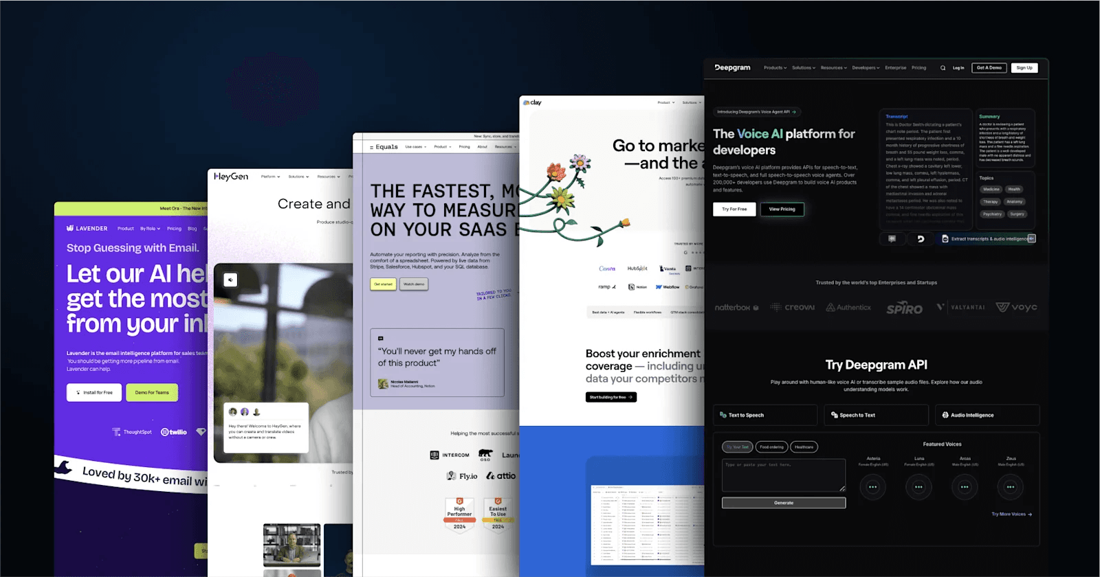
1. Deepgram
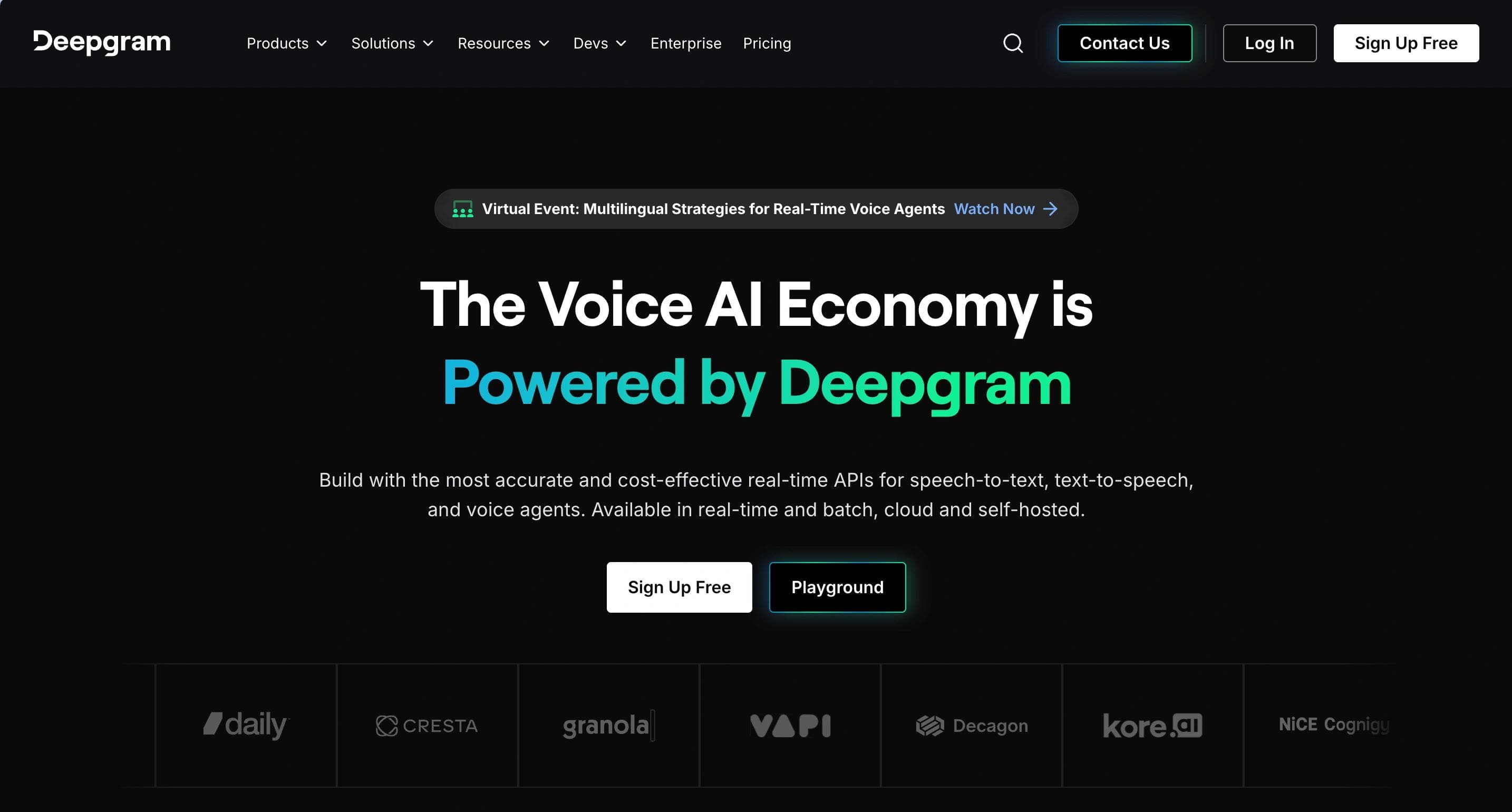
Deepgram's homepage features a professional, tech-savvy dark theme accented by blue and white. CTAs like "Try for Free" and "View Pricing" are prominently placed to attract developers and enterprises. The layout highlights core APIs for Speech-to-Text, Text-to-Speech, and Audio Intelligence, with an interactive playground for testing capabilities. Testimonials and statistics like "30% more accurate" emphasize reliability.
Web Design Elements That Stand Out from Deepgram
- Developer-Focused Design: Tools like the API playground and extensive documentation encourage user engagement.
- Engaging Visuals: The homepage uses contrast and animations to keep visitors focused on key offerings.
- Transparent Pricing: Free credits and clear cost comparisons build trust and reduce entry barriers.
2. Clay
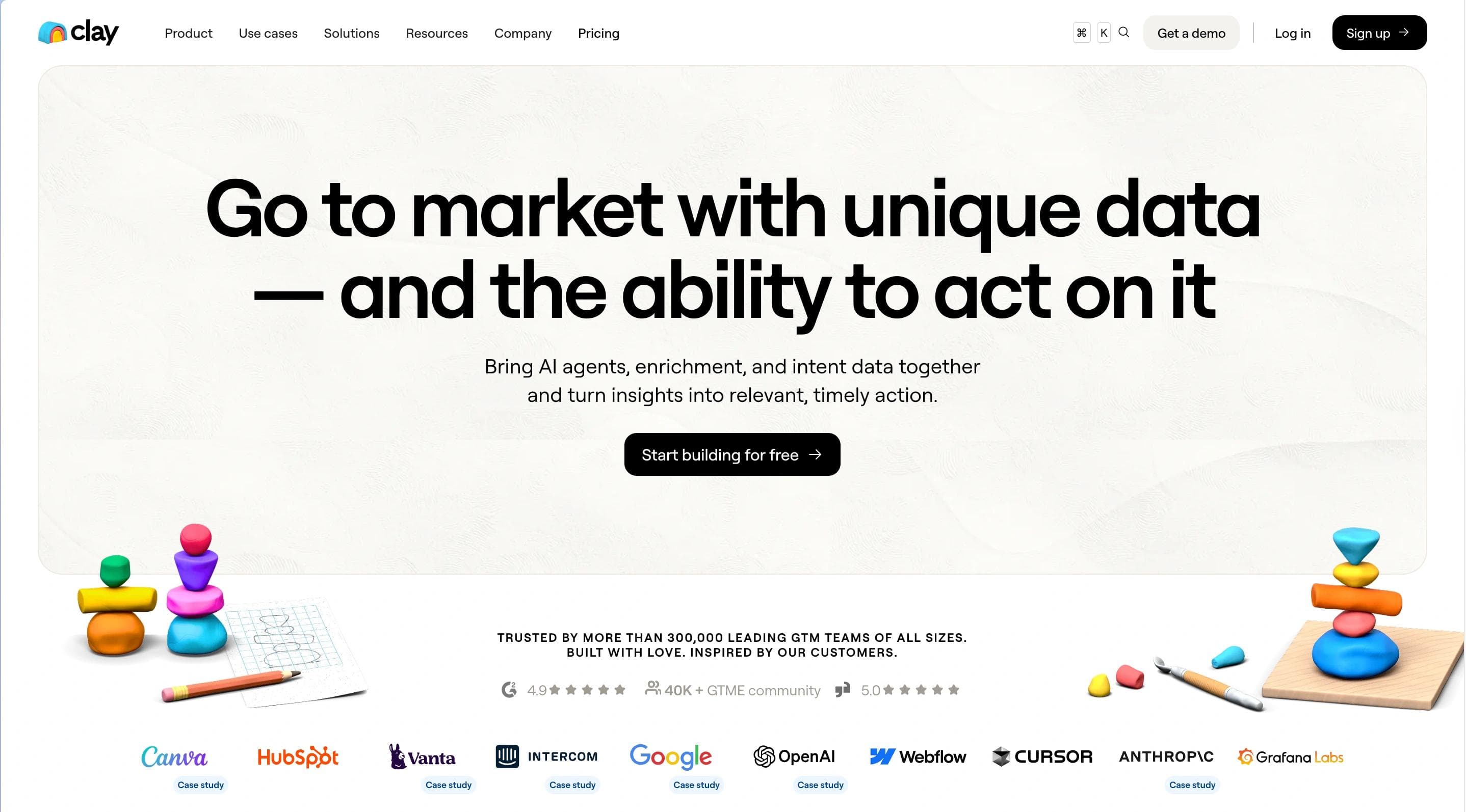
Clay's homepage is sleek and business-oriented, with a clean white background and floral accents. The layout emphasizes data enrichment and growth workflows, with a strong CTA, "Start building for free." Clear sections showcase AI-powered tools, integration capabilities, and customer success stories, including its $1.25B valuation.
Clay's Design Elements To Take Inspiration From
- User-Centric Navigation: Features like AI research agents and CRM integrations are presented intuitively.
- Trust-Building Elements: Customer testimonials, case studies, and clear pricing enhance credibility.
- Community Focus: The growth community and Slack integration foster collaboration among users.
3. Equals
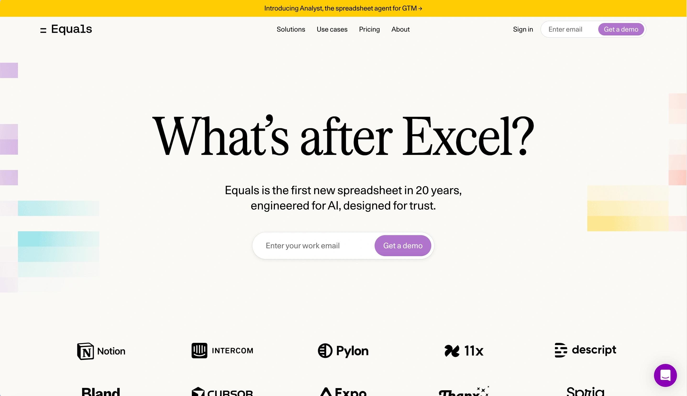
Equals' homepage features a clean, modern design with a basic color scheme. The main CTA, "Get started," encourages users to explore connected spreadsheet capabilities. The site showcases live data integrations, real-time dashboards, and AI-assisted summaries for businesses tracking metrics like ARR and SaaS analytics.
Web Design Elements We Like from Equals
- Streamlined Features Presentation: Complex functionalities like SQL queries, pivot tables, and AI insights are explained simply and visually.
- Focus on Real-Time Data: Live connections to Stripe, HubSpot, and Salesforce eliminate manual imports.
- Emphasis on User Stories: Testimonials from industry leaders enhance trust and highlight practical use cases.
4. HeyGen
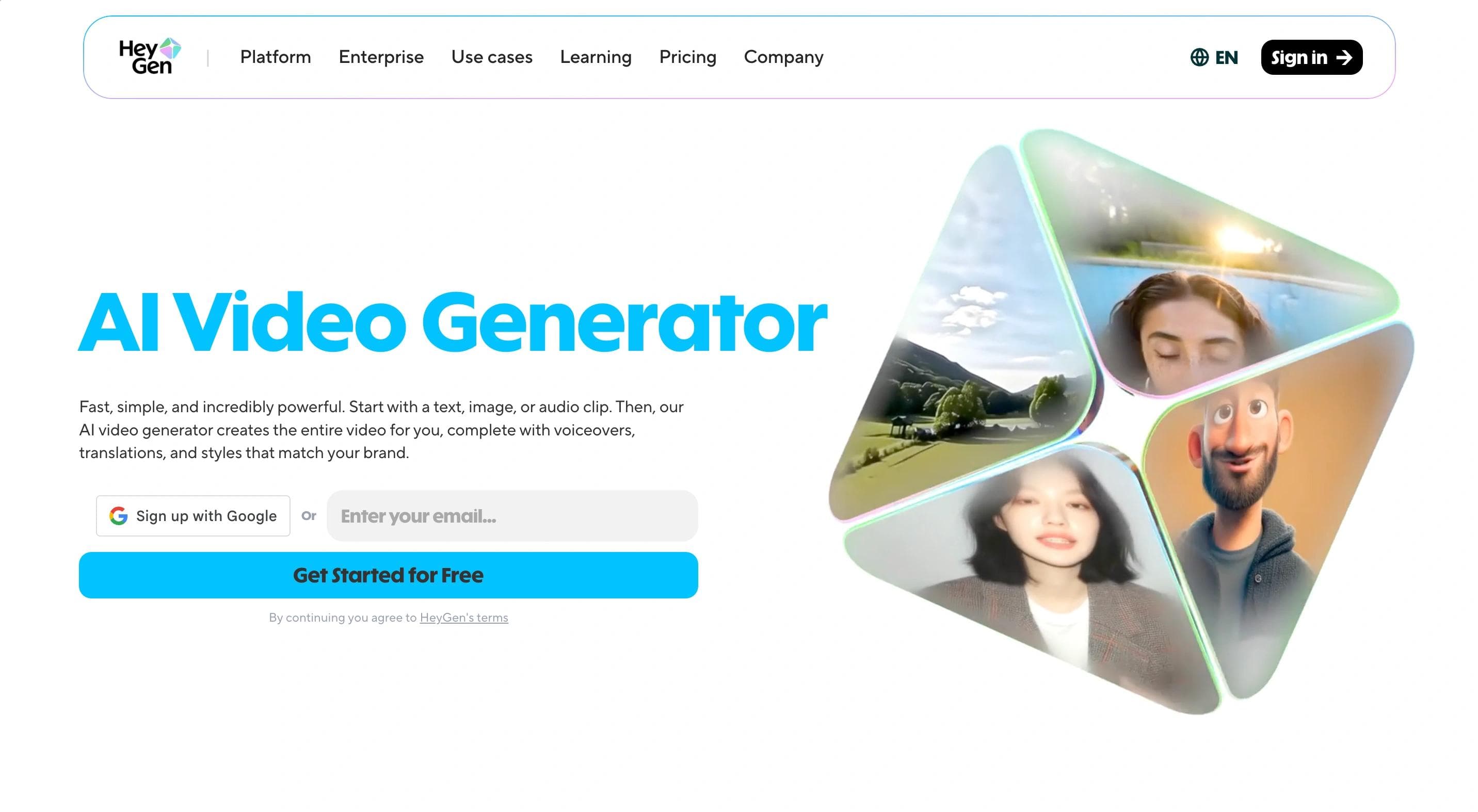
HeyGen's homepage features a vibrant, interactive design with a white background accented by purple elements. The layout draws attention to its primary CTA, "Get started for free," while emphasizing AI-powered video generation and translation in 175 languages. Users are introduced to AI avatars and tools for creating professional videos without a camera or crew.
Inspiring Web Design Elements from HeyGen
- Dynamic Content Showcase: Customer stories, tutorials, and AI-generated video examples engage visitors and demonstrate capabilities.
- Trust and Safety Emphasis: Compliance with SOC 2 and GDPR reassures users about ethical and secure platform use.
5. Lavender
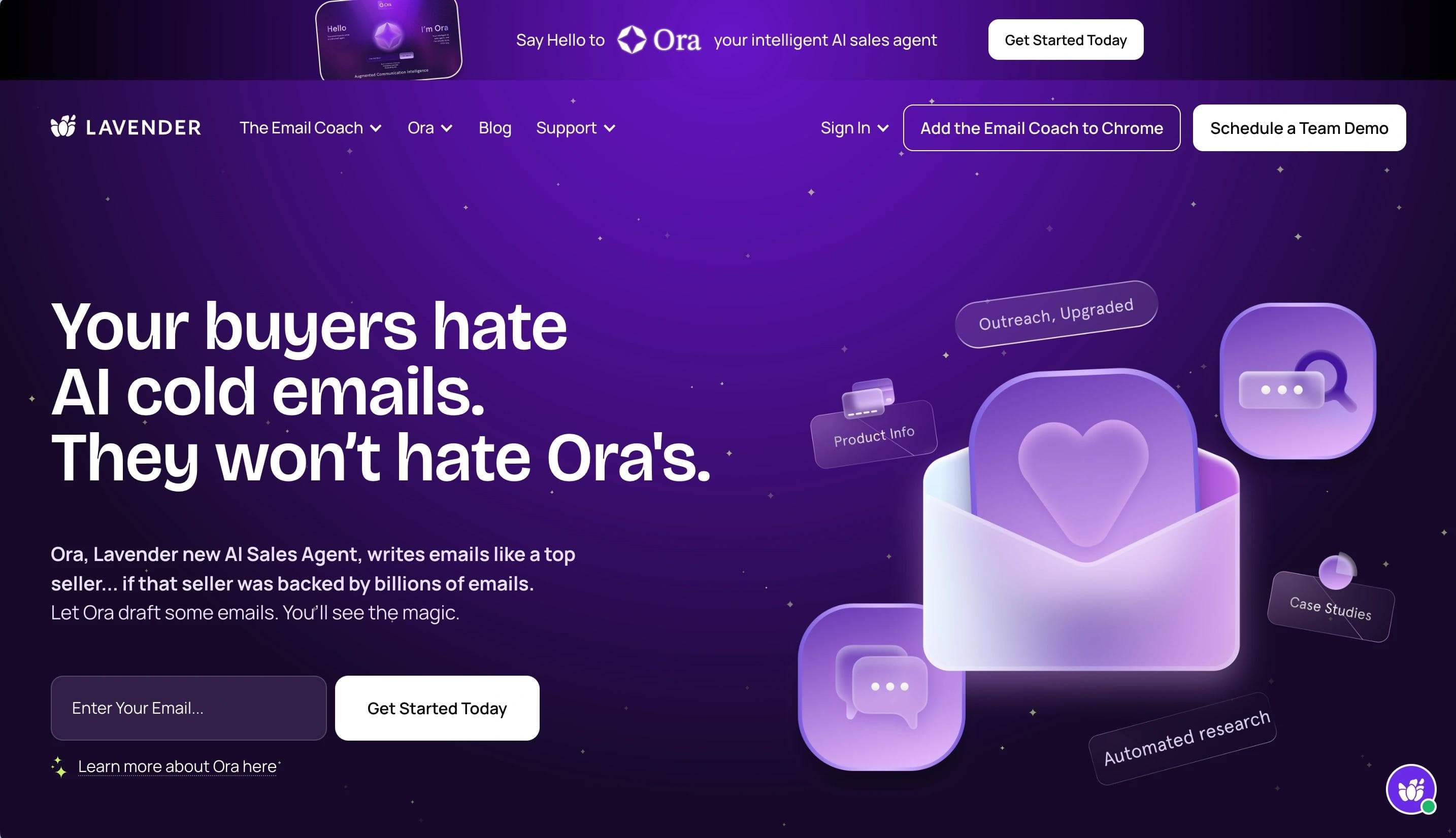
Lavender's homepage has a dynamic design with a purple, green, and white color scheme. Interactive animations such as floating hearts grab attention. Testimonial highlights and stats like "42% increase in replies" underscore effectiveness, while tiered pricing plans are clearly outlined.
Why We Love Lavender's Web Design
- Vibrant Color Scheme: A clean white background accented with shades of purple and blue creates a modern, inviting aesthetic.
- Engaging Hero Section: A prominent hero section with a concise headline and clear CTA immediately captures attention.
- Intuitive Navigation Bar: Clear categories such as "Product," "Pricing," "Blog," and "Support" allow users to easily find information.
6. Mutiny
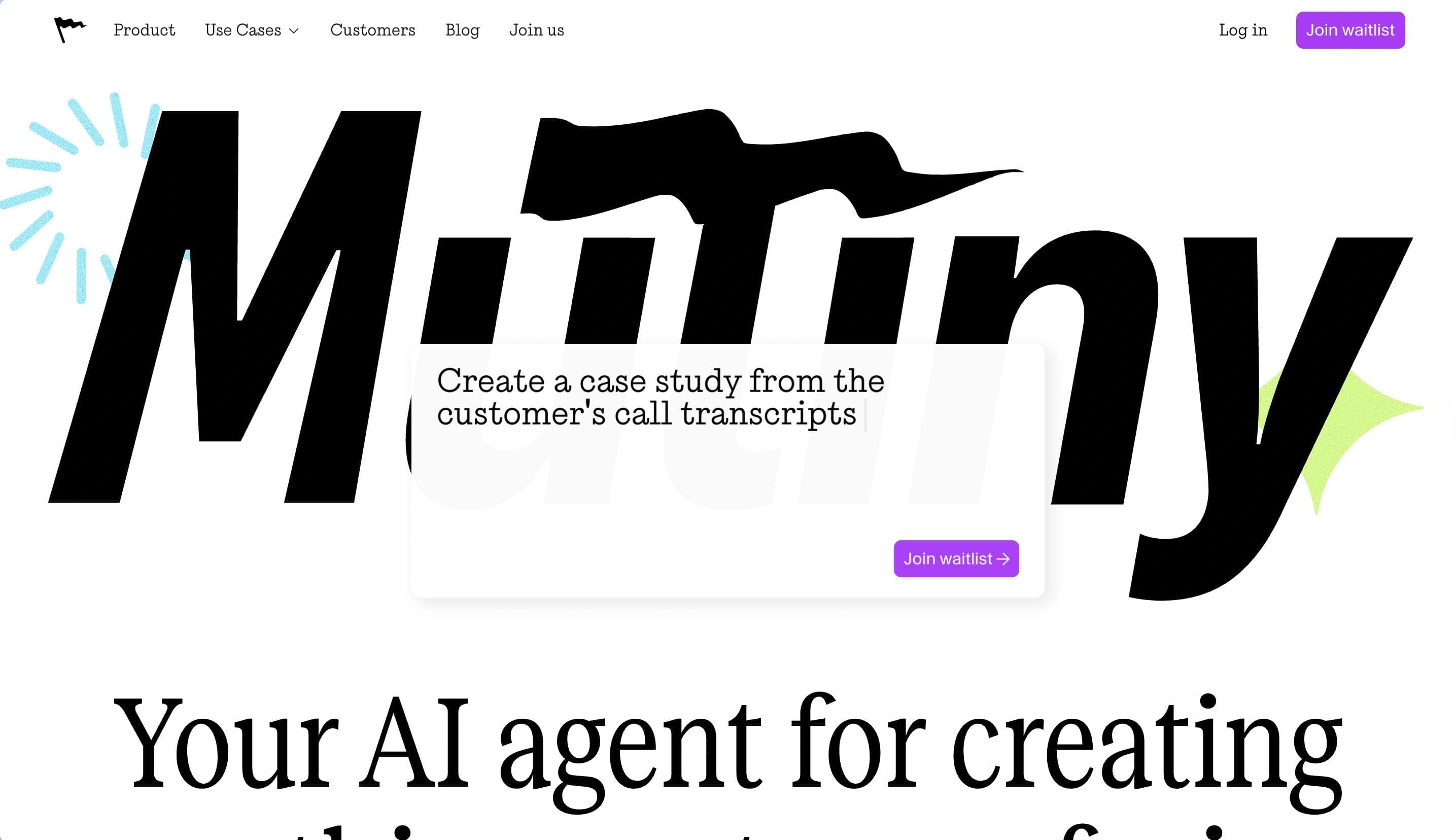
Mutiny's homepage highlights a modern, professional design with a white and blue theme with purple accents. The primary CTA, "Book your Demo," targets B2B marketers and sales teams. The platform focuses on personalizing marketing campaigns at scale with its 1:1 GTM approach, featuring personalized campaign activation, sales collaboration, and real-time insights alongside case studies.
Web Design Elements We Love from Mutiny
- Dynamic Color Scheme: A clean white background with vibrant blue and green accents creates a modern, engaging aesthetic.
- Interactive Product Previews: Interactive visuals and GIFs showcase the platform's features, giving users a dynamic look into how Mutiny works.
- User-Friendly Navigation Bar: Clear categories such as "Product," "Content," "Customers," and "Company" allow easy access to information.
7. Pitch
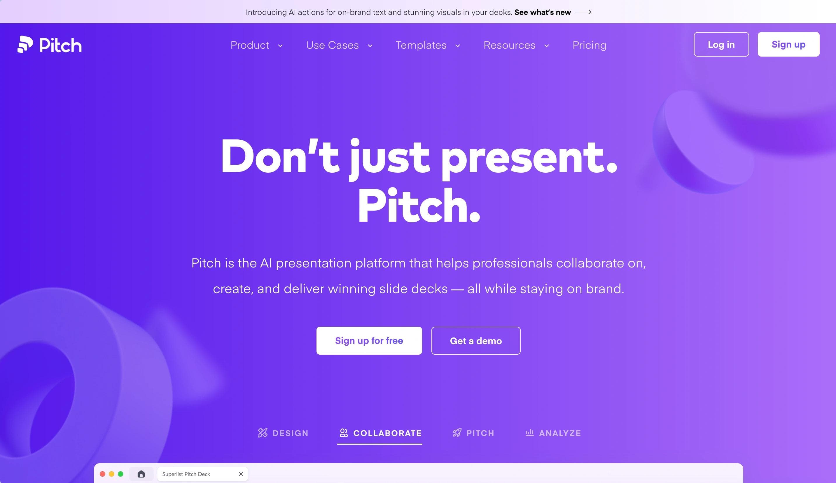
Pitch's homepage features a modern, sleek design with a white and purple color scheme. CTAs like "Sign up for free" and "Get a demo" encourage exploration. The site highlights AI-assisted template creation, real-time collaboration, and analytics for tracking presentation engagement.
Web Design Elements That Make Pitch Worthwhile
- Interactive Product Previews: Interactive visuals and GIFs give users a dynamic look into how Pitch works.
- User-Friendly Navigation Bar: Clear categories such as "Product," "Content," "Customers," and "Company" allow easy navigation.
- Product Updates: New feature announcements above the navigation bar improve visibility.
8. QuickNode
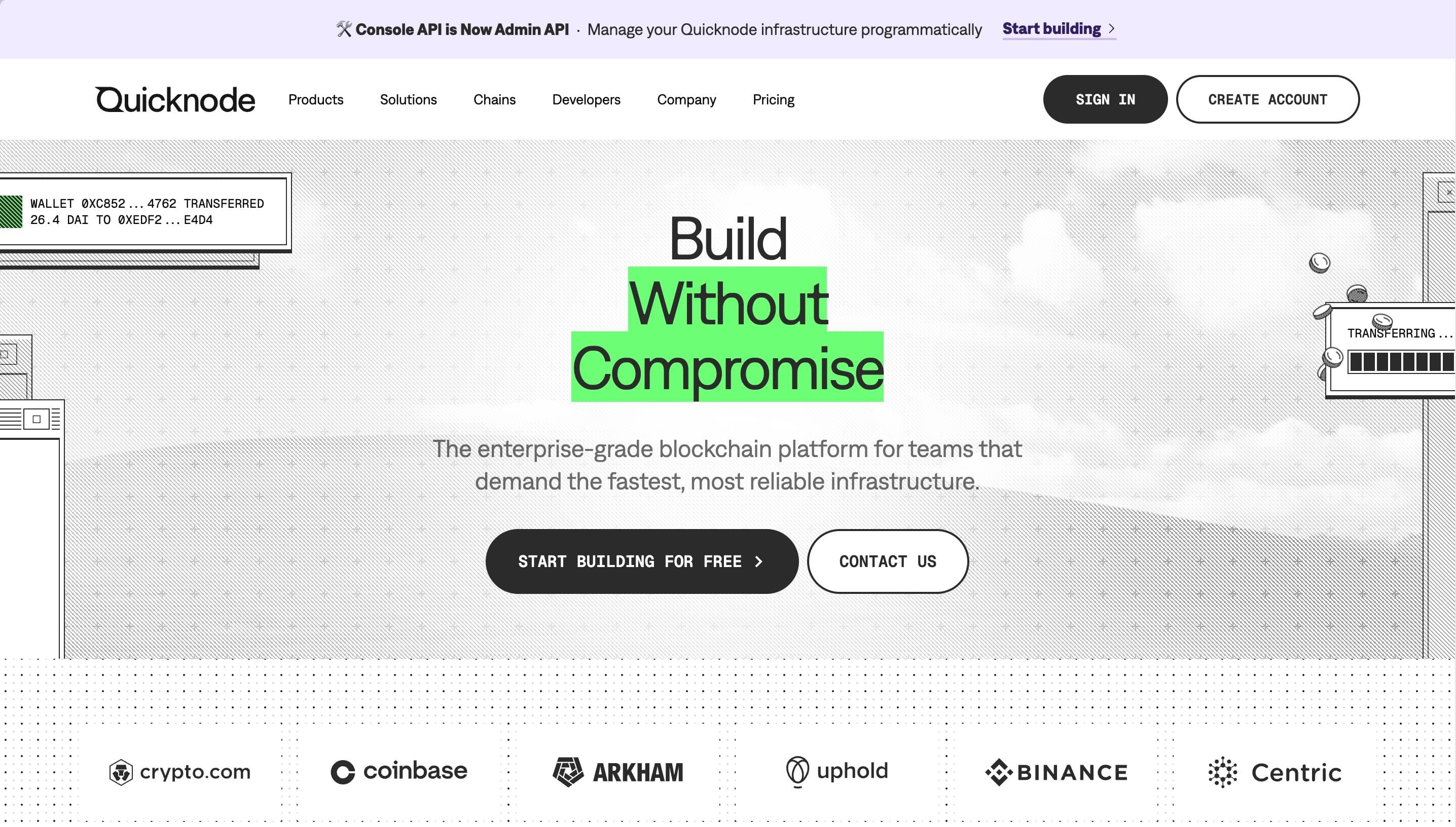
QuickNode's homepage features a futuristic, developer-centric design with a white and blue color scheme and engaging animations. CTAs like "Get started for free" and "Read docs" target Web3 developers. The site emphasizes high-performance APIs, multi-chain support (over 60 chains), and use cases including gaming, DeFi, and digital identity.
Why Take Inspiration from QuickNode?
- Tech-Focused Design: Bold gradients, sharp typography, and animations emphasize cutting-edge technology.
- Chain Integration Showcase: A dedicated section highlights supported blockchain networks with visually appealing icons.
- Engaging Metrics Display: Key performance metrics are prominently displayed, reinforcing QuickNode's value proposition.
9. Prismatic
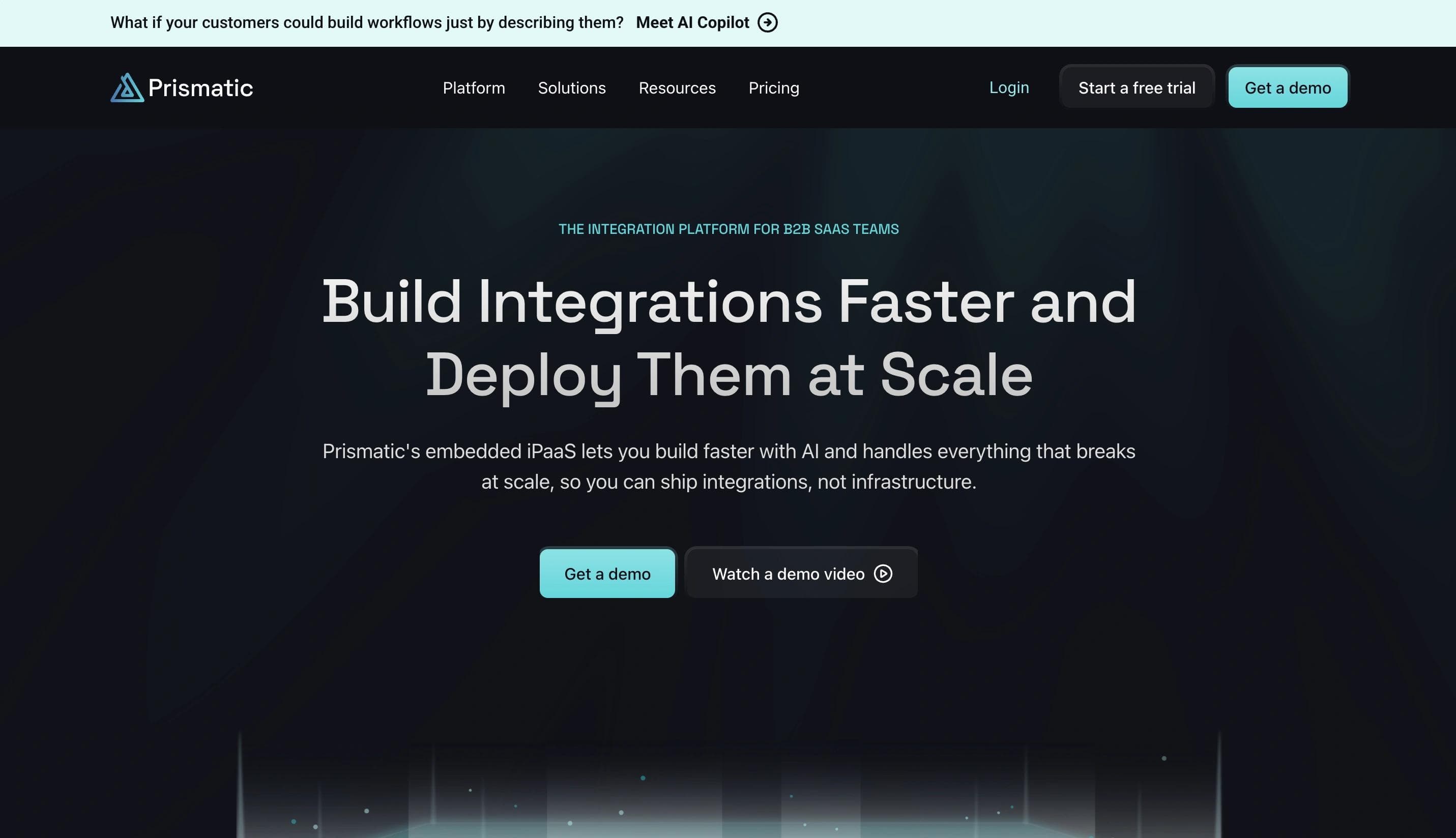
Prismatic's homepage is sleek and professional, using a clean white and blue color scheme with greenish accents. The main CTA, "Get a Demo," targets B2B SaaS teams seeking streamlined integration solutions. Testimonials and real-world examples validate its impact on productivity and scalability.
Web Design Elements We Love from Prismatic
- Clean and Professional Aesthetic: A minimalist design conveys professionalism and clarity.
- Informative Hero Section: A clear headline: "Ship product integrations faster and with less dev time."
- Comprehensive Navigation Bar: Categories such as "Platform," "Connectors," "Solutions," "Developers," "Resources," and "Pricing" allow easy access to detailed information.
10. Truepic
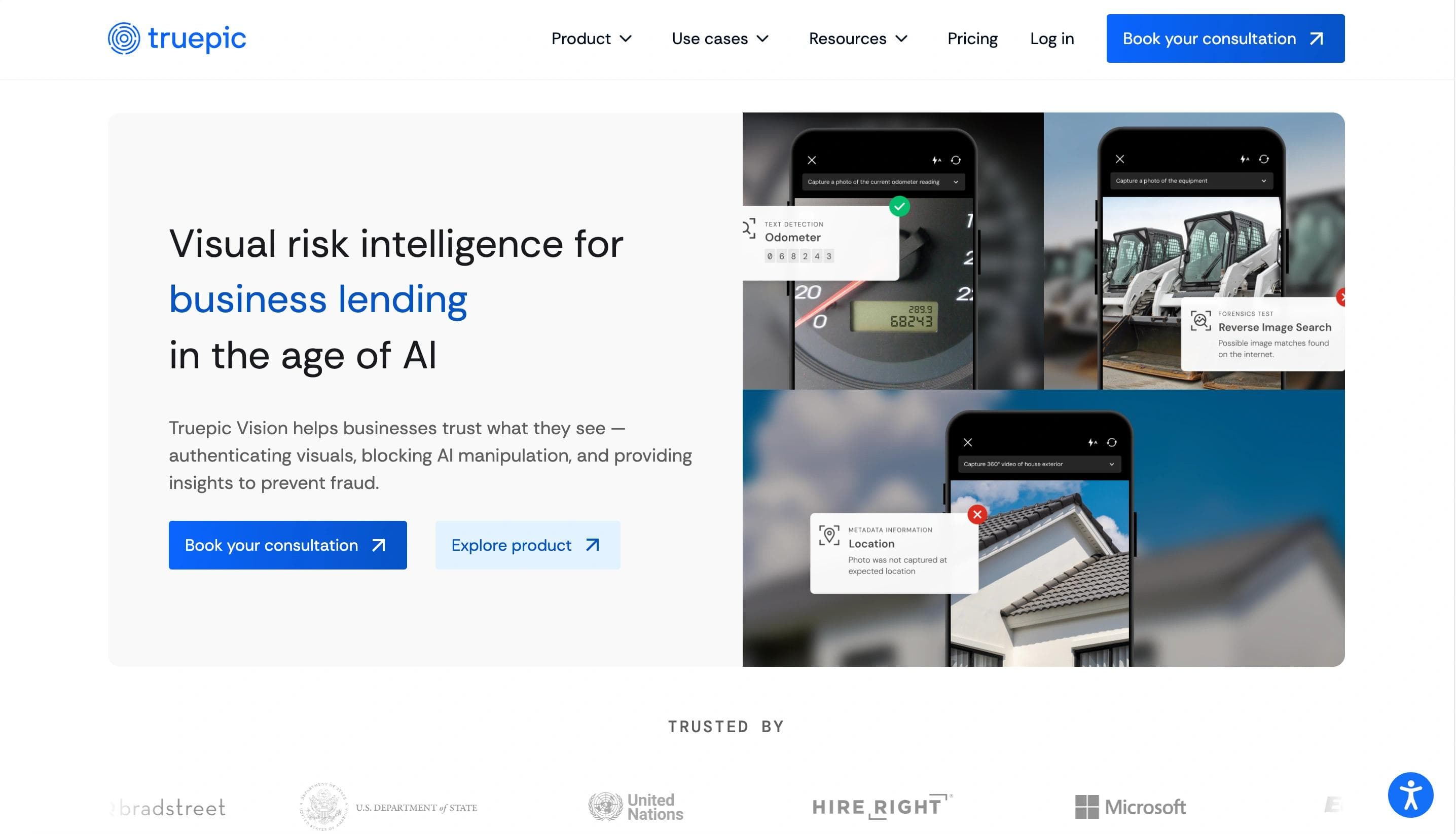
Truepic's homepage features a clean, corporate design with a white and blue color scheme. CTAs like "Contact sales" and "Explore products" engage enterprises exploring digital media authenticity solutions. The site highlights Enterprise C2PA for verifiable content and Truepic Vision for secure virtual inspections, with stats like "1,000M+ C2PA media files created."
Why Does Truepic's Website Stand Out?
- Latest News and Updates Section: A dedicated section for recent news, blog posts, and announcements keeps visitors informed.
- Interactive Product Demonstrations: Interactive elements let users test Truepic's virtual inspection platform hands-on.
11. Sanity
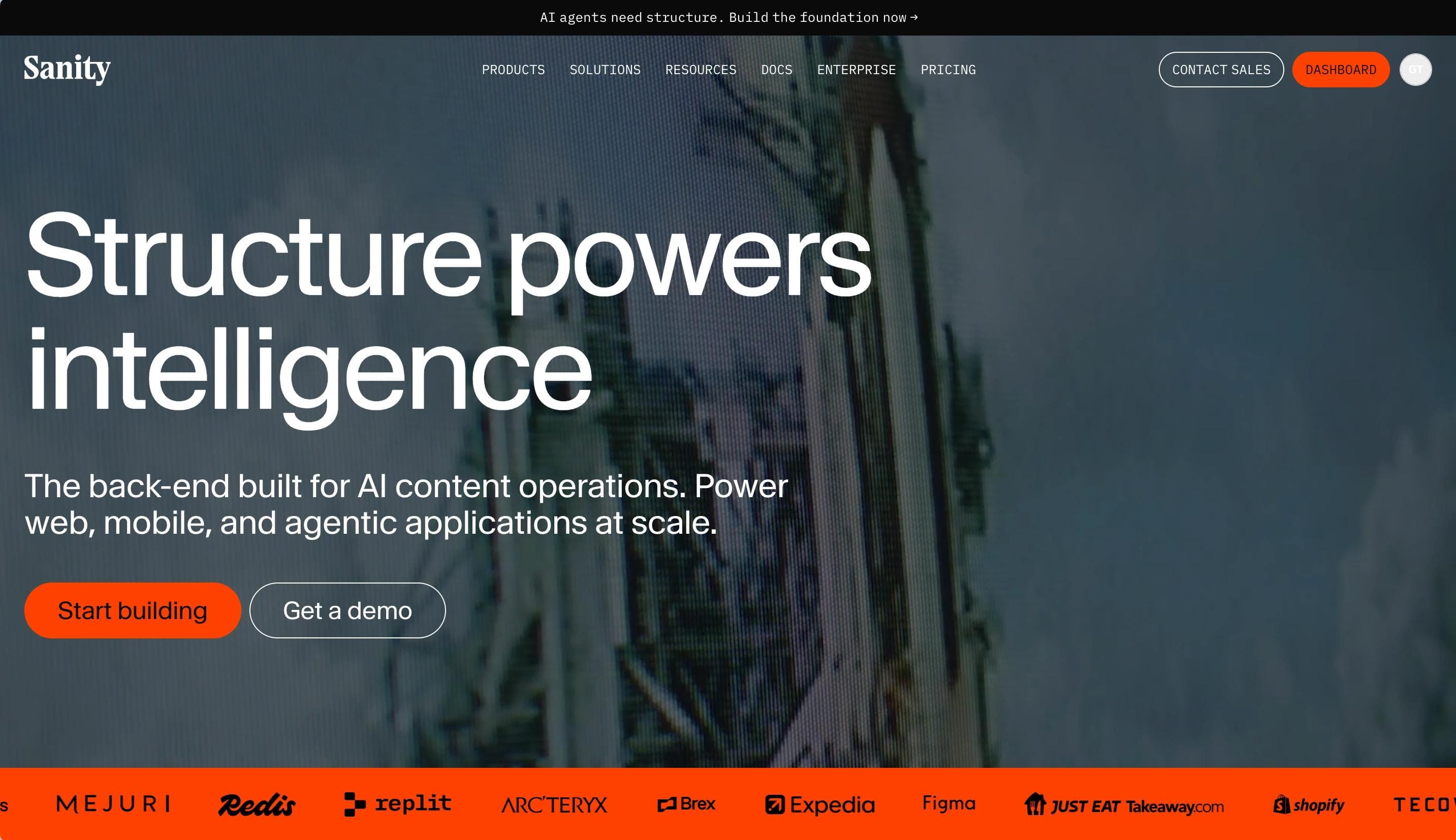
Sanity's homepage features a clean, modular design with a white, black, and red color scheme. CTAs such as "Start building" and "Book a demo" highlight its content-first approach. The site showcases its Content Operating System, including customizable Studio, APIs, and the Content Lake.
Web Design Elements That Make Sanity Stand Out
- Dynamic Platform Overview: Interactive sections explain core features like Studio, APIs, and Content Lake.
- Quick Developer Resources: Easy access to docs, guides, and API references.
- Client Logos Display: Showcases top clients like Cloudflare, Figma, and PUMA for credibility.
12. Attio
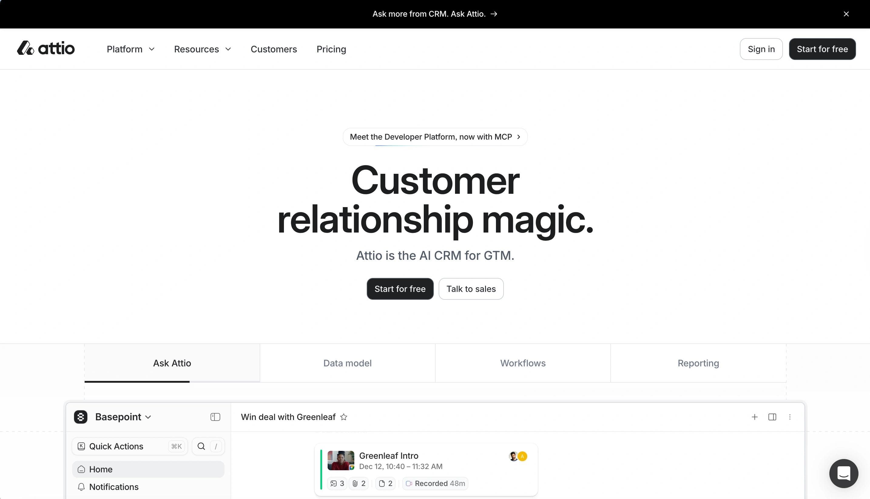
Attio's homepage has a modern, sleek design with a white and black palette. CTAs "Send me a demo" and "Talk to sales" encourage users to explore its AI-native CRM platform. It highlights customizable pipelines, AI-driven insights, and real-time integrations with Gmail and Segment, alongside tailored workflows and advanced automation.
Reasons We Love the Design of Attio
- Minimalist Aesthetic: Ample white space, bold typography, and soft blue accents create a modern, professional feel.
- Prominent Hero Section: A clear headline and sleek product interface visual paired with a standout "Get Started" CTA.
- Sticky Navigation Bar: A fixed top navigation bar with links to "Product," "Pricing," "Resources," and "Login" for easy access.
How to Upgrade Your Startup Website
Your startup website is more than a digital business card; with regular maintenance and strategic upgrades, you can transform it into a powerful asset that drives business results.
Align Your Brand Identity and Website
Your website should perfectly reflect your brand's personality and values.
To ensure alignment:
- Use colors and fonts that match your brand guidelines, reinforcing recognition and cohesion.
- Craft messaging that reinforces your brand voice and maintain its consistency.
- Design user experiences that reflect what your brand stands for, from customer service to navigation.
Expand Your Design System
A robust design system supports consistency while making your website more scalable and maintainable. Following an enterprise design system guide can streamline the process.
Here's how to build one:
- Create a Library of Reusable Components: Develop buttons, forms, and other elements for a consistent look and feel.
- Document Design Patterns: Outline how components should be used so your team follows the same standards.
- Use Collaborative Design Tools: Tools like Figma allow real-time team collaboration.
- Implement UI Component Libraries: Utilize tools like Storybook for developing and testing UI components in isolation.
Upgrade Your CMS
Your Content Management System (CMS) can make or break your website's performance.
Consider these upgrade paths:
- WordPress: Best for flexibility and extensive plugin ecosystem.
- Webflow: Ideal for design-focused startups requiring visual editing without coding.
- Shopify: Perfect for e-commerce-focused startups with built-in payment processing and inventory management.
The right CMS upgrade can improve site speed, SEO capabilities, and user engagement. For API-driven experiences, headless CMS platforms like Sanity (leading in short-term growth momentum) and Contentful (larger installed base) are gaining traction.
Create Relevant Content
Content remains pivotal for engaging users and driving conversions. Sixty-eight percent of online experiences begin with a search engine, and AI Overviews now appear in 16% of Google searches.
Implement these strategies:
- Conduct Thorough Audience Research: Understand your users' needs, preferences, and pain points to create content that resonates.
- Diversify Content Formats: Offer blogs, videos, infographics, and other formats to cater to different audience preferences.
- Optimize All Content for Search Engines: Use SEO best practices to improve visibility. Ensure your site meets Google's Core Web Vitals thresholds — currently, only 55.8% of websites pass all three benchmarks, meaning startups that do have a ranking advantage over nearly half of competitors.
- Maintain a Consistent Publishing Schedule: Regularly update your site with fresh, editorially overseen content. Mass-produced AI content saw an 87% drop in rankings after Google's 2025 core updates, making editorial quality a clear differentiator.
Monitor your website's performance metrics after implementing these upgrades. Use tools like Google Analytics and heat mapping software to track engagement and identify areas for improvement.
Ready for a Better Startup Website?
These outstanding startup websites show how thoughtful design transforms a web presence into a growth engine.
From Deepgram's engaging animations to Attio's conversion-optimized layouts, each example shows how strategic design choices directly impact business success. With U.S. venture capital totaling $339.4 billion in 2025 and competition intensifying — particularly among AI-native startups that now represent 65.4% of annual VC deal value — your website needs to make every millisecond count.
Talk to Webstacks to launch faster, scale smarter, and turn your website into a growth engine.
FAQ
What are the most important design elements a startup website should prioritize to maximize conversions and build credibility?
Place social proof strategically throughout the conversion path—real-time usage indicators, integration badges, security certifications near forms, and specific customer metrics tied to pain points. Use progressive disclosure in navigation to avoid overwhelming visitors while maintaining depth for serious buyers. Guide attention toward CTAs with directional cues like subtle arrows or gaze direction in imagery, and minimize form friction by requesting only essential information upfront. Add exit-intent popups with value-driven offers and microcopy near decision points to address unstated objections. Optimize page load performance through image compression and lazy loading, as speed directly signals professionalism. Finally, maintain visual consistency across all touchpoints—website, emails, decks, and social profiles—to accelerate trust through compound recognition.
How much does a professional startup website typically cost to design and develop in 2026?
Costs vary widely by complexity, platform, and team choice. Template-based solutions (Webflow, WordPress with premium themes) run $1K–$5K for lean MVP launches. Freelancer-built custom sites cost $5K–$20K, while agency projects range from $15K–$75K, with enterprise-grade solutions exceeding $100K. These figures include strategy, design, development, and initial content. Hosting, security, and maintenance add 15–30% annually. Budget separately for copywriting, photography, SEO, and conversion optimization. Headless CMS or composable architectures cost more upfront but offer better long-term scalability. The key is balancing budget constraints against a site's ability to drive measurable business outcomes and ROI.
What is the best CMS platform for a startup website that needs to scale quickly without requiring extensive developer resources?
Headless CMS solutions like Sanity or Contentful excel for startups prioritizing rapid scaling with minimal developer overhead. They decouple content from presentation, letting marketing teams update independently while developers build reusable components once, reducing technical debt and enabling flexible multi-channel delivery. Webflow offers a strong middle ground with visual editing and built-in hosting, eliminating DevOps complexity. Choose headless if your roadmap includes omnichannel delivery, multi-region expansion, or complex martech integrations; otherwise, an all-in-one platform may suffice for three-to-five years. Prioritize platforms with robust API documentation and active developer communities for long-term support.
How can a startup measure the ROI of investing in website design improvements?
Establish baseline metrics before redesigning, then track three categories:
- Conversion metrics (form submissions, demo requests, trial signups by funnel stage),
- Engagement indicators (time on site, scroll depth, bounce rates by source), and
- Revenue attribution (closed deals influenced by website touchpoints via CRM integration).
Use event tracking for micro-conversions, session recordings for friction analysis, and controlled experiments to isolate design impact on specific segments. For B2B startups with longer sales cycles, implement multi-touch attribution to measure pipeline velocity and deal size influence. Review quarterly against your investment to determine payback period.
What are the biggest website design mistakes that early-stage startups commonly make?
Early-stage startups commonly undermine growth by:
- Overloaded homepages packed with too many features instead of a single compelling value proposition.
- Slow load times caused by unoptimized images and cheap hosting, eroding credibility.
- No usability testing, with launches based on internal preferences rather than real user behavior.
- Poor conversion paths with buried CTAs, competing actions, and high-friction forms that kill conversions.
- Absent accessibility standards, excluding users and limiting market reach.
- Mismatched technology choices that over-engineer with headless architecture or under-invest in platforms that can't scale.
- No analytics at launch, making data-driven improvement and investor reporting impossible.
Your website is your biggest growth lever—are you getting the most out of it? Schedule a strategy call with Webstacks to uncover conversion roadblocks, explore high-impact improvements, and see how our team can help you accelerate growth.

I create SEO-driven content for B2B SaaS companies, from blog posts to case studies. I focus on research-backed writing that ranks on the first page and drives meaningful organic traffic.