15 Best Edtech Website Design Examples
If your business is in educational technology, a well-designed website will help you showcase your offerings, connect with your audience, and support your goals.
Your website isn't just a digital brochure—it's your virtual campus, learning environment, and first impression all rolled into one. This matters more than you might think, as most first impressions of a website are design-related, making thoughtful design crucial for edtech success.
In brief:
- Many top edtech websites combine clarity, strong branding, and intuitive navigation.
- Appealing visuals and interactive features play a pivotal role in user engagement.
- Responsiveness and accessibility influence how learners of all abilities benefit from digital platforms.
- Hosting, content organization, and ongoing maintenance affect performance and growth.
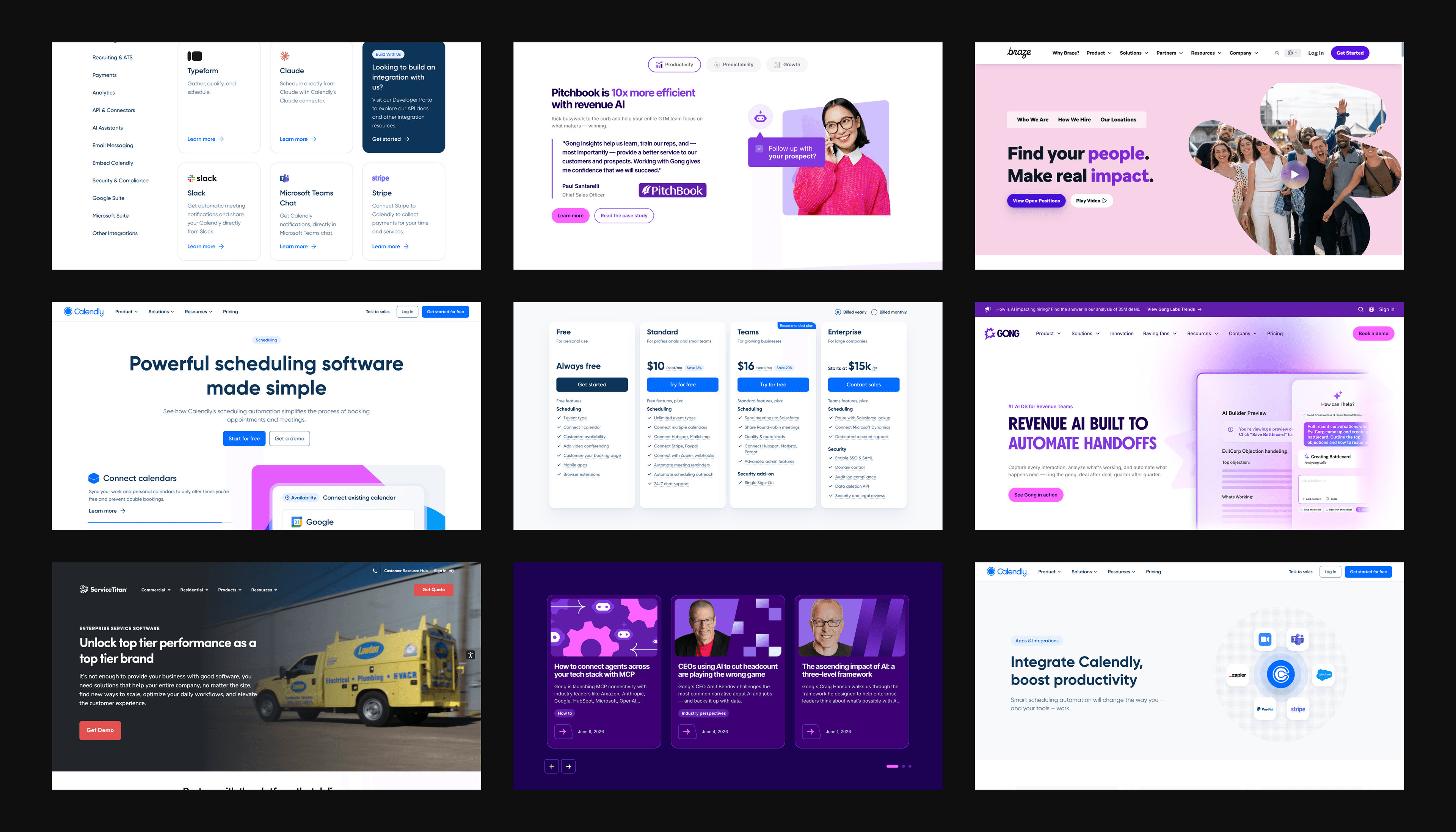
Webstacks websites don’t just look good—they scale with you and drive real results.

How to Design a Modern Edtech Website
A modern edtech website must balance functionality, user experience, and accessibility to support digital learning. When creating such a website, focus on key areas that influence how users interact with your platform and the overall learning experience you provide.
1. Create Smooth User Experience and Navigation
The foundation of any successful edtech website lies in its smooth user experience.
A well-designed navigation system ensures users can find what they need quickly and efficiently, which reduces frustration and improves engagement.
Consider implementing:
- Clean, Organized Layout: Use a strong visual hierarchy to guide users through your content effortlessly.
- Intuitive Navigation Menus: Design clear menus and logical categorization of content focused on user goals.
- Accessible Pathways to Key Features: Provide quick access to frequently used tools and resources such as pricing pages.
2. Focus on Robust Core Functionality
Modern edtech platforms support various learning activities. This involves integrating features that facilitate teaching, learning, and assessment in an online environment.
Key functionalities to include:
- Comprehensive Course Management Systems: Allow educators to create, organize, and deliver courses effectively.
- Personalized User Dashboards: Provide learners with an overview of their progress and upcoming tasks.
- Learning Management System (LMS) Integration: Seamlessly connect with popular LMS platforms for a cohesive learning experience.
- Collaborative Tools: Facilitate content creation and sharing among students and educators.
- Progress Tracking and Assessment Features: Implement tools for monitoring learner performance and providing feedback.
3. Offer Responsive Design and Accessibility
Your edtech website must work flawlessly across all devices while being accessible to everyone. Following a responsive design checklist can help you build a site that meets these standards.
Consider:
- Adaptable Fluid Layouts: Ensure your website looks and functions well on desktops, tablets, and smartphones.
- WCAG Compliance Features: Implement accessibility standards such as alt-text for images and keyboard navigation support.
By focusing on responsiveness and accessibility, you’ll make your educational content available to the widest possible audience.
4. Add Interactive Features and Engagement
To create an engaging learning environment, incorporate interactive features that keep users involved and motivated throughout their educational journey. For example, interactive landing pages can capture users' attention from the moment they arrive on your site.
Consider adding:
- Interactive assessments and quizzes
- Discussion forums and community features to foster collaboration and communication.
- Multimedia content integration, including videos, audio, and animations.
- Gamification elements such as badges, points, and leaderboards to motivate learners.
- Real-time feedback systems to guide learners.
- Dynamic content, such as video and animation, to explain complex topics.
5. Consider Performance and Technical Reliability
A modern edtech website must prioritize performance, as technical issues can detract from the learning experience and reduce user satisfaction.
Ensure that your website offers:
- Fast Loading Times: Optimize images and code to reduce loading times across all devices.
- Reliable Hosting Infrastructure: Choose hosting solutions that can handle high traffic and ensure uptime.
- Regular Updates and Maintenance: Keep your website up-to-date with the latest features and security patches.
- Analytics Integration: Track user behavior to understand engagement and improve the platform.
- Scalable Architecture: Design your website to handle growth and increased user demand.
See what’s working for industry-leading websites and find inspiration to improve yours.

Best Edtech Website Design Examples
Modern edtech websites use various design approaches. Here are our top picks for the best edtech website designs:
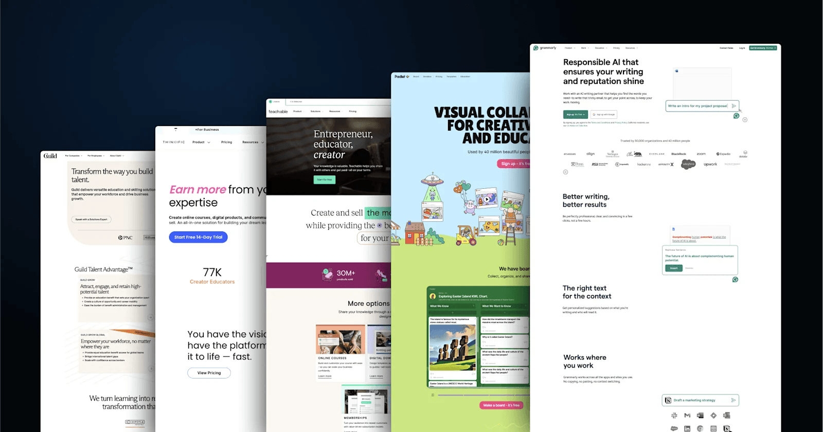
1. Grammarly
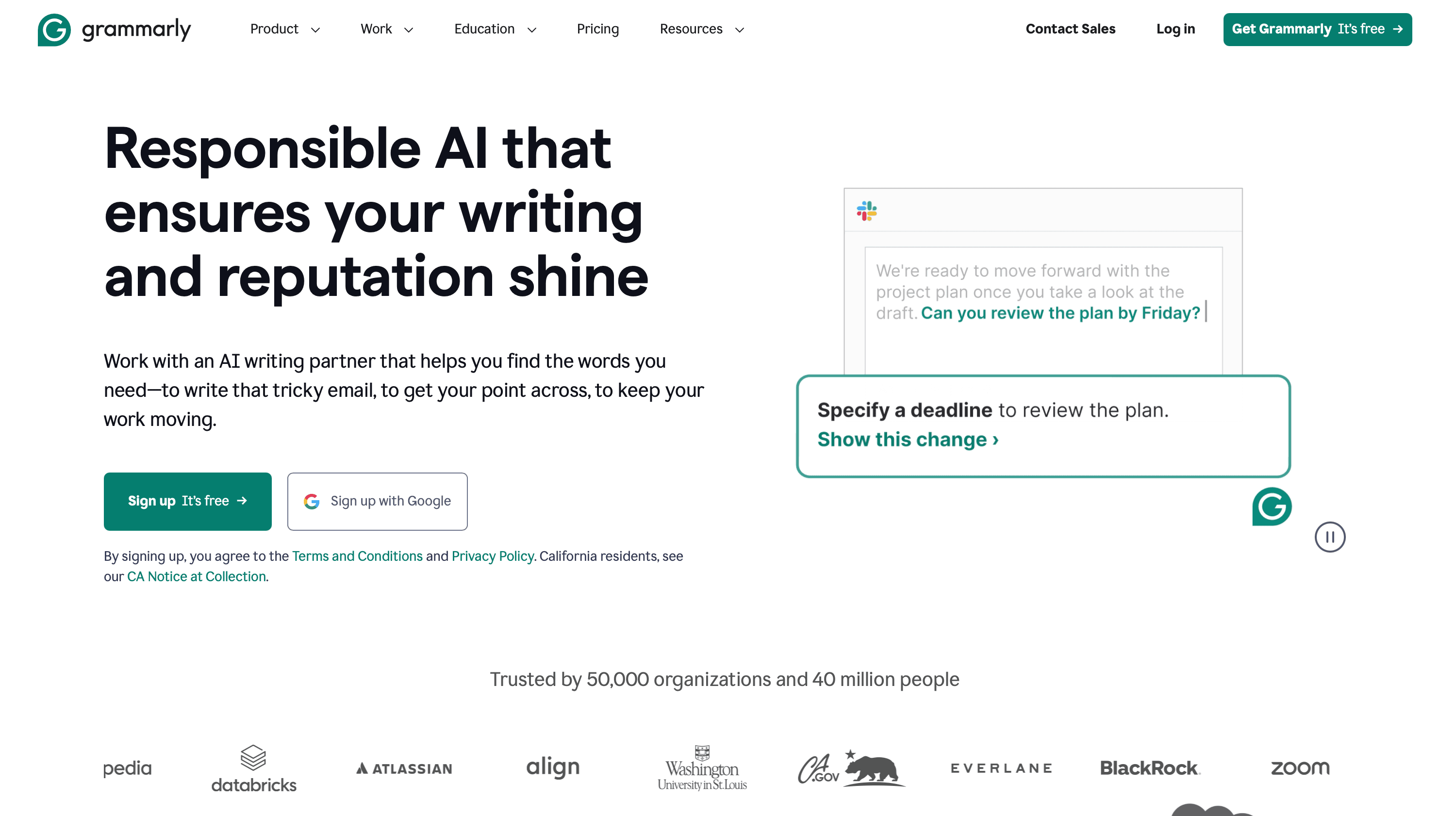
Grammarly is an AI-powered writing assistant that offers different plans to cater to individual users, professionals, and large organizations with features like tone adjustment, brand voice adherence, and text generation.
The homepage emphasizes user convenience and accessibility with prominent CTAs like "Get Grammarly - It's Free" and "Sign Up." The site uses a clean layout with a white and green color scheme that conveys professionalism and simplicity.
Design Lessons from to Learn from Grammarly
- Clean, Minimalistic Layout: Easy navigation and a focus on key offerings.
- Comprehensive Product Information: Clear descriptions of all tools and their applications.
- Extensive Help and Resources: Includes a blog, tech insights, and a detailed help center.
2. Padlet
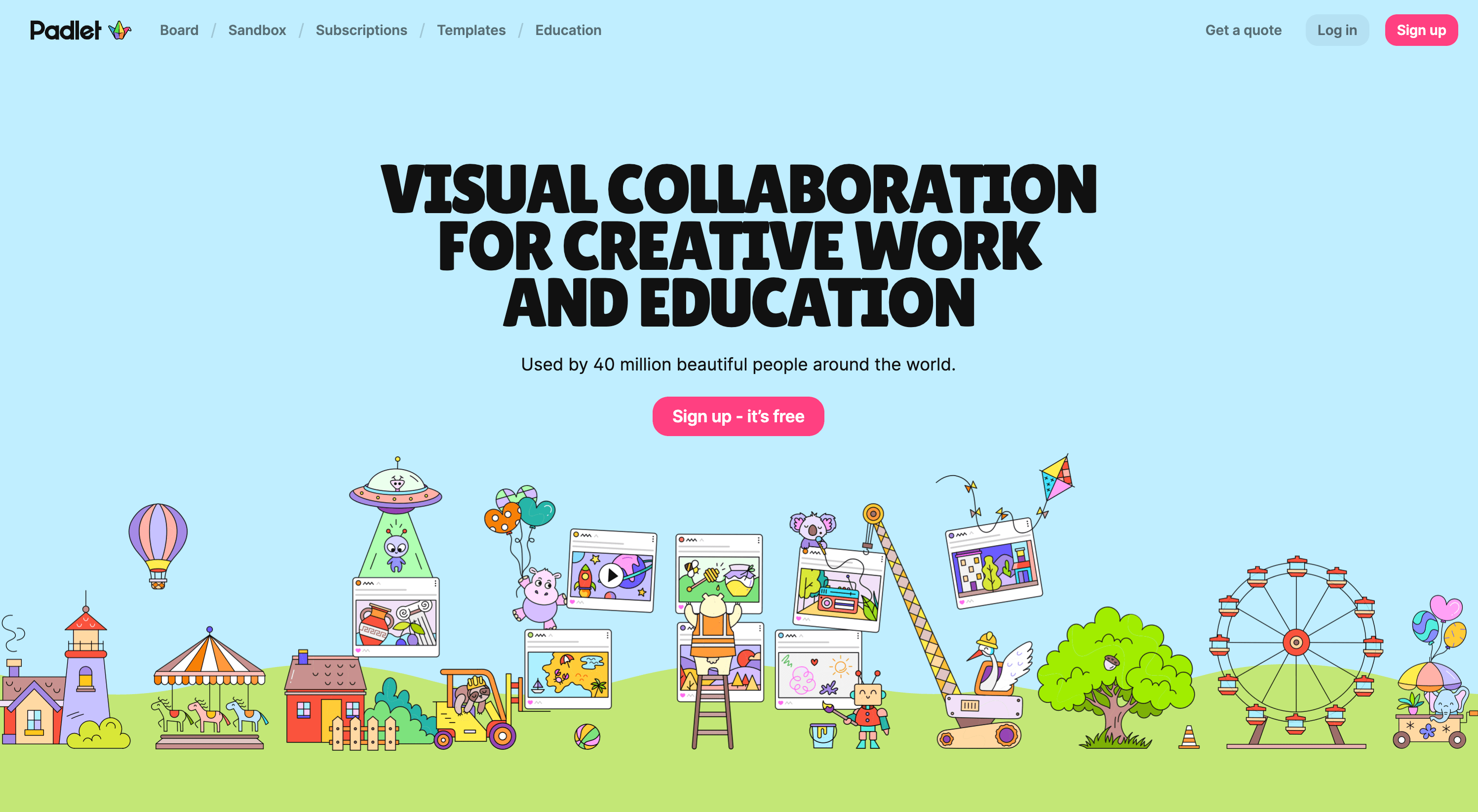
Padlet offers customizable digital canvases for brainstorming, storytelling, educational activities, and more. The website has a user-friendly interface where users can quickly create and organize content with sticky notes, images, and multimedia.
The homepage immediately draws users in with its pink, blue and green-colored vibrant imagery of digital boards and sandboxes, showcasing the platform's versatility. A primary call-to-action, "Sign up - it’s free," is prominently featured to encourage new users to get started.
Web Design Elements We Love from Padlet
- Vivid Visuals: Visuals are engaging and immediately demonstrate the platform's capabilities.
- Strong Social Proof: Ratings and user statistics are displayed prominently to build trust.
- Playful Language: Friendly phrases like “Every single one of them is beautiful” add a personal and inviting touch.
3. Teachable
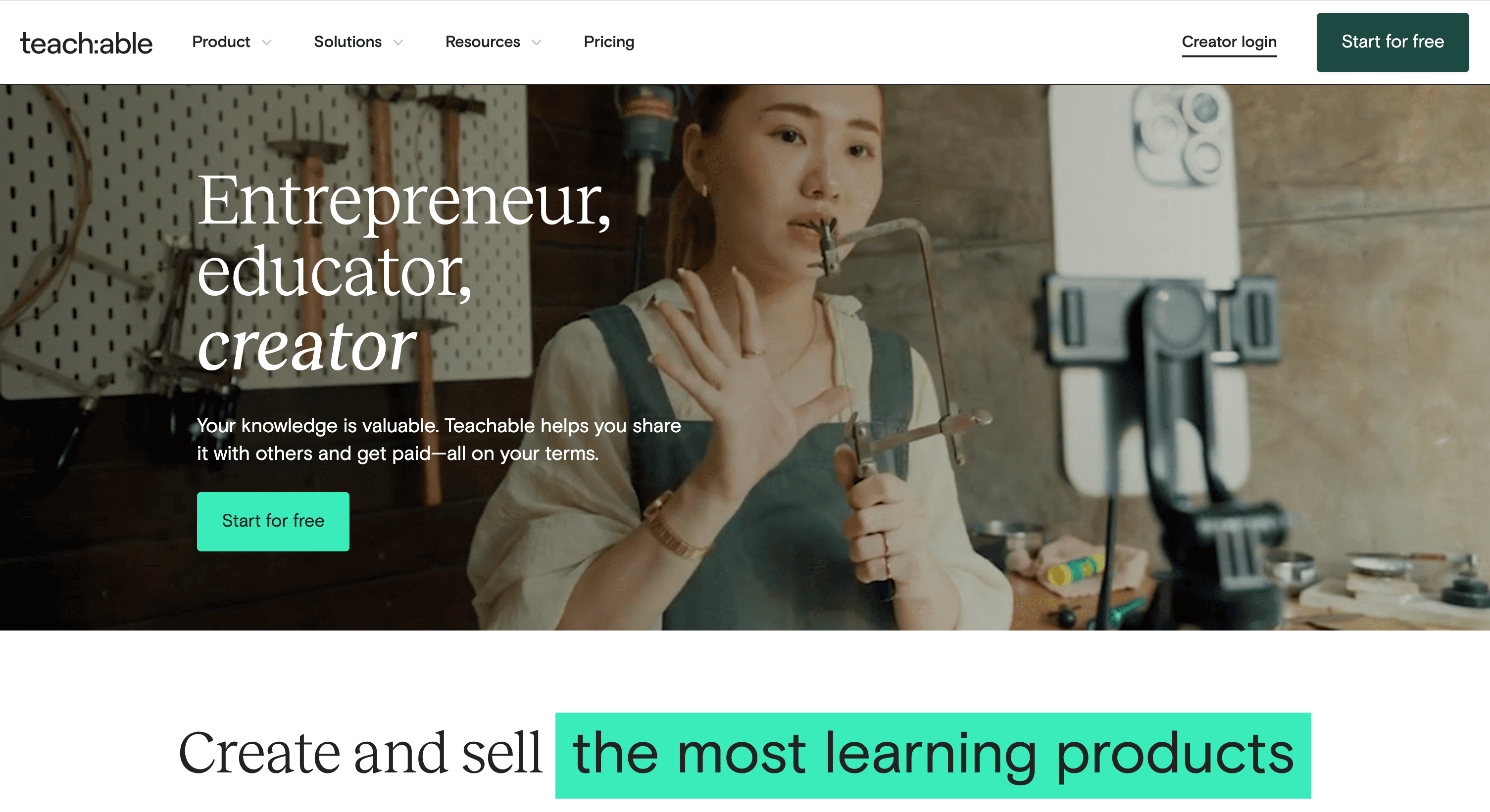
Teachable’s homepage uses a clean and professional design with a white, teal, and black color scheme that conveys trust. The layout is easy to navigate, with a prominent “Start for free” CTA encouraging immediate action.
Key offerings like courses, digital downloads, and memberships are displayed in well-structured sections. The site also incorporates testimonials and success stories to inspire creators and build credibility.
Web Design Elements from Teachable We Like
- Diverse Product Offering Focus: Clear sections highlight courses, coaching, and digital products as monetization options.
- Emphasis on Scalability: Flexible plans and tools cater to creators at every stage of their journey.
- Supportive Ecosystem: Resources such as blogs, tutorials, and creator success stories empower users.
- Minimalistic but Inviting Layout: The design is user-friendly without overwhelming new visitors.
4. Thinkific
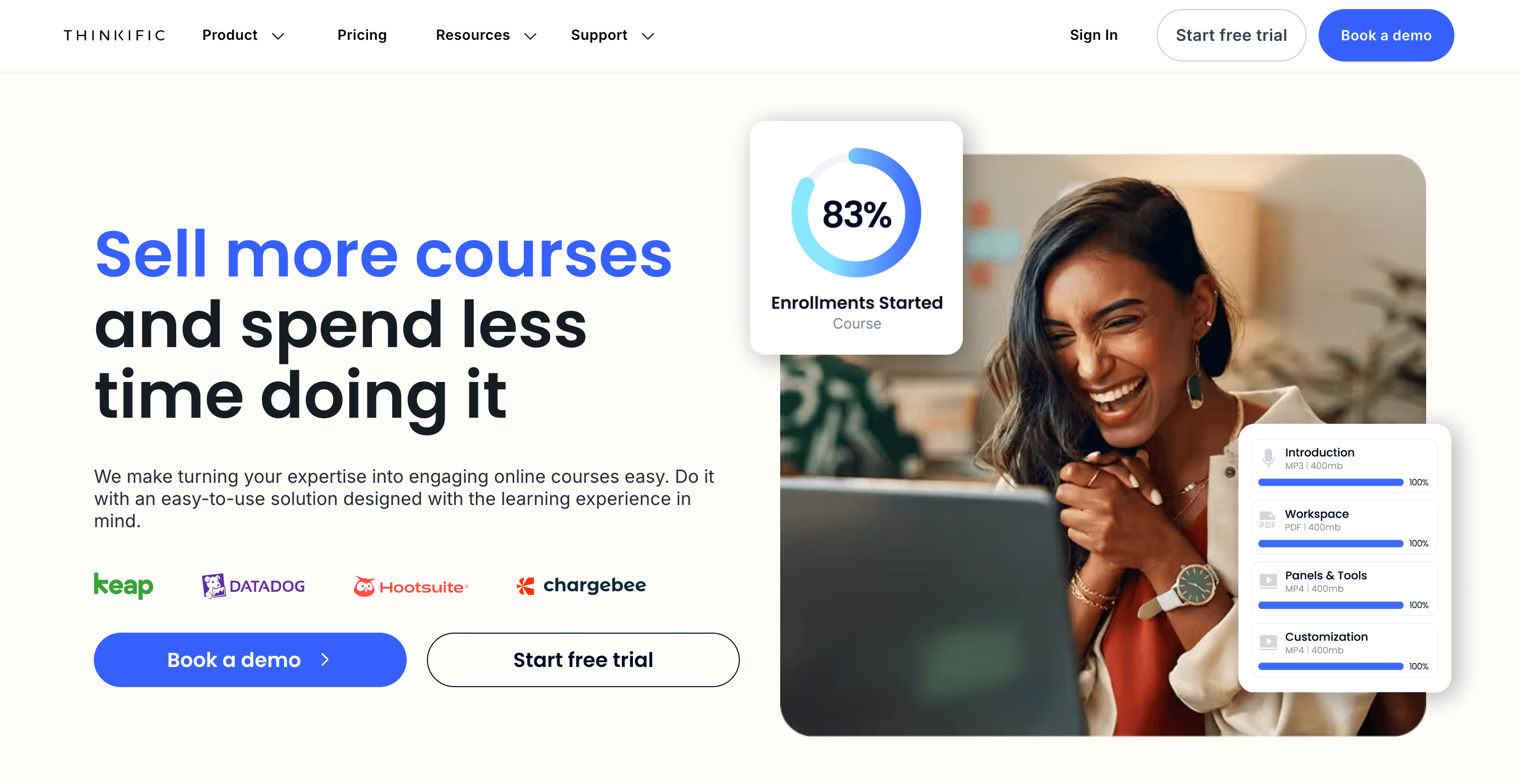
Thinkific’s homepage is modern and business-oriented, featuring a blue-and-white color palette with sleek fonts and bold headers. A prominent “Get Started Free” CTA encourages engagement, while a professional layout outlines offerings like memberships, analytics, and branded mobile tools.
The site emphasizes the all-in-one nature of the platform, appealing to creators and educators.
Top Web Design Elements We Love from Thinkific
- Streamlined Navigation: Clearly defined menus make it easy to explore tools, pricing, and customer examples.
- Focus on Advanced Tools: Features like branded mobile and analytics highlight the platform’s scalability.
- Entrepreneurial Appeal: The design is tailored for professional creators with a growth-oriented tone.
- Customer-Centric Features: Testimonials and case studies establish trust and inspire potential users.
5. Guild
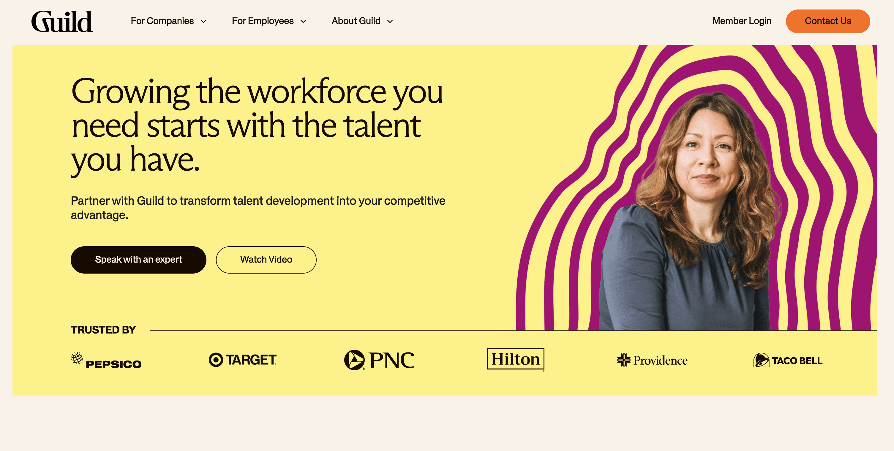
Guild’s homepage exudes a corporate and polished aesthetic, featuring a white-and-gold color scheme with orange highlights.
The main CTA, “Speak with a Solutions Expert,” targets decision-makers, while the layout focuses on showcasing results, such as improved retention and internal promotions. The homepage’s design emphasizes simplicity, making it easy for businesses to explore talent solutions.
Why Guild’s Web Design Caught Our Eye
- Data-Driven Case Studies: Metrics and outcomes from major clients, like Chipotle, build credibility.
- Professional Layout: Minimalism and clarity reflect the corporate focus of the platform.
- Global Accessibility: Education benefits tailored for diverse, international organizations expand its reach.
6. Numerade
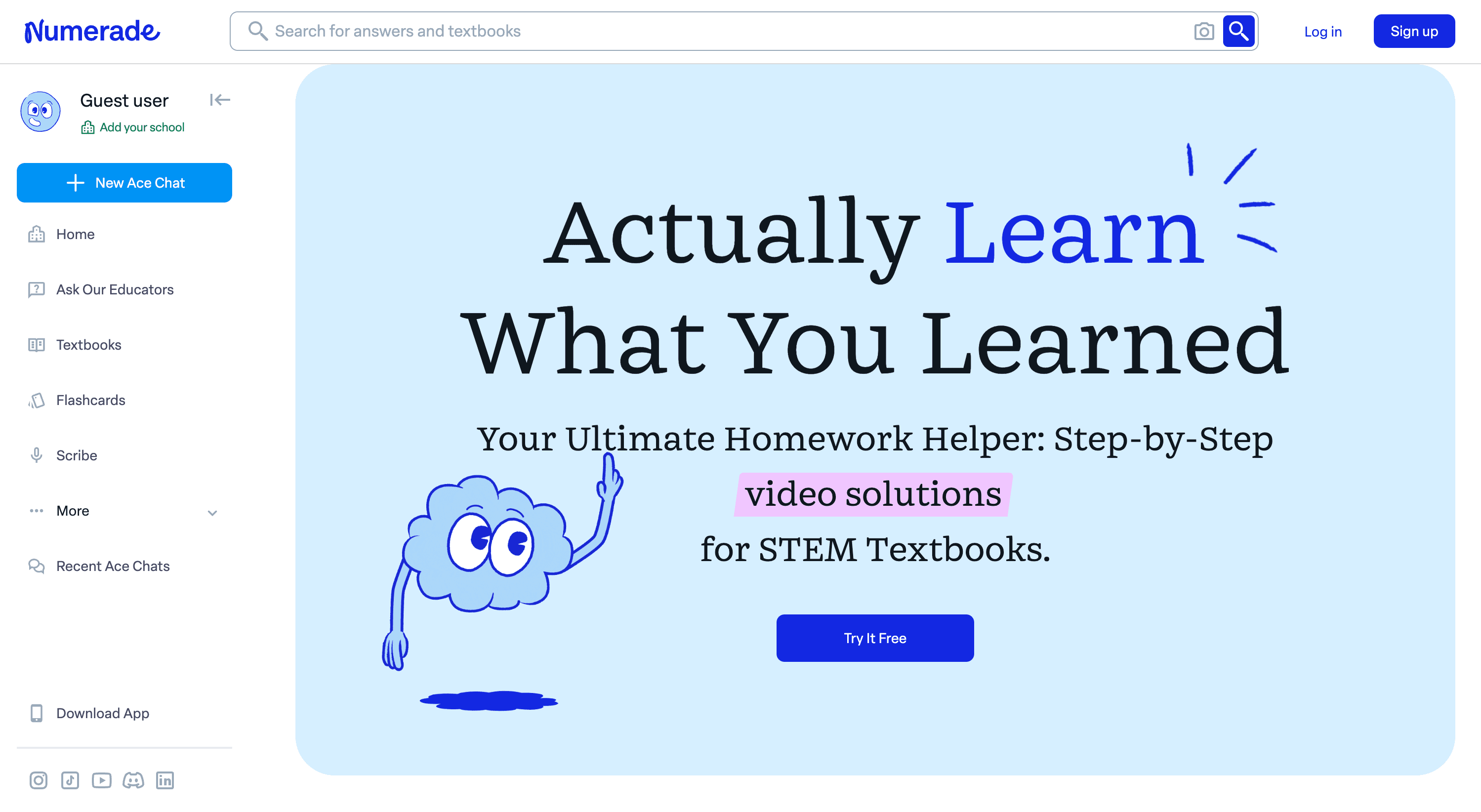
Numerade’s homepage features a clean, academic design with a white background complemented by navy blue and purple accents. The main CTA, “Try It Free,” encourages users to sign up for a 7-day free trial.
The layout is student-focused, highlighting features such as video textbook solutions, SnapSolve (instant video answers), and expert Q&A. Testimonials from users and impressive statistics, such as a 97% improvement rate in grades, build trust.
Our Favorite Web Design Aspects of Numerade
- Rich Content Library: Over 100 million videos cater to a wide range of subjects.
- Professional and Trustworthy Design: The use of testimonials and educator profiles establishes credibility.
- Mobile Accessibility: A dedicated app ensures 24/7 access to resources, appealing to on-the-go students.
7. Babbel
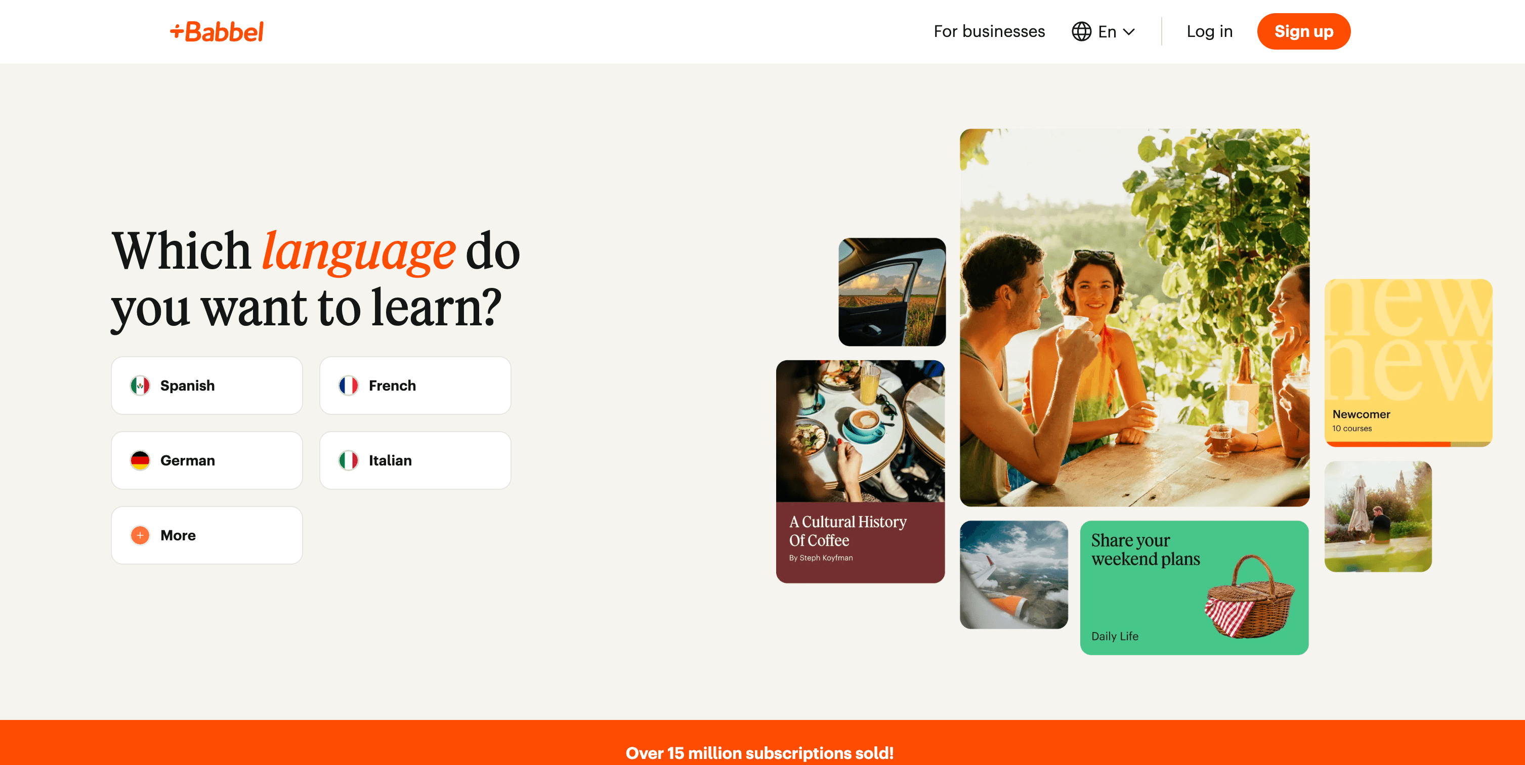
Babbel’s homepage is vibrant and inviting, featuring a beige background with splashes of orange that highlight key sections. The layout nurtures engagement, with the primary CTA, “Get started now,” repeated throughout.
The site is well-structured, presenting its core language learning tools, such as speech recognition, interactive dialogues, and grammar tips. Testimonials and success metrics, like "15M Subscriptions Sold," showcase its popularity and effectiveness.
Web Design Elements We Love from Babbel
- Eyecatching Headline: Visitors are welcomed by a CTA that says “Which language do you want to speak?”
- Clear Benefits Overview: As users scroll through the homepage, they learn all about Babbel’s benefits.
- Clean design: The homepage is clean and clutter-free, so users can easily find the information they need.
See what’s working for industry-leading websites and find inspiration to improve yours.
8. Newsela
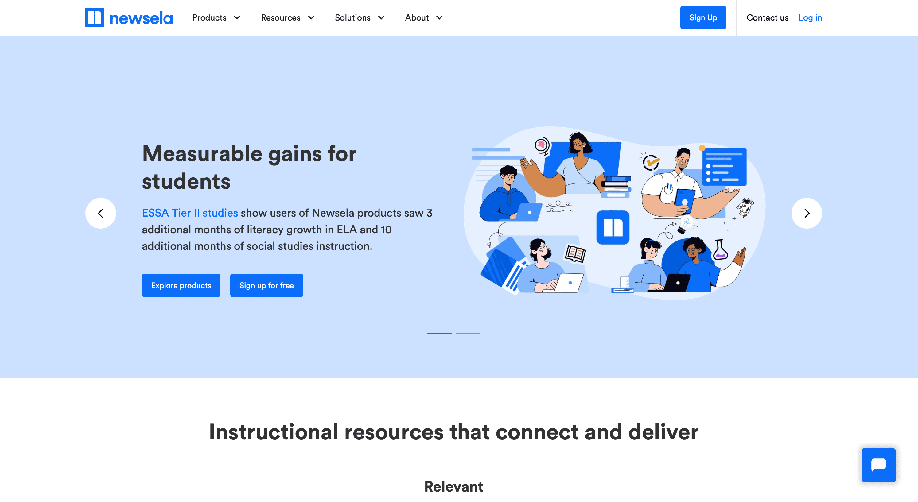
Newsela’s homepage uses a clean and educational design with a white and blue color scheme that fosters a professional, academic atmosphere.
CTAs like “Sign up for free” and “Explore Products” are prominent and encourage engagement.
The site emphasizes its value for teachers, students, and administrators with resources like standards-aligned content, literacy tools, and formative assessments. The layout is user-friendly, with clear segmentation of its instructional resources, premium products, and testimonials.
Design Elements That Stand Out from Newsela
- Clean and Professional Layout: The color scheme creates a polished and academic feel..
- Clear Navigation: The homepage effectively organizes key sections such as resources, products, and testimonials for easy browsing.
- Fun Graphics: Eyecatching, but still professional, graphics grab user attention.
9. Coursera
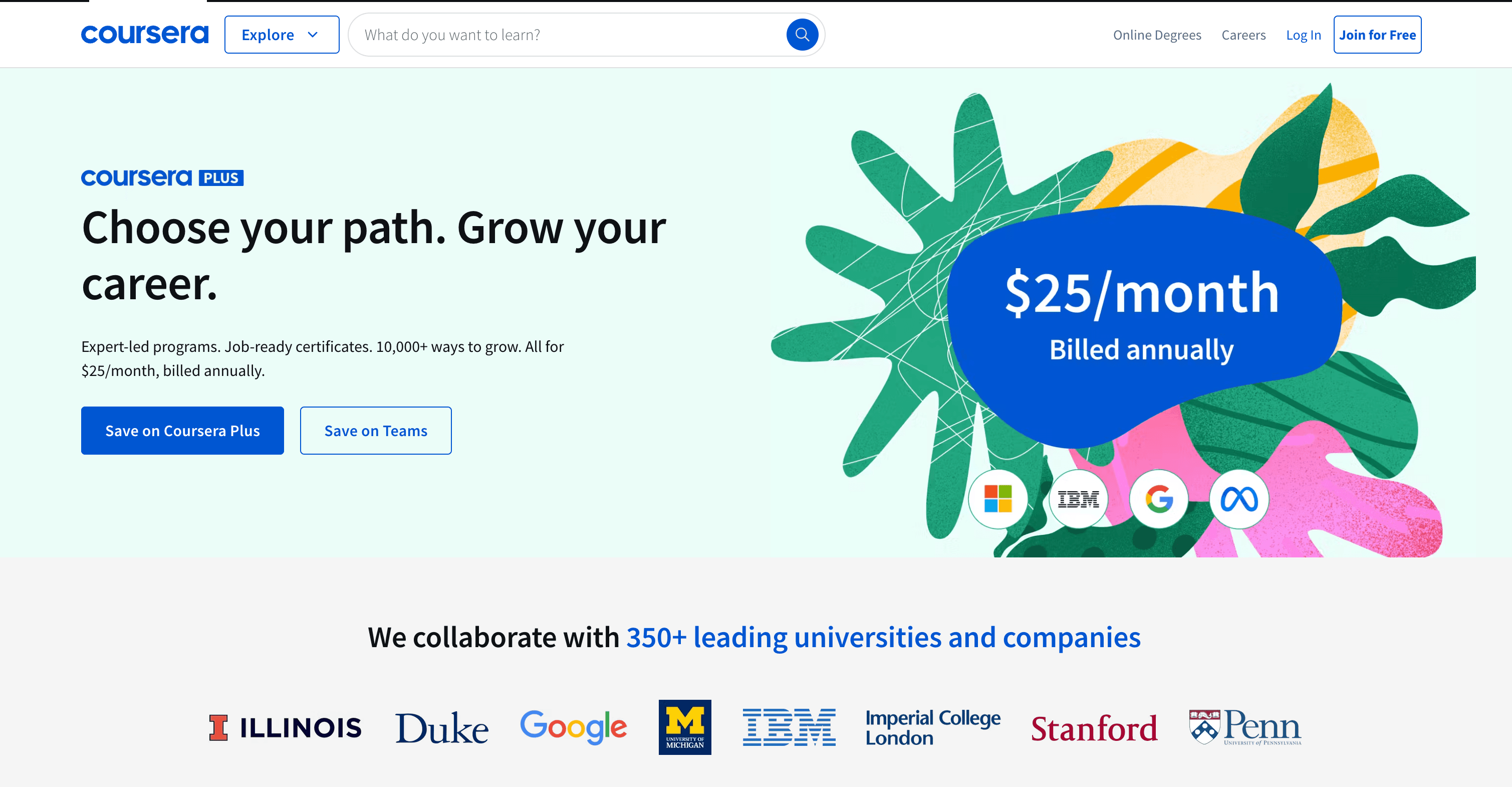
Coursera’s homepage showcases a modern, global appeal with a white and blue color scheme complemented by bold CTAs like “Save now” and “Get 50% off teams.”
The layout is highly structured, emphasizing diverse learning paths such as certificates, degrees, and free courses. Testimonials, job-role descriptions, and career benefits are strategically highlighted, creating an inspiring narrative for personal and professional growth. Partner logos of universities and companies underline its credibility.
Design Lessons To Learn from Coursera
- Tailored Navigation: Clear paths for individuals, businesses, universities, and governments.
- Engaging Visuals: Bold banners and CTAs like "Save on Coursera Plus" drive interaction.
- Credibility: Partner logos from top institutions build trust with users.
10. Quizlet
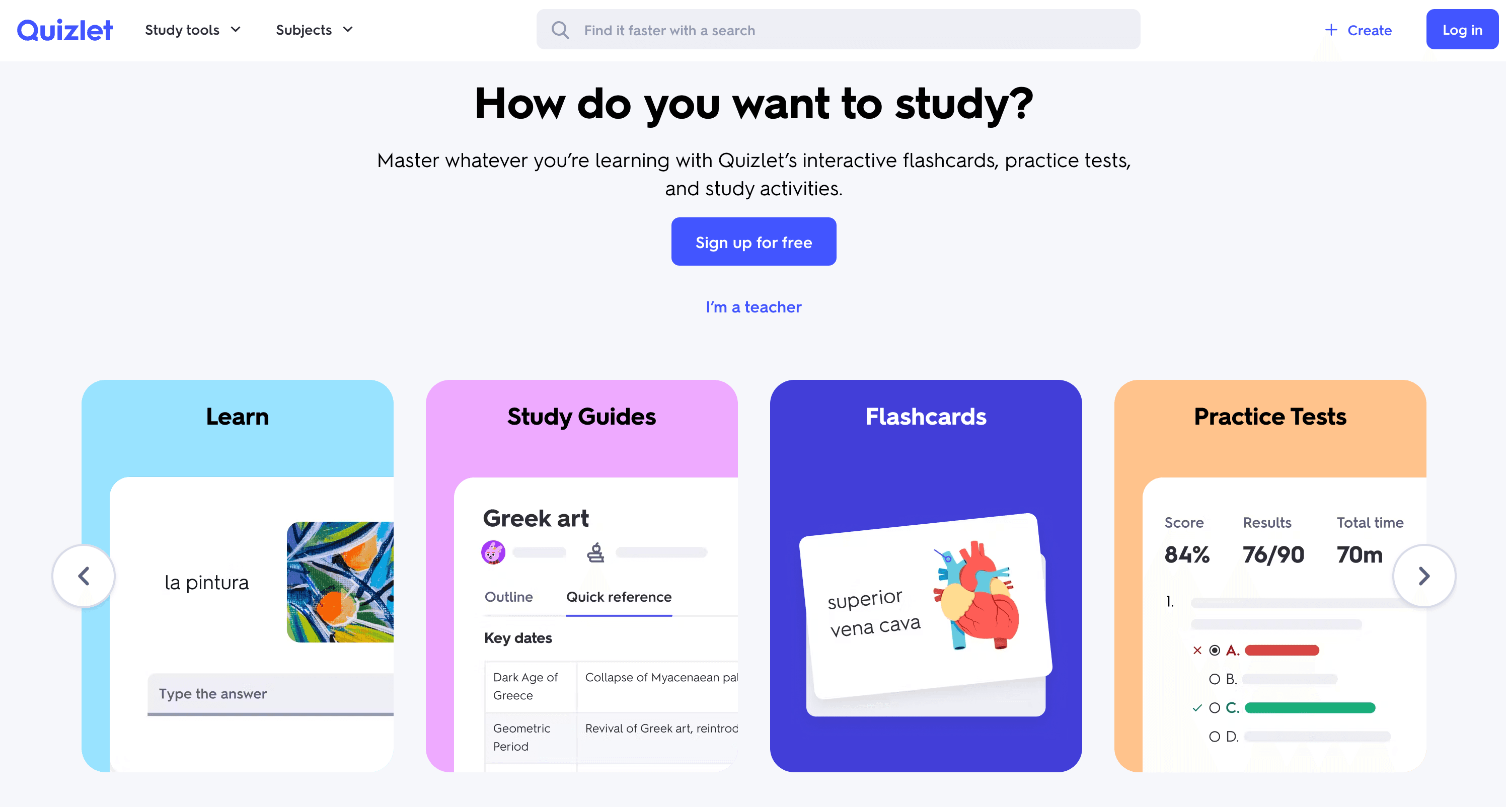
Quizlet’s website has a basic, easy-to-navigate design. It follows a simplistic white and blue color scheme with pastel colors for different sections. The CTA “Sign up for free” in the beginning is great to captivate users to sign up and learn more.
Then, the website offers a cool navigating section where users can access study guides, flashcards, practice tests, and more. You also get a button for “I’m a teacher” in case you want to switch to the teaching mode. The “Popular flashcard sets” section makes it easier to get started with the learning process right away.
Design Elements To Inspire You from Quizlet
- Clean Outlook: Clear organization of study modes and materials
- Playful Design: There’s a purposeful use of color along with the main color scheme.
- Prepping Material: Test prep on any subject available. It also turns class material into studiable guides instantly.
11. Clever
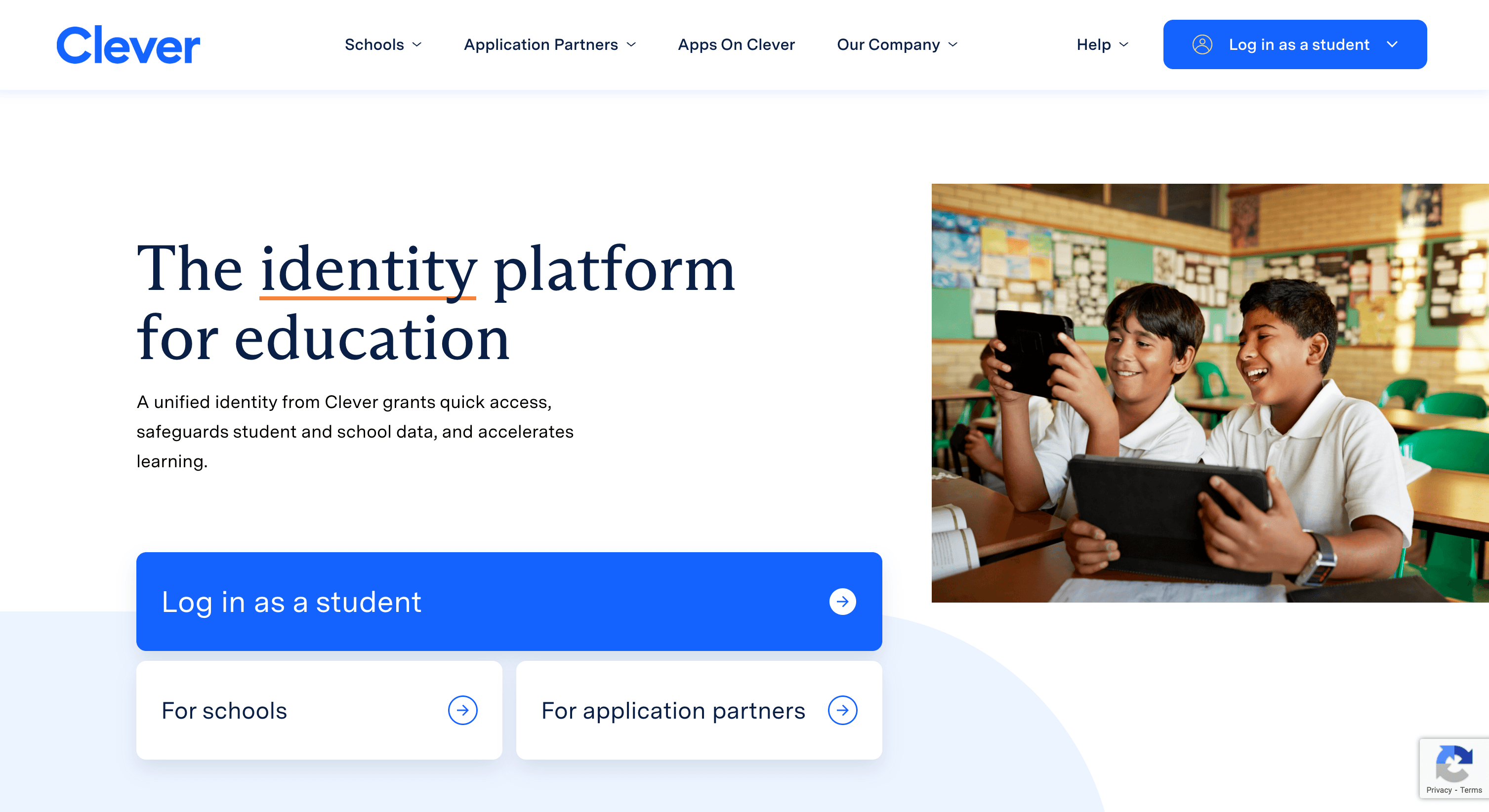
Clever’s homepage has a professional and user-friendly design with a clean white and blue color scheme that emphasizes trust and security. The layout highlights key features such as identity management, rostering, and analytics, making navigation simple for schools and application partners.
Images of real-world classrooms bring a pop of color to the homepage and keep users engaged with the content.
Why Clever’s Web Design Caught Our Eye
- Intuitive Navigation: Clear paths for schools and application partners, making it easy to access relevant information.
- Engaging Visuals: Educational imagery and concise messaging effectively convey the platform's purpose.
- Prominent CTAs: Buttons like "Log in as a student" and "For schools" are strategically placed to drive engagement.
12. Brilliant
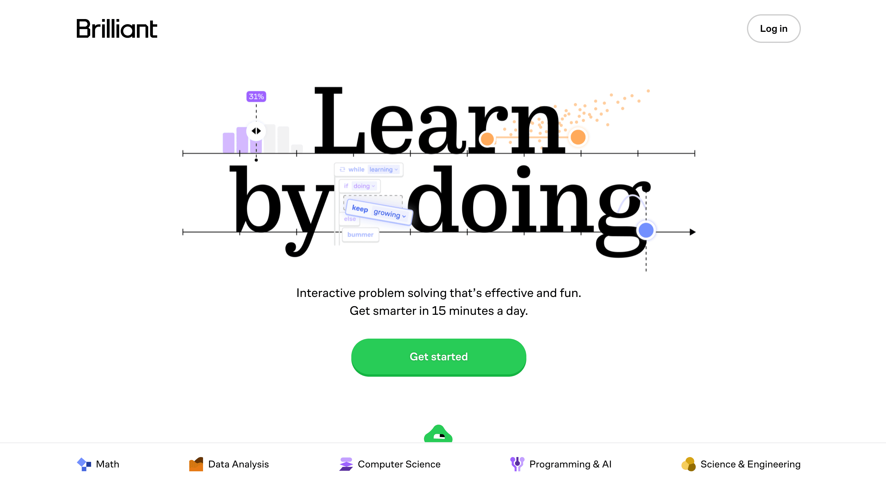
Brilliant’s homepage features an engaging and modern design with a white background and vibrant accents of blue and green that highlight key features.
The main CTA, “Get started,” is strategically placed alongside interactive animations to encourage user sign-up. Testimonials and statistics like “10 million learners worldwide,” are featured prominently to build trust.
Our Favorite Web Design Aspects of Brilliant
- Focus on User Reviews: The homepage emphasizes over 50,000 5-star reviews for the platform’s mobile app.
- Strategic Logo Placement: Google, Harvard, and Microsoft logos add credibility to the platform.
- Social Proof: The final homepage CTA uses the platform’s 10 million users as a strong proof point.
13. Cambly
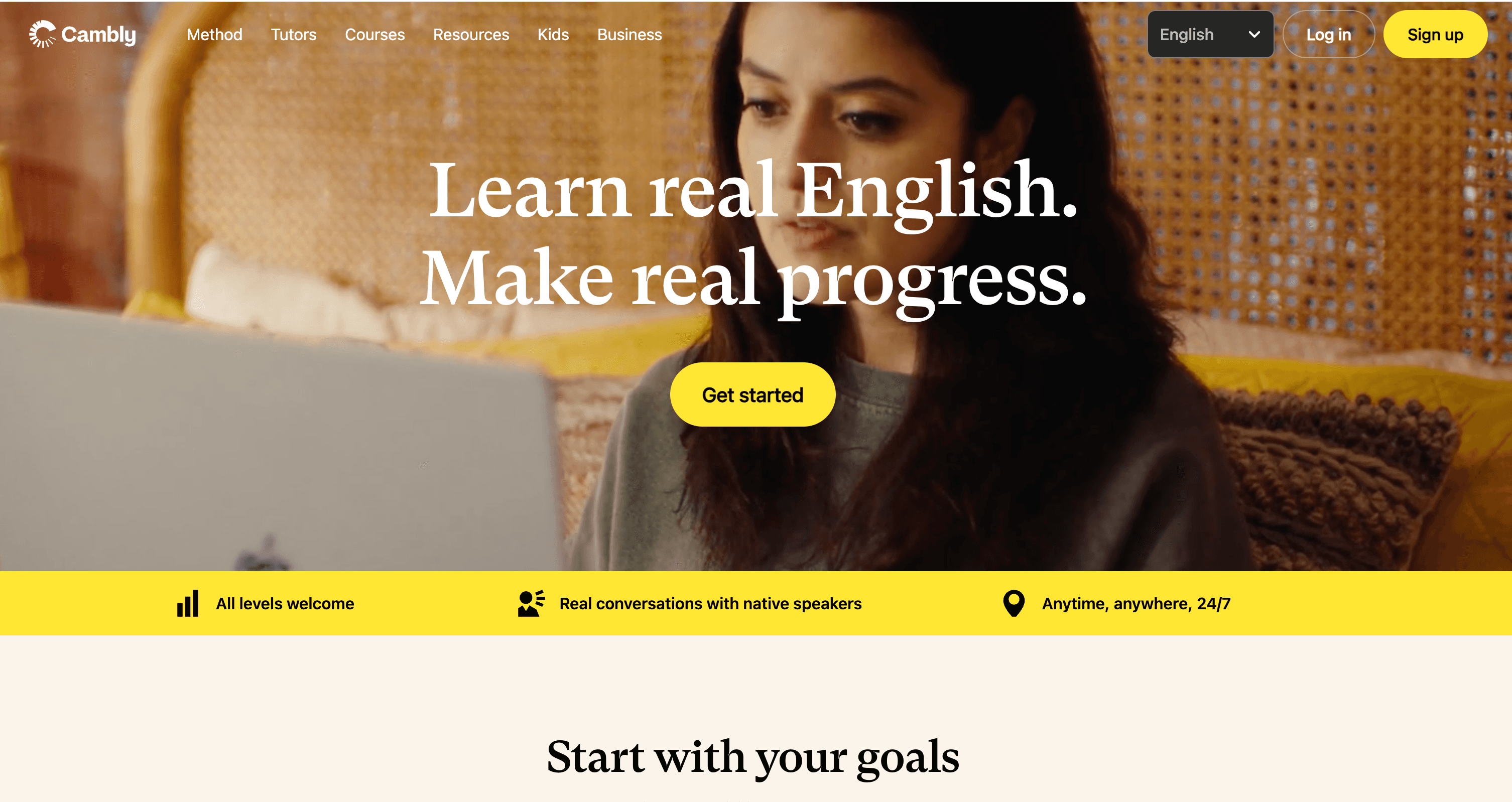
Cambly’s homepage is bright and welcoming, with a bright white and yellow color scheme that highlights its focus on accessibility and personalized learning. The main CTAs, “Get started,” “Start learning,” and “Explore tutors,” are positioned to encourage quick engagement.
The platform highlights flexible, 24/7 access to native English-speaking tutors and customized learning plans. Pricing plans for private and group lessons are showcased clearly, with testimonials adding credibility.
Web Design Elements We Love from Cambly
- Bright Color Scheme: A clean white background paired with bold yellow accents and splashes of blue creates a vibrant, welcoming aesthetic that draws attention to key areas of the site.
- Engaging Hero Section: The homepage greets users with a large, central hero image featuring a friendly tutor and a student, immediately conveying a warm and personal learning experience.
- Testimonial Carousel: A scrolling section features real user testimonials and tutor profiles, adding credibility and trustworthiness to the site.
14. CoachHub
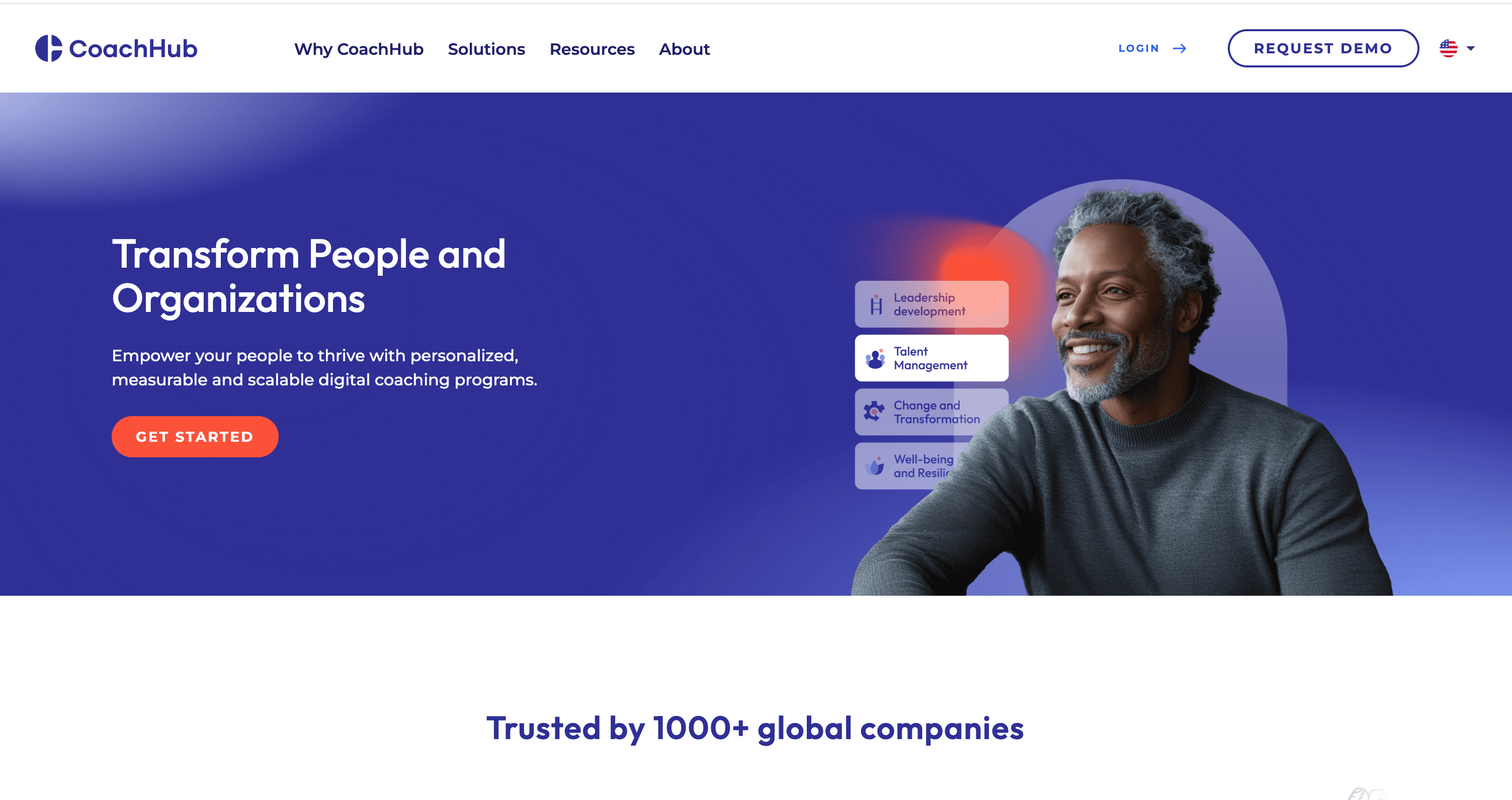
CoachHub’s homepage features a polished corporate design with a white and navy-blue color scheme, conveying professionalism and trust. The main CTA, “Request Demo,” invites organizations to explore its digital coaching solutions.
The site emphasizes AI-powered coach matching, personalized coaching programs, and measurable results. Detailed sections showcase features like global coach networks, analytics tools, and case studies, making the platform appealing to HR leaders and corporate decision-makers.
Web Design Highlights from CoachHub We’re Fond Of
- Embedded Video Content: An embedded video provides visitors with a quick overview of CoachHub's services, enhancing engagement through multimedia elements.
- Informative Statistics Display: The homepage presents impactful statistics, such as "62% Higher retention of top performers" using large, bold fonts to capture attention.
- Dynamic Hero Section: A prominent hero section showcases a compelling headline and a call-to-action button, immediately engaging visitors.
15. Wonderschool
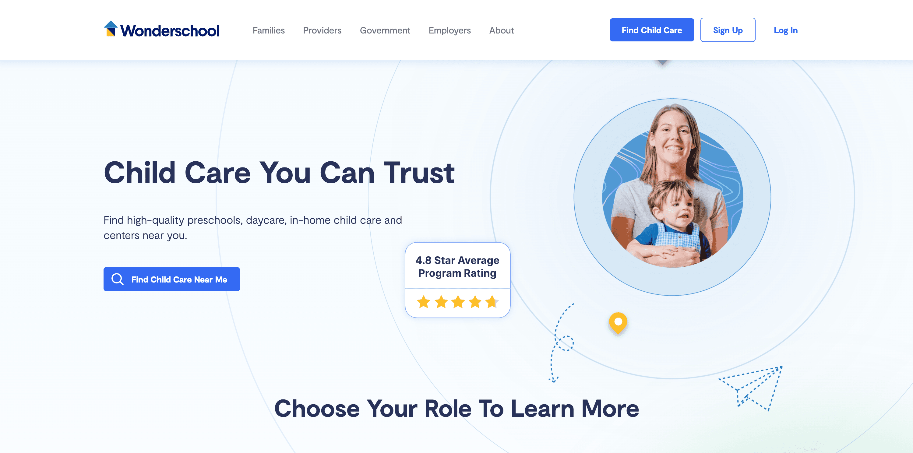
Wonderschool’s homepage uses a welcoming and approachable design with a clean white background and accents of green and blue to evoke trust and growth. The primary CTAs, such as “Find Child Care Near Me” and “Learn More,” guide families, providers, governments, and employers to relevant resources.
The site emphasizes licensed, high-quality childcare options, training programs for providers, and innovative management tools. User testimonials and licensing support are showcased prominently to highlight its impact.
Web Design Elements That Stand Out from Wonderschool
- Intuitive Navigation Bar: The top navigation bar is organized with clear categories such as "Families," "Providers," "Government," "Employers," and "About," allowing users to easily find relevant information.
- Informative Statistics: The homepage highlights key statistics, such as supporting providers in 47 states and being featured in national media, to build credibility and trust.
- Trust Indicators: The display of testimonials from providers and mentions of media features serve as social proof, enhancing the platform's credibility.
How to Upgrade Your Edtech Website
Upgrading your website means focusing on key areas that can positively influence the user experience and the overall effectiveness of your platform.
Strengthen Your Branding
Your brand is more than just visual elements—it's your platform's entire identity in the edtech space. Strengthening your branding helps differentiate you from competitors and builds trust with your audience.
Key strategies:
- Define Your Unique Value Proposition (UVP): Highlight what sets you apart, such as innovative features or superior support.
- Maintain Consistent Messaging: Ensure that all communications reflect your brand values and voice.
- Visual Identity Enhancement: Update logos, color schemes, and typography to modernize your brand's look.
By reinforcing your branding, you create a memorable impression that resonates with users and encourages loyalty.
Implement Scalable Web Design Systems
Implementing a scalable design ensures that your website remains consistent and functional as you expand.
Focus on:
- Responsive design for mobile access
- Intuitive navigation and clear user pathways
- Reusable design elements for efficiency
- Consistency in typography and color schemes
- Accessibility features for all users
Improve Content Management
An important part of effective content management involves changing how you present and organize it.
To get users to engage with your content more, implement the following:
- Develop a Content Calendar: Plan regular updates to keep content fresh and relevant.
- Encourage User-Generated Content: Build a community by allowing users to contribute.
- Use a Powerful CMS: Choose a Content Management System that meets your platform's needs, potentially by choosing a headless CMS.
- Logical Content Organization: Arrange content by subject, level, or type for easy navigation.
- Implement Strong Search Functionality: Help users find what they need quickly.
Optimize Your Hosting
Your hosting solution directly impacts user experience and platform reliability. When you optimize it, you’ll have a website that is fast, secure, and able to handle increased traffic.
Here’s what you should consider:
- Speed Optimization: Use caching and content delivery networks to improve loading times.
- Security Measures: Implement SSL certificates and security protocols to protect user data.
- Regular Backup Systems: Ensure data can be recovered in case of issues.
- Scalable Resources: Choose hosting that can grow with your platform.
- 24/7 Technical Support: Have support available to address issues promptly.
Ready for a Better Edtech Website?
The websites we’ve covered demonstrate the power of thoughtful design principles, from intuitive navigation to engaging user experiences. Like B2B SaaS websites, they show that success comes from combining aesthetic appeal with practical functionality so your platform looks great and serves its educational purpose.
Take that first step today. Begin by evaluating your current website against the design principles and examples we’ve discussed. Whether you choose to make improvements internally or collaborate with design professionals, remember that your website often serves as the first interaction users have with your educational platform—make it count.
Ready to transform your edtech website into a powerful educational tool? Download Webstacks' Best B2B SaaS Websites eBook to discover more inspiring examples and actionable insights that can transform your digital presence.
See what’s working for industry-leading websites and find inspiration to improve yours.

I create SEO-driven content for B2B SaaS companies, from blog posts to case studies. I focus on research-backed writing that ranks on the first page and drives meaningful organic traffic.