
Is your website built to adjust to different mobile devices and screen sizes without compromising the performance of your marketing efforts? Websites that are not responsive on different devices are miles behind responsive websites.
Not to mention, a lack of access across multiple devices interferes with marketing initiatives such as SEO campaigns, content marketing, and so on. Where do development teams land in the equation? Development teams that don’t build for accessibility are making it more challenging for themselves.
We'll explain the role development teams play in setting the stage for marketing teams in the website design process and how ignoring responsive design principles will hinder scalability.
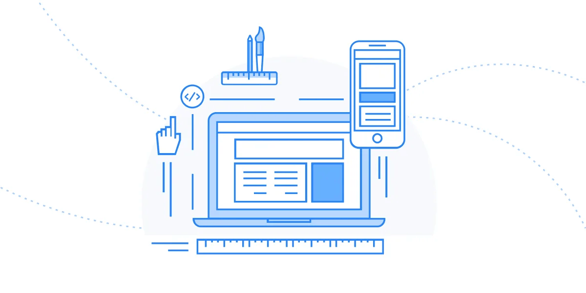
What is Responsive Design?
Responsive design involves creating websites that adapt to any screen size, device, or resolution. The goal is to ensure content and design elements scale automatically, providing a clean, structured look on any device. This approach prevents unnecessary resizing, scrolling, or panning, optimizing websites for various devices.
Why Responsive Design Frameworks Matter
Responsive design frameworks are essential tools that simplify the process of creating adaptable websites. They save developers from manually coding for each device, acting as versatile, reliable assets in web design. Not adopting these frameworks can hinder scalability and complicate marketing initiatives like SEO and content marketing.
More than 7.1 billion people are using mobile devices worldwide, so designing for mobile experiences should be a no-brainer.
But more importantly, deploying a website that follows responsive design practices allows for better scalability between development and marketing teams.
Users aren’t the only ones facing the aftermath of poor responsiveness from a website.
Internally, teams that are involved with the website building process (it’s usually marketing and development teams) face major hurdles trying to adjust to the poor performance of the site on devices that aren’t compatible with the site’s design system.
Challenge: Development teams build for the future
Responsive design is no easy task for development teams as they must test on multiple devices and multiple browsers to ensure the contents of the website fit nicely according to screen size.
Responsive design entails having to plan for a nearly infinite number of screen sizes. But in the grand scheme of things, developers are building with the future in mind and already making their website accessible to multiple audiences on different devices.
Responsive design uses CSS media queries to change styles based on the target device and then loads the page layout onto the user’s device.
Once this functionality is deployed, the contents of your website will automatically adjust to any screen size.
Now, marketers can comfortably create content for website pages without having to worry about how the content will be displayed to the end-user.
The "one size fits all" approach means less headache for developers, business owners, and consumers. Another plus is spending less time on maintenance to focus on other areas like marketing and content creation.
Your development team will be ecstatic! Instead of having to build a new mobile application, developers can build multiple style sheets for web pages.
Creating an entire mobile application will force developers to write code from scratch, which takes considerable time away from other tasks. With responsive design, development teams can simply repurpose the HTML code across devices.
It will cost you less to build a website using responsive design than building a stand-alone mobile application that will function almost identically to your site.
You have to keep in mind that building a mobile application means managing an entirely new system.
Whenever changes need to be made, development teams have to carve out time to edit both web applications. Maintaining separate web applications will get expensive.
With a responsive website, you only have to maintain one website while staying responsive to users on an array of devices.
Solution: Marketing Teams Can Work their Craft
The benefits of responsive design are what make this process scalable for both development and marketing teams.
We touched on how developers save time building a responsive website that adheres to multiple screen sizes across different platforms.
But at the end of the day, losing users and followers due to website performance issues falls into the lap of the marketer.
Marketing teams not having to worry about website responsiveness is a win in itself.
Development teams set their peers up nicely to execute what they're best at--pushing marketing initiatives that focus on improving SEO rankings, increasing website traffic, converting prospects into customers, and effectively targeting audiences across multiple platforms.
As we mentioned, some businesses maintain more than one website application because they’re not doing it the responsive way. Imagine marketing teams having to double their workload and repurpose content for multiple audiences—it doesn’t sound scalable at all.
Flexibility is a huge selling point for responsive design. Today, marketing teams want to make changes all the time.
To put it into perspective, 70% of marketers are actively investing in content marketing and growing out their content initiatives. This means that marketing teams need to be able to make changes quickly and with ease, whether it be repurposing the content or fixing a typo.
The flexibility responsive design offers is a huge advantage. If your marketing team prioritizes SEO heavily and uses search rankings to find quality leads, then the responsive design framework should be no question.
With responsive design loading your pages at a fast rate, your website will have a better chance of climbing up the SERPs because search engines like Google give preference to mobile-friendly websites.
This way users will enjoy your website’s usability and enough to convince them to stay on the page.
Therefore, marketing teams can continue to execute their marketing initiatives by only focusing on one website knowing that any alterations made will be processed with zero disruptions.
Benefits of Responsive Design Frameworks
Responsive frameworks enhance user experience by ensuring consistent functionality across devices. They optimize performance, streamline code, and reduce load times, crucial in retaining visitors. These frameworks also simplify scalability and maintenance, allowing sites to grow with business needs.
Enhanced User Experience
Responsive frameworks guarantee a seamless experience, whether users access your site via phone, tablet, or desktop. This consistency leads to happier visitors and increased engagement.
Performance Optimization
Built with performance in mind, these frameworks streamline code for faster load times. In the digital age, speed is vital—slow sites lose visitors quickly.
Scalability and Maintenance
As your company grows, responsive frameworks make scaling and maintaining your site easier. Their organized structure simplifies updates and changes.
Integration Capabilities
Responsive frameworks integrate smoothly with existing tech stacks, ensuring compatibility and minimizing headaches during implementation.
Implementing a Responsive Design Framework
Start by analyzing project requirements to choose the right framework. Set it up in your development environment and integrate it with your tech stack. Customize design elements to reflect your brand and test across devices to ensure consistency.
Tips for Maximizing Framework Efficiency
Optimize resources by minifying CSS and JavaScript files. Maintain code modularity for easy updates and ensure accessibility standards. Plan for future scalability to accommodate business growth.
Implement a Responsive Design Framework
Responsive frameworks enhance performance, boost user retention, and offer a high ROI. The initial investment pays off in streamlined development, easier maintenance, and improved user experiences.
For those ready to elevate their web presence, partnering with Webstacks can make the process smoother. Our expert services ensure that your responsive design not only meets but exceeds expectations, aligning perfectly with your company’s growth and tech needs.

