10 Elements of Strong Website Branding
Website branding uses visual and interactive elements to showcase who you are online. It's your company's identity, values, mission, and personality across every digital touchpoint.
As a web design agency, Webstacks has partnered with many high-growth companies to build conversion-driven website branding strategies. We specialize in helping clients create brand identities that reflect their unique position and grow with their business.
Our opinion is that successful website branding needs a strategic approach that combines multiple elements into a cohesive brand identity.
From your logo to your brand story, each piece contributes to the overall user experience and helps your brand stand out. By carefully implementing these elements, you'll dramatically impact how users engage with your website and brand.
Webstacks helps marketing teams build bold, conversion-ready brands through strategy, identity, and storytelling.

1. Logo Design
Your logo is a visual anchor that communicates who you are. It serves as your primary identifier.
Good logos are be instantly recognizable and work well in multiple formats. Here's what to aim for:
- Create a simple, scalable design that works across all digital platforms.
- Make it adaptable for different formats (horizontal, square, favicon).
- Provide adequate white space around logos.
- Consider responsive logo variations for different contexts.
- Ensure the logo aligns with overall brand positioning.
Take Instagram's logo as an example. Their vibrant gradient design captures creativity and innovation, perfectly matching the platform's focus on visual content. The simple camera icon remains recognizable even at tiny sizes, making it perfect for mobile apps and social media profiles.
Remember, your logo will appear everywhere, from website headers to app icons to social media profiles. Making sure it remains clear, distinctive, and on-brand across all these applications is key to building strong website branding online.
For inspiration, check out some innovative blockchain logo designs that showcase how logos can capture a brand's essence in the crypto space.
2. Typography
Typography does the heavy lifting in your website branding. It sets the tone and makes your content readable.
The fonts you choose shape how users perceive your brand's personality and how easily they absorb your message. And it creates a clear hierarchy and guides visitors through your content.
Here's how to nail your typographic branding:
- Pick 2-3 complementary font families to keep things cohesive and add them to your brand style guide. This limited palette creates visual consistency.
- Create a clear typographic hierarchy for headings, subheadings, and body text. It helps users scan and understand your content quickly.
- Improve readability across devices with appropriate font sizing and line spacing.
- Use consistent font pairings across all your digital platforms and marketing materials.
- Consider custom typography for a truly distinctive identity. It costs more but can set you apart from everyone else.
Netflix shows this perfectly with their custom wordmark. Their clean, distinctive font boosts brand recognition everywhere, from billboards to mobile apps. The bold, slightly compressed letterforms convey confidence and modernity, which perfectly matches their innovative image.
3. Color Scheme
A thoughtful color palette has the power to trigger emotional responses and strengthens brand recall.
When creating your website's color palette:
- Develop a focused palette with primary, secondary, and accent colors.
- Choose colors based on psychological associations that match your brand values. Blue often suggests trust and professionalism, while green can represent growth and sustainability.
- Ensure strong color contrast for readability and WCAG compliance. Familiarize yourself with web accessibility best practices to make your site inclusive for all users.
- Use color consistently to mark interactive elements and information categories. This helps users navigate intuitively and reinforces your visual language.
- Consider cultural color associations, especially for global audiences. Colors mean different things in different cultures, so do your homework to avoid sending unintended messages.
Take Circle, for example. Their site uses a sharp, modern palette centered on deep blue and white, signaling trust, security, and professionalism. These values align with their work in digital finance. The restrained use of accent colors keeps attention on the content.
Learn more about how Webstacks helped Circle with their website design.
4. Visual Style and Assets
Your visual assets reveal your brand's personality through imagery and design elements. They reflect your brand's character and create lasting impressions on your audience.
To build a strong visual style:
- Create a cohesive style for illustrations, icons, and photography that matches your brand personality. Webstacks recommends using a visual identity system to guide this process.
- Set clear guidelines for image selection that reflect your core values and connect with your target audience.
- Keep graphic elements consistent across all platforms. This includes shapes, patterns, and textures.
- Invest in custom visuals like illustrations or photography styles to make your brand.
5. Consistent Branding Across Pages
Your website should feel connected from page to page. That starts with using the same layout patterns for similar content. Product pages, blog posts, and forms should follow clear, repeatable structures.
A shared design system keeps buttons, typography, and spacing consistent. Navigation should work the same across every page, so users don’t have to relearn how to get around.
Your logo, colors, and fonts should appear the same way throughout the site. Stick to your brand guidelines to make sure these elements stay aligned.
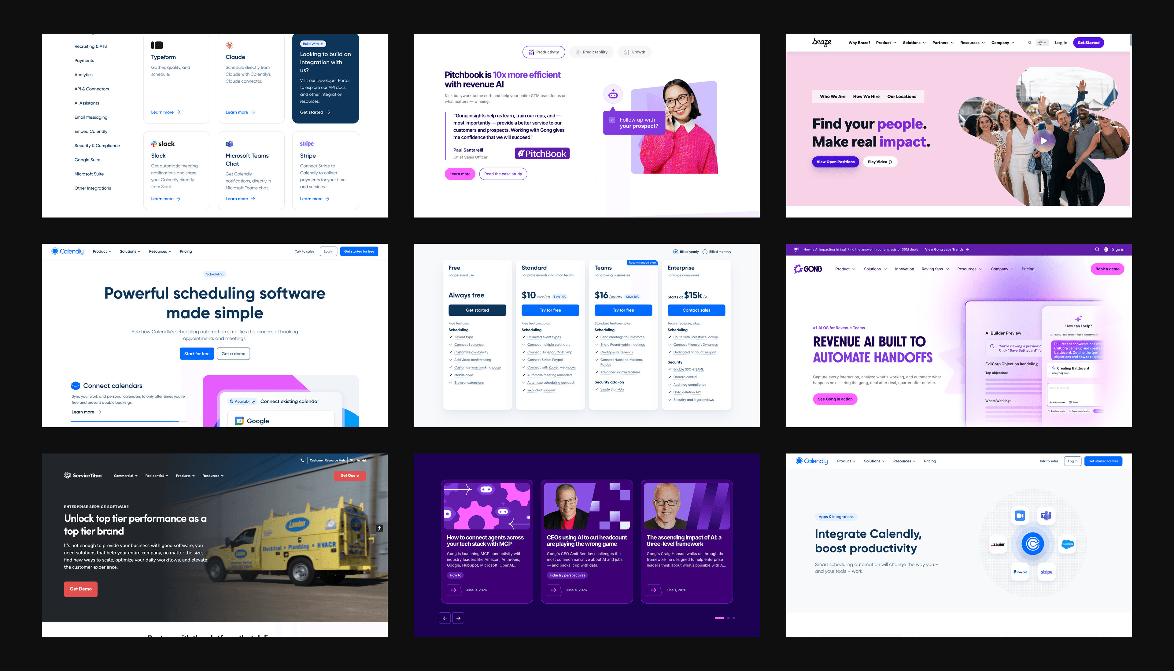
Calendly does this well. Whether you're scheduling a meeting, browsing product features, or reading their blog, every page uses the same visual structure. The experience feels predictable and polished, which builds trust.
Discover how Webstacks helped Calendly transform their website for enterprise.
6. User Experience (UX)
User experience shapes how people feel when interacting with your website. Great UX goes beyond looks to reflect your brand's quality and values in every interaction.
When designing your website's UX:
- Create intuitive navigation that reflects your brand values. If your brand stands for simplicity, your menu structure should be clean and straightforward.
- Design balanced page layouts that meet user needs and business goals. Place key conversion points prominently while still providing valuable content. Webstacks recommends using Figma for web design to improve collaboration and create consistent designs.
- Optimize page load times to avoid frustrating users. If your website performance is lagging, a headless CMS can do wonders for website speed compared to traditional CMS solutions.
- Balance innovation with usability when adding unique features. Distinctive experiences can set you apart, but not if they make your site hard to use.
Apple shows how seamless UX reinforces premium brand positioning. Their clean design, intuitive navigation, and consistent cross-device experience all create a sense of quality and attention to detail that matches their products.
Webstacks helps marketing teams build bold, conversion-ready brands through strategy, identity, and storytelling.
7. Header Design
Your header is one of the first things users notice and one of the few elements that stays visible as they explore your site. It should be functional, clear, and aligned with your brand.
Use a sticky header so your logo and navigation stay accessible as users scroll. Include only what’s essential: your primary navigation links, a clear call to action, and search if your site needs it. Don’t overcrowd it.
Make sure the header works across all screen sizes. On mobile, it should stay readable and usable without hiding important options or breaking the layout. Use consistent colors, typography, and spacing that match the rest of your site.
We’ll use our own website as an example. The header stays fixed, uses space efficiently, and keeps navigation simple. Users can move through the site without guessing where to go next or losing access to key links.
8. Calls to Action (CTAs)
Calls to action guide users toward key business goals while reinforcing your brand identity.
When designing CTAs:
- Design high-contrast buttons that stand out visually but fit your overall brand aesthetic. They should catch the eye without feeling disconnected from your site design.
- Write clear, action-oriented text that matches your brand voice. Whether your tone is professional, friendly, or innovative, your CTA copy should reflect it.
- Position CTAs strategically within the user journey. Place them at key decision points after you've built enough value or interest. This is especially important when optimizing landing page UX.
- Maintain consistent CTA design across your entire website.
Shopify is a great example of CTA implementation. Their bold "Start free trial" buttons appear strategically throughout their site.
For maximum impact, position your CTAs at emotional high points in your brand story. This creates a sense of journey continuation, where taking action feels like a natural next step.
9. White Space in Website Branding
White space is a branding tool that improves content focus, readability, and your brand's positioning. Strategic use of white space impacts how users perceive and interact with your information.
White space serves several purposes:
- Creates visual breathing room, letting your content stand out.
- Improves readability by reducing cognitive overload.
- Guides users' attention to key elements on the page.
- Conveys sophistication and intentionality in your design.
When using white space, maintain consistent rhythm with padding and margins throughout your site. Give content room to breathe with generous spacing around elements.
Justworks’ website demonstrates this with a layout that avoids clutter and emphasizes clarity.
Their homepage uses wide margins and generous spacing between sections. Text blocks are short and separated by ample padding, making content easy to scan. The navigation bar is simple, with clear links and no unnecessary elements.
Learn how Webstacks helped Justworks improve brand consistency and website traffic.
10. Brand Story and Messaging
Your brand story should explain what your company stands for and why people should care. It’s how you build trust and show people what sets you apart.
Start with a clear voice that reflects your brand’s personality. That voice should show up everywhere, not just on the About page. Whether it’s a headline, a product description, or a blog post, your tone should stay consistent.
Make your story specific. Why did the company start? What problems are you solving? What do you actually believe in? Skip the vague mission language and get to the point.
Don’t just talk about yourself but connect your story to the people you’re trying to reach. Show them how your values line up with their needs. And wherever possible, let your customers do the talking. Testimonials and real-world examples carry more weight than polished taglines.
Implement Conversion-Driven Website Branding Strategies
The above mentioned elements of website branding work together to create a cohesive brand experience. From logos and typography to white space and storytelling, each component plays an important role in communicating your brand's identity. These elements build meaningful connections with your audience and align your digital presence with broader business goals.
Webstacks partners with B2B companies to enhance their website branding through modular systems that scale. Unlike rigid templates, our approach treats websites as ongoing business infrastructure.
Contact Webstacks for a strategic brand audit and transform your website into a powerful asset that reflects your unique value and gets great results.
Your website is your biggest growth lever—are you getting the most out of it? Schedule a strategy call with Webstacks to uncover conversion roadblocks, explore high-impact improvements, and see how our team can help you accelerate growth.

I create SEO-driven content for B2B SaaS companies, from blog posts to case studies. I focus on research-backed writing that ranks on the first page and drives meaningful organic traffic.