Best Crypto Logos: 10 Iconic Blockchain Designs

Logos are a critical design component for a crypto startup's visual identity system.
Because your logo and your token (if your project has one) will be synonymous with your brand, it's critical that you get the design, color and balance right. In 2026 that bar is higher than it was in the last cycle: the gradient-soaked "Web3 aesthetic" is no longer a shortcut to credibility, and the projects with staying power have visual identities that hold up across exchanges, wallets, AI summaries and embedded contexts most teams never anticipated when they shipped their first brand guide.
Whether you're refreshing your brand or launching a new protocol, we've compiled a list of crypto logo designs that we think do a strong job communicating their brand values and distinguishing themselves from the crowd.
Webstacks websites don’t just look good—they scale with you and drive real results.

The 10 Best Crypto Logos
Here are the logos we will explore:
- Bitcoin
- Gnosis
- Curve Finance
- MetaMask
- Grayscale
- Uniswap
- Chainlink
- Solana
- Polygon
- Hyperliquid
Read on to see why we selected these top 10 blockchain logos, and send us a DM if you think another logo deserves to make it in our follow-up part 2 article.
1. Bitcoin

Here's why Bitcoin's logo made the list:
- It's as symbolic as the dollar sign $
- Its simplicity is subversive
- It's so recognizable it has become the icon of a global movement
The crypto industry would not exist without Bitcoin.
Full stop.
No ifs, ands, or buts.
At first glance, Bitcoin's logo doesn't look too impressive, but in the simplicity is where the design's subversive brilliance shines.
The original cypherpunks of the 1990s envisioned a future that didn't require middlemen like banks to send money in a trustful manner. While the goal in those early days might not have been to subvert the entire financial system, they saw the potential. More than fifteen years after the genesis block, that vision has produced a multi-trillion-dollar asset class with regulated spot ETFs, sovereign treasury allocations and a permanent place in mainstream financial infrastructure.
Simply by replacing the "S" in the U.S. dollar sign ($), Bitcoin powerfully announces its rightful place in the conversation next to fiat currency and precious metals.
Today, Bitcoin's bright orange symbol is a universally recognizable cryptocurrency logo that millions of developers, investors, artists and everyday people rally behind.
2. Gnosis

Why we think Gnosis has one of the best blockchain logos:
- The use of the owl is perfect for Gnosis
- Sharp details in the owl give off a fierce, unstoppable notion
- The owl was created from a circle
The Wise Owl of Ethereum
Next, we have Gnosis, an open-source platform that has grown from prediction markets and wallet infrastructure into Gnosis Chain, a full Ethereum-compatible Layer 1.
Gnosis is a Greek word that means knowledge, and for a network rooted in prediction markets and on-chain coordination, it's the perfect name. The logo borrows an animal that symbolizes knowledge, wisdom, intuition and independent thinking: the owl.
With just a few lines and shapes, the owl emerges with a fierce and heroic look whose razor-sharp eyebrows and powerful gaze feels like it can see into the future.
Using Knowledge to Match a Coincidence of Wants
CoW Swap (the rebranded CowSwap) is a decentralized exchange built on the CoW Protocol that reduces miner extractable value (MEV) by batching trades using a Coincidence of Wants (CoW) model.
CoW Swap feels like a natural extension of the Gnosis ecosystem because it relies on knowing what buyers and sellers are looking for and pairing them together to make the most cost-effective trade.
Of all the different types of logos, from abstract to simple word marks, character-driven logos feel the most relatable, memorable and best at communicating the brand's value proposition.
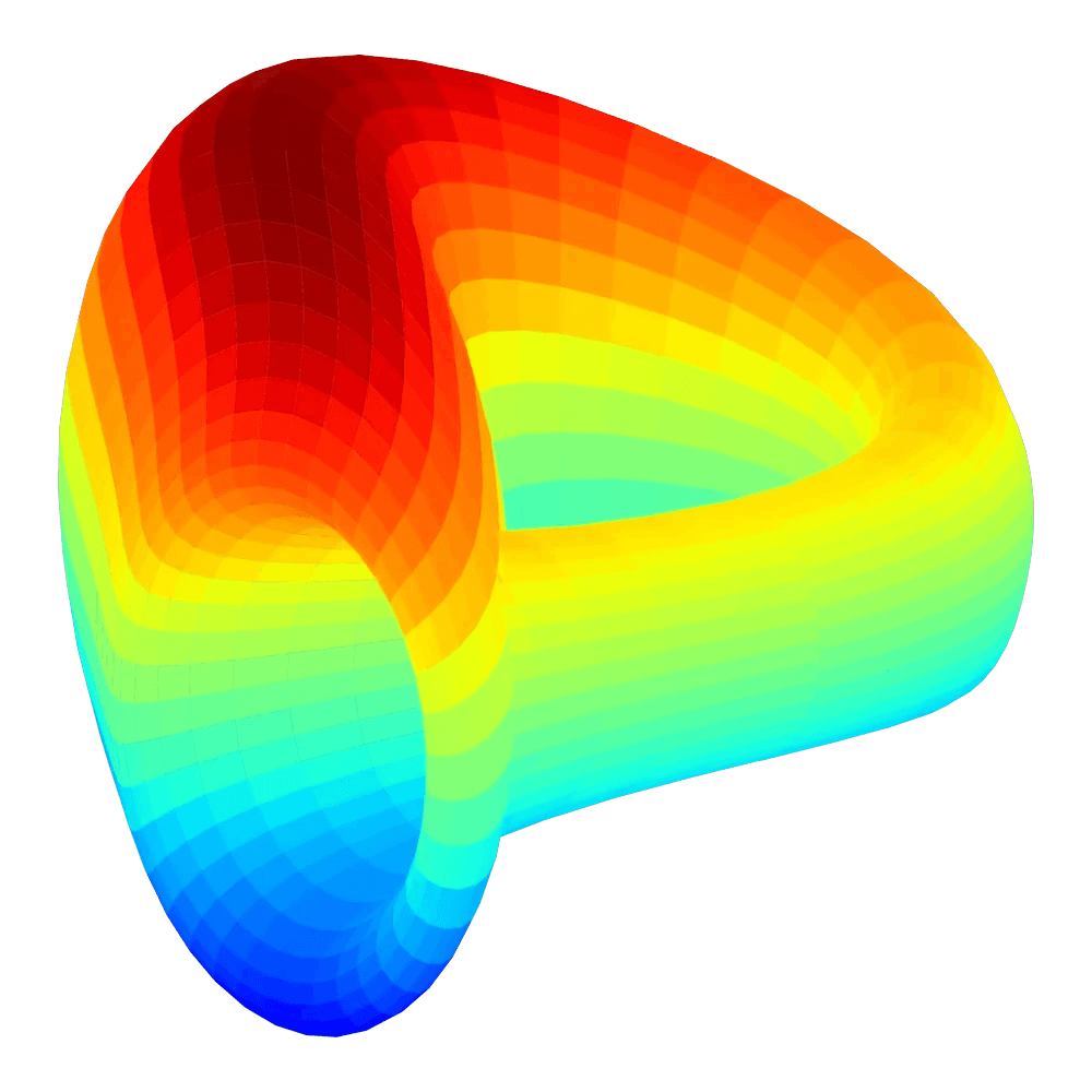
3. Curve Finance
Here are the design elements that landed Curve on our list:
- A complex logo with a mystery
- Gets you thinking about algorithms and math symbols
- Communicates its true identity
A Futuristic, Mind-bending Rainbow Blob from Space
If you didn't get enough of Curve Finance as an honorary mention on our top web 3.0 website designs, it also made our cryptocurrency logo top ten.
We don't get a lot of rain in San Diego, but we love post-storm rainbows. Maybe that's where Curve got their inspiration for their ridiculously bright, fluorescent logo design.
Curve is one of the original Automated Market Maker (AMM) style stablecoin exchanges that lets users and decentralized protocols swap pairs of assets that are closely related in price (e.g. USDC/USDT/DAI) with low fees and slippage. Even after surviving the July 2023 reentrancy exploit and the broader DeFi consolidation, Curve remains one of the most-integrated protocols in the stablecoin economy.
Stare at Curve's logo long enough and you might see colors for the next minute or two.
All colors of the rainbow are featured in the logo, which is also a representation of unity, blending and diversity. The colors look more like a heatmap, and a grid-like pattern runs through the entire logo similar to how wormholes are traditionally depicted when they bend the fabric of space and time.
Curve, on a technical level, is a work of mathematical art that deserves applause, and when you factor in how important low-slippage stablecoin AMMs are to the broader DeFi ecosystem, the use of a Klein bottle's infinity knot and the mathematical design feels natural.
DeFi protocols like Curve are sometimes referred to as "money legos" because different open-source smart contract protocols can be integrated in a number of ways to create novel financial products. The infinity knot, in some ways, expresses the limitless possibilities of Curve and decentralized finance in general.
4. MetaMask

Here's why MetaMask's logo made our top 10 list:
- The logo is a friendly, personable, 3D geometric shape
- Reminds us of a nostalgic video game character (Crash Bandicoot)
A Fox of A Crypto Wallet
MetaMask is a self-custodial crypto wallet that allows users to interact with Ethereum, EVM-compatible chains and an expanding set of L2s from their browser or phone. With the rollout of MetaMask Smart Accounts and the Snaps extension framework, the product has evolved well beyond its original "wallet popup" identity, and the logo has held up across every step.
What really stands out is that logo: a 3D animated orange fox that looks like it could be the main character of a video game from a decade ago.
You almost want to give it a name like Foxy, or a human name like Toby. That's how personal and memorable the design feels.
The team at MetaMask knew from the start that they wanted a logo that was fun, creative and geometric. That's how the 3D fox was brought to life.
First, the logo was asymmetrical to make it look more interesting and interactive. After several rounds of revisions, the team settled on a symmetrical logo with stylized details on the fox's mask (yes, the fox actually has a mask). The mask is the darker shades of orange that run from the chin to the inside of the fox's ears.
While 3D and geometric logos aren't uncommon in the cryptocurrency world, the combination of those styles with a friendly animal lends itself to a brand that feels trustworthy, approachable and memorable for users interacting with EVM dApps.
5. Grayscale
Here's why we included Grayscale on our list:
- Design is very, very targeted
- The elegance alone can hold it down
- Who needs color when you're the best of the best
A Blockchain Logo for Institutional Capital
Grayscale is the world's largest crypto-focused asset manager, and after winning its 2023 lawsuit against the SEC and converting the Grayscale Bitcoin Trust into a spot Bitcoin ETF in January 2024, GBTC now trades alongside the rest of Wall Street's spot Bitcoin products. That shift turned Grayscale's brand from a vehicle for accredited investors into a publicly traded ETF that anyone with a brokerage account can buy, while the logo itself stayed exactly the same.
That continuity is the point.
Grayscale's logo is minimal, sleek and feels high-class. The abstract G-shaped block looks like a modern piece of art that one might find at the Louvre (a similarly geometric, glass-like shape).
When you're trying to attract pension allocators, RIAs and family offices, you want to give off the impression that your brand will stand the test of time, just like your customer's wealth. The Grayscale logo gives off that classic, elegant feeling, and it kept that gravitas through the rockiest narrative shift in crypto's mainstreaming.
Grayscale Color Palette
In addition to the simplicity of the logo, Grayscale's identity uses the design rule it's named after: the collection of monochrome shades ranging from pure white to pure black known as grayscale. Who would have thought.
Grayscale keeps things simple and classy with its geometric, high-class logo, wordmark, horizontal lockup and namesake color scheme. That balance is exactly what a digital asset manager needs to be the default crypto allocation across institutional wealth platforms.
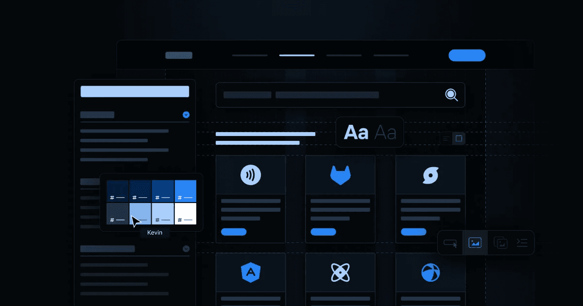
Build a Better Web3 Site with Webstacks Move fast with modular, scalable websites, optimized for launch, adoption and long-term growth. Explore our Web3 work
6. Uniswap
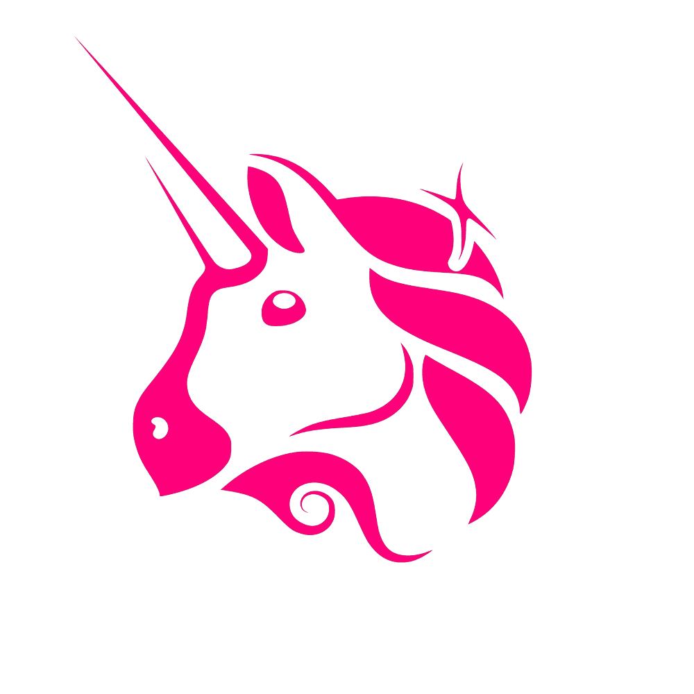
Here's why we think Uniswap has one of the best cryptocurrency logos:
- It is distinguishable from other DeFi platforms
- Makes something complex feel approachable
- We love DeFi unicorns (1inch and Uniswap to be exact)
Swap, Earn and Build
Maybe we are a bit obsessed with unicorns (and not just $1B startups).
Beyond their marketing stunts, like UNISOCKS, that landed them on our crypto marketing strategies article, Uniswap's logo is a strong marriage of fun, memorability and professional branding.
Uniswap is the dominant decentralized exchange (DEX) on Ethereum and across most major EVM L2s, and with the launch of Uniswap V4 in 2024 and its hooks architecture, the protocol now lets developers build custom logic directly into liquidity pools. The unicorn has had to stretch a long way since the V1 days, and it still works.
Before investing assets and trust into another DeFi platform, users first need some convincing from a friendly, colorful logo: a pink unicorn.
In the world of fantasy, unicorns embody purity and innocence, and they are the only reason why Voldemort can keep harassing Harry Potter.
As one of the first DEXs on Ethereum, Uniswap is every bit mythical and rare. Uniswap's goal was to build an easy-to-use decentralized exchange that would let any trader or yield farmer participate in open crypto markets.
To assuage fears and lessen complexity, Uniswap's approachable, non-threatening logo design, color choices and user interface have made it one of the most popular destinations in DeFi to swap between any two ERC-20 tokens on Ethereum.
7. Chainlink

Here's why we like Chainlink's logo design:
- Simplicity is great when the meaning is evident
- Another easily recognizable logo
- The color choice and size are spot on
Chainlink's Logo is Built to Last
Even if you're a die-hard fan of Solana and the high-fidelity price feeds of the Pyth Network, it's difficult to argue with the masterful design of Chainlink's logo.
Chainlink is exactly what its name suggests: a decentralized oracle network that provides a link between real-world data and smart contracts across more than a dozen blockchains. With the rollout of the Cross-Chain Interoperability Protocol (CCIP), Chainlink has expanded from price feeds into the broader infrastructure layer that institutions like Swift, DTCC and Fidelity have been piloting for tokenized assets.
Chainlink publishes external sources of data onto blockchains so smart contracts (prediction markets, decentralized exchanges, tokenized fund products) can use that data to update price feeds or execute trades based on trusted third-party data.
Chainlink's logo is literally a link in a chain, the same kind you'd find on an elementary school playground. It's simple, accurate and impossible not to recognize.
One design trap in logo design is overcomplicating the mark. For Chainlink, the team did just about the bare minimum, and that decision was perfect.
The hexagon shape is exactly what a chain link looks like, the closed loop is an important mental association for data and oracles, and the boldness of the link instills the trust, security and reliability for which Chainlink aspires to be known.
8. Solana
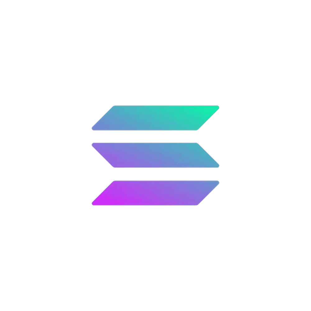
Here's why Solana's logo earns a spot on the 2026 list:
- The teal-to-purple gradient is one of the most recognizable marks in crypto
- Custom geometric typography refuses the generic "Web3 sans-serif" template
- The brand system holds up across exchanges, wallets, hackathons and physical events
Owning a Two-Color Spectrum
Solana is a high-throughput Layer 1 known for sub-second block times, parallel transaction execution and one of the most active retail and DeFi user bases in crypto. Through the 2022 contagion, the FTX collapse and a full-cycle recovery, the brand has held its line, and the logo has done a lot of the work.
Solana's identity is built around three angled bars in a teal-to-purple gradient, with custom geometric typography that nods to monospaced developer aesthetics without falling into "techy crypto sans-serif" territory. While most Layer 1s reach for a generic gradient and call it a day, Solana picked a specific two-color spectrum and committed.
The result is one of the few crypto logos that's instantly identifiable when stripped of its wordmark, projected on a stage at Breakpoint, or rendered as a tiny favicon in a wallet. That recognizability matters when your brand has to compete for attention across thousands of dApps, NFT collections and consumer apps in the same ecosystem.
Webstacks partnered with Solana on their website, where the brand system is put through its paces across documentation, validator dashboards, ecosystem pages and event landers. A logo this distinct only works if the rest of the system is built to give it space, and the design system is what keeps the gradient from getting buried.
9. Polygon
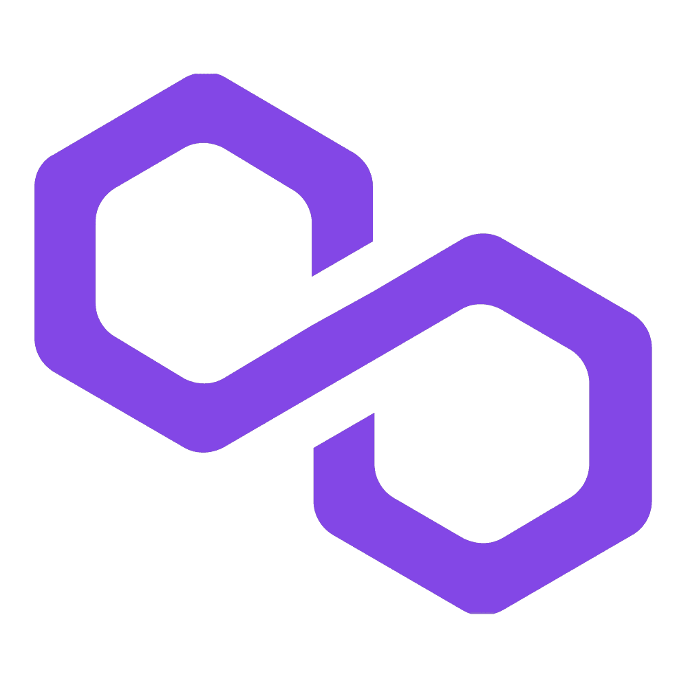
Here's why Polygon's 2024 rebrand earns a place on the list:
- The MATIC-to-POL transition is one of the most coordinated brand-and-token rebrands in crypto history
- A new mark that signals the shift from a single sidechain to a network of L2s
- Modernized purple palette and geometric mark that scales across the AggLayer ecosystem
From MATIC to POL
Polygon Labs rolled out the Polygon 2.0 vision across 2023–2025, including the migration of the MATIC token to POL and a refreshed visual identity that ties together Polygon PoS, zkEVM, the Chain Development Kit (CDK) and the AggLayer cross-chain settlement layer.
The mark itself stays in the polygon family (a nod to the original geometry), but the new system uses a sharper, more confident mark with a deeper purple palette. Where the old Matic Network logo read like a single chain's identity, the updated Polygon mark is built to sit at the top of an architecture diagram, with sub-products and partner chains nested underneath.
That's a hard rebrand to land. Crypto rebrands often crater token sentiment, fragment community recognition, or quietly get rolled back. Polygon's redesign held because the brand system was structured to absorb the change: the mark works at the top level, on individual product pages and across the dozens of CDK chains shipping with co-branded materials.
For B2B teams watching the crypto space for branding lessons, this is the relevant one. A logo refresh doesn't have to break recognition if the underlying design system is built to flex.
10. Hyperliquid
Why Hyperliquid earns the closing slot in 2026:
- A distinctive mint-teal accent that refuses the default DeFi gradient
- Monospace-coded wordmark that signals "built for traders, not retail spectators"
- A full brand system that wins through restraint
Restraint as a Statement
Hyperliquid is a Layer 1 purpose-built for high-performance on-chain trading, and through 2024 and 2025 it became the dominant venue for decentralized perpetuals, capturing volume from incumbents that had been entrenched for years. The HYPE token launch in late 2024 was one of the largest community airdrops in crypto history, and the protocol now sits alongside major centralized exchanges in trader mindshare.
What makes the brand work is what it refuses to do.
While the rest of DeFi reaches for a saturated purple gradient, Hyperliquid owns a single mint-teal accent against a black background. Where most crypto wordmarks default to a generic geometric sans-serif, Hyperliquid uses a custom monospace-coded typeface that reads as if it came out of a terminal. The "H" mark is sharp, unornamented and built from negative space, the visual equivalent of a clean order book.
The cumulative effect is a brand that signals seriousness without trying. It is the design language of a quantitative trading firm that decided to put its execution stack on-chain, and it lands because Hyperliquid commits to that posture across every surface (the trading interface, the documentation, the validator dashboards, the X presence).
For a list of crypto logos that have outlasted multiple cycles, Hyperliquid is the new entry that matters most. The brands that broke out in the 2024–2025 cycle are the ones that stopped reaching for the standard Web3 visual kit, and Hyperliquid is the cleanest example of the pattern.
Check out must-have resource for any crypto project looking to elevate its branding and web design!
Cryptocurrency Logo Designs: In Summary
The strongest crypto logos in 2026 share a pattern: they were built to outlast the narrative of the cycle they launched in. Bitcoin's modified dollar sign, Solana's two-color gradient, Polygon's geometric mark across a multi-chain architecture and Hyperliquid's monospace restraint all work because they're anchored to a clear idea, not to a trend. The projects that lean too hard on whatever aesthetic is winning that quarter (the year of skeuomorphic 3D, the year of brutalist sans-serifs, the year of AI-generated mascots) tend to need another refresh before their roadmap catches up.
For B2B and Web3 teams reading this list to pressure-test their own identity, the takeaway is the same one we apply to every site we build: the logo is one component in a system. It survives rebrands, integrations and exchange listings only if the design system around it is structured to give it room to breathe.
If you're looking for more blockchain content, check out our 13 Best Web 3.0 Design Examples.
Frequently Asked Questions
What makes a strong crypto logo in 2026?
A strong crypto logo in 2026 communicates a single clear idea, scales from a wallet favicon to a stage backdrop, and avoids leaning entirely on trend-driven aesthetics like generic Web3 gradients. The most durable crypto logos (Bitcoin, Solana, Chainlink and MetaMask) anchor to a recognizable shape, color or character that holds up when a new narrative cycle starts.
What's the most recognizable crypto logo?
Bitcoin's orange "B with two vertical lines" is the most recognizable crypto logo in the world by a wide margin, in large part because it has remained essentially unchanged since 2010 and is now embedded in everything from spot ETF marketing to mainstream financial media.
How is crypto logo design changing in 2026?
Crypto logo design in 2026 is moving away from the saturated gradient, glossy 3D and "futuristic abstract" aesthetic that defined the 2021 cycle. The brands that have outlasted multiple cycles (Solana, Polygon, Chainlink and MetaMask) are investing in design systems built around their mark, while the breakout protocols of the 2024–2025 cycle (Hyperliquid being the clearest example) are winning through outright visual restraint. The shared pattern is the same shift mature B2B SaaS brands made years earlier: stop chasing the trend, commit to the system.
Should a crypto project rebrand mid-cycle?
Rebranding mid-cycle is risky and frequently fragments community recognition, as a number of failed crypto rebrands have shown. Polygon's MATIC-to-POL transition is one of the few examples of a mid-cycle rebrand that landed cleanly, and it worked because the design system was built to absorb the change at the network, product and partner-chain levels.
Ready to build a Web3 brand and site that holds up across cycles? Talk to Webstacks.
Your website is your biggest growth lever—are you getting the most out of it? Schedule a strategy call with Webstacks to uncover conversion roadblocks, explore high-impact improvements, and see how our team can help you accelerate growth.

I was the first designer at Webstacks, where I focused on UX/UI design and building design systems. My developer background helps me bridge the gap between design and engineering.