Web3 Web Design: 30 Best Examples
The shift from Web2 to Web3 is well underway, with the global Web3 market projected to reach $4.6 billion in 2025. We see it, most notably, in the way artists, musicians, and entrepreneurs are sharing their work and building community. We see it, most notably, in the way artists, musicians and entrepreneurs are sharing their work and building community.
Whether you're creating a decentralized autonomous organization (DAO), minting or collecting NFTs, building on the decentralized web, or developing blockchain dApps, there's no shortage of projects to work on.
Top Web 3.0 Website Designs
In this article, we review 30 of the most exciting blockchain companies that are using Web 3.0 design to push the movement forward and build community.
Keep reading to learn some of the most popular Web3 website trends, get some pro design tips from our own Web3 designers, and discover some cool crypto projects you've never heard of before.
The blockchain industry needs good design
It's no secret that well-designed user experiences are one of the most genuine forms of building trust with your audience. We could speak for days on what good design is at its core, but this quote from Paul Rand sums it up quite nicely:
While this ideology applies to so many facets of design—digitally and in our everyday lives—we believe design's importance in crypto, specifically, is paramount to the adoption of blockchain-based alternatives.
Building in the blockchain industry is believing in the future—one where power is placed in the hands of the people and freedom is given back to creators.
The movement is picking up momentum with each passing day; however, blockchain's ambitious goals are consistently met with doubt and hesitation. Doubt is especially present when finances, drastic change, and risk collide.
Blockchain companies today are asking people to not only trust them with their money but challenging them to change their perception of the internet and the global financial system. Pair a subversive ideology with poor design, and you'll be met with pushback.
Blockchain is the perfect storm and presents an incredible design challenge.
So, how do we keep the momentum going when there is seemingly so much to tackle?
We start with what we can control—design.
Web3 Website Examples
1. Cosmos

We have to kick this article off with Cosmos. They are a perfect example of the Web3 website design trends seen across the industry - colorful gradients, 3D elements, and futuristic space themes.
While being incredibly expressive, they've done an excellent job at designing their brand on a solid foundation of beautifully orchestrated typography that scales, clear CTAs, a header hierarchy that allows users to effortlessly scan the website, and they make clear attempts to remain accessible with high-contrast text and backgrounds.
On a visual level, their use of planets to portray the decentralized apps, and "Internet of Blockchains" messaging is outstanding. Plus, they're interactive, which we love!
Besides their knowledge of beautiful and functional web design - which we love - Cosmos leans heavily into their name, symbol ($ATOM), and their vision of an internet of blockchains which to an active imagination looks like an interconnected universe.
Crypto Website Design Choices We Love
- Colorful gradients
- 3D elements
- Interactive visuals
- Space-theme
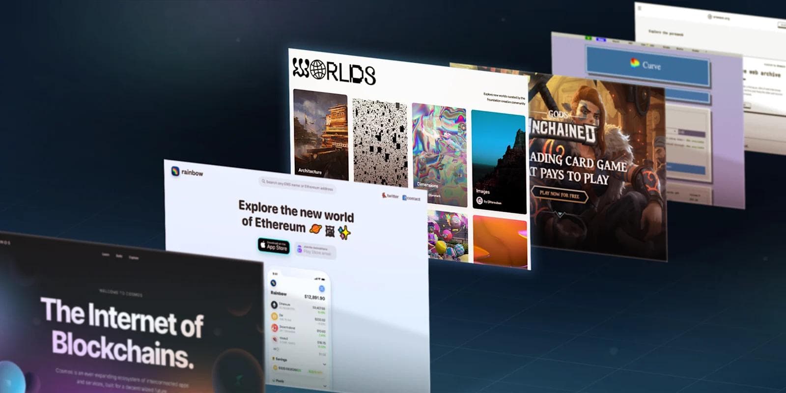
2. Rainbow

Rainbow's playful design, use of memes, and strong community are so unmatched that we could write a whole article on their brand (and tweets) alone.
Whereas many other wallets stick to what's considered safe in finance, Rainbow challenges the norm by pushing fun, eccentric designs.
The Rainbow website is rather straightforward as its goal is to send people to the app download page, but in the small details, we see the creativity that we—as the design industry—seem to have forgotten in the pursuit of the minimalist trend.
The wallet is also beautifully designed with the same artistic expression.
Their knowledge of beautiful and functional app design is abundantly clear; from the clear flows to the small moments of delight (loving the use of emojis), they're one of our favorite Ethereum-based software wallets apps to use.
Rainbow is a breath of fresh air and a leader in bringing some ✨spice✨ to design.
Digital Wallet Design Choices We Love
- Bringing expressive, fun design back to the web
- Embracing individuality
- Use of emojis
3. Hedera

Hedera is a proof-of-stake public ledger that is governed by leading enterprises, universities, and blockchain organizations around the globe.
This Web3 website design excels in a number of areas - where do we even start?
First of all, you are greeted with this bold, bright mix of blues that is instantly eye-catching. While the HBAR logo is pretty plain and simple, this website's use of vibrancy makes for an excellent contrast.
Beyond colors, Hedera utilizes a layout that's intuitive and engaging. Their website is rather large, and the homepage and navigation bar do a fantastic job of initiating a pleasant user journey.
Another key point is Hedera's use of animations. When a website can interact back with the user, it activates a whole new level of engagement. The "typing" hero animation, the button hover states, the text changing color with scrolling inputs - there are so many hidden easter eggs on this site. Once noticed, you really appreciate the attention to detail!
Layer 1 Website Elements We Love
- A bold and cool heading
- Use of illustrations to fill whitespace
- Neat microinteractions
- A clean, intuitive navigation menu
See what’s working for industry-leading websites and find inspiration to improve yours.
4. Circle

Moving onto Circle, the easiest business bridge to DeFi, and a client of ours here at Webstacks (warning: not-so-subtle humble-bragging).
We see similar elements to the crypto website design trends above, yet Circle adds flair by introducing vibrant illustrations that feel immersive while retaining a great flow throughout the page. We love this design choice because it nods to Circle's brand and the execution was done perfectly.
With a complex product, the easier you can make it for visitors to learn about your product, the greater your chances are at converting them into a lead and customer.
**Read more about how Webstacks helped Circle redesign its entire website here! **
Crypto Payment Website Design Choices We Love
- Colorful, pastel gradients
- Custom icon designs
- Curved sections to accentuate their brand
- Well-organized menu
5. Inter Protocol

Next, we turn to Inter Protocol - an unmistakable gem in Web3 websites. Obviously the full-screen hero animation is the staple of this design, and that bright yellow background compliments the dark copywriting very well.
If you keep scrolling, there are so many cool components that make this digital experience one-of-a-kind. The embedded Tweets, roadmap, and "Crowd Tracker" are all executed brilliantly.
Even from the design to its tech stack, everything about this site is enterprise quality. Inter also used Contentful, which is one of our favorite headless CMS platforms here at Webstacks.
Definitely check this one out for yourself!
Layer 1 Website Design Choices We Love
- Captivating motion design
- Bright yellow background
- Bold copywriting
- First-class tech stack
6. Bored Ape Yacht Club

Step into this truly immersive experience at the Bored Ape Yacht Club! First, the attention to detail here is incredible - the wall art, the arcade games, the subtle animations, and the sound effects bring this fictional bar to life.
This is an excellent example of something that differentiates an NFT project and its community. Not every NFT project goes above and beyond outside of the artwork for its collectibles. And not many are able to create such a strong brand through its website. Major kudos to Yuga Labs for knocking it out of the park with this one.
NFT Website Design Choices We Love
- Immersive design
- Attention to detail
- Brand building
7. Zest Protocol

Looking to take your Bitcoin out of cold storage and turn it into a productive asset? Definitely check out Zest Protocol!
Zest is an innovative way to put your BTC to work to earn more BTC, or borrow against your own BTC.
Our team here at Webstacks designed this site, and couldn't be more happy with how it turned out! We helped Zest find a style that doubled down on its orange-y branding. Some highlights for us are the deep gradients, dark mode with bold white text, of course the orange flowing across the screen in the hero.
This website is freshly squeezed, juicy, and most certainly, zesty.
Dapp Design Choices We Love
- Doubling down on brand identity
- Dark mode FTW
- Information hierarchy
8. Juno Network

Next up, we have "The Incubator of the Interchain", Juno. There are a couple of things that this design executes extremely well - color palette and illustrations.
The color of the page copy is a great alternative to the conventional plain white. Moreover, the pastel red really pops in contrast to the tan and the dark background.
We also love the illustrations, which pay tribute to the DAO-like nature of the network. And, their iconography (including their logo) is on point.
Layer 1 Design Choices We Love
- Exceptional color palette
- Super cool imagery
- Compelling and relatable copywriting
9. Kraken

Next, we have one of the largest CeFi exchanges in the US - Kraken. If you're looking for a fiat-to-crypto onramp for Bitcoin, Ethereum, or alt coins, Kraken is there to help.
Right from the homepage, it is obvious that Kraken understands its main audience of crypto novices just by analyzing its web design. Here are a few reasons that make us say so:
- The copywriting is crafted for people searching for the best platform to start turning cash into cryptocurrency.
- The "buy crypto" and "start" CTAs address exactly what crypto beginners are looking for.
- The hero component on the homepage features an image of their mobile app (where a majority will be finding and interacting with Kraken).
- The plethora of trust signals is designed to make new users feel safe putting their money into Kraken.
Overall, this CeFi website is well-executed and is certainly one of the many reasons Kraken is a leader in their space.
Web3 Design Trends From Kraken
- User-centric design
- Unique and memorable color scheme
- Plenty of CTAs
10. MultiversX

Let's turn our attention to MultiversX - previously known as Elrond. The rebranding to MultiversX reflects its broader vision to enable a new phase of development and applications beyond its original scope.
Now, MultiversX leans into its name and takes a much for futuristic approach to its identity. We can observe neon colors, deep space imagery, and lively animations. There's also a ton of social proof and strategic messaging that helps position MultiversX as a go-to network for dapps and other Web3 infra.
Blockchain Design Choices We Love
- Galactic design
- Ample trust signals
- Epic illustrations
11. 1inch
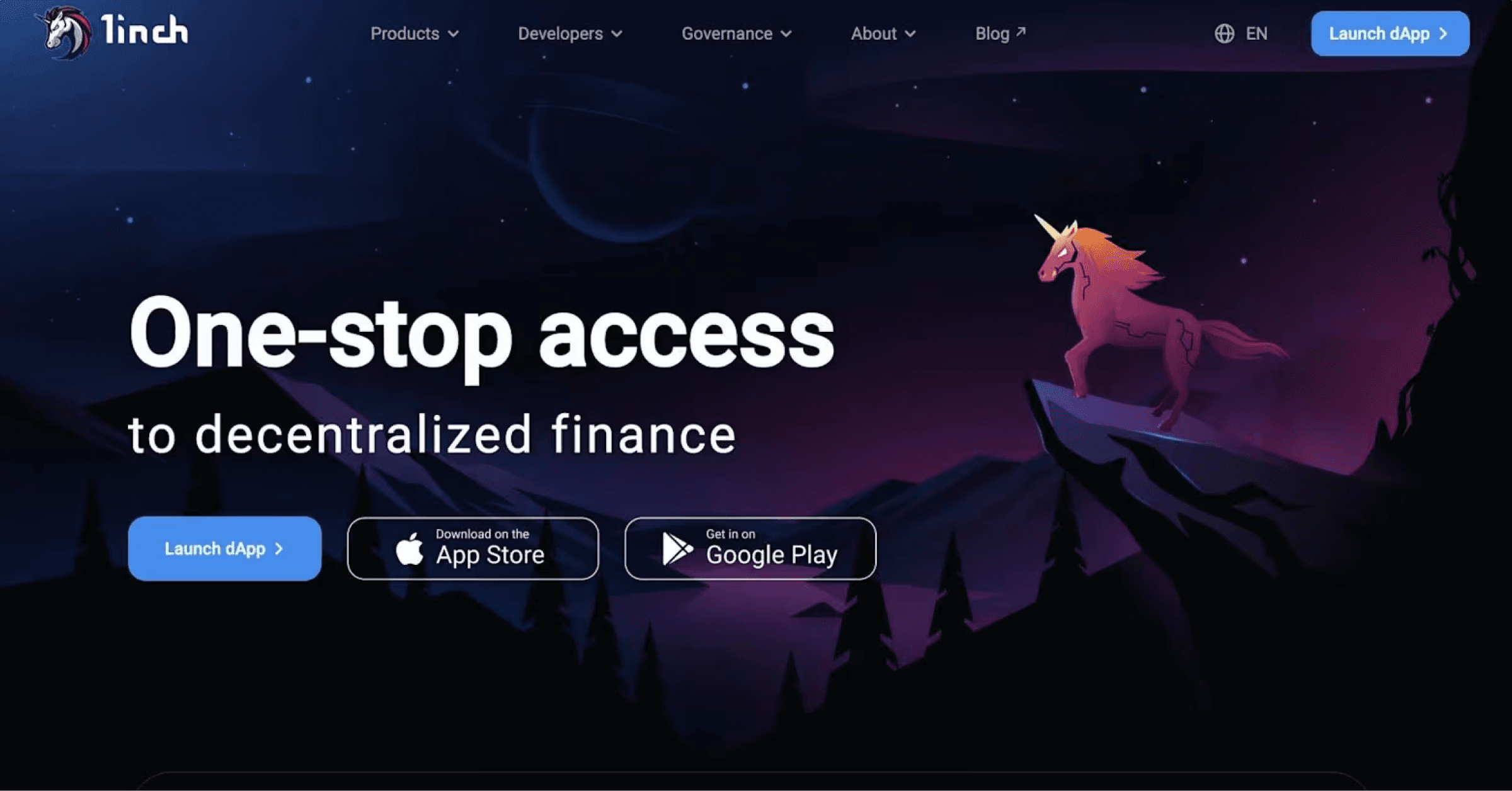
Decentralized exchanges (DEX) allow anyone with a digital asset wallet (more on these later) to buy and sell cryptocurrency tokens without requiring an intermediary.
Unless you know what you're doing, trading digital currency on a DEX can feel overwhelming, especially when there are real amounts of money on the line.
To welcome, reassure, and send trust signals to novice crypto traders, decentralized exchanges like 1inch, Uniswap, and Raydium emphasize simple UI designs.
Not only is the text super legible, but all the user needs to do is choose the token they have, the token they want, and set the amount they'd like to swap.

Because 1inch is a DEX Aggregator, they find the best trade for you across multiple DEXs to give traders the best possible price and lowest gas fees.
1inch displays this important information including the expected number of tokens they will receive, expected gas fees, and the trade route so users know exactly what is happening behind the proverbial curtain.
DEX Design Choices We Love
- Prancing unicorn animation in the hero
- Designing with universally understood icons
- Providing hover state tooltips, to help users learn how to use the interface
- Offering intuitive analytics with an embedded trading chart
See what’s working for industry-leading websites and find inspiration to improve yours.
12. Celestia

Want to see some sick gradients? Check out Celestia.
Unlike traditional monolithic blockchains that handle all core functions (execution, settlement, consensus, data availability) within a single layer, Celestia decouples these functions into specialized layers. As a result, this modular approach allows for more flexibility, scalability, and interoperability.
Throughout their site, Celestia does an excellent job of emphasizing this idea of modularity. Whether it's their visuals or the way that they speak, it's very clear what makes Celestia different than any other chain.
Blockchain Network Design Choices We Love
- Gradients, gradients, more gradients
- Clear, snappy copywriting
- Animated explainers
13. Family

Web3 wallets should be simple. Whether you want to send tokens, swap assets, or collect NFTs, users want a familiar, intuitive UI that hides the complexities of the chain. That's where Family comes in.
In addition to their app, Family also has a super clean website. They utilize simple design elements that clearly explain what Family is, how their app works, and why you can trust them.
Family does so by effectively using animated product illustrations, which give users a peek into the actual UI of the product.
Blockchain Network Design Choices We Love
- Playful illustrations
- Clear, snappy copywriting
- Animated explainers
14. Aave

Next, we have another popular DeFi app, Aave. If you're looking to lend or borrow crypto assets on Ethereum without a middleman, Aave is a platform to check out.
In terms of design, let's start by just taking a second to appreciate Aave's cute ghost mascot. Their branding is on point, including their logo and brand colors.
Moreover, the homepage hero features a mesmerizing, lava-like animation. Your eyes are then drawn towards the billion dollars of capital in Aave markets. The trust signals continue with more statistics and a list of security firms that audit the protocol. Overall, this design is effective at establishing credibility and encouraging engagement.
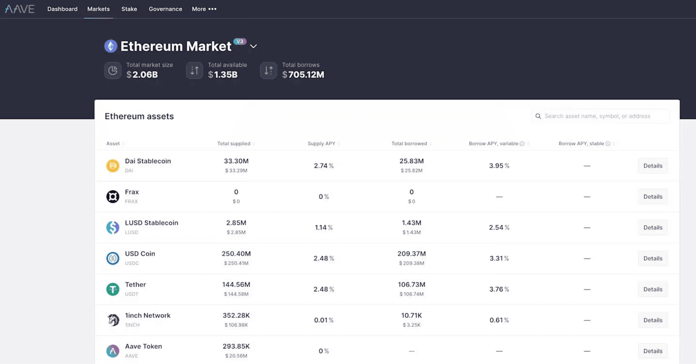
The UI of Aave's application is also extremely intuitive, which is crucial when it comes to DeFi platforms. All the information a trader needs is displayed in a neat manner. With so many different networks and markets, things can easily get complicated. However, Aave has found a solution by following simple web design principles.
DeFi App Design Choices We Love
- Fun logo
- Vibrant colors
- Trust signals
15. Audius

Audius is paving the way for what the future of music can look like through its musician-first platform and token $AUDIO.
Along with the inspiring mission of giving autonomy back to musicians, Audius has a great deal of personality across its website and music streaming platform.
They've embraced Web 3.0 website design trends, such as gradients and heavily blurred drop shadows, but what we enjoy most is how their design is unique to their mission.
dApp User Interface Design
As far as listening to music on Audius, the experience is similar to Soundcloud and easy to explore. They've done an excellent job at integrating what works with other music streaming UIs while remaining incredibly expressive and on-brand.

It is design choices like these that make building a community much easier. Of course, design is one small piece of the puzzle, but when something works well, the foundation for building community is much stronger.
Since your community is entirely one of a kind, show that you value them by providing well-designed user experiences.
Between Audius' exceptional design and strong community, we look forward to seeing where blockchain-based music streaming takes the music industry.
Decentralized App Design Choices We Love
- Design elements that allude to their mission
- Building off of what already works in the traditional space
- Engaging animated visuals
16. Ledger

Ledger is a hardware wallet that offers crypto holders the highest levels of security for protecting their digital assets. Because hardware wallets are not connected to the internet, the attack surface for getting hacked is significantly reduced.
Ledger's design is a standout within crypto! With such a strong presence in the space, the hardware wallet's website plays a key role in establishing its own unique brand identity.
Because Ledger is selling digital asset security, their website must exhibit the unrivaled durability, security, and trustworthiness of its products.

In many ways, Ledger does what Apple does really well - they let their product shine, highlighting the craftsmanship, simplicity, and industrial-grade quality.
Ultimately, Ledger put forward an enterprise-level website that wonderfully complements their brand and wallets.
Hardware Wallet Website Design Choices We Love
- Letting the product speak for itself
- Dark Mode
- Awesome typography
- Trust Signals
17. Blocknative

Blocknative is bringing simplicity to the most complex part of Web 3.0: the mempool.
They're another client of ours here at Webstacks, and they've truly embraced the Web3 design style that's been the focus throughout this article.
As you scroll their website, you'll notice highly saturated gradients, dark backgrounds, interactive elements that demonstrate how the product works, and Easter Eggs that when discovered, switch your view from light to dark mode!
Interactive Tools
With the passing of EIP-1559, and the London Hard Fork (activated on August 5, 2021), how Ethereum manages gas (Gwei) prices have changed.
To give builders and traders reliable gas prices to cost-effectively execute smart contracts, Blocknative updated their Ethereum Gas Estimator.
Check out how Webstacks designed and developed Blocknative's Gas Estimator here!

Tools like gas estimators, impermanent loss calculators, and DeFi dashboards are great ways for blockchain startups to attract users to their sites and earn new business by providing immediate value to website visitors.
Crypto Design Choices We Love
- Gradients on text
- Dark mode
- Multiple trust signals
- Product animations
18. Flow

Developed by the team behind popular projects like CryptoKitties and NBA Top Shot, Flow is a blockchain designed for creating NFTs, gaming apps, and other decentralized applications.
Their homepage hero section features tons of exciting visuals from projects being built on Flow. And if you keep scrolling, there are really neat animations as you move from section to section.
Flow knows it needs to showcase its growing ecosystem, and its website is an important tool for generating hype. Effective web design is essential for intriguing visitors and turning them into users.
Blockchain Design Choices We Love
- Pastel background
- Neat scrolling effects
- Videos and people-centric visuals
19. Gods Unchained

When game design meets web design like Gods Unchained, it creates an immersive user experience that any fan of video games can appreciate.
There are so many well-designed fantasy-themed elements; you can tell that care was put into the smallest of details, too, with even the dividers being styled to match.
Play-to-Earn Messaging
One of the worst aspects of traditional games is ownership of the items and achievements you earn by investing countless hours playing a game.
Using NFTs, in-game items can be provably owned by the players, and sold on exchanges, moving the industry from a pay-to-play model to a play-to-earn model.

Being a core value proposition of blockchain-based video games, Gods Unchained boldly leans into this selling point with its poignant copywriting.
One of our personal favorite sections is this card section. They could have done a standard card UI design with some fantasy icons, but no. Instead, the cards were given full card deck treatment with beautifully done textures and accents.

Founded by former creators of Magic the Gathering, it's clear Gods Unchained knows their target audience and plays into the fantasy-style game design trends.
The only thing unchained is the design team's creativity. (+1 charisma)
Crypto Gaming Design Choices We Love
- Fully embracing the fantasy gaming theme
- Beautifully designed cards
- Stunning illustrations
- WoW/MTG vibes
20. Star Atlas

If you're into crypto gaming, you may have heard of Star Atlas.
The space-themed RPG quickly ascended into headlines back in 2021 with captivating gameplay footage from their metaverse. Beyond anything in-game, their website is absolutely mesmerizing. It doesn't follow the same format as most video game websites do. It is truly an "experience", starting with how you enter and navigate the website.
After clicking "Enter", you are teleported into the world of Star Atlas. As you scroll, you watch as the page transforms right in front of your eyes.

The experience is so unique and memorable, that it makes it hard to not want to give the game a try. In our opinion, this is the peak of web design in crypto gaming - and perhaps gaming in general.
Web3 Style Choices We Love
- Use of dimensionality
- Product showcasing
- Intergalactic vibes
21. Iron Fish

Iron Fish is a Layer 1 blockchain that aims to provide the strongest privacy guarantees on every cryptographically secured transaction.
Blockchain technology, being born from the cypherpunk forums, is rooted in privacy, security, and decentralization. While this ethos permeates the entire industry, nowhere else is it more pronounced than the privacy token sector.
If you're building a privacy competitor to long-established tokens like Dash and zCash, you need to take privacy - from protocol design to marketing - to the logical extreme. From Iron Fish's name, logo, and no-nonsense messaging, their priorities are clear.

And what's better than a cool name like Iron Fish? Even cooler fish illustrations.
While one could argue that fun, creative illustrations are antithetical to something that should be seen as private, secure, and hardened, brands in crypto still need personality to attract the attention and support of new users.
Iron Fish's style is unlike any other layer 1 blockchain. It's fun, it's wacky, and we don't know about you, but we 100% trust this fish.
Crypto Design Choices We Love
- Direct messaging
- Fun illustrations
- Clear site flow
22. Trust Machines

A client of Webstacks, Trust Machines is a start-up that is growing the Bitcoin ecosystem with decentralized applications and blockchain technologies.
At the beginning of our engagement, the Trust Machines website had a simple, one-page site for their manifesto. With little to work with, our job was to construct a complete Web3-inspired brand identity that was futuristic, elegant, and memorable.
While Trust Machines is building on Bitcoin, the team wanted a color palette that was independent of Bitcoin's iconic orange. What we came up with was a unique scheme consisting of dimensional green gradients.
Paired with dark mode and white text, this made for amazing contrasts. The 3-D illustrations seen throughout the website follow the same style, and help give the website (and Trust Machines) a distinct style and personality.
Read more about the Trust Machines website redesign here!
Web3 Infra Design Examples We Love
- Spacey elements
- Unique typography
- Organized page layout
23. Worldcoin

Worldcoin is on a mission to create a global, digital financial and identity network for everyone.
Their website revolves around the globe (quite literally). There are all sorts of illustrations and copywriting relating to the grand scale of Worldcoin's mission. When you have synergy between your design, messaging, and your products, it makes for a very strong brand.
Web3 Website Design Examples We Love
- Large, powerful headings
- Live Worldcoin stats
- Mix of light and dark mode
See what’s working for industry-leading websites and find inspiration to improve yours.
24. LayerZero
LayerZero keeps things clean, sharp, and built for developers. The dark background, neon green text, and grid visuals feel like you're inside a terminal.
There's no extra noise, just what you need to understand the tech.
The layout is simple but well thought out. Bold headlines explain what the protocol does, stats show how much it's being used, and subtle animations give it just enough movement to keep things interesting.
The whole site leans into LayerZero's vision of being the backbone for omnichain apps, and it does so without trying too hard.
Omnichain Website Design Choices We Love
- Sleek black background with neon accents
- Real-time protocol stats front and center
- Grid visuals that reinforce the tech
- Straightforward, developer-first messaging
25. Kleros
Kleros calls itself "The Justice Protocol," and the website makes that feel real from the jump.
The bold purple gradients and clean iconography give it a sense of structure, but also approachability. That's something you don't always expect from a site about decentralized arbitration.
Everything's laid out clearly. The homepage shows you how the protocol works, presents live case data to build trust, and gives you multiple ways to get involved.
If you want to join as a juror or integrate Kleros into your own dApp, the site makes that next step easy. It's a great example of how even something as complex as decentralized justice can be made simple and welcoming with the right design.
Web3 Justice Design Choices We Love
- Layout Shwcasing Purpose
- Bold use of purple gradients
- Stats that build trust
- Clean CTA flow for different users
26. Paragraph
Paragraph is all about giving writers more control. The design is soft, simple, and elegant, which is exactly what you'd want from a publishing platform built for Web3.
The muted color palette, spacious layout, and classic serif fonts give it a familiar, almost print-like feel. But under the hood, it's fully modern. You can collect posts, earn directly from your audience, and even plug into DAOs, all without cluttering the experience.
It's the kind of site that lets your words do the talking, while quietly giving you the tools to own your work.
Publishing Design Choices We Love
- Editorial-style layout that puts writing first
- Calm colors and timeless typography
- Thoughtful, creator-first UX
- Onchain features baked right in
27. Gnosis
Gnosis makes complex infrastructure feel surprisingly easy to understand. The site mixes clean, modern typography with generative textures that give it a slightly retro, but also futuristic vibe.
It's very Web3, but still super readable.
Everything is broken down into sections, such as Gnosis Chain, GnosisDAO, and Gnosis VC, so you're never overwhelmed. The subtle animations and shifting colors help guide you through the page without pulling focus from the content.
It's smooth, intentional, and clearly built by a team that knows how to turn deep tech into something approachable.
Design Choices We Love
- Textured backgrounds with personality
- Simple, modular layout
- Clear, legible typography
- A site that tells the story of the whole ecosystem
28. Privy
Privy keeps wallet infrastructure simple and clean, just the way developers like it.
The site uses a dark theme, soft animations, and straight-to-the-point language that makes it easy to follow.
What stands out is how organized everything feels. Each section walks you through a feature such as embedded wallets and key management, without drowning you in technical jargon. You get diagrams, product screenshots, and real specs that show exactly how it works.
It's a solid example of how to make deep tech feel fast, friendly, and usable.
Wallet Infra Design Choices We Love
- Modular layout with real product visuals
- Dev-first dark mode
- Clean sections that match how the product works
- Clear copy
29. Syndicate
Syndicate takes a bold approach to design. Big type, minimal colors, sharp layout. It doesn't look like a traditional website. It feels more like a statement.
Everything supports their mission, which is building ownership into the internet.
From the schematic diagrams to the alternating light and dark backgrounds, the site makes a complex topic feel surprisingly clear. Even the spinning globe visuals are a smart way to show this idea of global infrastructure focused on the community.
It's clean, intentional, and built with purpose, just like the product.
Decentralized Infra Design Choices We Love
- Global, tech-style visuals
- Values-first messaging
- Neutral colors with high contrast
- Layout that feels modular and structured
30. Curve Finance

As a bonus, we just had to include Curve Finance's token swap UI from 2021. It topped our list back when we began this Web3 design series a few years ago. And while Curve's newer design combines retro with futuristic styles, we're bigger fans of the OG version.
Do you find yourself reminiscing about the 90s and wishing to relive some of the original World Wide Web experiences?
Well, look no further.
Curve embraced the 90's aesthetic and took it to the next level.
While the interface and color scheme may not be the most welcoming or user-friendly, from a purely "for fun," standpoint, we still adore everything about it.
Crypto Design Choices We Love
- 90's aesthetic
- Vibrant logo
- Nostalgia
How to Get Web3 UI Design Right
Designing for Web3 isn't just about slapping some gradients on a background and calling it a day. Keep in mind that you're designing for a community and access to a technology that's still unfamiliar to most people.
Here's how to get it right:
Design for Understanding, Not Just Aesthetics
If your protocol or product requires a mental leap, your design needs to meet users halfway. That means clear language, diagrams that explain real functionality, and layouts that guide. Avoid abstract jargon. Show how it works.
Embrace Modular Thinking
Web3 is modular by nature. Your site should be, too. Think in blocks. Each section should serve a purpose: educate, activate, or convert. Don't overwhelm users with 20 things at once. Let them explore at their own pace.
Prioritize What's Real
Real data. Real screenshots. Real use cases. A lot of Web3 websites still rely on vague promises and lofty language. Instead, show actual protocol stats, dashboards, product visuals, or community activity. That's what builds credibility.
Reflect Your Values Through Design
Are you all about privacy? Transparency? Community governance? Let that show up in your layout, typography, and UX choices. Design can reinforce what your brand stands for.
Think Beyond The Homepage
A flashy hero section isn't enough. Your dashboard, docs, and token interfaces all matter. If a user has a good experience once they log in or connect their wallet, they'll stick around. If they get lost, they won't.
Treat Your Site Like a Product
Web3 teams iterate on-chain, but often overlook the need for their site to have the same energy. Run usability tests. Talk to users. Measure what pages people drop off from. Small changes here can have huge downstream effects.
Web 3.0 Websites: Closing Thoughts
There we have it— 30 examples of Web3 websites that stand at the top of the blockchain industry.
Whether you follow the trends or challenge them, we hope you took inspiration from this list. If you learned something, share it on Twitter or your favorite Discord server.
Move fast with modular, scalable websites—optimized for launch, adoption, and long-term growth.

I was the first designer at Webstacks, where I focused on UX/UI design and building design systems. My developer background helps me bridge the gap between design and engineering.