10 Best Industry Page Design Examples

Most B2B websites treat industry pages as afterthoughts: generic content hubs that check an SEO box. But high-performing companies use industry pages as conversion engines, targeted experiences that speak directly to sector-specific pain points, build immediate credibility, and accelerate pipeline velocity. The difference between a commodity industry page and a revenue-driving one comes down to design, messaging precision, and strategic call-to-action placement.
In 2026, the bar has risen further. Buyers now expect AI-personalized content, interactive product demos, and proof-forward layouts that answer their specific questions before a sales conversation begins. Generic industry pages don't just underperform, they actively signal to buyers that you don't understand their world.
In this article, we cover the essential elements of high-performing industry pages, including clear messaging, engaging visuals, and strong calls to action. We also examine ten of the best industry page design examples to give you concrete ideas on how to create pages that attract and convert visitors. Whether you're looking to build credibility, improve search engine optimization (SEO), or increase qualified leads, this guide will help you design industry pages that deliver results.
Key Takeaways:
- Industry pages drive qualified traffic by targeting high-intent, sector-specific searches, improving both SEO performance and lead quality.
- High-converting designs balance credibility signals (case studies, testimonials) with clear, action-oriented CTAs that guide visitors toward demos or consultations.
- The best industry pages demonstrate deep sector expertise through specific pain points, use cases, and measurable outcomes, not generic feature lists.
- In 2026, AI-personalized content, interactive demos, and dark-mode design systems are emerging as standard expectations among enterprise B2B buyers.
What is an Industry Page?
An industry page is a dedicated section of your B2B website that provides detailed information about specific industries related to your offerings. These pages play a significant role in a website's strategy by targeting niche markets and highlighting the business's expertise, services, and solutions tailored to meet the unique needs of certain industries.
Industry page design serves two main purposes: acting as a valuable resource for visitors looking for industry-specific insights and boosting the website's SEO efforts. By including relevant keywords and offering in-depth content, industry pages can significantly improve a site's visibility in search engine results. This increased visibility leads to more potential leads and customers by matching what users are searching for and providing targeted, valuable information.
In 2026, there's a third purpose gaining importance: answer engine optimization (AEO). As more B2B buyers start research conversations with AI tools like ChatGPT and Perplexity, industry pages structured with clear, factual, question-answer formats are surfacing as cited sources in AI-generated responses. Companies optimizing for this layer gain visibility before buyers ever reach a traditional search engine.
Why B2Bs Should Prioritize Industry Page Design on Their Website
Understanding what industry pages are is only the first step. The real question is why they matter strategically, and how design choices directly impact conversion outcomes.
The strategic case for industry pages comes down to compounding returns. Unlike campaign landing pages, which generate traffic for a defined window, a well-built industry page continues driving qualified leads, building category credibility, and generating pipeline long after launch. Each optimization cycle, new case study, or added FAQ section increases the page's authority over time, making it one of the highest long-term return on investment (ROI) assets on your site. Strong design amplifies this: intuitive navigation, scannable layouts, and strategically placed calls to action (CTAs) keep visitors engaged and guide them toward action from the first visit and every one after.
Additionally, industry-specific pages help your business stand out by positioning you as an authority in the space. When your pages highlight success stories from clients in similar sectors, you build credibility and trust that generic content can't deliver.
Key Elements of a High-Converting Industry Page
Creating a high-converting industry page means combining content and design elements that engage visitors and prompt them to take action. These are the elements that distinguish a conversion engine from a standard content page — keep them in mind as you review the examples below.
- Clear and Compelling Headline: Kick off with a headline that grabs attention and clearly states the page's purpose or main benefit right away. It should be short and relevant to your target audience, encouraging them to read on.
- Engaging Visuals: Use high-quality images, infographics, and videos that demonstrate your solution in action. In 2026, interactive product demos and animated UI previews are replacing static screenshots as the standard.
- Persuasive and Concise Content: Craft your content to address the specific needs and pain points of your industry audience. Keep it clear, concise, and free of jargon, providing immediate value and solutions that resonate with your visitors. Implementing on-page SEO best practices ensures your content is optimized for both users and search engines.
- Clear Call-to-Action: Place strong CTAs throughout the page, guiding visitors toward actions like requesting a demo, signing up for a newsletter, or contacting sales. Make sure these CTAs stand out and use action-oriented language to encourage clicks.
- Social Proof and Testimonials: Build credibility by including testimonials from past clients or case studies showcasing successful outcomes. In 2026, quantified proof — specific metrics, benchmark comparisons, ROI calculators — is displacing generic quote-based social proof as the primary trust-building mechanism.
- Responsive and Fast-Loading Design: Make sure your page is mobile-friendly and loads quickly on all devices. A seamless technical experience improves visitor engagement and reduces bounce rates across all device types.
- AI-Personalized Content Blocks: Leading B2B companies in 2026 are introducing dynamic content sections that adapt based on visitor firmographics, referral source, or behavioral signals. Industry pages that tailor messaging to company size, role, or vertical convert at higher rates than static alternatives.
With these elements established, let's examine real-world examples that bring them to life.
Best Industry Page Design Examples
Looking for inspiration? Here are ten industry page design examples from top B2B websites, updated for 2026.
1. Bambassadors
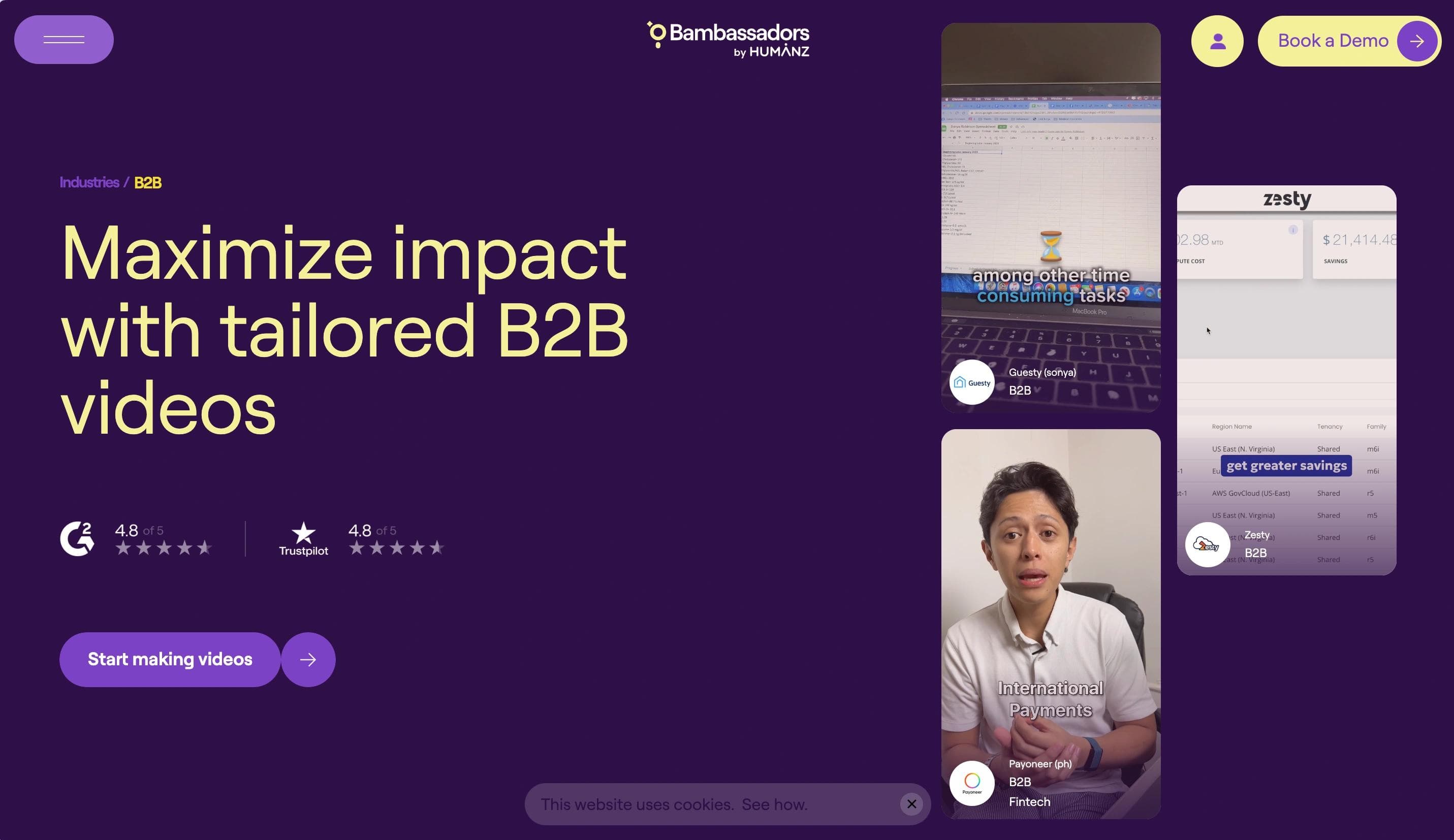
Bambassadors' B2B industry page emphasizes video marketing expertise tailored for B2B brands. The page opens with a bold headline and rotating hero visuals showcasing real creators and impactful campaigns. The content structure balances credibility and product offerings, highlighting why top B2B brands trust Bambassadors.
A carousel of success metrics and testimonials reinforces the effectiveness of their services. The page blends vibrant purple and yellow colors, playful but professional typography, and interactive visuals to maintain engagement and flow.
Standout Elements
- Video-first hero section
- Case studies and metrics
- Creator highlights
- Conversion-driven CTA
By leading with video content and rotating creator highlights, Bambassadors immediately demonstrates proof of execution. The metrics carousel provides quantifiable validation while the CTA removes decision friction by emphasizing speed to launch.
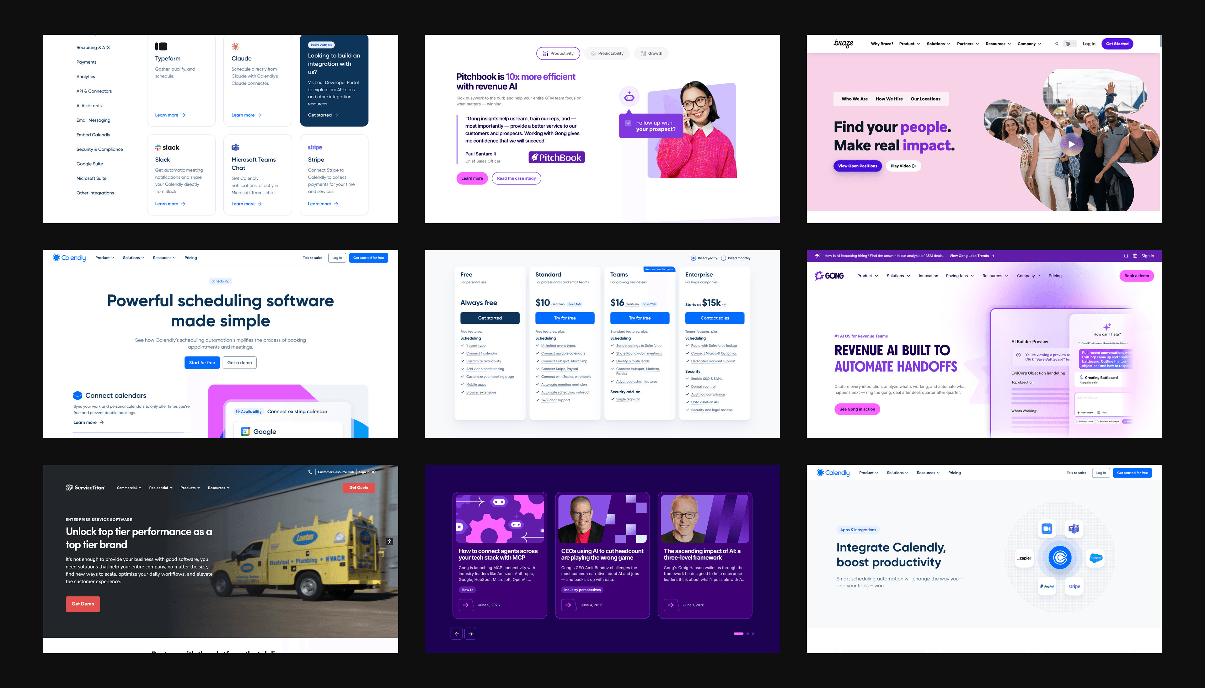
2. Toggl
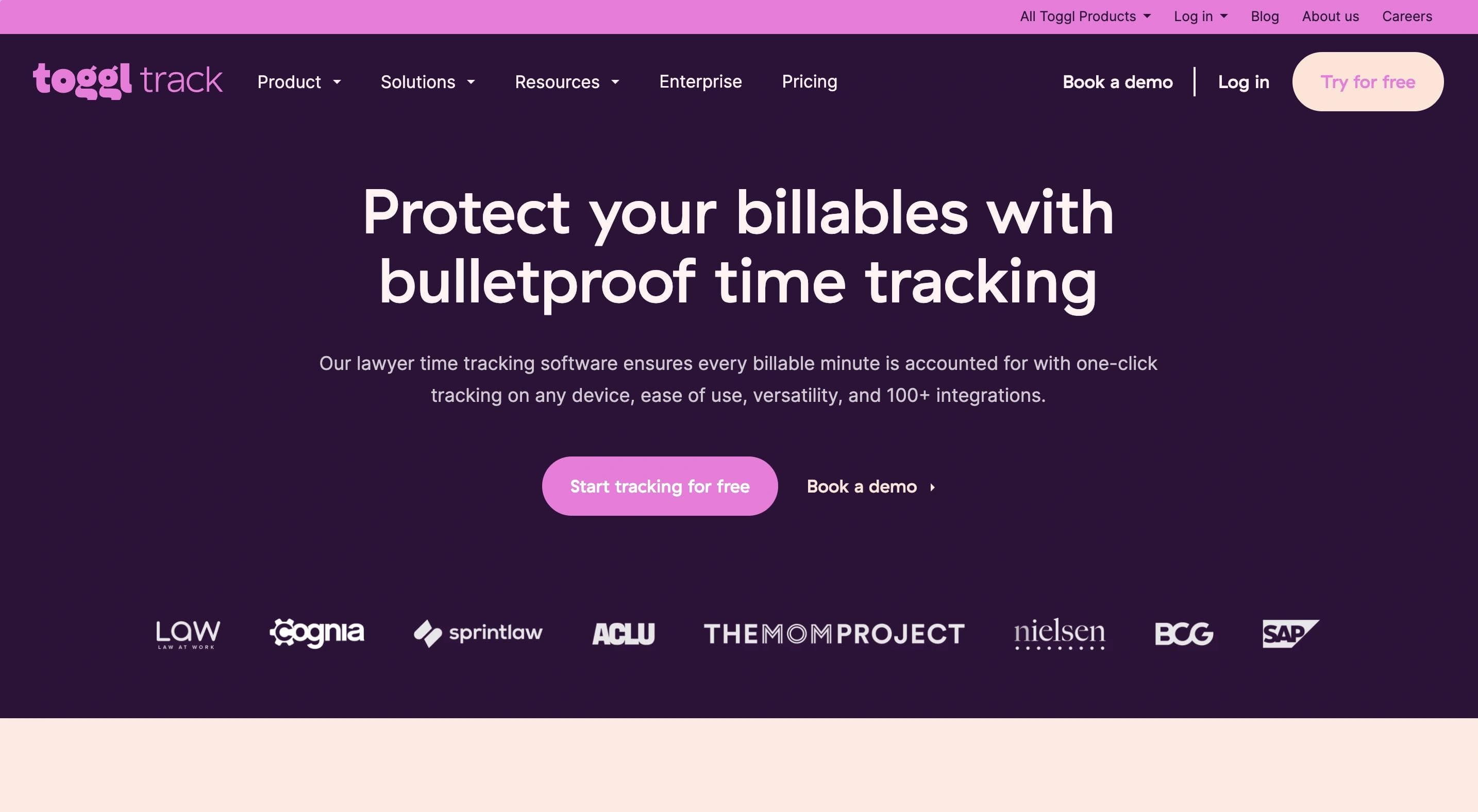
Toggl's industry page for law firms communicates how its time-tracking software streamlines operations for legal professionals. The headline immediately ties into the importance of billable hours, supported by visuals of reports and dashboards.
Throughout the page, benefits are clearly broken down with sections highlighting automated billing, improved team productivity, and workload balance. The use of a warm purple and soft pastel color palette, rounded icons, and friendly typography creates a professional yet approachable design. Multiple CTAs encourage users to try the product for free.
Standout Elements
- Benefit-driven messaging
- Feature previews
- Free trial CTA
- Legal-specific content
By opening with "billable hours," the metric law firms obsess over, Toggl immediately signals relevance. The free trial CTA removes friction at the decision point, while legal-specific FAQs preemptively address objections. This combination shortens the consideration phase and accelerates trial signups.
3. HeyGen
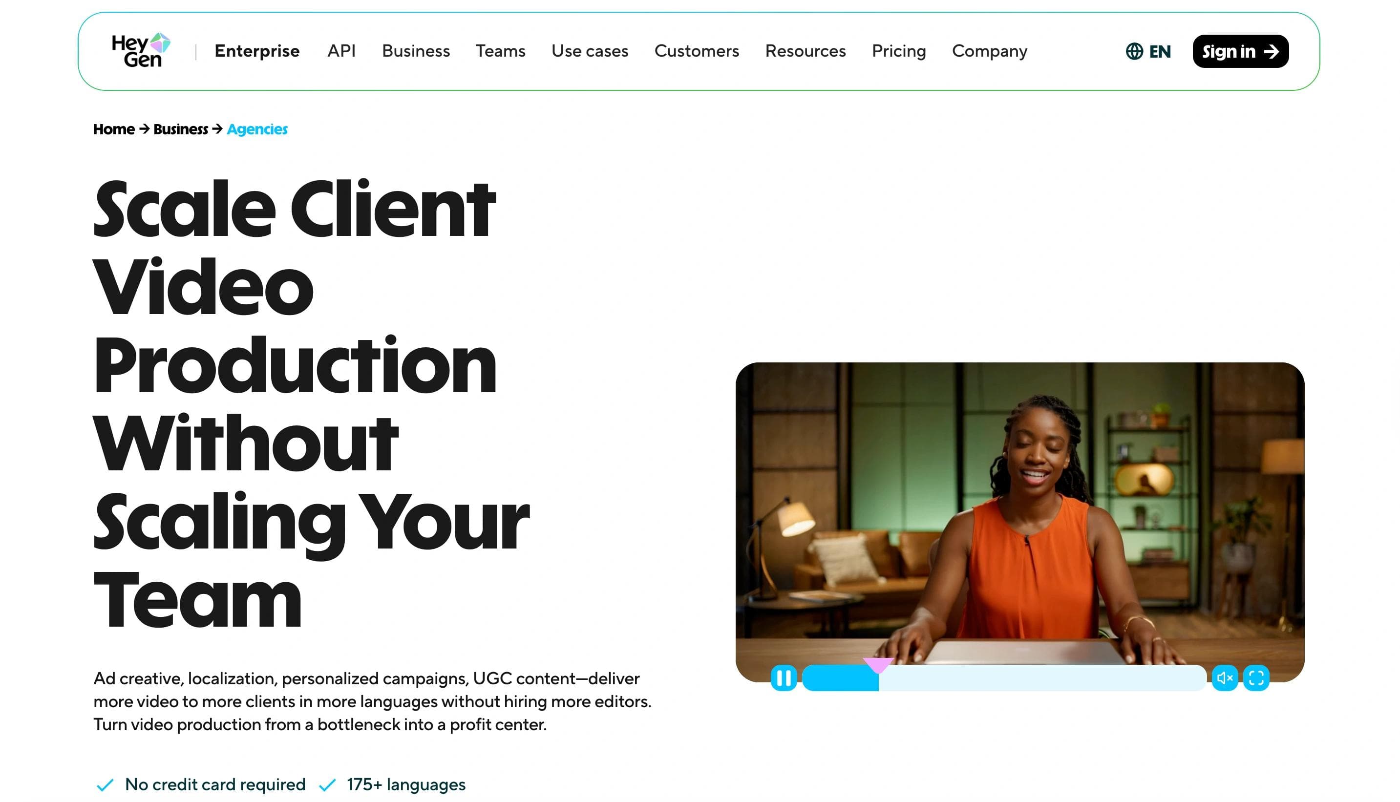
HeyGen's industry page for agencies highlights how AI can transform video production by delivering studio-quality results quickly and affordably. The design uses a blend of gradient visuals and video previews to immediately catch the user's attention.
The message appeals to agencies with storytelling at their core, showcasing testimonials and case studies from brands like Trivago. A streamlined step-by-step guide emphasizes simplicity, while multilingual capabilities strengthen its appeal to global agencies. A partner program invitation rounds out the offering. In 2026, HeyGen's page is particularly notable for how it integrates live AI demo functionality, letting visitors experience the product directly on the page.
Standout Elements
- Embedded AI demo
- Custom multilingual features
- Partner program
- Quick-start CTA
HeyGen reduces decision friction by demonstrating the product in action through embedded video examples and live AI demos. The step-by-step simplicity messaging addresses the common objection that AI tools are complex, while the partner program creates a dual conversion path for users and agency collaborators.
4. Miro
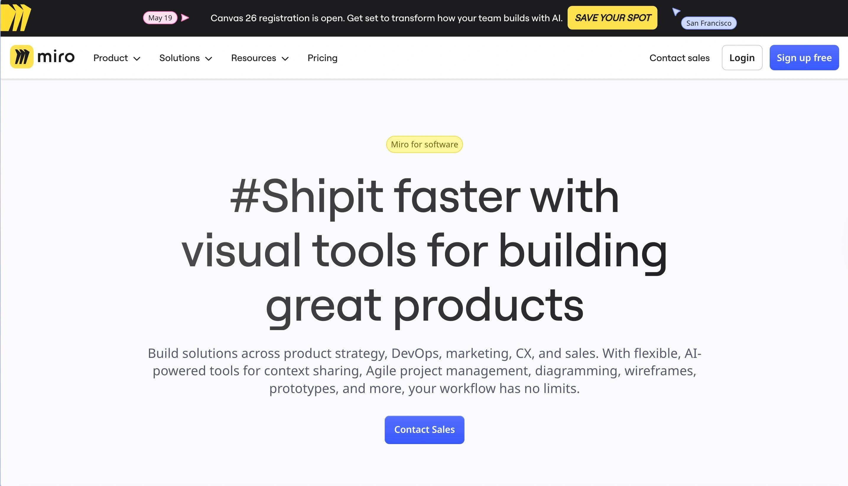
Miro's SaaS industry page focuses on accelerating product development cycles through visual collaboration tools. The page presents a clean, structured design with product screenshots that demonstrate use cases like roadmaps, backlogs, and wireframes.
The message centers on how Miro empowers teams to collaborate from product discovery to delivery, ensuring transparency, speed, and alignment. It highlights integrations with popular tools (Jira, Slack) to streamline workflows. Security and data protection features are emphasized to build trust with enterprise-level SaaS teams. Miro's 2026 update adds AI-assisted diagramming previews directly in the hero section, giving product teams a concrete sense of time savings before they scroll.
Standout Elements
- Dynamic product previews
- Workflow integrations
- Case studies and testimonials
- Security emphasis
Miro reduces adoption risk by showcasing integrations with tools SaaS teams already use daily. The security emphasis addresses enterprise procurement objections upfront, while product screenshots provide visual proof of functionality, shortening the evaluation cycle for technical buyers.
5. LaunchDarkly
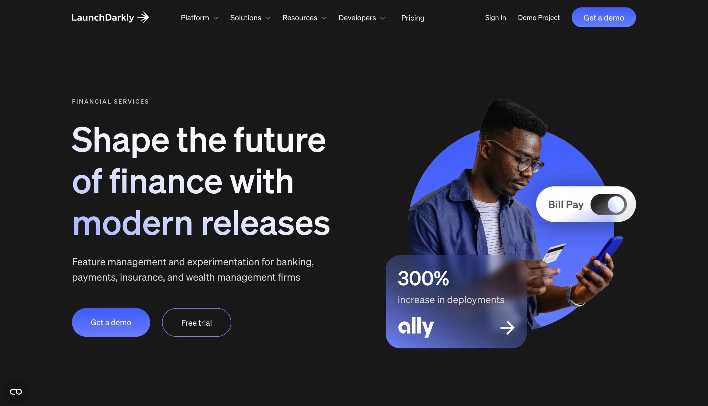
LaunchDarkly's industry page for financial services highlights how their platform helps ensure smooth software releases. It emphasizes reliability with benefits like enhanced risk management, improved compliance, and streamlined deployments.
With clear, bold messaging and well-placed statistics, the page establishes credibility through client logos from major financial institutions and a featured case study from Ally Bank. The visual design employs a sleek dark background contrasted with vibrant purples and blues, giving a modern, tech-forward feel. The layout is clean and spacious, with rounded, easy-to-read typography that balances professionalism and accessibility.
Standout Elements
- Security and stability focus
- Credibility through client success
- Dark-mode design system
- Actionable CTAs
LaunchDarkly speaks directly to financial services' top priority: risk mitigation. By leading with compliance and downtime prevention rather than features, they align messaging with how this audience evaluates vendors. The Ally Bank case study provides peer validation from a trusted industry name.
6. Rippling
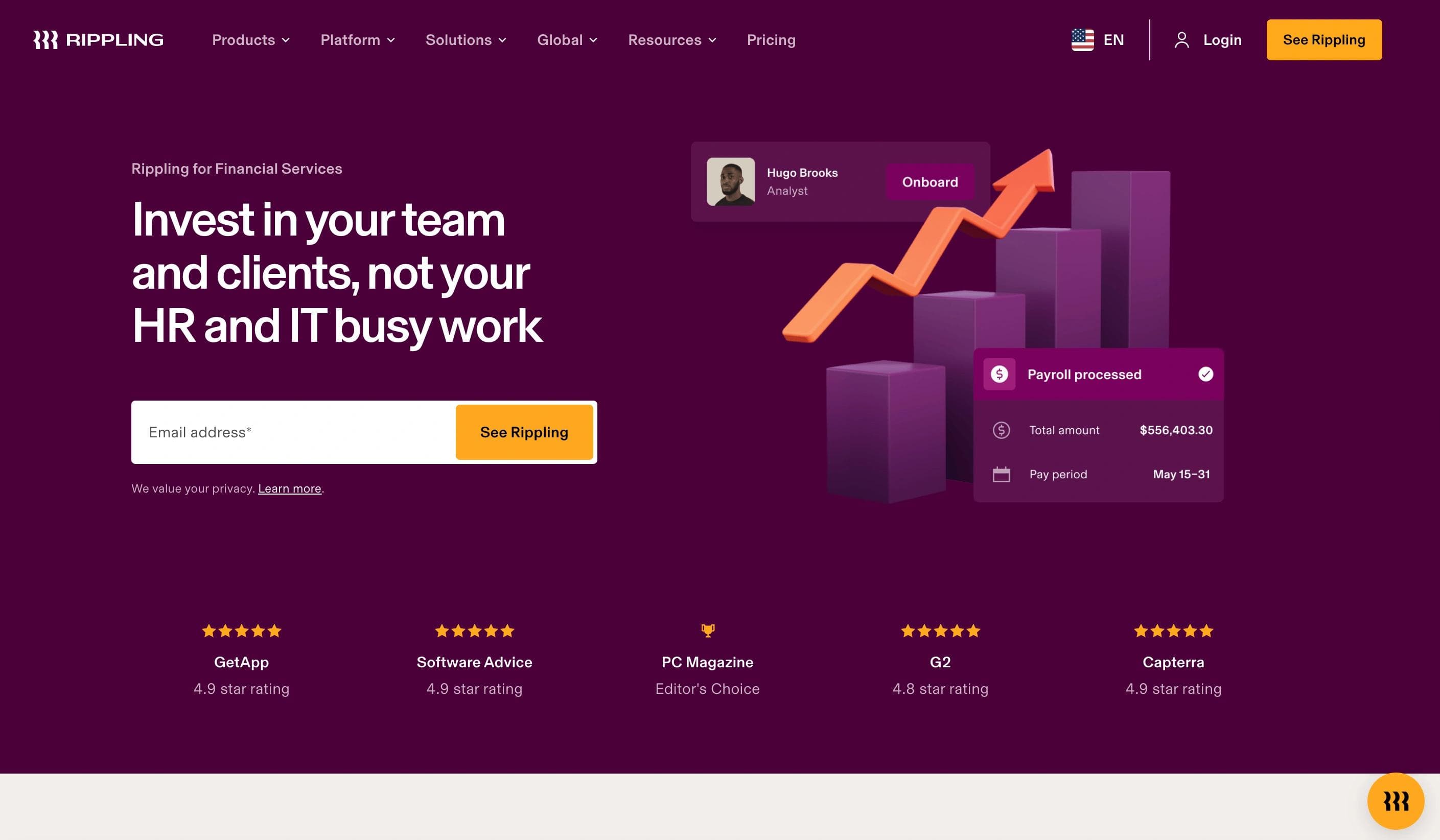
Rippling's industry page targets financial services firms by promoting streamlined HR, payroll, and IT solutions. It highlights the ability to onboard, pay, and manage employees with reduced administrative workload and increased operational efficiency.
The messaging reinforces trust by showcasing awards, testimonials, and Fortune 500-level benefits offerings. The design uses a rich, warm color palette of deep purples and creams, complemented by bold typography and dynamic data visuals, giving a refined and business-oriented impression.
Standout Elements
- Time-saving solutions
- Trust signals
- Sophisticated design
- Detailed product breakdowns
Rippling targets financial services firms experiencing rapid growth by quantifying time savings on administrative burden. The awards and Fortune 500 benefit comparisons position them as enterprise-grade, while the warm design palette softens the technical complexity of an all-in-one platform.
7. Amplitude
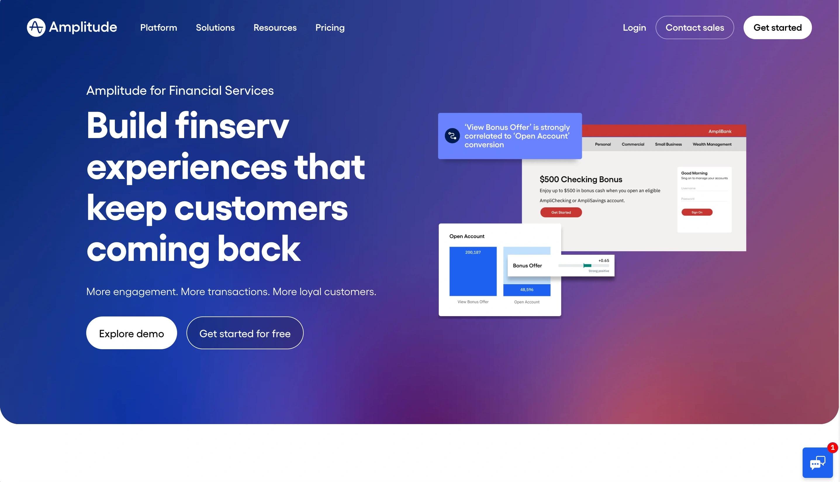
Amplitude's financial services page promotes a data-driven approach to improving digital customer experiences. The focus is on unifying banking platforms and using advanced analytics to map customer journeys, reduce churn, and optimize engagement.
The page combines impactful product screenshots, statistics, and testimonials, reinforcing credibility with proof of success. Visually, it employs a clean, modern style with shades of blue and white, communicating professionalism and trustworthiness. Interactive graphs and charts illustrate the platform's ability to deliver real-time insights.
Standout Elements
- Analytics-first approach
- Detailed visual previews
- Unified messaging
- Modern, trustworthy design
Amplitude positions analytics as the solution to financial services' digital transformation challenges. The visual data previews demonstrate sophistication without requiring technical expertise to understand, while the unified platform messaging addresses the common pain point of fragmented banking systems.
8. Braze
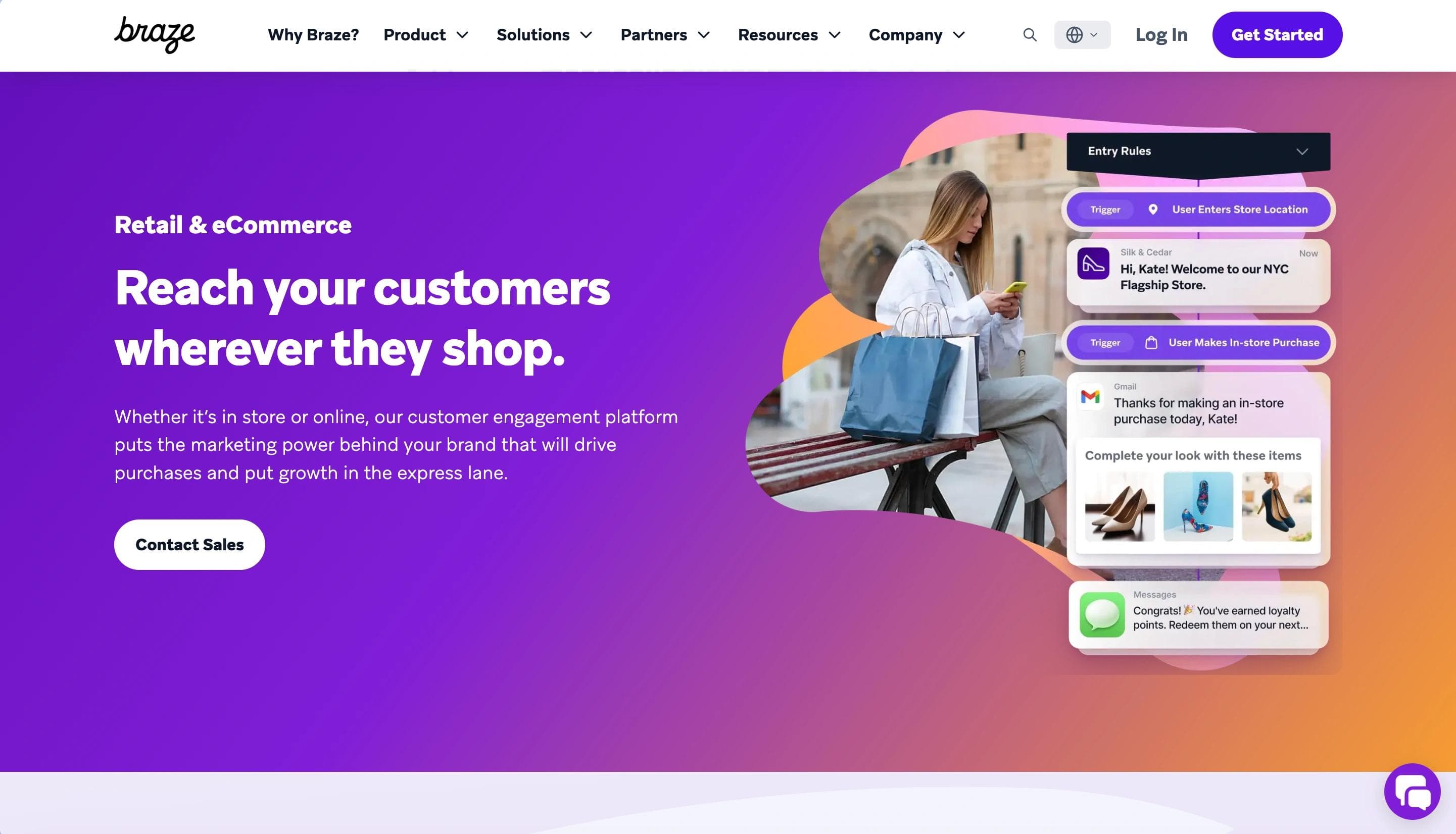
Braze's retail and eCommerce industry page emphasizes customer engagement through personalized shopping experiences and data integration. The page highlights how brands can use purchase data to create custom experiences and improve marketing effectiveness.
Performance statistics, including increased conversion rates and customer lifetime value, reinforce the platform's impact. The visual design features dynamic gradients in purple, pink, and orange, complemented by modern, floating UI elements that demonstrate flexibility and innovation. In 2026, Braze has added a live benchmark tool that lets retail marketers see how their engagement metrics compare to category peers, a standout addition that creates a personalized "aha moment" early in the page experience.
Standout Elements
- Personalized experiences
- Proven success stories
- Data integration focus
- Interactive benchmark tool
Braze leads with personalization as the competitive differentiator in retail and eCommerce. The measurable success metrics provide ROI validation for marketing leaders, while the vibrant, modern design signals innovation and positions them as a next-generation platform rather than legacy marketing automation.
9. Deel
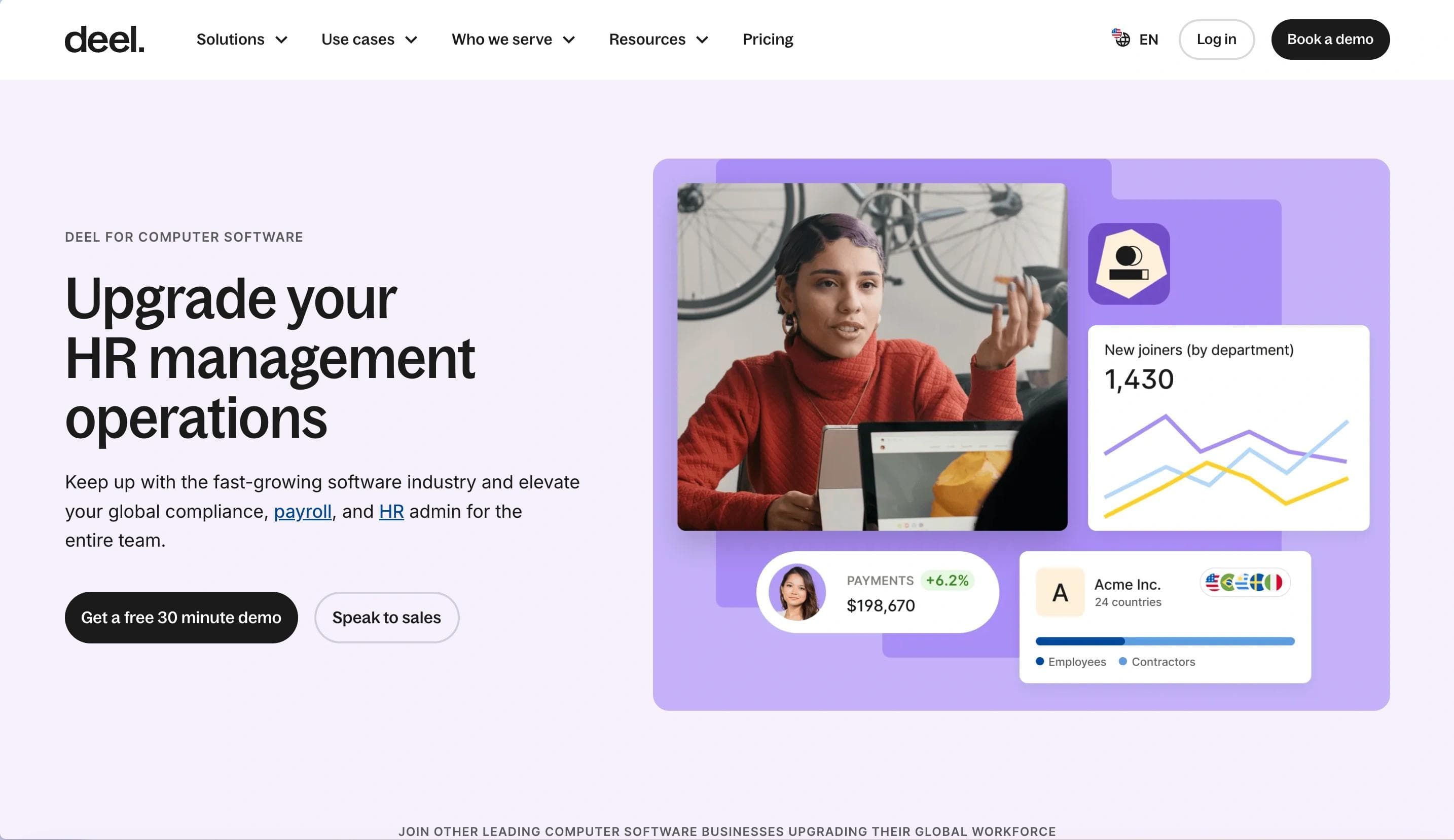
Deel's industry page for computer software companies presents a comprehensive solution for scaling globally while managing HR challenges. The content emphasizes how Deel helps software businesses access global talent, streamline HR operations, and stay compliant across borders.
Throughout the page, case studies highlight success stories. The design is clean and visually engaging, featuring soft curves, warm pastel accents in purple, yellow, and blue, along with illustrative graphics that reinforce a user-friendly brand identity.
Standout Elements
- Global talent acquisition
- Seamless integration
- Custom HR automation
- Showcased success
Deel addresses the software industry's distributed workforce challenge by positioning global hiring as a competitive advantage rather than a compliance burden. The integration emphasis removes technical objections, while automation messaging appeals to lean HR teams at fast-growing companies.
10. Monday.com
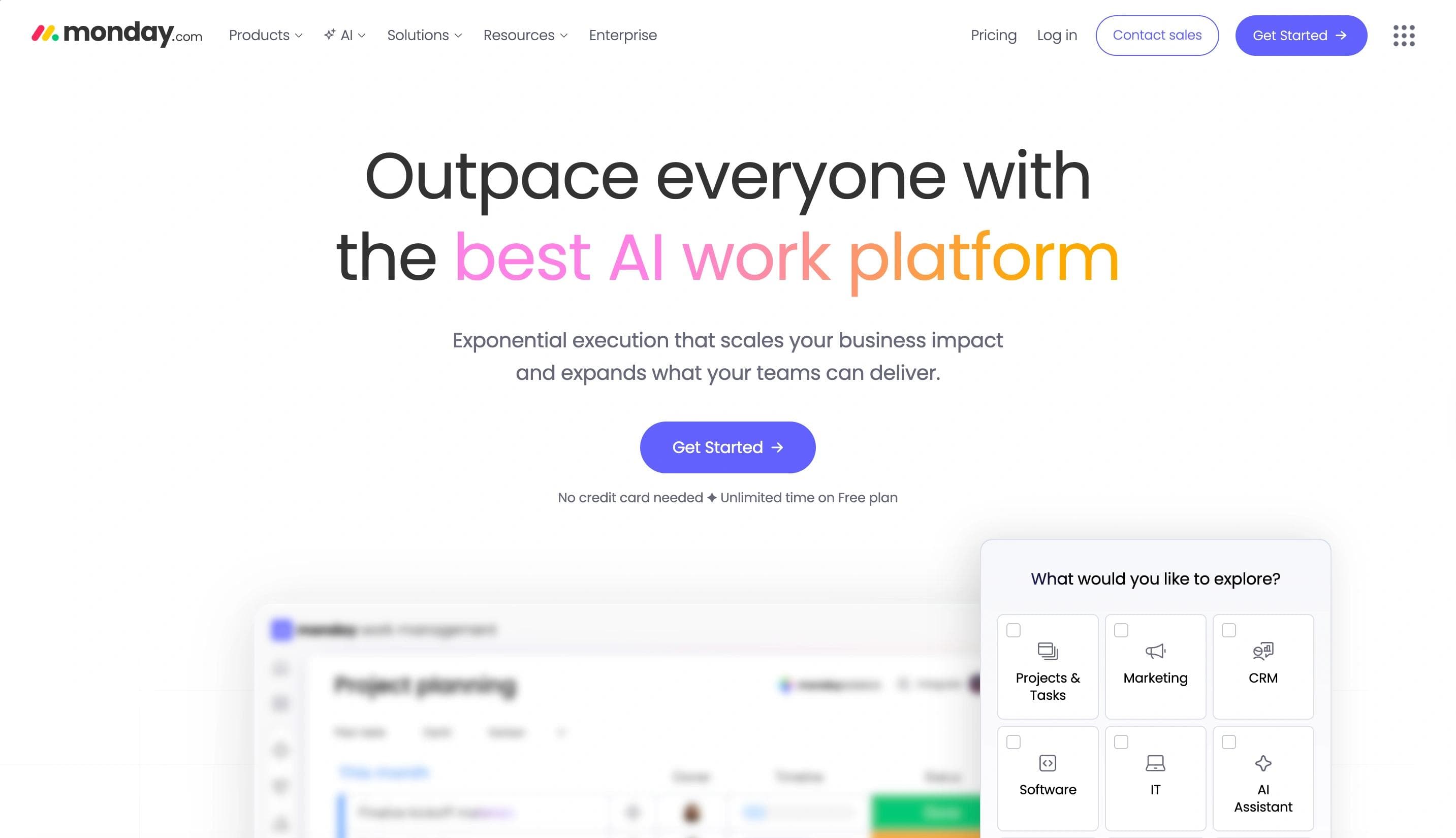
Monday.com's industry page for retail highlights how its platform improves collaboration and operational efficiency across key teams such as product, marketing, and operations. The messaging focuses on streamlining communication, boosting visibility into workflows, and accelerating time-to-market.
The design employs a vibrant blue palette with white and purple accents, giving it a clean, modern feel. Images of diverse teams and retail environments provide real-world context, emphasizing teamwork and productivity. Monday.com's page is particularly strong in 2026 for its role-based navigation, letting retail marketers, ops managers, and IT leads each jump to content relevant to their function without scrolling through irrelevant sections.
Standout Elements
- Role-based navigation
- Data-driven improvements
- Customer success stories
- Solution in action
Monday.com segments by retail team function rather than company size, making the page relevant to multiple decision-makers within the same organization. The recognizable brand case studies provide social proof that resonates with retail professionals, while the interactive demo invitation lowers commitment barriers to product exploration.
What the Best Industry Pages Have in Common in 2026
Looking across these ten examples, a few design and strategy patterns separate high-performers from the rest this year.
Interactive demos are replacing static screenshots
Buyers expect to experience the product before talking to sales. Pages that embed interactive walkthroughs or live AI demos convert at higher rates than those relying on screenshots alone.
Dark-mode design systems signal enterprise credibility
High-contrast, dark-background layouts have moved from developer tools to mainstream B2B SaaS, particularly for technical and financial services audiences.
Role-based content pathways reduce friction
Rather than asking all visitors to scroll through the same page, leading companies now offer persona-specific navigation that routes buyers to the content most relevant to their role.
Quantified proof outperforms qualitative testimonials
Specific metrics, benchmark comparisons, and ROI calculators are displacing generic quote-based social proof as the primary trust-building mechanism.
AEO-ready structure improves AI discoverability
Pages built with clear headings, factual answer-first paragraphs, and structured FAQ sections are increasingly surfacing as cited sources in AI-generated search responses, extending reach beyond traditional organic rankings.
When to Use Industry Pages vs. Use Case Pages
Both page types serve distinct strategic purposes, and knowing which to build first shapes how effectively your site captures and converts demand.
Prioritize industry pages when your product serves distinct verticals with unique workflows, compliance requirements, or buying processes (healthcare vs. fintech, for example). Industry pages improve SEO for high-intent searches and demonstrate domain expertise that shortens sales cycles.
Prioritize use case pages when your product solves the same problem across industries (project management, time tracking). Use case pages show versatility and help prospects self-identify whether your solution fits their needs, regardless of sector.
Think of it this way: industry pages say "we understand your world," while use case pages say "here's how we've solved problems like yours before." Together, they create a complete picture of your expertise.
Build Industry Pages to Reach the Right Audiences
Industry pages are a powerful way to connect with the people who matter most to your business. When designed with strategic intent, they do triple duty: attracting high-intent organic traffic, building sector-specific credibility, and guiding qualified visitors toward pipeline-generating actions. In 2026, the best industry pages add a fourth function, surfacing as cited sources in AI-generated search results, extending reach into channels that didn't exist two years ago.
The difference between a commodity industry page and a revenue driver comes down to precision: knowing your audience's pain points, demonstrating expertise through proof, and designing experiences that remove friction from the decision process. If your industry pages aren't performing, the issue isn't traffic. It's design and messaging alignment.
Ready to build industry pages that convert? Talk to Webstacks.

I lead growth at Webstacks, connecting strategy, design, and engineering to build websites that drive results. I specialize in website strategy, CMS implementation, and helping B2B teams scale their web presence.