Press Page Design Best Practices for B2B SaaS
A well-designed press page does more than host press releases. It shapes how journalists, analysts, and stakeholders perceive your company, giving them instant access to the materials they need while reinforcing your brand narrative.
Whether it's the latest company news, high-quality images, or executive bios, a press page acts as the central spot where journalists and stakeholders can find everything they need. It not only makes communication smoother but also strengthens the company's brand and supports a great website design.
In brief:
- A press page is a central platform providing journalists with essential company information.
- Well-designed press pages improve corporate communication and strengthen brand identity.
- Implementing best practices in press page design improves accessibility and media engagement.
What Is a Press Page?
A press page, also known as an online newsroom, is a key part of a B2B website designed to make communication between a company and the media easier.
Essentially, it focuses on providing essential information to journalists and stakeholders. Acting as a central hub, a press page allows journalists, media professionals, and the public to access complete and current information about an organization.
This dedicated section usually includes important elements like press releases, media kits, company overviews, mission statements, and contact information for media inquiries.
Why Are Press Pages and Newsrooms Important?
Press pages improve corporate communication and branding. They provide a structured platform for companies to maintain narrative consistency and brand image.
A press page can also improve search engine rankings through the use of branded keywords and external links.
Best Practices for Press Page Design
Here are some best practices to help you create a press page that's both informative and user-friendly:
- Simplify Navigation: Make sure your press page is easy to navigate. Use a clean design with clear headings so journalists can quickly find what they need. Simplifying navigation reduces frustration and increases the chances of positive interactions.
- Prominent Contact Information: Display contact details prominently on your press page. Include up-to-date email addresses and phone numbers for your media or marketing team.
- Comprehensive Company Background: Include a concise company overview that highlights your organization's impact, mission, vision, and core values. This context helps journalists write stories about your company with the right perspective.
- Highlight Recent News: Feature recent updates prominently on your press page. Showing the latest news upfront keeps the press informed and ensures that the most current developments are easy to find.
- Showcase Media Coverage Highlights: Display significant media mentions and recognitions your company has received from reputable sources.
- Include Awards and Recognition: Create a section dedicated to showcasing awards and other significant accolades. Highlighting these achievements further reinforces your company's credibility and success. Incorporating high-quality visuals and illustrations can further enhance the appeal of your press page.
- Offer a Downloadable Media Kit: Provide a downloadable media kit containing essential resources like logos, high-resolution images, executive bios, and press releases.
- Ensure Mobile Optimization and Interactivity: Recognize that journalists might access your press page on various devices. Make sure the page is mobile-friendly and works well on smaller screens.
- Include a Clear Call to Action: Add a clear call to action, inviting visitors to reach out for more information. This could be an invitation to contact your media team via a linked email address, ensuring journalists can easily get accurate information.
See what’s working for industry-leading websites and find inspiration to improve yours.

Press Page and Newsroom Examples
Looking at successful press pages and newsrooms shows us what elements make these digital spaces effective for communicating with media professionals. Here's a closer look at the press pages from some well-known companies, highlighting what they do well.
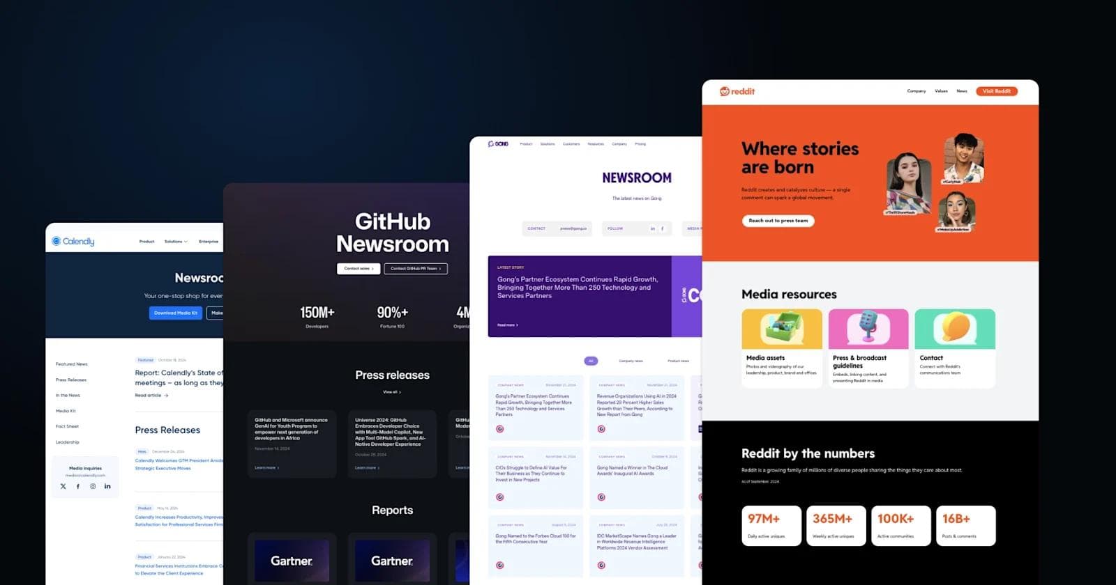
Reddit's press page is colorful, playful, and community-driven, embodying the platform’s unique culture. The design is visually distinct, incorporating bright backgrounds, cartoonish avatars, and a bold orange aesthetic that immediately feels true to Reddit’s identity.
Unlike traditional newsroom pages, Reddit’s press section is designed for storytelling rather than just corporate updates. The page features a "Reddit by the Numbers" section, highlighting key platform statistics, while the "Reddit News" section curates major announcements with whimsical, Reddit-style illustrations.
Perhaps the most unique element is the executive team showcase, where each leader is represented by a personalized avatar, reinforcing the company’s emphasis on creativity and internet culture.
Standout Elements:
- Snoo avatars for leadership – Instead of standard executive headshots, Reddit uses customized Snoo illustrations for each team member, making leadership bios feel fun and uniquely Reddit.
- Data storytelling with "Reddit by the Numbers" – The newsroom doesn’t just list updates; it presents key platform stats (users, communities, engagement) in a way that reinforces Reddit’s global influence.
- Community-first design approach – Everything from the vibrant visuals to the casual, engaging copywriting reflects Reddit’s internet-first culture, setting it apart from traditional corporate press pages.
Gong
Gong's press page is sleek, vibrant, and heavily branded with its signature purple-heavy aesthetic, reinforcing its identity as a bold, AI-driven sales intelligence company. The layout is structured for clarity, with a featured story at the top, followed by categorized news updates, and concluding with a "Gong by the Numbers" section highlighting key company stats.
One of the most notable aspects of this newsroom is its hyper-organized categorization of news, allowing visitors to filter between company news and product news for a more personalized browsing experience.
Additionally, the newsroom prioritizes external engagement, with clear call-to-action buttons for media inquiries, social media follows, and downloadable press resources at the very top of the page.
Standout Elements:
- Strong, consistent branding – The newsroom fully embraces Gong’s signature purple theme, creating a cohesive and instantly recognizable experience.
- Filterable news categories – Unlike many newsroom pages, Gong allows users to toggle between company news and product news, making it easier to find relevant updates.
- Global office locations in the footer – The newsroom uniquely includes a detailed global office directory, subtly reinforcing Gong’s international presence and reach.
ClickUp
ClickUp's press page is vibrant, energetic, and visually captivating, reflecting the company’s modern and dynamic brand identity. The page immediately grabs attention with a bold gradient background and engaging animations, reinforcing ClickUp’s focus on productivity and innovation.
The newsroom is structured around media visibility, prominently showcasing logos from top-tier publications like The New York Times, Forbes, and Bloomberg before diving into press articles.
Standout Elements:
- Striking gradient design & animations – The newsroom’s colorful, high-energy aesthetic stands out from the standard corporate press page, mirroring ClickUp’s branding.
- Emphasis on third-party credibility – Instead of just listing company news, ClickUp highlights media logos first, reinforcing its reputation through external validation.
- Dedicated outreach section – A unique “Let’s get in touch” area provides direct access to press inquiries, partnerships, and other contacts, making it one of the most journalist-friendly newsrooms.
Calendly
Calendly’s press page is sleek, minimalistic, and highly functional, mirroring the company’s focus on efficiency and seamless scheduling. The page has a clean, structured layout with a deep blue header featuring prominent "Download Media Kit" and "Make a Media Inquiry" buttons, making press resources instantly accessible.
The newsroom is designed for quick navigation, with categorized sections for press releases, media coverage, and company resources. The "In the News" section pulls in third-party mentions from high-profile sources like Forbes, VentureBeat, and Fast Company.
Standout Elements:
- Effortless media filtering – The newsroom features a sidebar navigation menu that lets users quickly jump between press releases, media mentions, fact sheets, and leadership profiles.
- Strong meeting culture positioning – The "2024 Report: The State of Meetings" is featured prominently, reinforcing Calendly’s thought leadership in workplace productivity.
- Integrated product CTA at the bottom – Instead of ending with just press content, the newsroom includes a "Sign Up for Free" section that seamlessly promotes Calendly’s booking features, tying the newsroom back to the product itself.
GitHub
GitHub’s Newsroom is a polished, well-organized press page designed to provide quick access to the latest company updates, reports, and brand assets. The dark, modern aesthetic, combined with bold typography, makes the page visually engaging while maintaining a professional and developer-focused feel.
One of the standout features is the structured layout, which separates press releases, industry reports, media mentions, and customer stories into clear sections. The GitHub Copilot by the Numbers area is a unique addition, showcasing impressive adoption stats with large, easy-to-read figures. At the bottom, the Media Kit and Executive Insights sections make it easy for journalists to grab brand assets or learn more about GitHub’s leadership.
Standout Elements:
- Press release grid – A structured layout that displays the latest company news in easy-to-read cards.
- Data-driven storytelling – The “GitHub Copilot by the Numbers” section highlights adoption stats in a visually compelling way.
- Comprehensive media resources – The Media Kit and Executive Insights sections ensure journalists have access to branding materials and leadership perspectives.
See what’s working for industry-leading websites and find inspiration to improve yours.
Intercom
Intercom’s Newsroom is clean, minimalistic, and highly functional, providing journalists with a straightforward way to access company news, background information, and brand assets. The page keeps things simple, prioritizing readability and accessibility with a structured layout.
One of its best features is the "More About Intercom" section, which provides a quick snapshot of the company, including a short description, full boilerplate, and key stats like year founded, employee count, and customer base.
The Brand Assets and Guides section is also well-organized, offering downloadable logos, leadership photos, product screenshots, and team images—all in one place. At the top and bottom of the page, a "Contact Press Team" button is prominently placed, ensuring journalists can easily reach out.
Standout Elements:
- Concise "In the Media" section – A simple list of recent press coverage with direct links for easy reading.
- "More About Intercom" company snapshot – Key company facts and stats presented in an easy-to-digest format.
- Well-structured brand asset library – Quick access to logos, leadership photos, and product visuals in one organized section.
Miro
Miro’s Newsroom is visually engaging and structured to provide quick access to company updates, media coverage, and announcements. The page features Miro’s signature bright, collaborative aesthetic, with custom illustrations at the top that reinforce its creative and team-oriented brand identity.
The standout feature is the press release grid, which presents the latest announcements in a card-based layout with a mix of text, images, and Miro branding. This makes scanning for updates easy and visually appealing.
While there is no dedicated media kit, the newsroom effectively highlights Miro’s industry recognition, leadership hires, and product innovations in a digestible format.
Standout Elements:
- Visually engaging design – Custom illustrations and Miro’s signature color palette make the page feel creative and inviting.
- Card-based news layout – Press releases are neatly organized in an easy-to-scan grid format with a mix of images and text.
- Expandable news section – A “Show More” button allows users to browse older announcements without overwhelming the page.
Braze
Braze’s Newsroom is vibrant, structured, and content-rich, making it easy to explore the company’s latest media coverage and announcements. The page features a bold purple gradient header, reinforcing Braze’s dynamic brand identity while keeping things visually engaging.
The layout is divided into distinct sections, starting with a featured news highlight, followed by a Media Coverage section that showcases external articles from major publications. Below that, the Latest News Announcements section presents press releases in a grid format, complete with Braze’s signature branding.
A large call-to-action (CTA) banner mid-page invites visitors to “Join the movement to journey orchestration,” adding a unique marketing element that ties the newsroom into Braze’s broader messaging.
Standout Elements:
- Featured news highlight – A prominent card at the top spotlights key company coverage, making sure the most important news stands out.
- Media coverage integration – Instead of just listing press releases, the page includes third-party articles from outlets like Nasdaq and Martech, reinforcing credibility.
- Branded CTA for engagement – The “Join the movement” banner integrates newsroom content with Braze’s marketing strategy, making the page more than just a press resource.
Salesforce
Salesforce’s News & Insights page is a content-rich, visually dynamic newsroom that blends company news, industry insights, and customer success stories into a seamless experience. The design is modern and vibrant, incorporating Salesforce’s signature cloud-blue branding and custom illustrations that reinforce its AI-driven innovation.
The page is packed with information, featuring a hero section that highlights major company announcements, followed by press releases, media resources, featured stories, and customer success highlights. One unique addition is the "Featured Stats" section, where Salesforce presents key industry data points in a visually compelling format. A newsletter signup form at the bottom encourages users to stay updated on the latest Salesforce news, making the newsroom an ongoing engagement tool rather than just a static resource.
Standout Elements:
- AI-driven storytelling – The newsroom prominently features Agentforce, Salesforce’s AI initiative, showcasing its real-world applications and impact.
- Featured Stats section – A dedicated space presents key industry and company metrics in digestible, eye-catching stat cards.
- Customer success integration – The newsroom highlights case studies from brands like Davivienda, making it as much about customer stories as company news.
Loom
Loom’s Newsroom is sleek, modern, and well-organized, with a strong emphasis on media recognition and brand credibility. The design features a bold dark purple theme that aligns with Loom’s branding, creating a visually cohesive experience.
The page is structured into distinct sections, starting with a featured news highlight, followed by Press Highlights, which showcase external articles from major publications like The Wall Street Journal, Protocol, and Quartz.
The Awards & Accolades section stands out, reinforcing Loom’s credibility with recognitions from platforms like G2, Forbes, and Google. Finally, the Press Releases section and a prominent press contact email make it easy for journalists to access official company updates.
Standout Elements:
- Awards & Accolades section – Loom dedicates a section to showcasing its industry awards and recognitions, reinforcing its credibility.
- Press Highlights grid – Instead of a traditional press release feed, Loom prioritizes external media coverage, positioning itself as a widely recognized industry leader.
- Dedicated press contact – A large, centrally placed email address ensures that media inquiries are effortless and direct.
Ahrefs
Ahrefs’ Media Kit page is a no-nonsense, highly functional press resource that provides instant access to essential brand assets. The design is minimalistic yet bold, with a striking blue header that reinforces Ahrefs' branding.
Unlike traditional newsroom pages, this one is exclusively focused on media materials, making it ideal for journalists and content creators looking for quick access to company visuals and information.
The page is neatly structured into sections for logos, product screenshots, office photos, and team images, all available for bulk download. The "For Media" section at the bottom highlights Ahrefs’ authority in the SEO industry with featured media quotes from major outlets like Bloomberg, Forbes, and TechCrunch. Contact details for press inquiries are also easily accessible.
Standout Elements:
- Bold branding focus – The strong blue header and oversized logo section make the brand identity unmistakable.
- High-resolution team & office photos – Unlike many media kits, Ahrefs includes candid team images and data center photos, giving journalists more visual storytelling options.
- Media mentions integration – The "For Media" section prominently features quotes from top-tier publications, reinforcing Ahrefs’ credibility as an SEO leader.
Kraken
Kraken’s Press Room is a media-rich newsroom designed to showcase the company’s presence in the cryptocurrency space. The deep purple branding and abstract crypto-inspired graphics give the page a strong identity, reinforcing Kraken’s tech-forward image.
The page prominently features video interviews with Kraken executives, making it one of the few press pages that prioritizes multimedia content over static press releases.
Below that, the Headlines section curates news mentions from major financial and crypto publications, including Bloomberg, DLNews, and The Block, ensuring a diverse range of coverage.
Standout Elements:
- Video-first approach – Unlike most press pages, Kraken prioritizes media interviews with executives, making its leadership more visible.
- Crypto-specific media coverage – The newsroom highlights mentions from both mainstream finance (Bloomberg, Business Post) and niche crypto outlets (CoinTelegraph, The Block), reinforcing Kraken’s influence in both spaces.
- Quick-reference company facts – The "Kraken Facts" section provides essential company data at a glance, ideal for journalists needing fast details.
Amplitude
Amplitude’s Newsroom is clean, modern, and highly structured, reflecting the company’s data-driven identity.
The simple yet elegant layout presents press releases as visually engaging cards at the top, followed by a streamlined chronological list of announcements with filtering options for easy navigation. The page maintains a professional and minimalist aesthetic, with a focus on clarity and accessibility.
A “Load More” button enables infinite scrolling, allowing users to access past releases without overwhelming the page. The emphasis on financial and investor-related announcements highlights Amplitude’s standing as a key player in the analytics and enterprise software space.
Standout Elements:
- Data-driven aesthetic – The newsroom mirrors Amplitude’s focus on analytics with a clean, no-frills design that prioritizes structured information.
- Filtering for press releases – Unlike static lists, Amplitude’s newsroom includes dropdown filters for year and type, making it easy to find specific updates.
- Investor-friendly focus – Earnings calls and financial results are prominently featured, catering to both journalists and investors tracking the company’s performance.
Rippling
Rippling’s Newsroom is bold and visually distinct, featuring a deep brown and gold color scheme that reinforces the brand’s premium, finance-tech aesthetic. The page is designed to establish credibility with notable media coverage, awards, and an extensive archive of press mentions, making it a valuable resource for journalists.
The page prominently highlights logos of major media outlets such as Reuters, TechCrunch, and Sky News, reinforcing Rippling’s reputation in business and financial reporting. Below, the "Media Resources" section provides downloadable logos, product screenshots, and executive headshots, ensuring that the press has access to high-quality assets.
The extensive, scrollable press list is more comprehensive than most newsroom pages, featuring detailed, date-stamped entries covering everything from funding rounds to product launches.
Standout Elements:
- Awards integration – The newsroom prominently features Rippling’s Top Startups, Fastest-Growing, and Industry Choice awards, reinforcing its credibility.
- Deep, chronological press archive – Instead of just highlighting recent news, Rippling provides a structured, long-form archive of past press coverage, making it easy to track the company’s evolution.
- Strong finance-tech aesthetic – The dark, refined color scheme and clean typography give the newsroom a premium financial brand feel, aligning with Rippling’s positioning in HR and payroll tech.
Lattice
Lattice’s Newsroom is clean, welcoming, and designed with a soft, human-centric aesthetic that reflects the company’s focus on people and HR innovation.
The page is structured into three primary sections: "In the News", showcasing external media coverage; "Press Releases", linking to official company announcements; and "Featured from the Blog", which highlights thought leadership and industry insights.
What makes this newsroom stand out is its seamless integration of product updates and HR trends, positioning Lattice not just as a business but as an industry leader. The calming green gradient in the CTA section reinforces the company’s mission of supporting people-first workplaces, making the page feel more engaging than a traditional corporate newsroom.
Standout Elements:
- People-first visual design – The use of soft gradients, rounded cards, and a warm color palette aligns with Lattice’s mission of improving workplace culture.
- Thought leadership integration – Instead of just listing news and press releases, Lattice incorporates blog insights and HR research, adding value for industry professionals.
- Direct press release links to PRNewswire – Unlike many newsroom pages that host press releases internally, Lattice directs visitors straight to PR distribution sites, ensuring official updates are easily shareable and widely accessible.
See what’s working for industry-leading websites and find inspiration to improve yours.
Ready for a Better Press Page?
Drawing inspiration from these examples during your press page redesign can make a significant difference in how your organization is perceived.
If you need more flexibility and scalability, consider migrating to a headless CMS, which can improve your press page's performance and manageability.
Building out more B2B page types? See our guides to partner page design and corporate website design for more examples.
With a more refined press page, the media and your audience will have access to accurate information and can share your company's story effectively.
Ready to take your B2B website to the next level? Download Webstacks' Best B2B SaaS Websites eBook to discover more inspiring examples and actionable insights that can transform your digital presence.
Your website is your biggest growth lever—are you getting the most out of it? Schedule a strategy call with Webstacks to uncover conversion roadblocks, explore high-impact improvements, and see how our team can help you accelerate growth.

I create SEO-driven content for B2B SaaS companies, from blog posts to case studies. I focus on research-backed writing that ranks on the first page and drives meaningful organic traffic.