Wireframe vs Prototype: Key Differences & When to Use
Design deliverables are costing your team weeks of wasted effort, but not for the reason most marketing leaders assume. The problem isn't slow designers or difficult stakeholders—it's that everyone involved treats wireframes, mockups, and prototypes as interchangeable "pictures of websites" when they're actually fundamentally different validation tools serving distinct strategic purposes.
This confusion creates expensive patterns: stakeholders provide visual feedback during structural reviews, teams discover missing content sections after investing days in high-fidelity design work, and developers receive ambiguous specifications that require multiple rounds of clarification. Each mistake extends timelines, inflates budgets, and frustrates teams who can't understand why "simple design updates" take weeks to complete.
The staged approach from wireframes to mockups to prototypes prevents expensive revisions by ensuring structural changes happen when they require hours instead of days. Understanding which deliverables validate which decisions eliminates the bottlenecks that slow campaign execution and create developer dependencies.
This guide explains how wireframes, mockups, and prototypes differ, which validation questions each answers, and how to sequence them strategically to maximize efficiency and minimize rework.
Wireframes: Structural and Functional Validation
Wireframes answer the foundational question: "Is this structure right?" before teams invest in visual design or interactive elements. Wireframes are basic visual representations that focus on the placement of elements like headers, buttons, navigation, and content blocks. They use deliberately simple grayscale boxes and placeholder text to communicate structure without the distraction of final design details.
The deliberate simplicity of wireframes serves a strategic purpose beyond saving design time. By stripping away visual polish, wireframes force stakeholders and teams to evaluate whether the foundational architecture serves user needs and business goals. This approach prevents the common pattern where teams get distracted by aesthetic debates before confirming they're building the right structure in the first place.
What Wireframes Look Like
The visual minimalism of wireframes is intentional design, not incomplete work. Every element is reduced to its most basic form to keep attention focused on layout, hierarchy, and functionality rather than aesthetics.
Wireframes use intentionally minimal visual elements:
- Simple geometric shapes representing content areas
- Grayscale only with no brand colors applied
- "Lorem ipsum" text instead of final copy
- Basic annotations indicating functionality and interactions
This stripped-down approach prevents stakeholders from providing visual feedback when structural decisions remain unvalidated. When a wireframe shows gray rectangles and basic labels, stakeholders naturally focus on questions like "Should the testimonial section appear before or after the feature comparison?" rather than "Should we use navy or teal for the call-to-action button?" The former question is appropriate at this stage; the latter wastes time debating decisions that depend on structural choices not yet locked.
What Problems Wireframes Solve
Wireframes enable structural and functional validation before aesthetic investment. Without this validation stage, teams frequently discover fundamental structural problems only after investing significant time in detailed visual design, requiring expensive rework. Wireframes confirm that content organization matches user mental models, document specifications for interactive elements through annotations that translate directly into development tasks, and force productive conversations about whether structure serves business objectives. Structural changes at the wireframe stage require minimal designer effort, while restructuring a finished mockup requires substantially more time across typography, imagery, and brand element integration.
When and How to Use Wireframes Effectively
Knowing when wireframes provide the most value helps teams avoid both over-investing in unnecessary validation and under-investing in critical structural decisions. Deploy wireframes when you need to answer:
- Does this page structure support our conversion goals?
- Have we included all necessary content blocks and functional elements?
- Does the navigation logic match how users think about our product?
- Can developers build this within our technical constraints?
Reviewing Wireframes Effectively
Focus feedback on layout effectiveness, content organization, navigation logic, and functional completeness. Explicitly exclude feedback on brand colors, final copywriting, image selection, and visual design preferences.
Require explicit written approval of wireframes before mockup work begins. Frame the approval as: "We are locking page structure, navigation, and functional requirements. Changes after this point require returning to wireframes and will impact the timeline."
Common mistake: Providing visual design feedback during structural validation wastes review cycles by leading to debates over color choices when structural problems remain unresolved. A stakeholder who comments on button colors during wireframe review demonstrates a fundamental misunderstanding of what wireframes validate. This mistake extends timelines by forcing multiple review cycles where one properly focused review would suffice.
Solution: Explicitly direct stakeholders at wireframe review kickoff: "Please focus feedback on layout, content organization, user flow, and functionality. Visual design feedback will be welcomed during the mockup phase." When stakeholders provide visual feedback anyway, respond: "Great question for the mockup phase. For now, can you confirm whether this structural approach supports the conversion goals?"
Mockups: Visual and Brand Validation
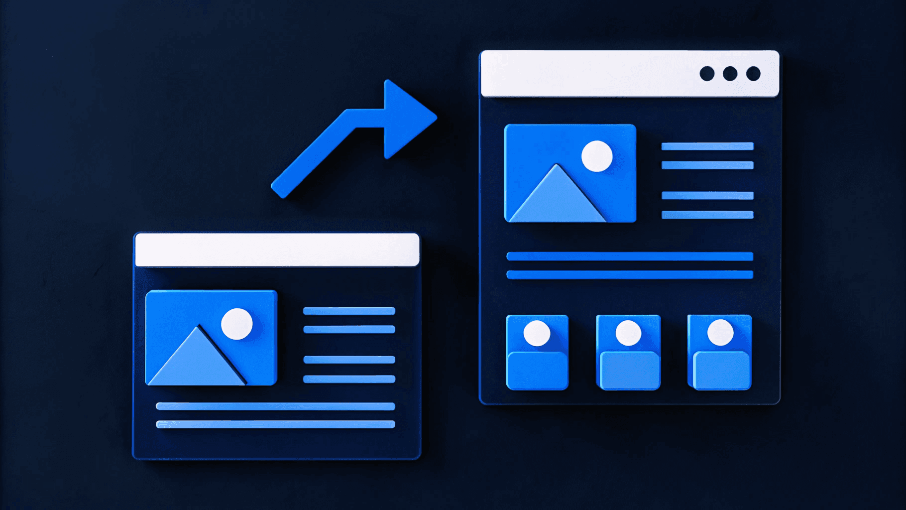
Mockups answer the aesthetic question: "Does this look right?" after structural decisions are locked. Mockups showcase color, text, shapes, and other visual elements while remaining completely static, providing a visual representation without interactive functionality.
Where wireframes deliberately strip away visual detail to focus attention on structure, mockups add complete visual fidelity to validate brand consistency and aesthetic effectiveness. This represents a fundamentally different type of validation that requires different stakeholder attention and different types of feedback. Mockups enable executives to evaluate whether the visual design matches market positioning, marketing teams to confirm brand guideline compliance, and development teams to receive precise implementation specifications.
What Mockups Include
Mockups transform the grayscale structural foundation of wireframes into complete visual representations that stakeholders will recognize as finished design. Every visual detail in the final product appears in mockups, creating the exact aesthetic experience users will encounter.
Mockups provide the complete visual fidelity stakeholders will see in the final product:
- Complete brand color palette application
- Final typography with specific font choices and hierarchy
- Actual photography and graphics replacing wireframe placeholders
- Precise spacing and sizing matching final implementation
The critical distinction from wireframes: mockups show exactly what users will see, but not how they'll interact with it. A mockup displays a button in its final visual state with proper colors, shadows, and typography, but clicking it in the mockup file produces no result. This limitation is intentional—interaction validation requires a different tool with different capabilities.
What Problems Mockups Solve
Mockups enable visual design validation and brand consistency confirmation after the structure is approved. These validation challenges cannot be addressed through wireframes because they require complete visual fidelity to evaluate properly.
Mockups ensure visual consistency with corporate identity standards by showing exact color usage, typography application, and graphic treatment before development investment. They allow executives to evaluate whether visual design matches the company's market positioning and competitive context. And they document exact spacing values, color codes, typography settings, and asset requirements that eliminate guesswork during implementation.
When and How to Use Mockups Effectively
Understanding which questions mockups answer helps teams recognize when this deliverable type provides value versus when they need to advance to prototypes. Deploy mockups when you need to answer:
- Does this visual design align with our brand guidelines?
- Will this aesthetic resonate with our target audience?
- Does this positioning match our competitive context?
- Do we have executive approval to proceed with development?
Mockups cannot answer questions about user experience or interaction patterns—trying to evaluate "Will users understand how to navigate this workflow?" from static images leads to assumptions that often prove wrong during actual usage. When interaction patterns, workflow complexity, or user experience questions require validation, teams need prototypes instead.
Reviewing Mockups Effectively
Focus feedback on brand alignment, typography choices, color palette application, imagery selection, and visual hierarchy. Explicitly exclude requests to change layout structure, add or remove content blocks, modify user flows, or alter information architecture.
The explicit exclusion of structural feedback at this stage protects the time invested in visual design work. When stakeholders request structural changes during mockup reviews, project managers can reference the approved wireframes and explain the timeline impact of returning to the structural validation stage.
Common mistake: Requesting structural changes during visual validation forces teams to realize content is missing or navigation logic is flawed after seeing polished mockups, requiring returns to wireframes that waste invested design time. This mistake is particularly expensive because it requires discarding hours or days of detailed visual design work to fix foundational problems that wireframe reviews should have caught.
Solution: Require explicit written approval of wireframes before mockup work begins, as noted in the wireframe section. When structural change requests arise during mockup reviews, respond: "That's a structural change that requires returning to the wireframe stage. Based on the approved wireframe, can you confirm whether the visual execution matches what you expected?"
Prototypes: Interactive and Experiential Validation
Prototypes answer the experiential question: "Does this work right?" by enabling actual user testing before development investment. Design experts define prototypes as "early models that simulate design and functionality, created to test concepts, gather feedback, and iterate before final development," distinguishing them from mockups through interactivity rather than visual fidelity.
Where wireframes validate structure and mockups validate aesthetics, prototypes validate experience through hands-on interaction. This is the most sophisticated validation type because it requires users to actually navigate through interfaces, complete workflows, and interact with elements as they would in the finished product. Prototypes answer questions that cannot be resolved by looking at static images, no matter how polished those images appear.
Despite their polish and interactivity, prototypes are disposable learning tools, not near-final products. This mindset distinction prevents teams from over-investing in prototype perfection when the goal is rapid hypothesis testing. Effective teams ask "What assumptions are we testing?" rather than "How close are we to done?" When teams approach prototypes with a testing mindset rather than a showcase mindset, they iterate faster and learn more.
What Prototypes Include
Interactivity is the defining characteristic that separates prototypes from mockups. While mockups show what users will see, prototypes demonstrate what users will experience when they actually use the interface.
Prototypes feature:
- Clickable buttons with realistic transitions
- Working navigation between pages and sections
- Form interactions including validation and error states
- Animated transitions showing state changes
- Conditional logic demonstrating different user paths based on selections
This interactivity transforms static visual representations into experiential simulations that users can navigate as they would the finished product. A prototype allows users to click a menu icon and watch the navigation drawer slide in, select form options and see dependent fields appear, or click through a multi-step checkout process to identify where friction or confusion occurs.
What Problems Prototypes Solve
Prototypes enable interaction pattern validation and user experience testing through hands-on usage. These validation challenges cannot be addressed through static mockups because they require actual interaction to reveal problems. Complex workflows require real users to navigate through interactions to reveal friction points and confusing patterns—insights impossible to gather from static mockups. Enterprise applications often involve multi-step processes, conditional form logic, or context-dependent interfaces that only become clear through experiential testing. And prototypes document timing, easing functions, and interaction sequences with precision that prevents the costly "that's not how we expected it to behave" revisions during quality assurance.
When and How to Use Prototypes Effectively
Prototypes provide value when interaction patterns, workflow complexity, or user experience questions require validation that static visuals cannot provide.
Deploy prototypes when you need to answer:
- Can users successfully complete this workflow without assistance?
- Do interaction patterns match user expectations?
- Where do users encounter friction in multi-step processes?
- Are animation timings and transitions intuitive?
Reviewing Prototypes Effectively
Focus feedback on interaction intuitiveness, transition timing, workflow friction points, state change clarity, and navigation pattern effectiveness. Explicitly exclude structural changes, visual design revisions, brand inconsistency concerns, and feature addition requests.
By the time teams reach prototypes, both structure and visuals are locked, allowing all attention to focus on whether the interactive experience works for users. This focus prevents the scattered feedback that occurs when teams try to validate structure, aesthetics, and experience simultaneously.
Common mistake: Treating prototype feedback as final quality assurance rather than exploratory validation leads teams to over-invest in prototype perfection when the goal is rapid hypothesis testing. Prototypes exist to surface problems cheaply before development begins, not to demonstrate finished quality.
Solution: Frame prototype reviews as testing sessions, not showcases. Ask "What assumptions are we testing?" rather than "How close are we to done?" When stakeholders provide production-quality feedback, respond: "That's a valuable observation for the development phase. For this prototype, can you confirm whether users can successfully complete the workflow?"
When to Skip Stages Strategically
Not every project requires all three validation stages. Understanding when to skip stages prevents over-investment in unnecessary validation while ensuring critical decisions receive appropriate scrutiny.
- Skip wireframes when: Working within an established design system with proven page templates where structural decisions are already validated through previous projects. Creating a new landing page using existing header, hero, feature grid, and footer components doesn't require wireframe validation—the structure is predetermined.
- Skip mockups when: Building internal tools where visual polish is secondary to functionality, and stakeholders accept design system defaults without brand customization. An internal reporting dashboard for operations teams doesn't require executive visual approval.
- Skip prototypes when: Implementing simple, convention-based interactions that follow established patterns. Standard button clicks, basic form submissions, and static page navigation don't require validation—users expect these patterns and they rarely cause usability issues.
However, skipping stages without strategic justification often creates a pattern in which teams discover problems late when fixes are expensive.
Partner with Design Process Experts
Understanding wireframes, mockups, and prototypes transforms you from a passive recipient of design deliverables into a strategic collaborator who maximizes team efficiency and project outcomes.
The principle underlying this framework is mutual exclusivity: each deliverable serves distinct validation purposes. Wireframes answer structural questions, mockups answer visual questions, and prototypes answer experiential questions. Attempting to validate visual design during wireframe reviews or structural decisions during prototype testing wastes time and creates confusion.
The difference between teams that execute this framework successfully and those that struggle comes down to enforcement: treating stage gates as non-negotiable discipline rather than flexible suggestions. Without rigorous enforcement, stakeholders naturally provide whatever feedback comes to mind, regardless of appropriateness for the current stage, creating the expensive rework patterns this article describes.
Webstacks specializes in translating this staged validation framework into operational reality for B2B SaaS marketing teams. The agency's methodology centers on rigorous stage gates, enforced feedback boundaries, and composable design systems that make subsequent projects faster because foundational decisions remain validated across implementations. Talk to Webstacks about transforming your design process from a source of bottlenecks into a competitive advantage
Your website is your biggest growth lever—are you getting the most out of it? Schedule a strategy call with Webstacks to uncover conversion roadblocks, explore high-impact improvements, and see how our team can help you accelerate growth.

I lead growth at Webstacks, connecting strategy, design, and engineering to build websites that drive results. I specialize in website strategy, CMS implementation, and helping B2B teams scale their web presence.