
Menu navigation is just as important as any other component that shapes your design process. You can ask any UI/UX designer and they'll agree. So let me help you upgrade your entire menu UX blueprint with these 4 tips!
Your Website has 50 Milliseconds to Capture Users' Attention
You read that right. 50 milliseconds could be the difference between a well-resonated website that converts and, well, a new bounce rate high score—the high score that no one wants.
The good news is that the art of first impressions isn’t too difficult. Especially since we’ve boiled down all of our research into an ongoing short series (we’ve got you.)
Equipped with these menu navigation best practices, your website will be ready to impress, retain attention, and convert in no time.

The Importance of Providing Clear, Concise Navigation
Navigation is easily one of the most important elements of a website. And, look, we’re all for innovation on the web, but in the case of marketing websites, we believe in clarity over aesthetics every time.
Neil Patel, a marketer highly appraised by the Wall Street Journal and Forbes, says the following about web navigation:
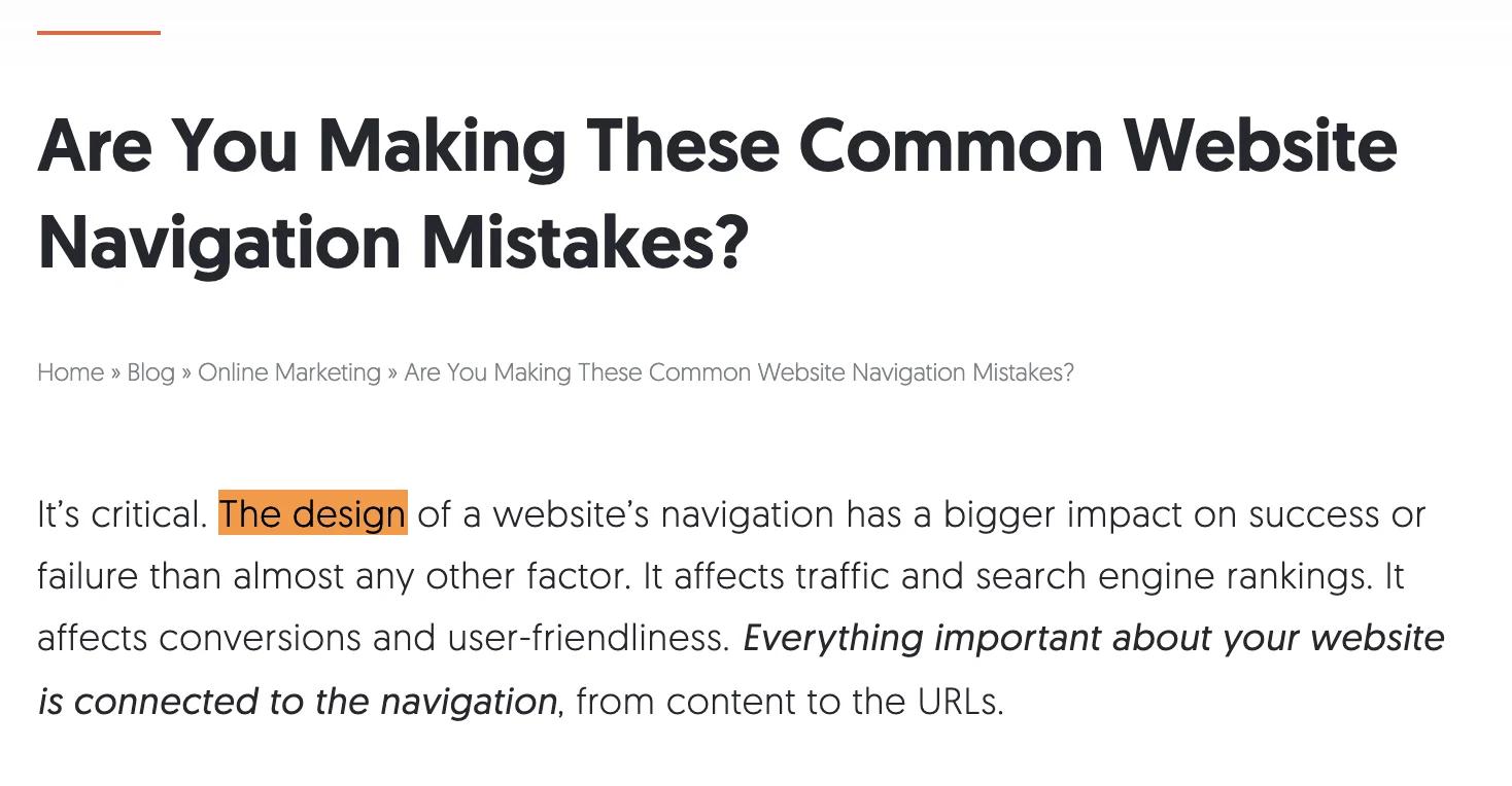
neil-patel-website-mistakes
So if a user cannot recognize familiar navigation within those 50 milliseconds that we talked about earlier, they’re as good as gone.
Website navigation mistakes are expensive and avoidable. One mistake could affect both search rankings and user-friendliness. Don’t worry—the preventative measures that can be taken are simple.
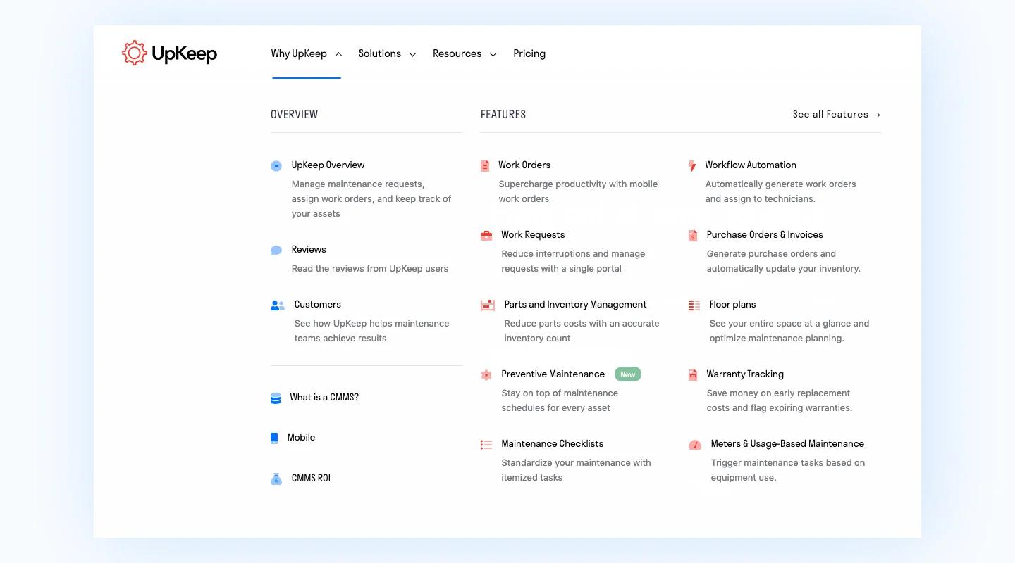
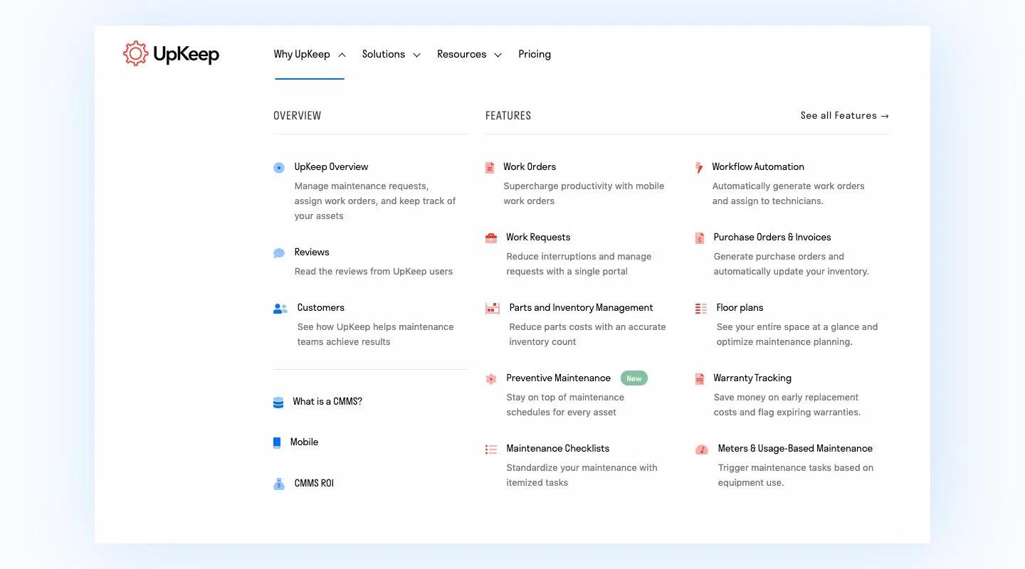
1. Serial Position your Navigation Elements
Shopmonkey.io is an example. An easy-to-digest navigation bar follows this universally understood layout:
- Company logo
- Navigation links
- CTA button
“But!” you may be saying, “My CTA button is the most important, so it should be first!”
Introducing the serial position effect: placing important and/or key items at the beginning or the end of a sequence.
“Psychology studies show that attention and retention are highest for things that appear at the beginning and the end. It’s called the “serial position effect,” and it’s based on the principles of primacy and recency.
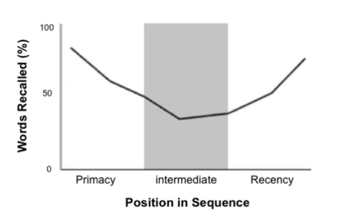
serial-position-effect
If you equip the serial position strategy with a sticky horizontal navigation bar, you’re golden. Having that information always available is a huge win and has proven to contribute to the conversion rate.
By using this strategy, you’re setting your users up for an intuitive experience when traversing your website. And a website that can easily be navigated is a high converting one.
2. Limit the Number of Items to Seven
No one likes a cluttered experience. When you present too many options in one area, the likeliness of overwhelming a user increases. This leads to confusion in knowing where to look for information which, in turn, lends to bounce rate.
“But, what if I have more than 7 pages!
We hear you - it’s a common occurrence. In these cases, we recommend using a mega menu. Mega menus are similar to drop-down menus but without usability problems.
upkeep-mega-menu
Here are a few pros to mega menus:
- They show everything at a glance, so users can see it instead of trying to remember.
- They let you visually emphasize relationships among items—helping users understand their choices.
- Mega menus make it easy to use pictures and icons when appropriate.
3. Design for Accessibility
While the colorful navigation bar that you designed looks cool, how accessible is it? With navigation being one of the most important elements on your site, a smooth experience must be ensured.
This means a multitude of things; let’s break it down.
- Ensure text is readable - This is done through proper use of color contrast and appropriate text size. We recommend sticking with black or white text and using a minimum of 1rem font (with the root at 16px.)
- Use a visual indicator for active states - Color is typically used here, but we recommend going the extra mile and including another visual cue for those that are colorblind. It’s not as hard as you might think - a simple underline works just fine!
4. Ensure a Mobile-Friendly Navigation Experience
Mobile web traffic accounts for 52.6% of global web traffic. While mobile traffic may differ between websites, it is standard in 2020 to provide an intuitive experience across all breakpoints—desktop, tablet, mobile, etc. Anything less is simply unacceptable.
upkeep-mobile
Let’s face it—with attention span at an all-time low, do you think that people will take the time to try to traverse poor mobile navigation? If they can’t find a comfortable experience on your site, they’ll look somewhere else for one
Here are some tips to keep that from happening:
- Provide an easy-to-find hamburger mobile menu - This is the three stacked lines that you’ll find all over the mobile web. This icon is common practice and universally understood.
- Make the navigation bar sticky - Sticky means to keep an element in one place as a page is scrolled. The plus side is always having the navigation ready to go without having a user scroll to the top again. Cons...there aren’t any. Make the nav sticky. Just do it.
- Ensure comfortable touch targets - Touch targets are what activate an action when tapped. So let’s say your hamburger menu icon is 20px; 20px isn’t a large enough area to tap. This is where you’d include a touch target behind it. Best practice calls for 44px.
Ready to Design the Best Navigation Experience?
We’ve covered the importance of menu UX - applicable from fintech UX as well as SaaS UX and everything in between - and the best ways to drive maximum conversions. We hope you’ll take these tips into your next web design project and join us in modernizing the web through better experiences.
Thank you for reading part one of our Web Experience series. In the meantime, you can share your favorite navigation experiences with us on Twitter and join the conversation.

