Resource Page Design for B2B SaaS
A resource page is a central hub where users can find valuable information on a specific topic. It offers comprehensive content like articles, guides, and videos, and it promotes engagement by encouraging exploration of in-depth knowledge.
When done right, resource pages build trust and encourage repeat visits from your audience.
In brief:
- Resource pages are central hubs that offer valuable content to improve the user experience and SEO.
- They can generate leads and help B2B enterprises establish credibility and authority in their industry.
- An effective resource page design includes user-friendly navigation, intuitive menus, search functionality, and mobile responsiveness.
- Diverse content types—like blogs, guides, podcasts, webinars, and interactive tools—enrich resource centers to meet various user needs.
What is Resource Page Design?
Resource page design involves strategically organizing a section of your website to centralize content such as articles, guides, white papers, case studies, and webinars.
Choosing the right Content Management System (CMS) is important in this process, as it significantly impacts how easily you can manage and update your resource page.
For B2B enterprises, resource pages are indispensable because they perform multiple roles.
They serve as an educational hub where potential clients can gain insights into industry trends and your company's products or services. This helps prospects make informed decisions and builds trust by showcasing your expertise and thought leadership in the sector.
Plus, resource pages support customer self-service by offering troubleshooting resources and guidance.
Why You Should Invest in a Resource Page or Resource Center
Investing in a resource page or center can give your B2B website multiple strategic advantages. Here's why it's a smart move:
Create a Lead Generation Machine
A resource page can turn your website into a powerful lead generation tool. By offering valuable and educational content, you draw more prospects into your funnel.
Providing resources for free also shows your commitment to delivering real value and helps your audience solve issues or understand complex topics.
You can capture users' information by offering exclusive content like whitepapers, webinars, or e-books in exchange for their contact details. These exchanges help build a marketing database and also encourage repeated engagement, where potential customers get used to the valuable content provided by your company.
This involvement primes them for more personalized engagements, like product demos, free trials, or sales conversations.
Establishing Credibility and Authority in Your Industry
When you regularly publish high-quality, insightful content, you position your company as a thought leader among competitors.
Building an authoritative presence differentiates your brand and fosters a community of engaged followers. By consistently delivering solutions that address industry challenges and trends, you help elevate the industry while securing your place as an influential voice within it.
Content Ideas for a Resource Center
A resource center contains a variety of content types tailored to engage and inform your audience. To improve your resource page, here are some content ideas:
- Blogs: Offer timely insights and updates on industry or customer-centric topics, keeping readers informed with a casual yet engaging tone.
- Guides: Provide detailed instructions or overviews that help users deepen their understanding of specific subjects.
- Podcasts: Engage audiences with audio content that includes interviews and discussions, perfect for those who prefer listening on-the-go.
- Webinars and Video Content: Deliver dynamic visual content with expert insights and interactive Q&A sessions.
- Templates: Offer practical resources like forms or worksheets to assist users in implementing strategies.
- Glossaries: Clarify industry-specific terms.
- Infographics: Simplify complex information using visual representations that are easy to digest and remember.
- Interactive Tools: Incorporate tools like calculators, quizzes, or AI applications to provide personalized insights and engagement.
- eBooks: Deliver detailed explorations of topics for users seeking in-depth information.
- Checklists: Supply easy-to-use lists that help users with different tasks.
- Industry Reports: Present extensive research and data to establish thought leadership.
- Case Studies: Highlight real-world success stories to showcase practical applications and benefits of solutions or services.
- Whitepapers: Provide authoritative documents that explore specific issues, offering expert perspectives and detailed analysis.
- Trust Centers: Showcase the security and privacy measures your organization takes to ensure your customers' data is safe with you.
- Press: Disseminate the latest company announcements, brand assets, or leadership bios.
How to Design a Resource Page
A good resource page is easy to use, simple to navigate, and it captures the visitor's attention. Follow these guidelines when designing your own:
- User-Friendly Design and Navigation: A resource page should be easy to navigate. Use a simple layout that includes clear headings and organized sections. Employing UX design tools and following a UX design strategy can reduce confusion and encourage further exploration of the site.
- Intuitive Menu Structure: A clear and logical menu structure is designed with scalability and flexibility in mind, so your resource page can grow and adapt over time.
- Search Functionality: Incorporate a search tool that lets users find resources on your resource page using keywords or phrases. This functionality is especially beneficial for resource-heavy pages.
- Responsive Design for Mobile Users: A responsive design allows users to access your resources conveniently on smartphones, tablets, or desktops, so use flexible layouts that adjust to various devices.
How to Maximize Leads from a Resource Center
To get more leads from your B2B resource center, you need to plan and execute a sound website strategy. Let's look at some key ways to make your resource center more effective.
Develop a Content Strategy
Understanding your target audience's needs is the foundation of a content strategy.
Begin by researching common industry challenges and the types of questions your prospects frequently ask. Content should be categorized based on stages of the buyer's journey: awareness, consideration, and decision-making.
Instead of creating random pieces, map out cornerstone topics that build authority over time. For example, in-depth guides and industry reports can serve as anchors, while blog posts and case studies fill in gaps.
Feedback from both users and internal teams—such as sales—can help refine content focus.
Build Multi-Channel Marketing Campaigns
Visibility doesn't happen by accident; a resource page needs targeted promotion.
Social media platforms provide an excellent opportunity to showcase content highlights, but posts must be adapted to fit the tone of each platform. For instance, LinkedIn posts might emphasize expertise and data, while Instagram stories could share quick tips.
Email campaigns further amplify reach by offering curated content based on user preferences. Industry partners and influencers can also expand your audience through collaborative promotions.
Repurposing content is another smart tactic—turn webinars into short clips or transform guides into infographics.
Implement SEO
To attract organic traffic to your resource page, use search engine optimization (SEO).
You can start with keyword research. Identify terms your audience frequently searches, paying close attention to those with high relevance but manageable competition. Resource titles, headings, and image alt text should all include these keywords.
Internal linking is often overlooked but plays a key role by creating logical pathways between related content. Speed and mobile performance, two factors heavily weighted by search engines, also require regular testing.
Beyond on-page SEO, external backlinks from reputable sites can boost your authority.
Optimize for Conversions
Attracting visitors is important, but turning them into leads is where the real impact lies.
CTAs should be both visually prominent and strategically placed throughout the resource center. Phrases like "Learn More" or "Get Started" may underperform compared to specific, benefit-driven messages like "Start your 7-Day Free Trial".
Navigation design can influence conversion rates as well; users who quickly find relevant content are more likely to engage further. Data from heatmaps and session recordings provides insight into where users lose interest. Testing different designs and formats—such as shorter forms versus multi-step processes—can reveal what works best.
Website personalization is another lever for conversions, with dynamic recommendations guiding users to the next logical step based on their browsing behavior.
Develop Remarketing Strategies
Remarketing helps maintain visibility for users who explored your resource center but left without taking a specific action.
You can segment your audience based on behaviors like time spent on key resources or downloads. For example, someone who viewed multiple webinars might respond well to a follow-up email offering a product demo.
Remarketing ads should be tailored to each segment's needs, delivering relevant content that nudges them further along their journey.
Additionally, dynamic website content—such as personalized recommendations for return visitors—can improve engagement rates. Analyzing click-through and conversion rates regularly allows you to optimize campaigns and adjust messaging for different user groups.
Constantly Evaluate and Test
Ongoing performance monitoring helps you improve your resource center over time.
Define key metrics early, focusing on engagement indicators like bounce rate, time on page, and navigation paths. Analytics tools can help you identify which content formats resonate most with users. Instead of guessing, rely on data-driven A/B tests to refine headlines, CTA placement, and design elements.
See what’s working for industry-leading websites and find inspiration to improve yours.

Best Resource Page Examples
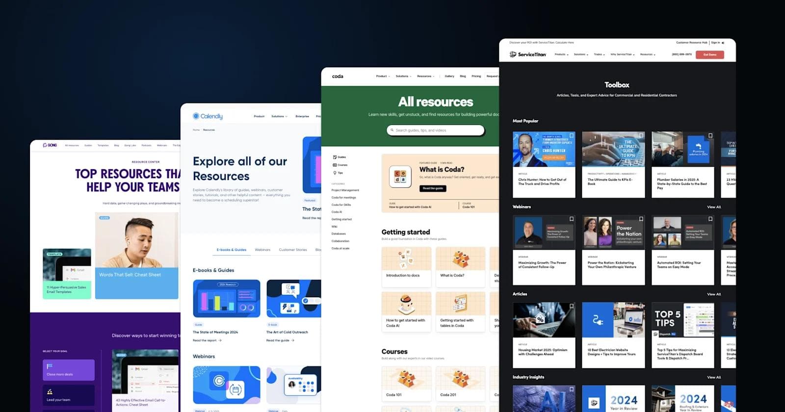
1. ServiceTitan

ServiceTitan's "Toolbox" resource page serves as a comprehensive support center for contractors and field service professionals. The content is grouped into practical sections like Most Popular, Industry Insights, and Tools, catering to both strategic and operational needs. The page's design is visually rich, showcasing diverse content formats—articles, calculators, webinars, and podcasts—with a clean, card-based layout that simplifies browsing.
Each resource category directly targets real-world challenges, such as managing cash flow, improving productivity, or navigating industry trends. The toolbox extends its utility by featuring essential tools, like a business valuation calculator and flow rate estimator, alongside downloadable licensing templates for different states.
Standout Elements
- Interactive tools – Provides tools such as calculators for business valuation and flow rate.
- Industry-focused updates – Timely insights on topics like AI integration and yearly industry trends reflect a commitment to keeping content relevant and actionable.
- Diverse content formats – Podcasts, webinars, and videos complement the written materials.
- Downloadable guides – Resources like licensing requirement documents and industry templates cater to specific needs, making the page a functional resource beyond just educational content.
2. Lattice

The Lattice Library is a well-organized resource hub designed to provide HR professionals with actionable tools and insights for workforce management.
Prominent features include a Spotlight section that showcases high-value resources like HR calendars and performance review guides. The vibrant, approachable design integrates colorful visuals and intuitive search functionality, which makes the page feel dynamic yet simple to navigate.
Standout Elements
- Diverse resource types – Templates, in-depth reports, and actionable articles cater to both strategic planning and daily tasks.
- Vibrant, HR-centric visuals – Illustrated banners and colorful icons distinguish each section, creating a light, approachable aesthetic.
- Events integration – Upcoming webinars and events are promoted within the resource hub, seamlessly connecting users to real-time learning opportunities.
- Practical tools – The "Put it into Practice" section provides HR professionals with ready-to-use policy templates, bridging knowledge and application.
3. Coda

Coda's All Resources page helps users learn how to make the most of their documents and workflows. It's organized into sections like Getting Started, Courses, and Tips, each designed to offer clear and practical guidance for users at different stages of their Coda journey.
Beginner guides such as "Introduction to Docs" help new users get comfortable, while advanced tutorials cover topics like using formulas. The page also includes a community forum where users can share advice and get answers to common questions. An interactive search bar makes it easy to quickly find specific tips or resources.
The layout features playful, colorful illustrations that give the page a welcoming feel. With a mix of guides, tips, and community resources, Coda ensures users have plenty of support to learn and solve everyday challenges.
Standout Elements
- Courses and structured learning paths – Organized courses like "Coda 101" and "Formulas 101" give users a step-by-step approach to mastering the platform.
- Playful design – Illustrated icons with warm, grid-patterned backgrounds give the page a friendly and approachable feel.
- Interactive search and navigation – A prominent search bar encourages users to quickly locate guides, tips, and video content based on specific needs.
4. Lyssna

At first glance, Lyssna's resource page stands out with its playful mix of bold colors, hand-drawn design accents, and layered visuals. But it's more than just eye-catching. The page invites users to dive into practical tools, like downloadable templates, that help refine customer experience strategies.
Videos featuring real-world stories and expert advice add a dynamic learning experience, making it easier to digest complex ideas. For users who prefer live engagement, the events section offers access to webinars and workshops with customer engagement professionals.
Standout Elements
- Whimsical design accents – Abstract, colorful illustrations and overlapping elements bring a light-hearted, creative energy to the page, reinforcing Lyssna's approachable brand.
- Video resources – Embedded videos feature expert insights and customer success stories, making complex ideas more digestible.
- Event integration – The dedicated events section highlights upcoming webinars and workshops, encouraging active participation in Lyssna's learning community.
5. Gong

For sales teams looking to sharpen their strategies, Gong's resource hub offers a blend of quick-hit insights and deep dives. The page draws you in with a curated "Top Resources" section, where standout content like sales templates and featured video guides take center stage.
Scrolling down, users can explore a steady stream of updates from Gong Labs, featuring data-backed studies that decode sales trends and buyer behavior. Podcasts and webinars are also woven into the page, allowing sales professionals to tap into expert advice at their own pace.
The use of a bold purple theme improved readability while reinforcing the brand's confident, energetic tone.
Standout Elements
- Quick-access content categories – A side navigation bar lets users jump straight to the resource type they need.
- Featured video highlights – Eye-catching, embedded video previews in the top section bring immediate attention to key resources.
- Dynamic purple and white color scheme – The vibrant layout maintains visual interest without sacrificing usability.
- Podcast and blog integration – A seamless combination of learning formats, from podcasts to blog posts, caters to varied content consumption preferences.
6. Maze

Maze's resource hub, titled "In the Loop," strikes a balance between thought leadership and practical guidance for UX researchers and product teams.
Guides and reports dive into step-by-step processes for UX research, usability testing, and prototype validation, giving teams hands-on methods they can apply directly to their projects. Beyond the written content, podcasts and events bring the community together, offering perspectives from leading experts in design and product strategy.
Designed with a clean, structured layout, the hub makes navigation easy with categorized collections and interactive search tools.
Standout Elements
- Advanced filtering and search tools – Allows quick navigation across reports, guides, and events, making it easy to pinpoint desired resources.
- Prominent podcast feature – Highlighted episodes with large thumbnails create strong visual appeal while encouraging engagement with the latest expert conversations.
- Color-coded content collections – The page leverages a system of color-coded categories for "User research," "Product feedback," and "UX & UI design," providing visual structure.
- Integrated events section – Upcoming product workshops and webinars are easily accessible, supporting ongoing professional development.
7. Apollo

Apollo's resource hub immerses users in a wide variety of educational content designed to improve sales strategies and automation workflows. From the moment you land on the page, you're greeted by "What's New," featuring up-to-date insights like how AI tools can streamline prospecting and lead generation.
Apollo's own AI platform drove over 47 million targeted prospecting actions in 2025 alone through features like company lookalikes, website visitor tracking and custom AI filters that automatically qualify leads.
For users who want expert-led advice, the Master Classes section delivers on-demand training sessions that tackle core challenges like cold emailing and outbound program development. Complementing these are practical resources, such as ready-to-use templates and detailed playbooks, that provide hands-on solutions.
The vibrant visuals and intuitive layout make it easy to shift between in-depth learning paths, quick tips, and knowledge base articles.
Standout Elements
- Dynamic content categories – Each section has distinct designs and color themes, visually breaking up the page for easy skimming and navigation.
- Book feature section – The inclusion of a dedicated book on outbound sales, with an artistic, modern design, makes this resource feel premium and aspirational.
- Highlighted master classes – Prominent headshots and clear titles emphasize expert-led instruction, creating a sense of authority and relatability.
- Modular learning structure – The page integrates various formats—guides, videos, and templates—tailored to different stages of the sales process, making it adaptable for diverse learning needs.
See what’s working for industry-leading websites and find inspiration to improve yours.
8. Calendly

Calendly's resource hub invites users to dive into its top research with a bold feature on meeting trends for 2025. The feature highlights that employees now spend 11.3 hours per week in meetings, nearly a third of the average workweek (Flowtrace State of Meetings Report 2025). This opening sets the tone for a content experience tailored to productivity and scheduling solutions.
Customer success stories take the spotlight, showcasing how companies like DocuSign and Atlassian improved collaboration with Calendly's tools. From there, users can explore a variety of practical content, including video tutorials, guides, and live webinars designed to improve scheduling strategies.
The clean, approachable design prioritizes simplicity, making navigation effortless with category tabs like E-books & Guides and Video Tutorials.
Standout Elements
- Featured research highlight – A visually dominant "State of Meetings" report encourages exploration through compelling data visuals.
- Customer story showcase – Real-world success stories from major companies like DocuSign and Atlassian create credibility, giving users real-world insights.
- Consistent brand visuals – Blue tones, iconography, and graphics maintain a cohesive, calming experience, emphasizing professionalism and clarity.
9. Deepgram

Deepgram's resource hub caters to developers, researchers, and business leaders diving into the world of AI-driven voice technology. The dark-themed interface sets a futuristic tone, inviting users to explore technical case studies, AI innovations, and market insights.
The hub also includes thought leadership content with podcasts and webinars featuring experts discussing real-world applications of AI. Search and filtering options make it easy to zero in on relevant topics, whether you're looking for beginner resources or advanced research on machine learning.
If you're also in the artificial intelligence space, Deepgram is certainly one of the best sources of inspiration for AI website design.
Standout Elements
- Advanced filtering system – Visitors can narrow down results by type, such as articles, podcasts, or case studies.
- Immersive dark theme – The resource page features a sleek dark aesthetic, reducing screen glare.
- High-impact visual previews – Dynamic, tech-inspired images accompany each resource entry, drawing attention to featured content.
10. Deel

Deel's resource hub offers a blend of insights and practical content to help businesses navigate global hiring and payroll compliance.
Visitors can browse resources by topic, uncovering popular articles on hiring best practices, compliance strategies, and scaling remote teams. Structured sections for reports and webinars ensure both in-depth research and live learning opportunities are within easy reach.
The warm, minimalist design, enhanced by illustrations and intuitive search tools, makes Deel one of the best fintech websites in the industry.
Standout Elements
- Prominent search and filtering – The search feature is supported by easy-to-use category filters for browsing by resource type and topic.
- Bold, colorful tiles – Vibrant and geometric illustrations give life to the content while maintaining a professional tone.
- Scroll-friendly layout – Modular, stacked sections like Popular Articles and Popular Reports allow seamless exploration of content without overwhelming the user.
11. Hubspot

HubSpot's resource hub is a playground for marketers, filled with interactive tools like the Website Grader, Guide Creator, and Make My Persona. These hands-on resources invite users to take immediate action, whether it's optimizing their website or crafting a marketing campaign from scratch.
On the content side, eBooks and reports cover emerging trends, such as building meaningful customer relationships in the age of AI. According to CRM leaders, 86% say AI helps make customer interactions feel more personalized.
The hub's clean design keeps everything accessible, with filter options that make finding specific guides, templates, or tutorials effortless.
Standout Elements
- Dynamic filtering and search – A prominent filter and search section helps users find relevant resources quickly.
- Illustrative resource cards – Colorful, minimalistic icons differentiate resource categories visually.
- Content variety – The hub includes tools, templates, webinars, and ebooks to cater to a wide range of business needs.
- Social sharing integrations – Direct links to share resources across platforms like LinkedIn and Twitter encourage engagement and content distribution.
12.Dialpad

Dialpad's resource library is as visually engaging as it is practical. The library's design uses a bold purple and white color palette, giving each resource card a clean, polished appearance that invites exploration.
Templates and checklists at the top provide actionable tools for tasks like call scripts and employee onboarding, making it simple for users to get started quickly. As you scroll, playbooks and guides deliver in-depth strategies for improving productivity and customer engagement, with vibrant icons and preview images breaking up text to maintain visual interest.
Standout Elements
- Content variety – The library includes multiple formats: templates, playbooks, comparisons, and videos, catering to diverse user preferences.
- Visual resource cards – Each resource is depicted with thumbnails that give users a preview of what to expect.
- Clear CTAs – Throughout the page, calls to action like "See how Dialpad works" encourage exploration of Dialpad's services and products.
13. BambooHR

The BambooHR content library takes a vibrant design approach, using a variety of colors to categorize content and ensure each resource stands out visually. Whether it's an onboarding guide, an employee experience report, or performance management tips, each resource card features bold graphics and short, easy-to-skim summaries.
Rather than relying on a rigid structure, the library encourages organic discovery. Highlighted sections like "Most Popular" showcase frequently accessed guides, helping visitors quickly find what's trending. Playful illustrations reinforce BambooHR's friendly brand identity while maintaining clarity.
Standout Elements
- Extensive variety – A large number of resources are presented, each with distinct categories such as "Best Practices" and "How-to Guides."
- Dynamic tile design – Each resource is accompanied by bright, attention-grabbing tile headers, ensuring quick readability and visual interest.
- Focused search capability – The top of the page includes a search bar and filtering options for users to quickly locate relevant resources.
- Strategic highlights – Featured resources are displayed prominently at the top, guiding users to key content.
14. Yotpo

Bright visuals and well-organized categories guide users through Yotpo's resource hub, designed to help eCommerce brands achieve both immediate and long-term marketing goals.
The "Trending Guides" section invites users to explore actionable strategies, from Black Friday campaigns to customer reviews. As you scroll, top resources for acquiring traffic take the spotlight, helping marketers refine SEO, social media, and email outreach efforts.
Standout Elements
- Highlight of premium content – A prominent feature block showcases a campaign calendar report, helping visitors quickly spot high-value resources.
- Category-specific guidance – Resources are broken down into actionable categories like "Acquire Traffic" and "eCommerce marketing basics," making it easy to access relevant information.
- Trending spotlight – A "Trending guides" section near the top gives priority to popular or time-sensitive content.
- Newsletter prompt – Midway down the page, a simple but eye-catching newsletter signup form offers users ongoing marketing insights.
Ready for a Better Resource Page?
If you're aiming to revamp your resource page to better connect with your audience and strengthen your digital strategy, make sure to use the examples above to guide your design choices.
With clear organization, eye-catching visuals, and great content, you'll be capturing leads via your resource hub in no time.
Ready to take your B2B website to the next level? Download Webstacks' Best B2B SaaS Websites eBook to discover more inspiring examples and actionable insights that can transform your digital presence.
Your website is your biggest growth lever—are you getting the most out of it? Schedule a strategy call with Webstacks to uncover conversion roadblocks, explore high-impact improvements, and see how our team can help you accelerate growth.

I create SEO-driven content for B2B SaaS companies, from blog posts to case studies. I focus on research-backed writing that ranks on the first page and drives meaningful organic traffic.