7 Tips for Designing a SaaS Navigation Menu (with Examples)
The navigation menu is among the first elements users interact with, shaping their initial impressions. Get this right, and you'll encourage further exploration.
However, designing and organizing a SaaS navigation menu can be challenging. Having worked with many high-growth tech companies on website redesigns and site architecture, we know the complex decisions that undoubtedly arise.
You may be already asking yourself, “what should we include in our top-level navigation items?” or “what belongs in each submenu?”.
These choices will ultimately have significant impacts on the user experience and the paths users take through your menu navigation to explore your website.
With the right approach, you can create simple menu designs that prioritize high-value pages while encompassing your entire website.
In this article, we’ll share the most effective tips for arranging your SaaS navigation.
Webstacks websites don’t just look good—they scale with you and drive real results.

What Is Usually Included in a SaaS Navigation Menu?
One of the most common mistakes in SaaS navigation is trying to cram too much into the menu. Overloading your nav with every possible page might seem helpful, but it often leads to confusion, clutter, and a poor user experience.
The root problem isn't just volume—it's strategic misalignment. When navigation becomes a repository for every stakeholder's pet page, it stops functioning as a decision-making tool for visitors. Users arrive with specific questions and intent, and your navigation should guide them to answers quickly, not present them with an overwhelming catalog of options.
Instead, it's best to focus your SaaS menu on high-impact pages that guide users through your product, value proposition, and conversion paths. Prioritize the pages that align with how your target buyers evaluate solutions and make purchasing decisions, not just internal organizational structure.
While every product is different, there are a few core items that most SaaS navigation menus include:
- Products - Allows visitors to explore the various offerings and features on the SaaS platform.
- Solutions/ Use Cases - Helps discover how the software applies to specific needs or scenarios, demonstrating its practical applications.
- Pricing - Gives access to transparent information about your pricing models.
- Resources - Lets users explore guides, tutorials, case studies, and other helpful materials to boost the value of the SaaS product.
- About / Company - Allows visitors to learn more about the team, values, and mission of the organization behind the SaaS platform.
- Contact - Enables users to reach out for inquiries, support, or assistance related to the SaaS product or services.
- Demo - Entices potential customers to try a product or service before purchasing.
- Log in - Gives access to an account, where users can manage settings, subscriptions, or personalized preferences within the SaaS platform.
These core items form the foundation of most successful SaaS navigation structures because they address fundamental buyer questions and conversion pathways.
These secondary navigation items serve more specialized use cases and may be valuable depending on your business model, target market, and product complexity. Consider adding them when your audience segments demand distinct pathways or when specific stakeholder groups need dedicated resources:
- Why - Highlights the reasons prospective customers should choose you.
- Developers - Provides resources and tools devs can use to build on and customize the SaaS app.
- Enterprise - Explains how the products and solutions apply to large-scale organizations with complex needs.
- How it works - Shares a step-by-step guide helping prospects understand the ins and outs of the product.
- Integrations - Presents compatible third-party tools and services users can integrate with the SaaS product.
- Customers - Exhibits positive experiences and testimonials from satisfied users and clients.
- Partners - Showcases existing partnerships and collaborations with other businesses and organizations.
Each of these items serves a distinct buyer need or evaluation criterion, so include them strategically rather than adding all of them by default.
See what’s working for industry-leading websites and find inspiration to improve yours.

Tips for SaaS Navigation Menu Design
The navigation menu is one of the first things people interact with on a SaaS website. It helps users explore the product, understand what's being offered, and decide what to do next.
But many companies add too many links or organize them in a way that's hard to follow. The result is decision paralysis: visitors can't distinguish between what matters and what doesn't, leading to higher bounce rates and lost conversions. Poor navigation structure signals that a company doesn't understand its own value proposition well enough to prioritize it clearly.
A SaaS navigation menu should highlight key pages, match how users think about the product, and make it easy to take action. This requires aligning internal business logic with external user mental models—organizing content around how buyers naturally evaluate solutions, not how your org chart is structured.
The tips below cover common patterns, things to avoid, and how to build a menu navigation system that supports your users and your business goals.
1. Structure Navigation Around User and Business Needs
Before designing your SaaS navigation, map out your site's core content. Group pages into logical categories like Product, Solutions, Resources, and Company.
This exercise forces you to confront redundancies, gaps, and misalignments between what you've built and what users actually need. Navigation design is a content strategy and information architecture problem that reveals whether your site structure serves user goals or just reflects internal silos.
Tools like Miro or Octopus.do can help you build a visual sitemap that makes gaps and redundancies easier to spot, especially useful during a redesign or as your product offerings grow. Visual mapping also enables cross-functional teams to collaborate on structure before committing to design and development.
B2B teams with multiple user types or product tiers should pay special attention to clarity. The menu should help visitors quickly self-identify and find relevant information without guesswork. When different personas (executives, practitioners, technical buyers) all use the same navigation, your structure must accommodate varied entry points and goals without forcing everyone through a single funnel.
Use Labels People Actually Understand
Avoid jargon, vague terms, or branded menu items that don't clearly say what's behind them. Enterprise buyers and busy stakeholders don't have time to click around and explore.
What seems clever internally often confuses externally. Your audience doesn't share your company's vocabulary, and navigation is the place to meet them where they already are.
Use straightforward labels like "Pricing," "Features," or "Use Cases" that reflect how your audience searches for solutions. Internal naming should never leak into your nav menu. Test labels with real users or prospects outside your organization to verify that your menu communicates intent clearly and intuitively.
Test and Evolve Your Navigation
Even an organized navigation menu can break down as your product or audience changes. Regular usability testing via heatmaps, click tracking, or user interviews can uncover where people get stuck or drop off.
Navigation should evolve with your business, product complexity, and user needs. What worked at Series A may fail at enterprise scale, and what resonates with early adopters may confuse mainstream buyers.
Pay attention to where users hesitate, what they overlook, and which items get ignored. Back your findings with data. Use analytics tools to see which paths lead to signups, demo requests, or high-value actions. Combine qualitative feedback with quantitative behavior to identify not just what's broken, but why, and what to prioritize fixing first.
2. Implement Mega Menus to Improve Navigation for Large Websites
Mega menus are fantastic for showing links to more pages while minimizing the design complexities. Combining similar pages into a single menu item helps users navigate the website more intuitively and reduces unnecessary scrolling and clicks by 50%.
Unlike traditional dropdown menus that force users to scan vertically through long lists, mega menus use two-dimensional layouts that reveal entire sections of your site architecture at once. This allows users to compare options side by side and understand relationships between content categories without clicking through multiple levels.
Logical grouping can also reveal related functionalities users may have overlooked. When you cluster features, use cases, or resources together visually, you help users discover solutions they didn't know to search for, turning your navigation into a discovery tool, not just a wayfinding system.
Use Visual Elements to Enable Quick Recognition
Mega menus succeed when they go beyond text-only hierarchies to incorporate visual elements that accelerate comprehension and decision-making. Icons, images, and color coding help users process information faster than reading alone, reducing the cognitive effort required to navigate complex site structures.
Visual cues are a major component of mega menus, providing:
- Better recognition - Grab user attention with striking visual elements, as these work more effectively than text, facilitating quicker recognition of menu options.
- Improved usability - Create a more intuitive interface, reduce the cognitive load on users and improve overall usability, creating a more intuitive interface.
- Universal understanding - Visual symbols have a universal appeal, meaning they speak to users regardless of their language and culture.
- Aesthetic appeal - Although small, these visuals add aesthetic value to the interface, resulting in a more engaging and visually appealing experience for users.
When implemented thoughtfully, these visual elements transform navigation from a functional necessity into an engaging interface component that guides users naturally toward their goals.
3. Embrace Icons as Visual Cues
You may have a clear target audience, but your users will inherently come from diverse backgrounds, and you should cater to their needs. Icons transcend language barriers and reduce cognitive load by leveraging universal visual patterns that users recognize instantly without needing to read and process text.
For instance, most people instantly understand icons like a magnifying glass for search or gear for settings, allowing all users to navigate the interface effortlessly regardless of language proficiency or cultural profile. These conventions exist because they've been reinforced across thousands of digital products, creating shared expectations that you can leverage to make your navigation feel immediately familiar.
Maintain Consistency in Iconography
Create a cohesive visual language within the SaaS navigation bar with standardized icons across different features and functions. This will help your users quickly become familiar with the visual cues needed to move around the website.
Whether using the same icon for settings throughout the design or consistently representing notifications with a bell symbol, iconography consistency ensures that users understand how the interface works.
Provide Tooltip Descriptions for Icons to Improve Clarity
Universal icons are invaluable, but some users may still require extra guidance. This is why you should develop a tooltip with additional context and clarification.
These short explanations appear when users hover over or interact with an icon, clarifying its function or purpose. Tooltips serve as a safety net for ambiguous or context-dependent icons, ensuring that even unfamiliar users can navigate confidently without guessing what each symbol means.
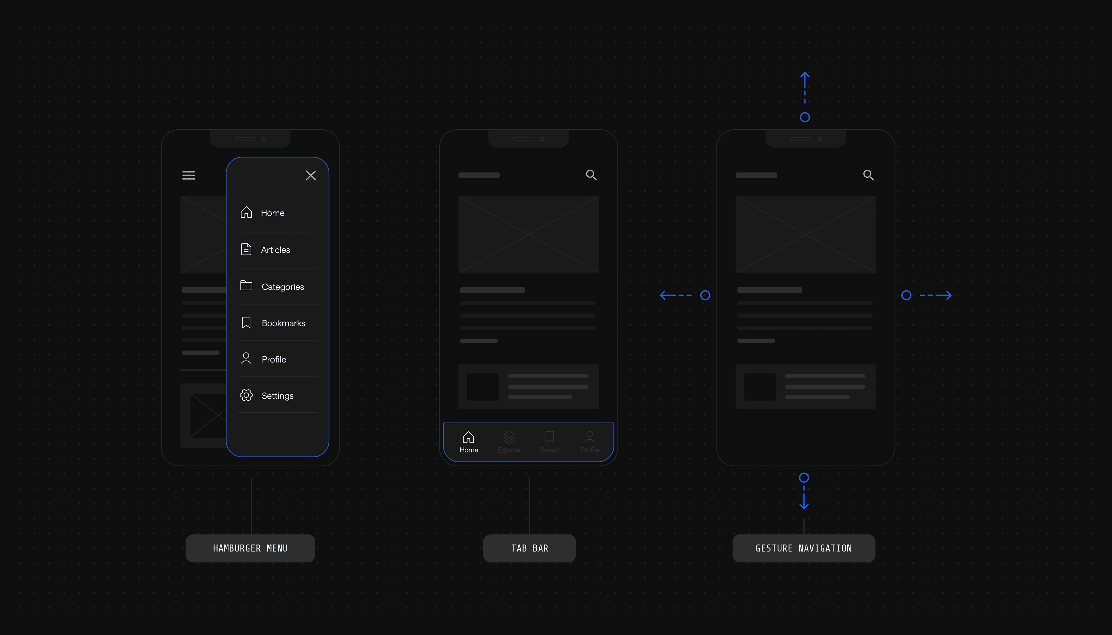
4. Tailor Designs for Compact Screens
Since nearly 96% of the global digital population had connected to the internet using a mobile phone in mid-2023, not having a mobile-optimized website is a big no. That means users should face no friction with a mobile SaaS navigation menu. A responsive mega menu design requires consistent elements in a predictable and logical location.
Mobile navigation failures disproportionately impact conversion rates because frustrated users on small screens will leave and evaluate competitors instead. The stakes are even higher for B2B buyers who research solutions on mobile before engaging sales teams on desktop.
For example, users will expect to find the SaaS hamburger menu in the top corner of the interface, as this is a simple way to access additional menu options on smaller screens. Breaking established conventions forces users to hunt for basic navigation controls, creating unnecessary friction right at the entry point of their experience.
Prioritize Essential Menu Items and Collapse Less Critical Ones
When optimizing the SaaS nav bar for smaller screens, go for a simplified structure. This involves using straightforward language and adjusting button sizes to accommodate finger touch.
However, also consider the navigation context. For instance, mobile device users typically look for specific information and need quick access. Cater to their on-the-go needs by making the most important navigation features more accessible and collapsing those they use less frequently. Analyze your mobile analytics to identify which pages mobile users visit most often, then surface those paths prominently while hiding secondary options behind progressive disclosure patterns.
Use a Mobile-Friendly Hamburger Menu to Conserve Space
Known for its three horizontal lines, the SaaS hamburger mobile menu collapses the menu items into a compact icon that users can expand by clicking or tapping. Thanks to that, it saves screen space while giving access to all menu options. Plus, users can easily access the menu without unnecessary clutter, ensuring steady navigation.
The hamburger pattern works because it's become a widely recognized convention, though it does hide navigation behind an interaction, so pair it with clear primary CTAs that remain visible, like "Get Demo" or "Pricing," to ensure critical conversion paths stay accessible.
5. Employ Microinteractions to Provide Subtle and Effective Feedback
Clicking on a menu item and not getting any response causes poor UX, leaving users wondering whether the system recognized their actions. This ambiguity creates anxiety and hesitation, forcing users to second-guess every interaction and decide whether to wait, click again, or abandon the task entirely.
Animated cues, whether a subtle hover effect or a smooth transition, add a much-needed layer of responsiveness. These small interactions communicate system status in real time, confirming that the interface is working and that the user's action has been registered and is being processed.
Provide Timely Feedback
Website navigation is not a strictly one-sided interaction. Users expect feedback messages that let them know whether, for example, they submitted a form successfully.
An immediate response, such as a concise submission message, reassures users that the system has received and processed their input. Without confirmation, users don't know if their action worked, if the system is loading, or if they need to try again, creating uncertainty that damages trust and increases abandonment rates.
6. Optimize Accessibility with Sticky Navigation Menus
The functionalities that users click on the most (e.g., dashboard) should be brought to the forefront and readily available at all times. This way, users don't have to spend extensive time searching for key features and can quickly perform tasks.
Sticky navigation eliminates the need to scroll back to the top of long pages, keeping critical pathways accessible regardless of where users are in their browsing session. This is particularly valuable on resource-heavy pages, case studies, or documentation where users may need to pivot to other sections without losing their place.
Minimize the Need for Scrolling To Find Navigation
Users often find long scrolling tedious and time-consuming, which poses a risk you don't want to take, especially if your SaaS website has multiple features. The longer users have to scroll to find navigation controls, the more likely they are to forget where they wanted to go or lose context about their original intent.
Design compact and concise sticky menus to provide quick access to the necessary functionalities and simplify moving to other parts of the site. Focus on essential top-level navigation items only; sticky menus have limited real estate, so prioritize the most frequently used pathways while keeping secondary options available through hamburger or dropdown patterns.
Test the Sticky Navigation Across Browsers and Devices to Ensure Consistency
Sticky navigation relies on CSS and JavaScript behaviors that can render differently across browsers, operating systems, and device types. What works perfectly in Chrome on desktop may break or behave unexpectedly in Safari on iOS, creating inconsistent experiences that frustrate users and damage credibility.
The following tests can help you verify whether the sticky menu functions well on every device and browser:
- Device testing - Ensure the sticky menu functions correctly and remains visible and accessible on PCs, laptops, tablets, and smartphones.
- Browser compatibility - Open your website and try the sticky menu on different web browsers, such as Google Chrome, Mozilla Firefox, Safari, and Microsoft Edge.
- Screen size variability - Challenge the sticky menu's behavior by testing it on screens of different sizes, resolutions, and aspect ratios.
Consistent testing across environments prevents edge cases where sticky navigation breaks or behaves unpredictably, which can damage user trust and create support burdens.
7. Use Breadcrumbs to Illuminate User Pathways
While not directly embedded in the menu, breadcrumbs are still a valuable navigation tool that cannot be overlooked. These trails help visualize the pathway from the homepage to the current page, making it easy to understand the overall organization and navigate between different website levels.
Breadcrumbs become especially critical on large sites with deep hierarchies; they provide context about where users are within your site structure and offer quick escape routes back to parent categories without forcing users to rely solely on the back button or start over from the homepage.
You can use breadcrumbs to help users find their way on their website by adding location-based breadcrumbs. For instance:
You are here: Home > Category > Subcategory > Page Title
Breadcrumb trails should be simple, visible, and easy to interpret. Make them more noticeable with contrasting stylings, such as distinct colors, typography, or background styles.
Although you can place them near the top of the page or just below the header, they should be far enough from other navigation menus to avoid clutter. Breadcrumbs should enhance navigation, not compete with it. Position them where they're accessible but don't interfere with primary navigation patterns or calls to action.
Best SaaS Navigation Menu Examples
Take a look at these examples of SaaS navigation menus to find inspiration:
Monday.com

Thanks to its neat and well-organized navigation, we couldn't start our best SaaS navigation menu examples without placing Monday at the forefront. The primary navigation bar features four sections that users most frequently click on to get their work going, and each collapses into a helpful dropdown menu when clicked on. However, Monday earns this spot primarily for its clear typography, intuitive icons, and accessibility!
Key highlights of the mega menu:
- 🧠 Logical grouping
- 👀 Visually appealing and intuitive icons
- ✏️ Descriptive labels under each feature
ClickUp

You must love ClickUp's accessible navigation menu, which includes all the vital sections in hierarchical order, starting with the Product feature. It leaves no room for confusion, ensuring clear labels and subtle microinteractions, such as changing the color when you hover over a category. But we must give special kudos to ClickUp for its responsive design and SaaS navigation menu that adapts to different devices with ease.
Top callouts for adaptive design:
- 🍔 Neat SaaS hamburger menu
- 📰 Prioritization of essential menu items
- ✔️ Striking icons and effective microinteractions
UpKeep

Fast, responsive, and easy to navigate — what's not to like? UpKeep will capture your attention on the website and encourage you to keep clicking because its navigation menu effortlessly provides concise labels and intuitiveness. A humble brag from us and a shout-out to our Webstacks design team for crushing this navigation menu design!
Things that make UpKeep's microinteractions stand out:
- 🌈 Hovering over icons triggers different colors
- 🖱 Quick response to every hover
- 👤 Consistency with the overall brand identity
See what’s working for industry-leading websites and find inspiration to improve yours.
Hotjar

At first sight, Hotjar's navigation menu appears simple and minimalist, reflecting the overall aesthetic of the website. But this platform plays with visual cues differently by fading out every other item when you click on a particular feature in the dropdown menu. The font choice, size, and weight boost the menu's visual appeal while ensuring readability.
What elevates Hotjar's iconography:
- 🔠 Clean and legible font
- 👓 Easily scannable menu items
- 🧹 Consistent spacing for a clean and organized layout
Stripe

Stripe is the champion of navigation menu simplicity and clear labels, making it easy to find information and resources. Dropdown menus appear the moment you hover over the main items, collapsing into colorful and intuitive icons. But Stripe primarily made it to our list thanks to its consistent design language.
Key points for consistency:
- 🔡 Clean and simple typography
- 💲 Intuitive and aesthetic icons
- 🟣 Modern color scheme
ServiceTitan

We must applaud the logical order of the navigation menu, which leaves no room for ambiguity. ServiceTitan ensures comprehensive coverage, providing access to everything you may need when interested in their software, from products to trades. What we particularly appreciated were the clear CTAs that can encourage users to choose this company.
Why ServiceTitan's CTAs stand out:
- 🗣 Straightforward language that leaves no doubts about the desired action
- 📣 Easily noticeable
- 👍 Consistency across different sections
Lattice

Lattice's navigation menu uses clear language and focuses on the website’s core features. The straightforward pathways and intuitive labels prioritize the SaaS menu UX. Moreover, the sticky menu ensures continuous access to navigation options regardless of how far you scroll down.
Top Callouts:
- 📷 Use of images in sub-menus
- 👁 Visual continuity
- 📱 Responsive design
Ready to Design a SaaS Navigation Menu That Wows Users?
We equipped you with all the information you need to create an effective, visually appealing, and accessible SaaS nav menu. But understanding best practices is only the first step; implementing them within your existing design system, content model, and business requirements is where strategic execution becomes critical.
If you're looking for help building a navigation system that scales with your product and aligns with your go-to-market goals, Webstacks can help. Navigation is the intersection of content strategy, user research, technical architecture, and conversion optimization. Getting it right requires expertise across all four domains, plus the ability to balance competing stakeholder priorities while keeping user needs at the center.
We partner with fast-growing SaaS companies to design and develop websites that drive results. Our approach starts with understanding how your audiences evaluate solutions, then maps navigation structure to their decision-making pathways. We build navigation systems that adapt as your product, positioning, and go-to-market motion evolve, ensuring your website remains a growth asset rather than a redesign liability.
We partner with high-growth tech brands to design, build, and scale websites that marketers and end-users love.

I create SEO-driven content for B2B SaaS companies, from blog posts to case studies. I focus on research-backed writing that ranks on the first page and drives meaningful organic traffic.