
A visual identity system is a set of defined rules for creating consistent designs, product messaging, and branded sales materials.
Unfortunately, not every brand has one.
We’ve met teams of all sizes - from pre-seed to series E - who fall short when it comes to having a comprehensive and organized visual identity system.
From trying to sort through multiple, slightly different icon iterations to sifting through years of logo designs in a single shared Google Drive folder, an undocumented brand identity system frustrates employees, wastes precious time, and presents an inconsistent brand.
Let’s discuss brand strategy and how to create a stunning visual identity system!

What is a Visual Identity System?
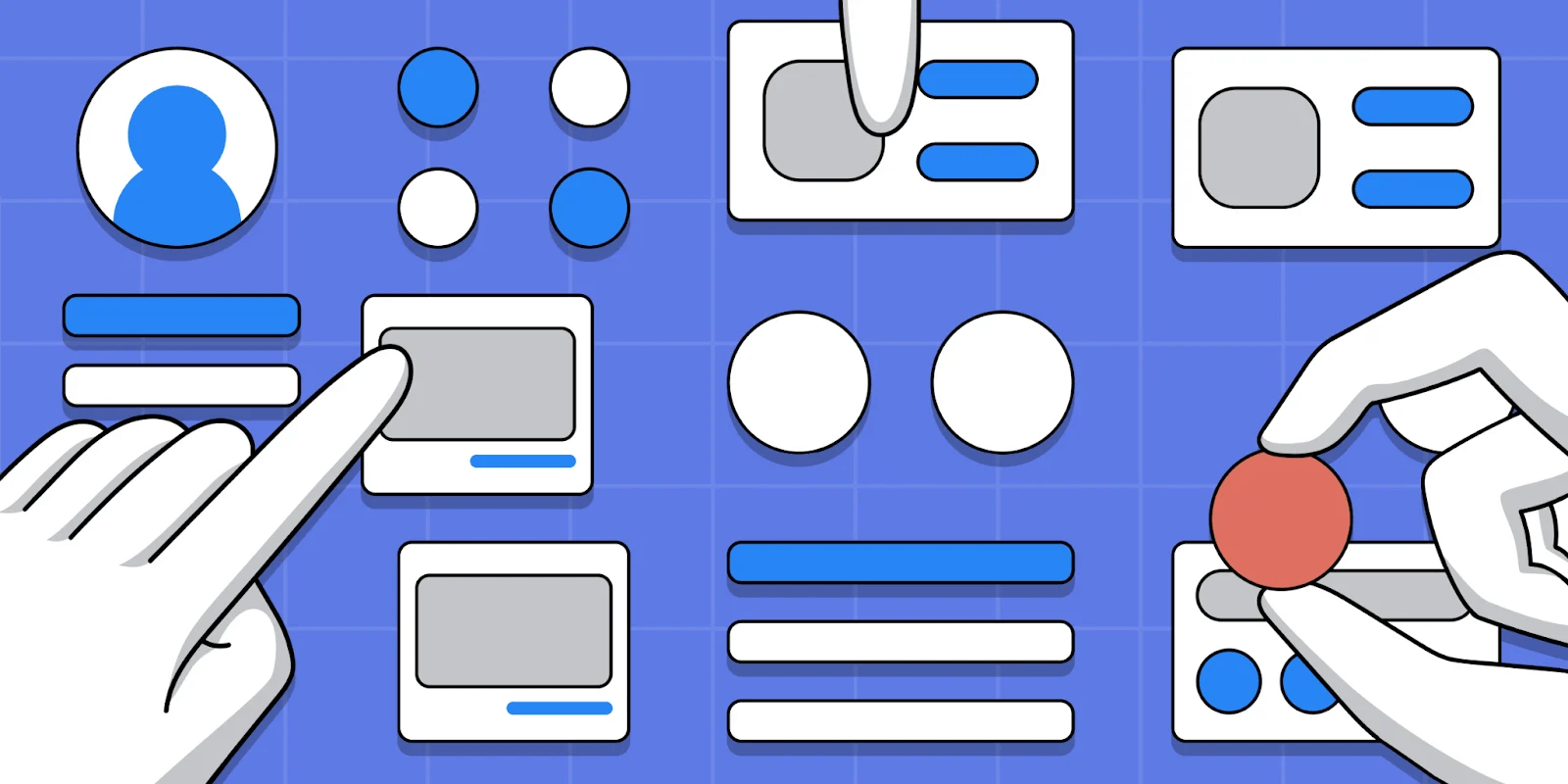
A visual identity system is a collection of design software, templates, color palettes, type kits, icons, logos, and images that are usually hosted in the cloud for design departments to access at any time.
Visual identity systems ensure universally consistent graphics for a brand's digital and physical presence.
Due to its reusability among designers and developers, a good visual identity system will also be equipped with clear usage guidelines. These guidelines showcase how to implement existing components in order to avoid branding inconsistencies.
Creating a visual identity is a crucial part of developing a wholistic brand identity - which encompasses both visual and non-visual elements.
How Do Designers Benefit from Visual Identity Systems?
A visual identity system (also referred to as a design system) is a single source of truth for design and development teams. In our decentralized world of remote work, this has become increasingly important.
When done correctly, visual identity systems provide a multitude of benefits:
- Increases design consistency across teams (e.g. graphic, video, development, etc.)
- Improves cohesiveness from design to design
- Shapes brand perception
- Decreases onboarding time of new designers
- Speeds up the design process with reusable elements
If education is the great equalizer, design is the great communicator. When brands put systems in place, they observe benefits across the company.
Visual Identity System Example - Colors
Now let’s explore an example of what exactly a visual identity system includes.
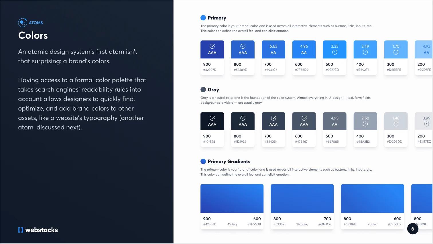
Webstacks Color Palette
Above is a color palette taken from our Atomic Design guide. It plays a crucial role in our own visual identity system here at Webstacks.
Each web page, asset, social post, and piece of merchandise that Webstacks creates starts with this exact color palette.
Our entire visual identity system exists on Figma, which gives any Webstacks designer or developer easy and convenient access whenever it is needed. Notice that each section is labeled, letting any new designer or developer know exactly what each color is.
We recommend using a tool like Figma to start building out the design components you’d like to include. It’s important to have a collaborative tool that members across your team can access at any time.
Requirements for Visual Identity System Design
Design teams across the world have unique processes, standards, personnel, messaging, and design software tech stacks among other things.
Because all brands are different your identity system can be whatever you want it to be, as long as it is your company’s single source of truth.
But there are three important requirements every team should follow:
1. Take ownership of the visual identity system
Everyone on the team must be on board with the visual identity system.
Designers must invest time into building out their design library, design managers must dedicate time to building a governance model, and stakeholders must be prepared to invest time into reviewing the final design system.
When everyone on the team takes some modicum of responsibility for upholding standards, design integrity, resources, and processes the whole team benefits.
2. Keep technical details in mind
Because a visual identity system is a shared library the people that use it frequently (e.g. designers and developers), must decide on naming conventions and a shared vocabulary that makes sense for both teams.
Have trouble aligning? Atomic Design principles can help with dividing components into categories with descriptive technical details and improving cross-team collaboration.
3. Build a visual identity system that is future-friendly
Your visual identity system should be more than just a reusable set of components. The system must scale for future projects.
The identity system can be used as a checklist for future design projects and making sure any new components or ideas adhere to the visual identity system that you created.
How to Build a Visual Identity System
So we’ve touched on the requirements of a visual identity system. Now let’s dive into getting your visual identity system started at a basic level.
1. Start with design principles
Before building anything visual, define the values that guide every design decision.
These aren’t just high-level brand words. They’re practical, opinionated rules that shape your system. Things like: “Clarity over decoration,” or “Design for accessibility from day one.”
To keep things grounded, document your principles somewhere your team can actually use them: Notion, a Figma page, or a simple website.
You’ll also want to make decisions about tooling: Will you write your system in code (like with Storybook) or keep it design-first (in Figma or Zeroheight)? And who’s going to own it? Without clear ownership, systems fall apart fast.
2. Build your foundation of reusable components
Now it’s time to lay the groundwork: colors, typography, spacing, grid, icons. Don’t overcomplicate it. Focus on the parts that show up everywhere, like buttons, headings, input fields, and cards.
Start in Figma by creating components with clear, scalable naming (think Button/Primary/Default, not Blue Button).
Set up a shared library so everyone’s pulling from the same source.
3. Choose and structure your color system
Color is where a lot of brands trip up: too many shades, no logic behind naming, and accessibility gets overlooked.
To keep it simple, pick one or two primary colors that reflect your brand, then build out supporting roles for neutrals, backgrounds, accents, and alerts.
Name them based on purpose, not appearance (like Color/Primary/Background, not Sky Blue). That way, they make sense even if the hex value changes later.
Tools like Coolors or Adobe Color can help you build a palette, but make sure every color passes accessibility contrast standards, especially for body text and buttons.
4. Set your typography rules
Good typography makes everything feel more cohesive. Choose 1–2 typefaces that scale well across digital and print.
Set up a type scale with consistent spacing and sizes (a modular scale like 1.25x works well).
Define styles for headings, body text, captions, and buttons. And codify rules for line height, max character count, and spacing, so designers and devs aren't guessing every time they open a new file.
Build these styles into your Figma library and match them in code.
5. Finalize your icon system
Icons add meaning fast, especially in interfaces where space is tight. But inconsistent styles or unclear usage can make them more confusing than helpful.
Pick a single style such as line, filled, or rounded, and stick to it. Use an existing library like Feather or Noun Project, or work with a designer to build a custom set.
Store them as components, define usage rules (minimum size, padding, color behavior), and decide how they’ll be implemented in your codebase. The goal is for designers and developers to use the same icons, the same way, every time.
6. Define your spacing and layout system
White space is also a part of your brand’s rhythm. Start with a consistent spacing scale (usually based on an 8px or 4px grid), then define how that scale applies to margins, padding, and alignment.
Build out grid systems for desktop and mobile. Maybe it’s 12 columns on desktop, 4 on mobile. And document how content should behave at different breakpoints.
These rules should show up in both your design files and code, so layout stays consistent no matter who’s building.
7. Turn components into real design patterns
Once your components are ready, start combining them into full patterns. This is where the system really starts to feel usable.
You don’t need to design every possible screen. Just build the patterns your team uses most often.
For example, start with a simple contact form, then create a landing page layout that includes a headline, features, testimonial, and CTA. These patterns help everyone understand how components work together and they cut design time in half.
Types of Visual Identity Elements
These are the core elements of a visual identification system that shape how people perceive your brand at a glance.
Logos
Your logo is usually the first visual element someone associates with your brand. It needs to feel unmistakably “you,” no matter where it shows up.
There are a few common types:
- Wordmarks use the brand name as the logo. Google, Coca-Cola, and Netflix all rely on type alone. If your name is unique or you want to keep things simple, this is a great route.
- Symbols are icons or emblems that stand on their own, like Apple’s apple or Twitter’s bird. These work best for brands with broad recognition or visual storytelling baked in from day one.
- Combination marks pair a symbol with text (Adidas or Spotify). This gives you flexibility: the symbol can be used on its own once the brand is established.
When choosing a logo type, consider where it will appear and whether it needs to scale down cleanly or work without color.
Color Schemes
Color sets the emotional tone of your brand before a single word is read. It’s the quickest way to signal what your brand stands for.
Each color carries psychological weight:
- Red grabs attention. It’s energetic and urgent, great for brands that want to stir action.
- Blue builds trust. That’s why it’s everywhere in finance and tech because it signals stability and calm.
- Yellow adds warmth and positivity, often used in brands that want to feel friendly and upbeat.
You also need a structured color system:
- Define primary, secondary, and accent colors.
- Build in neutrals for backgrounds and typography.
- Check accessibility contrast to make sure everything is readable.
Most importantly, use color consistently. When someone sees that exact green or deep navy, they should immediately think of your brand.
Typography
Typography is your brand’s voice in visual form. The font choices you make say as much about your brand as the words themselves.
- Serif fonts (like Times New Roman or Georgia) feel traditional and trustworthy. They work well for law firms, universities, and institutions that lean on legacy.
- Sans-serif fonts (like Helvetica or Inter) feel clean, modern, and neutral- Popular in tech, startups, and brands aiming for simplicity.
- Display fonts can add flair, but they’re best used sparingly for headlines or campaign graphics, not body copy.
Design Styles
Style is how all the pieces come together. It’s the overall visual mood: bold, minimalist, textured, colorful, flat, 3D.
Whatever direction you choose, make sure it reflects your brand’s personality and shows up consistently across everything you publish.
Take Red Bull: loud colors, fast-moving graphics, extreme photography. Now compare that to Chanel: high contrast, clean lines, lots of white space.
Both are instantly recognizable because they commit to a clear visual tone.
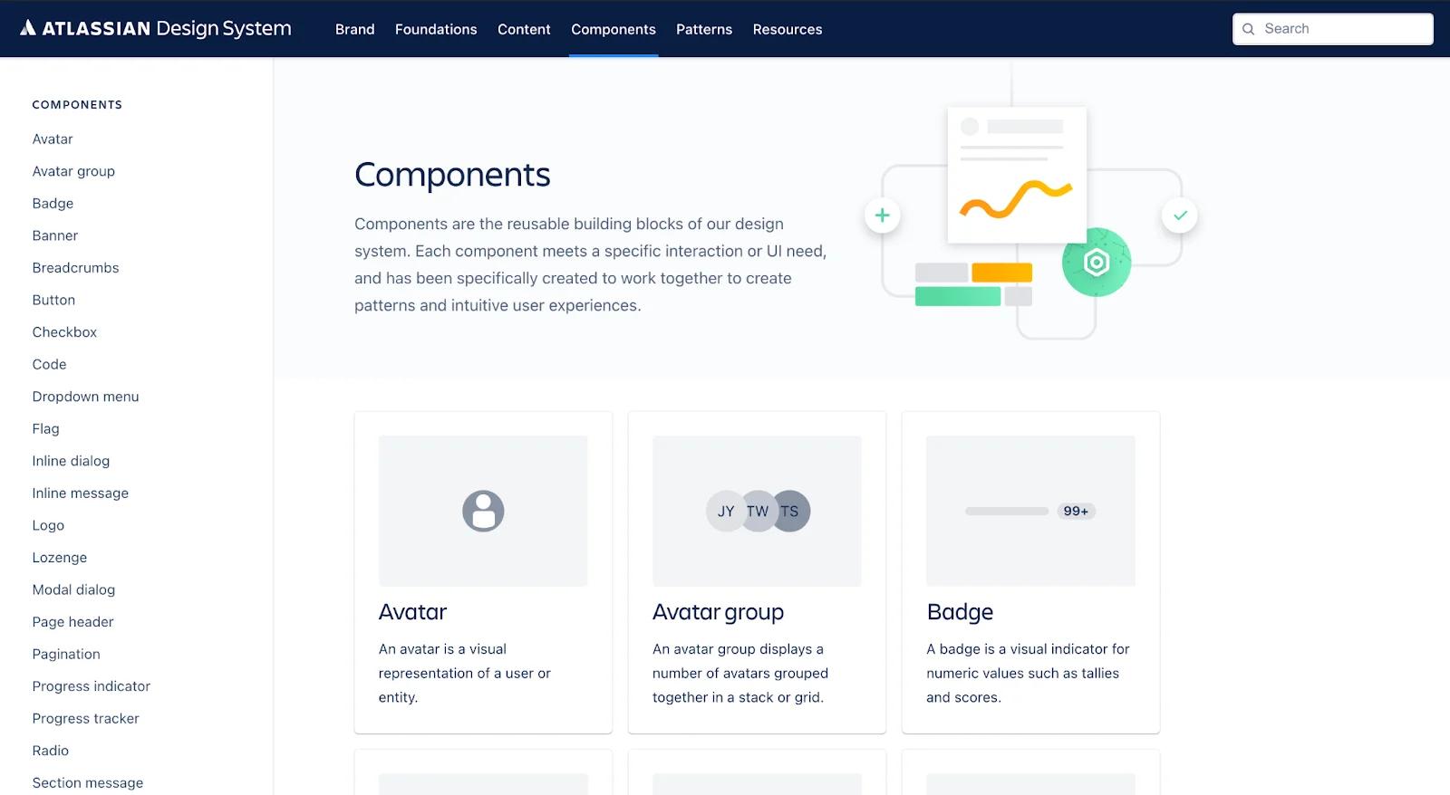
Case Study: Breaking down Atlassian’s Visual Identity System
Atlassian, creators of the popular project management tools Trello and Jira, focuses on keeping companies agile, organized, confident, and fast to market.
Atlassian’s brand personality expresses itself in its visual identity system. Organized into five groups - components, patterns, brand, foundations, and content - Atlassian’s design system is a perfect example to which design departments should aspire.
Components
blog 6 image 3
Atlassian has ten components that are used as building blocks for their designs.
This doesn’t mean your design system should also have ten components, rather you must find the components that will fit your User Interface (UI) needs.
Within each component, there are more layers that designers and developers can use.
For example, Atlassian’s avatar component shows designers what the default icon would look like and includes the line of code developers will need to deploy it in a UI.
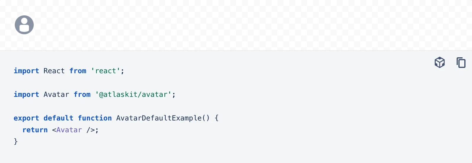
blog 6 image 4
To take it a step further, Atlassian includes another block in their avatar component, called the avatar item, that shows what the avatar item looks like with a wrapper along with a line of code.
Atlassian’s components also include badges, banners, buttons, dropdowns, modals, messages, flags, checkboxes, and more!
Patterns
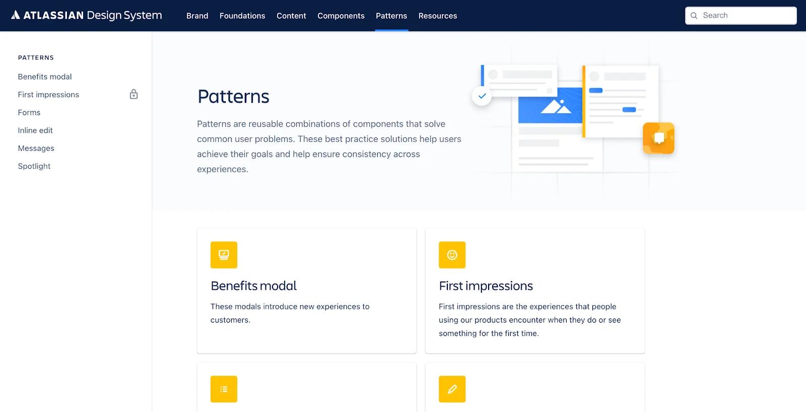
atlassian-patterns
Patterns are different combinations using the components described above. This part of their visual design system is a small “how-to” guide on implementing component combos.
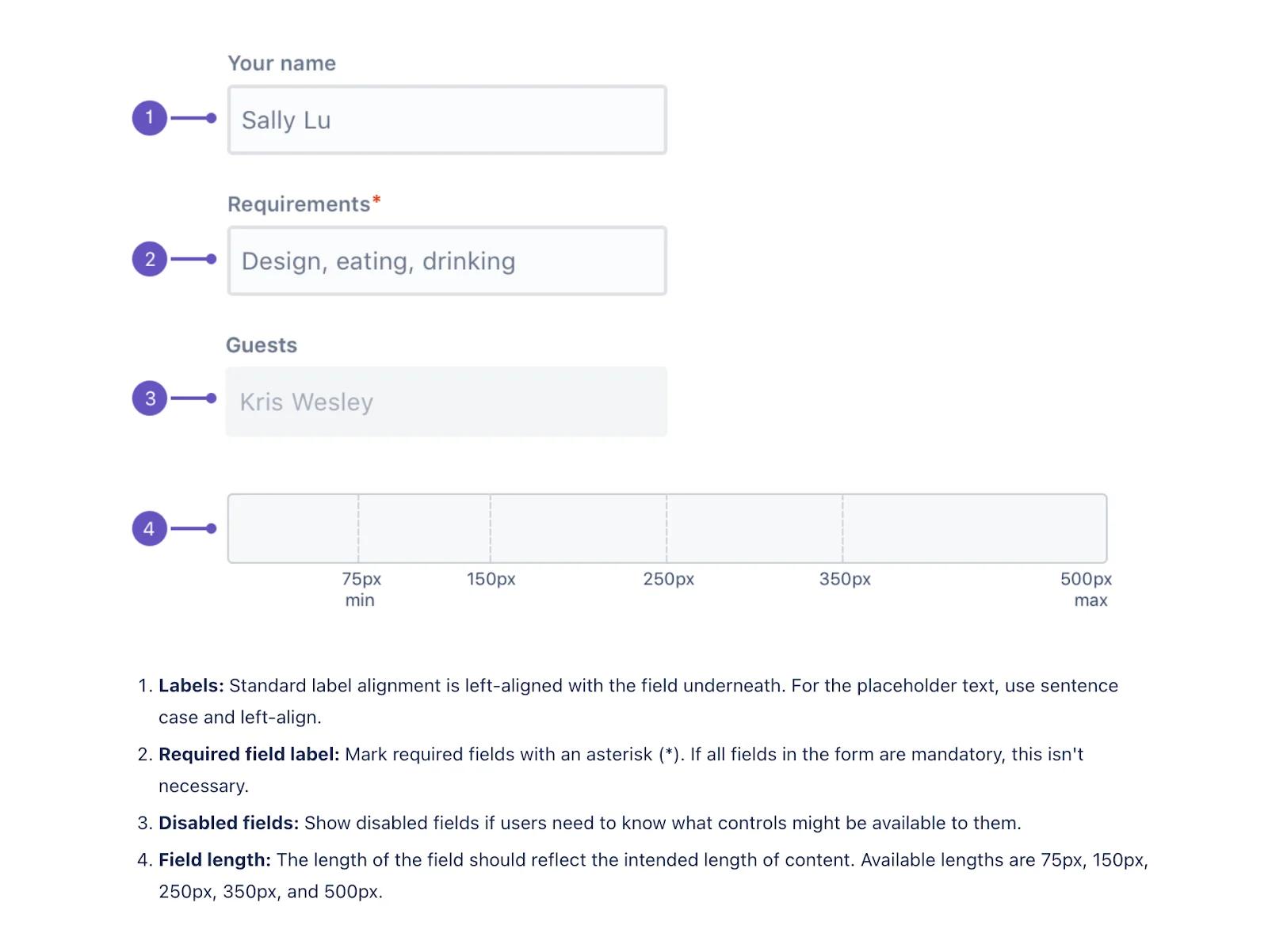
atlassian-pattern-labels
The form pattern’s labels let their team know the correct way to style their forms including the dialogue box length, placeholder text, label alignment, and more.
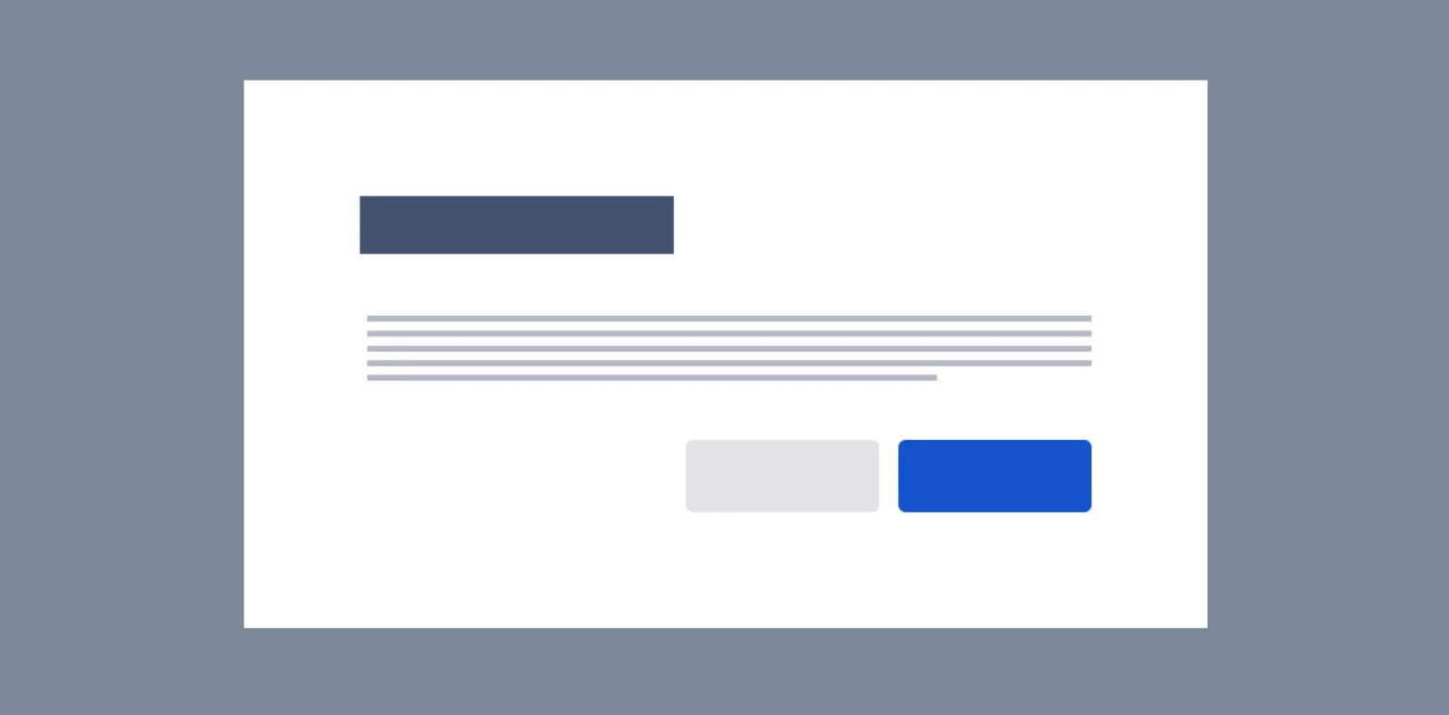
atlassian-usage-mockup
Atlassian also designed custom graphics to display what the finished design should look like after following the design system guidelines.
This custom illustration shows the proper way to position headers, text, and button components. Small notes can be paired with these illustrations to explain the illustration.
Patterns must include the reusable components you came up with in step one. If they’re not being used, consider restructuring your visual identity system from step one.
To give you a better understanding of pattern combinations, here are Atlassian’s patterns: benefits modal, first impressions, forms, inline edit, messages, and spotlight.
Brand
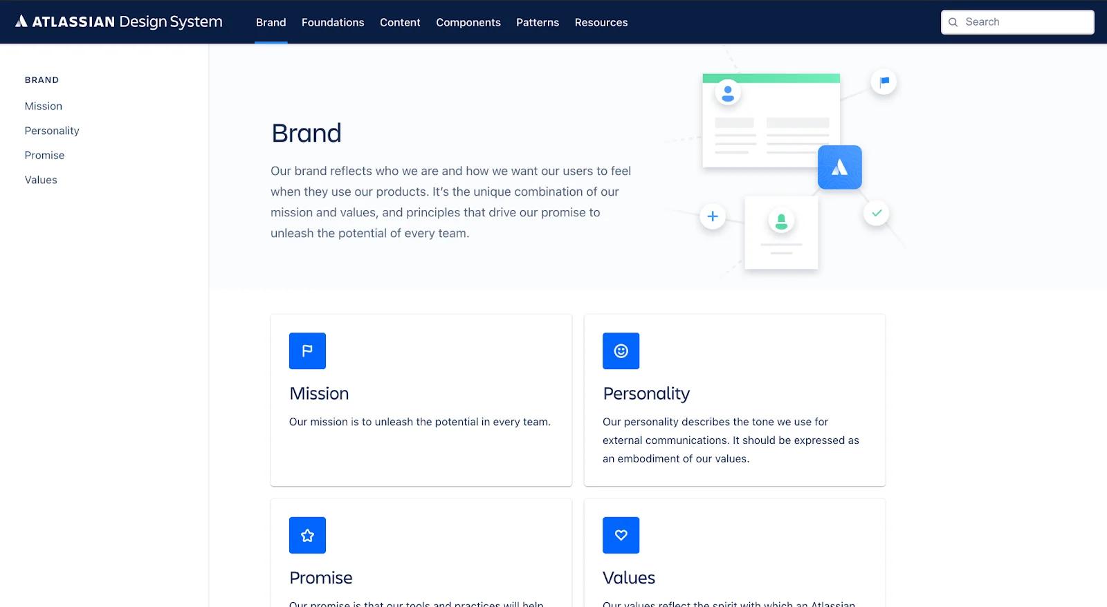
atlassian-brand
Adding your brand mission, vision, values, and personality to the system is a huge plus!
There might come a time where you forget what the messaging should sound like or the values that keep your audience engaged.
Fret no more - this page will save you from losing touch on your brand’s identity.
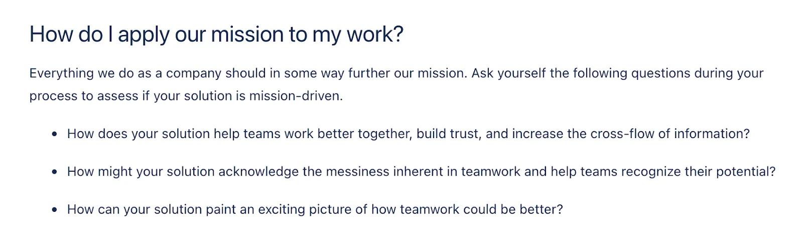
atlassian-mission-statement
Atlassian includes a section on how to apply personality, mission, and promise to their work.
They provide a set of questions for their team to ask themselves to ensure the work they create is in line with brand expectations. This is a must-add in our book!
Foundations
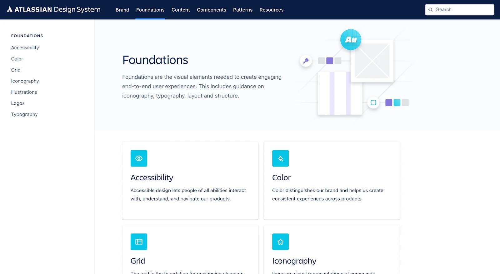
atlassian-foundations
For Atlassian, foundations include all their visual elements that make their design work look beautiful. This portion of their visual identity system includes accessibility, color, grids, iconography, illustrations, logos, and typography.
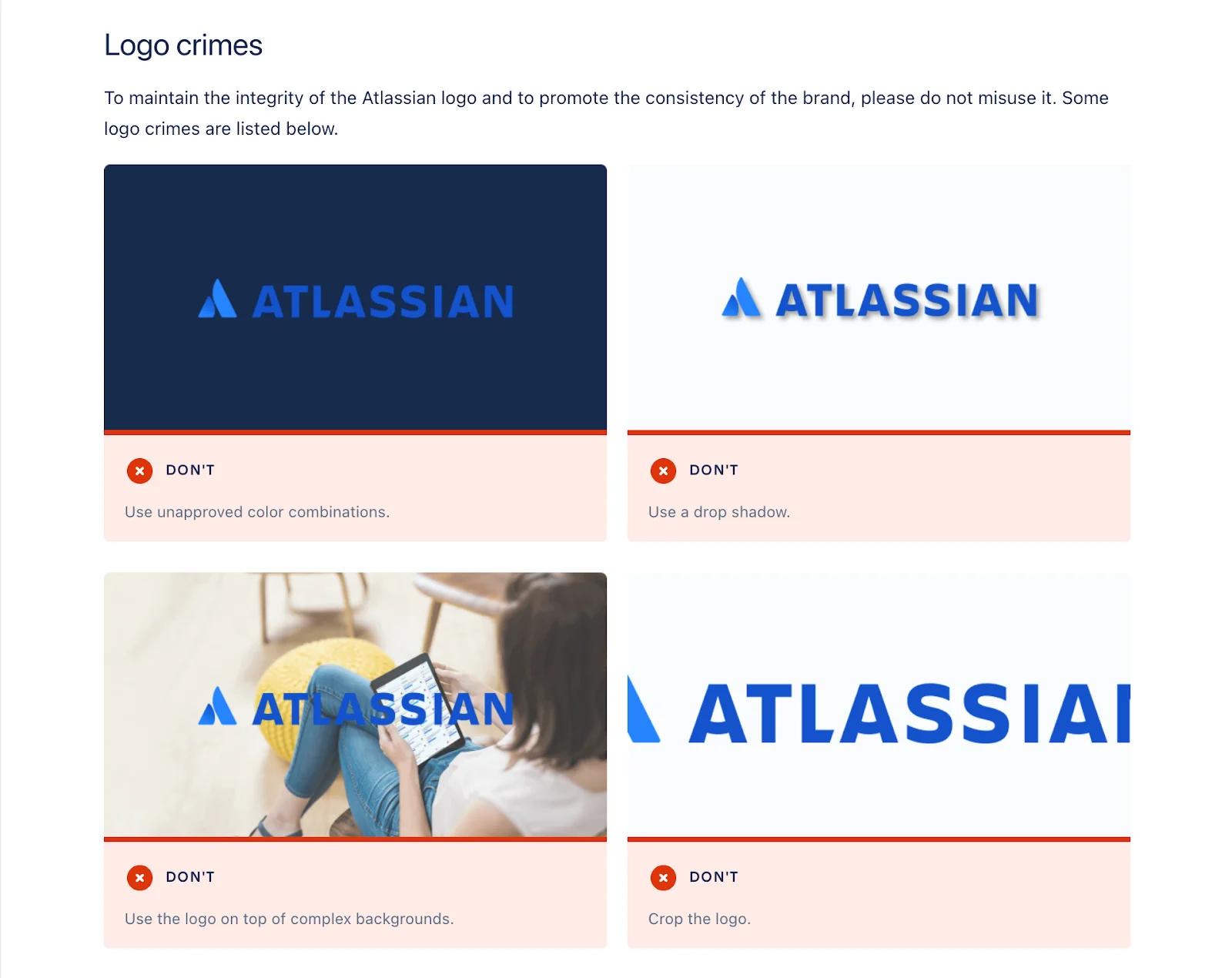
atlassian-logo-crimes
It’s important to add something similar to what is pictured above. Atlassian does a great job of displaying what to do and what not to do.
This section should cover your color palettes, icon sizes, and types, grid sizes, and any other visual aspects of your design system.
Before building your foundation in your visual identity system, we recommend you create a brand style guide, which is a set of rules and guidelines on logo usage, typography, illustration styles, and other essential design components.
Need some inspiration? Check out how we created the Webstacks brand style guide.
Content
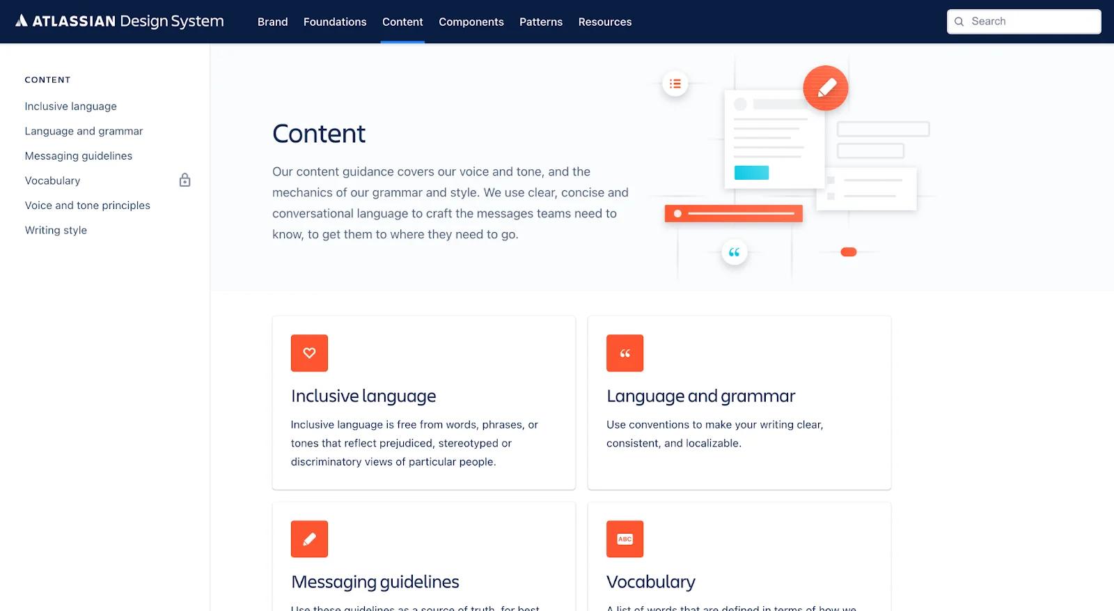
atlassian-content
The content portion of their design system covers grammar, voice, tone, and language that should be used to best craft their messages. Similar to the brand component, it is an essential part of any design system.
By implementing these grammar rules, writers will feel confident drafting new copy, and stakeholders will feel their product is being represented accurately across copy, formatting, language, and style.
How to Align Visual Identity with Brand Strategy
Your visual identity should be a direct reflection of your brand’s strategy, not just in theory, but in execution. Here’s how to make sure the two stay tightly connected:
- Root everything in your brand values: Get crystal clear on what your brand stands for. If your value is innovation, your visuals should feel modern and forward-thinking. If you lead with approachability, lean into softer colors, friendly typefaces, and open layouts.
- Keep your design language consistent: Visual inconsistency creates confusion. Whether someone’s landing on your homepage, scrolling through your LinkedIn post, or opening a sales deck, the tone should feel the same. Set rules for layout, color usage, and imagery and apply them everywhere.
- Build alignment across teams: A visual identity system falls apart without buy-in from the people actually using it. Involve marketing, product, and design early.
Start Your Visual Identity System
Great brands don’t happen by accident, they’re built with intention. A visual identity system helps you stay consistent and show up in the world with confidence.
Properly executed, you will a save a significant amount of time and resources - all while projecting a distinct and unified identity.
Looking for more assistance on developing your brand identity and visual identity system? Schedule a call with Webstacks to learn more about how we can help you.


